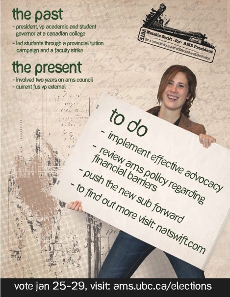
Campaigning started bright ‘n early this morning, and the halls & classrooms are already plastered with posters of varying size and attractiveness. Clearly, a number of people were verrrrry busy with Photoshop over the weekend. This editor couldn’t help but note that by as early as 9ish, Buchanan B had a heavy emphasis on the presidential campaign: every classroom on the second floor had both a Bijan and a Nat Swift poster; Sean Kim trailed in third by choosing specific areas (although we have to doubt the wisdom of ‘top of the recyling bin’ as a location). No doubt dedicated volunteers spent long hours to ensure that we were confronted with the smiling faces of hacks wherever we may go, although we can’t help but wonder what measures were necessary to keep toiling fingers at the button machines.
In these dizzying times, it can be hard to properly analyze campaign media sources. That’s why, after the jump, we’ve given you our Handy Dandy Campaign Poster Field Guide. It’s the definitive resource to identifying, classifying, and ultimately analyzing the campaign materials with which you’re about to be, for lack of a better term, flyerfucked.
Should you, by the way, notice that we’ve an important subgroup, let us know in the comments. Did I mention we love the shit out of comments? OH BOY COMMENTS.
FYI: Use of campaign materials for the purposes of this post does not constitute an endorsement in any way, shape, or form. Duh.
The Classic
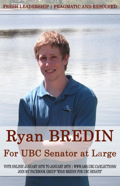
The Classic poster is the simplest type, providing viewers with key pieces of information only: a great big headshot, preferably outdoors; a name; and a position. Sometimes—but not always—these posters will make prominent use of action verbs, like ‘VOTE’ or ‘CHOOSE’ or ‘SCREW’.
Pros: Simple message, uncomplicated text. Great for branding a candidate or familiarizing voters with their name. Easily stolen, placed on bedroom ceiling for secretive nighttime viewing.
Cons: Low on information. Pictures not always as flattering as candidates might believe. Lots of empty space provides better graffitti, defacement opportunities. (NB: AMS Confidential does not encourage defacement of candidate materials, except in the comfort & privacy of your own home, or in MS Paint.)
The Talking Point/The TMI
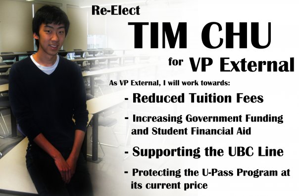
The Talking Point poster, and its cousin, the TMI, are characterized by their emphasis on information. One or two major differences exist in this category. Whereas the Talking Point (see above) makes judicious use of prioritized information, setting forth a few key points which are subordinate to candidate name & picture, the TMI requires a longer reading time. It conveys more information, but is less effective at a glance.
Pros: Conveys platform to students who wouldn’t attend debates/check website. Still fun to look at. Allows evaluation of candidate’s design skills. Entertains voters in line for bathroom, to enter classroom, etc. Can be combined with other poster types.
Cons: Requires time to fully absorb. Talking points easily criticized as misleading. Occasionally, information overload. High likelihood that more than 3 fonts and/or ‘interesting’ typeface will be used.
The Golden Boy
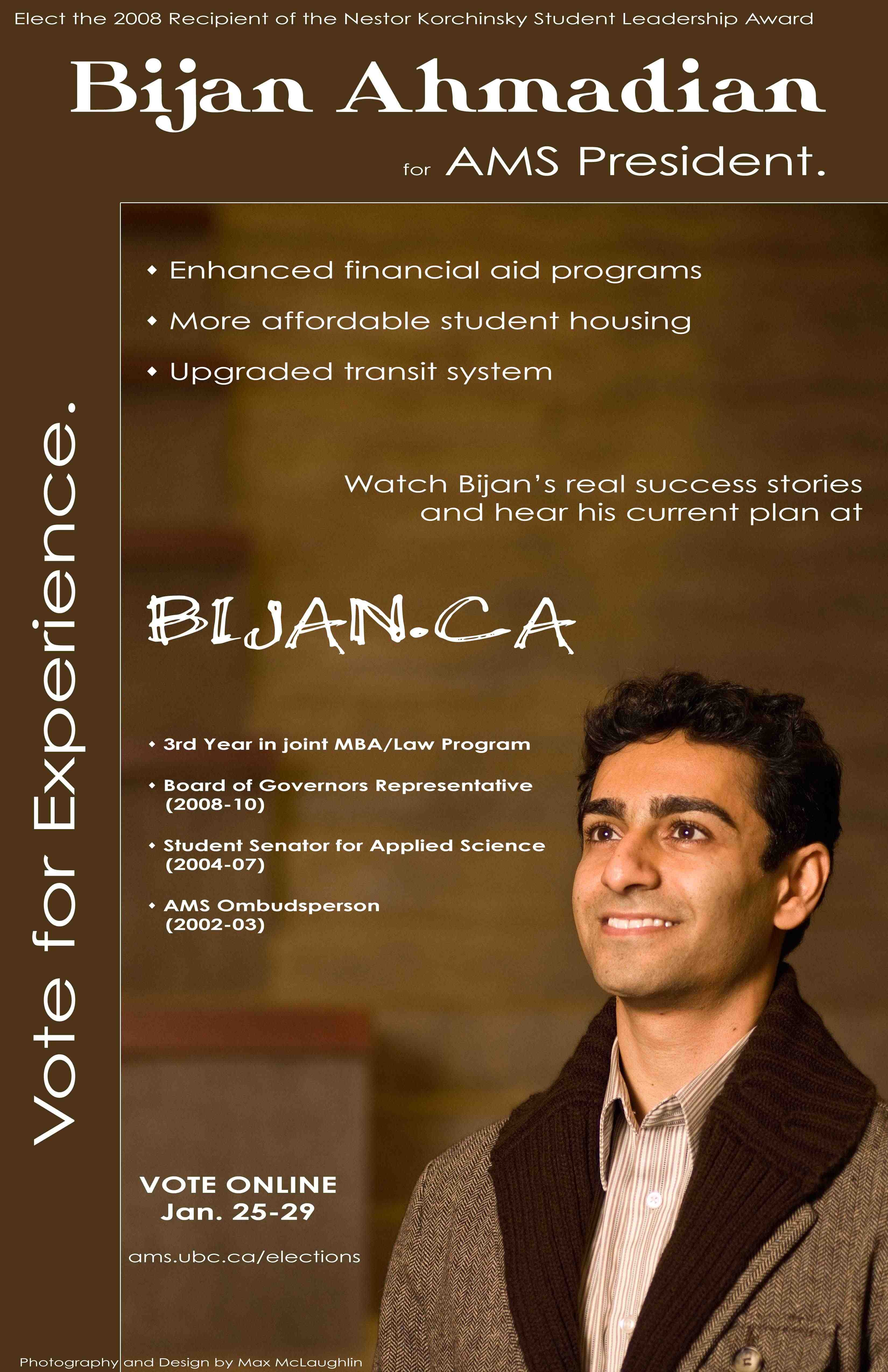
The Golden Boy (or girl) works from the Socialist handbook of politicking—he or she uses a higher-level and -quality shot than their competition, and makes it the focus of the poster. Candidates who aspire to Golden status gaze warmly into something, be it our eyes or the future.
Pros: Heartwarming, often dreamy. Gives one a sense of calm and security. Generally combined with the Talking Point to provide a good mix of information & visual stimulation.
Cons: If not handled correctly, schlocky as all get out. Strong possibility that candidates will try to cast their opponents in a less golden light. Candidate may be taking him/herself too seriously.
Lookalikes: the New Hope. Yeah, we’re looking at you, Sean Kim, with your Obama posters. You don’t fool us with that sheepish look, no matter how adorable it is.
The Fun One:
Candidates who put up a ‘fun’ or ‘kooky’ poster may be trying to set themselves apart from their opponents or emphasize their approachability/concern for students/commitment to communication/etc. It’s the postering exclamation point. Like the Golden Boy, the Fun Guy relies largely on their photographer to communicate their message, although serious text is important to present a complete message.
Pros: Like the Golden Boy, heartwarming, often dreamy. Inviting to first-time voters, some (but not all) jaded hacks. Possible nice contrast with srs business text = more complete picture of candidate.
Cons: Again, potentially schlocky.
The Rebel Yell:
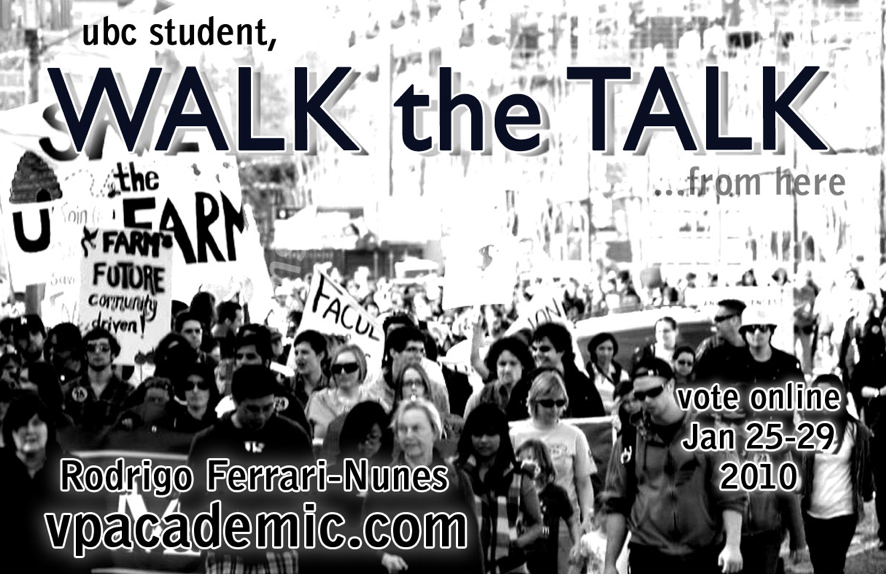
By far the most politicized of our postering categories, the Rebel Yell often includes no images whatsoever of the candidate. Rather, they attempt to visually link said candidate to an idea or cause close to his/her heart: the Farm, the Knoll, Student Advocacy, etc. Examples we’ve seen have been low on text, high on things that just plain don’t look fun. Like maybe the anti-unicorn junta is coming to town or something. Like we should all be very, very afraid, or aware, or both.
Pros: Message, once figured out, is strong. Scare tactics often effective. Challenges viewers; invites a second or third look, if only to figure out what poster is actually for. Printing costs for black & white probably much cheaper.
Cons: Could easily go unseen next to larger, more colorful posters. Requires thinking, interpretation, which students as a whole not strong on. Kind of terrifying.
The Total Hottie:
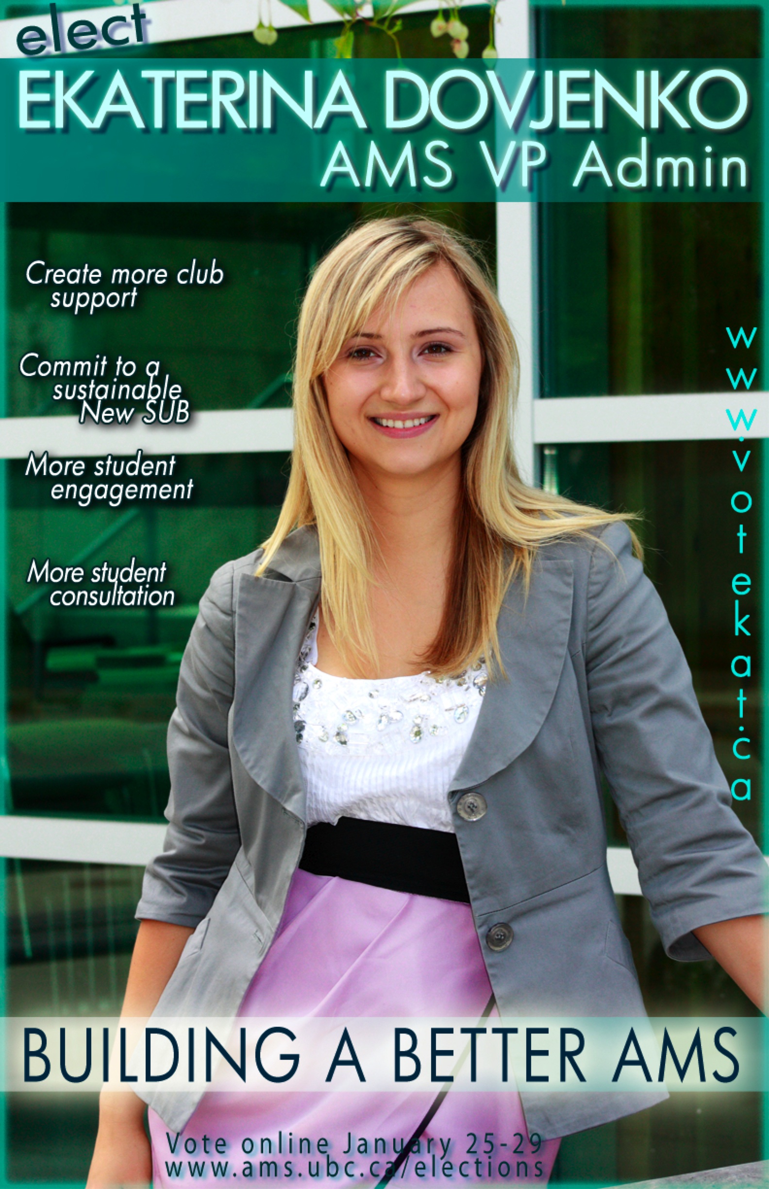
What, like you weren’t thinking it? Regardless of text/image balance and screaming blue font, this poster is selling us on one thing for sure: Ekat, you’re totally smokin’.
Pros: Visually effective, with strong impact. Stands out in sea of brunettes. Beautifying campus.
Cons: Voters could lose sight of candidate’s real political qualifications, beyond stylish blazer. Has already inspired strong desire to pinch poster, candidate’s cheeks, which is highly inappropriate, makes us feel like somebody’s bubbe. +10 to rambling on.
Sean Kim also put handouts on top of urinals, so recycling bins might be one of his more ‘normal’ placements.
As Ze Frank would say – “Bad design – makes me wanna throw up.”
Postering, for me, has not started yet… but we came up with a few designs, and I think you got the gist of it. The only detail you got wrong is about the ‘Knoll’ and what that may mean. Why am I not in the poster? I feel that this campaign is not about me or how I look. It is about ideas, thinking, analyzing, and coming with solutions that can be implemented with the best for UBC students in mind. The idea is to direct people to the website, where they can find all of my proposals and ideas and make their own minds. I would not want students voting for me (or anyone else) simply because I have the right key word on a poster or because I am wearing my best suit.
Back when I was an apathetic international student (2003-2007), I did not want to get involved with AMS elections because the posters made me want to run away from it – they usually seem very self-serving and have nothing to do with the actual JOB those elected will be performing. This is an important year for making ends meet and for making our relationship with the university productive. The best of luck for all candidates – may you ‘win’ because of your ideas, not your appearance!
-Rodrigo
Hear hear. Why so many fonts?
I APPROVE OF THIS POST.
Also, never having met Natalie Swift, I had a really hard time figuring out whose poster that was. DOESN’T MATTER HOW FUN YOU THINK YOU ARE, SWEETHEART, IF NO ONE KNOWS YOUR NAME.
Natalie is doing new posters with her name nice and big! Woot Woot. Bigger is better.
Here at UVic we have slates, and posters fall along slate lines. Unfortunately, slates do not stick to one colour (or colour combination) each, which makes things confusing, and in my opinion they should. Here are some notes from the 2009 UVSS election:
TeamFAST (the pro-CFS slate) chose to do black and white printing on coloured paper. That way they could print the maximum number of posters (50 per candidate) without going over the maximum spending limit ($50 per candidate.) However, their posters were much less eye-catching.
The other major slate BANG! did colour posters (and a few black and white ones) and as a result they had fewer posters, since they cost more.
A two-person slate, BOLD, did black and white posters. A four-person slate, YES! campaigned paperless (no posters or leaflets.) It didn’t work.
Both the major slates tend to follow a “talking point” style.
What about banners (those huge newsprint things that always falling off buildings?) Both TeamFAST and BANG did them–FAST’s banners had huge, primary colour block lettering and were easy to read at a distance, while BANG’s had candidate photos and were more artistic, but had smaller type making them hard to read.
And Rodrigo, if that poster is an indication of what you think a student union exec position entails…well, you wouldn’t have my vote if I was at UBC.
TeamFAST, BANG!, BOLD, and YES! are the most entertaining slate names ever.
At UBC our one slate is …Students for Responsible Leadership.
Ohhh, UVic…..
Not only that, but BANG (which stands for Bold Awesome New Government) chair candidate Curtis Smith used the slogans “Do you want a BANG?” and “It’s not just a slate, it’s an innuendo.” He also made a video called “Curtis Smith’s BANGing First Date.” I’m not sure if it’s still up but I can try to find it for you. BANG candidates’ Facebook statuses included “Go BANG in public at a polling station” and “Don’t forget to BANG online.”
I couldn’t make this stuff up.
Hilarious.
Also, you only have a $50 spending limit?!
We have…erm… I think its $450 limit and you get reimbursed for $300? Something like that.
oh, and, of course, mine are the only posters you can later keep and color your own way 🙂