
The Future of Starbucks’ Logo
![]() Picture from here.
Picture from here.
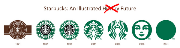
I found this picture so funny. It is very interesting to see company logos evolving over time. I would have thought that logos should not change because it represents the company and so if they changed it an issue that may arise would be people not recognizing it anymore. But after thinking a bit deeper, it would be okay to alter it every 10 years, like Starbucks has done. Updating a logo to make it more appealing to the current generation is actually quite smart. They don’t have to worry about their existing customers not recognizing the logo (since they are already customers!). In fact, they can attract a new generation of customers! I also remember Tamar (my marketing teacher) saying that simplifying company names (General Motors –> GM) may take away from the company’s mission or the whole meaning behind the company. For starbucks, the iconic mermaid may mean something to what Starbucks is trying to represent. If that was reduced down to a big green dot, all meaning behind what Starbucks is trying to represent will be gone from the logo. Anyway, I’m prettyyy sure Starbuck’s logo will not end up as a green dot in 2041. But who am I to say, maybe the future generation will find that attractive. I guess we’ll just have to wait 30 more years to see!
