Original
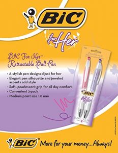
A few years ago Bic released their new product “Bic for Her”; a line of coloured pens that were designed for women “to add a touch of personality and a pop of color to your day with beautifully smooth writing and bold, trendy designs” (Bic). If by bold they meant: bold mistake in judgement from their marketing team, then I would agree. Although the blatant sexism is there, it’s interesting to pick out all of stereotypical details that have gone into this problematic ad.
The overarching issue is the target audience. The fact that they have to point out that this pen is suitable for women insinuates that for some reason women might face difficulty or embarrassment using or being seen with any other typical pen one might buy at the store. It insinuates that men and women need to be even further separated, stereotyped, and defined than they already are. Not only are there women’s shampoo and men’s shampoo, little girl’s toys and little boy’s toys, but now we need pens to further alienate people from one another? The media in general seems to use every opportunity possible to herd people into a particular category or gender. Whether it’s sexualizing women on TV, or portraying men as muscular forces of power, it can be hard to ignore. We don’t need pens to even further categorize ourselves. And why is it Bic for Her…are they also trying to say that women are unable to buy their own pens? Someone else is buying them for ‘her’?
Another issue I have to take up with this advertisement is its descriptive word choice. I wonder what went into the choosing of the words “elegant”, “jewelled”, and “pearlescent”? Is this Bic’s way of telling us that these are the traits women should be striving for? As if all women are good for is being stylish and flirty. Of course the colors of the pens (purple and pink) are all too fitting to this woman Bic has been telling us to be. And why are the fonts all playful and pretty? Do they think that it’s the “female font”? Last, but not least, they have the audacity to tell us we are getting “more for [our] money.” What more could a girl want, right? How about a pen that doesn’t segregate people based on their gender?…that’d be nice.
Culture Jam
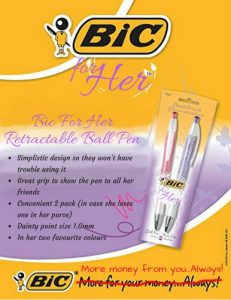
Rather than make extensive changes to the advertisement in order to make it at all acceptable, I chose to instead emphasize the blatant sexism. While this advertisement already does a pretty good job of being sexist all on its own, I chose to address a few key areas to make it even more obvious. As was noted previously, the main issue was the specific targeting of women. Bic for Her is already pretty degrading so I chose to leave it as is. I changed the messaging of the ad to be directed towards men that may be buying these pens for a woman (because women couldn’t possibly purchase pens on their own) and always addressed the actual product target as “her” or “she”.
I wanted to emphasize many of the sexist stereotypes that are being portrayed in the original ad. This included the pen colours, the cursive flirty fonts, and the idea that women buy pens for the stylistic purpose (rather than to write with them?). Each point in the product description helps emphasize the sexist nature of the post. I wanted people to see the poorly hidden message that lies behind this advertisement. Namely that women are less capable of buying or using any other pen on the market.
Finally, I wanted to address the statement at the bottom of the advertisement: “More for your money…Always!” We know this is a marketing ploy, but what scares me most is that the entire marketing team at Bic allowed for this ad to go through. No one stopped and said “is there another way we can reach the female market? Are we so greedy for profits that we need to attempt to lure women in with fluffy words and pretty colours?” It’s a money grab and I wanted this to be clear, so I changed “More for your money…Always!” to “More money from you…Always!” I wanted the statement to be obvious, so I used the red to make it stand out.
Mostly I want people to recognize all of the little details that go into convincing or tricking the consumer into thinking that this is the product for them, that they need it, or that somehow pens should be different according to your gender. Pens are universal; they don’t pay attention to gender and we shouldn’t make them. I want people to compare these two ads and think about the tricks that are in place in every ad we see. We need to recognize the stereotypes, recognize the greed, and try to make informed purchasing decisions.