Major Project: Typography
Artist’s Statement
Interactive Non-Fiction
Before starting this project, I didn’t know a lot about typography. What I did know was that typography catches my eye and that I have a deep appreciation for the print and patterns that I encounter on a day-to-day basis… in books, magazines, websites and blogs.
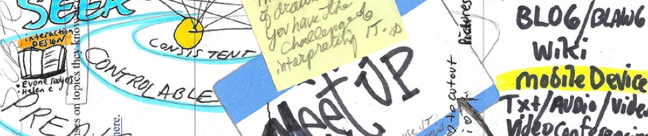
For my project, I used interactive non-fiction to gather a repository of resources pertaining to typography. This project combines text, visuals and short audio-visual video clips in order to present a small sampling of resources available on the topic.
Platform
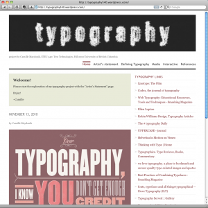
I chose to use the WordPress.com platform to create and design my project. After exploring a few other free options, I decided using WordPress was the best fit as I am familiar with the platform and I can continue to add resources to my project even after completion of the course. The site itself is easy to navigate and simple for clear comprehension and readability.
My project is best explored by starting with Defining Typography, then Media, followed by Interactive and References. At any time, feel free to explore the typography links listed on the sidebar.
Critical Issues
After completing an earlier assignment in this course on the Shifting Economies of Book Production and learning more about Johannes Gutenberg’s (1398 – 1468) printing press, I was inspired to learn more about movable type and typography. Robert Logan (2004) writes that, “With the printing press we finally encounter a technology whose impact on the use of the alphabet is so great that it must be ranked in importance with the alphabet itself. For not only did the printing press greatly multiply access to alphabetic texts, it also, through the regularity it introduced, transformed the way in which the alphabetic text was placed on the page and was perceived by its readers” (p. 177).
Fast-forward a couple of hundred years to the 20th century. Bolter (2001) states, “Digital technology in the form of desktop publishing and computer-controlled photocomposition refashioned the practice of printing” (p. 49). Bolter (2001) explains, “The computer opens the printing process to small groups and even individuals. Amateurs can create their own camera-ready copy and make selective use of or ignore altogether the stylistic practices of professional typographers” (p. 49).
As educators, we are constantly creating resources for our students and knowledge of typography is essential when producing our own documents. Schriver (1997) explains, “Rightly or wrongly, every writer is now potentially a document designer – quite a responsibility, because good design has been shown to play a positive role in influencing the way readers think and feel about products and services” (as cited in Hoist-Larkin, 2006, p. 417).
Different students will have differing requirements when it comes to reading the text laid out as part of educator made resources. For example, emerging readers won’t be able to recognize complicated letterforms. Educators must always carefully consider the target audience for the resource. It is not about whether or not the educator can discern and read the type personally, but whether the students the piece is aimed at can. Wilkins, Cleave, Grayson & Wilson (2009) studied the size and design of typeface in textual material for children: “In children’s reading material there is additional complexity. The shape of characters may differ from those in adult text, particularly as regards single-storey ‘a’ and ‘g’’ (p. 402) and it was found that the various typographic parameters of font-size, inter-character spacing, word spacing, line spacing, justification and line length interact in affecting reading performance.
My hope for this repository of information and resources about typography is that it can introduce other educators to this art, so that we, as educators, can reflect more critically on the design of our materials and resources for students.
Thank you for reading and interacting with my project!
Enjoy!
~ Camille
References
Bolter, J. D. (2001). Writing Space: Computers, Hypertext, and the Remediation of Print. Second Edition. Mahwah: Lawrence Erlbaum Associates.
Holst-Larkin, J. (2006). Personality and type (but “not” a psychological theory!). Business Communication Quarterly, 69(4), 417-421. Retrieved from ERIC database. (EJ798322)
Hughes, L., & Wilkins, A. (2000). Typography in children’s reading schemes may be suboptimal: Evidence from measures of reading rate. Journal of Research in Reading, 23(3), 314-24. Retrieved from ERIC database. (EJ624606)
Schriver, K. A. (1997). Dynamics in document design: Creating texts for readers. New York: John Wiley.
Seddon, T., & Waterhouse, J. (2009). Graphic design for non-designers. San Francisco: Chronicle Books.
Wilkins, A., Cleave, R., Grayson, N., & Wilson, L. (2009). Typography for children may be inappropriately designed. Journal of Research in Reading, 32(4), 402-412. Retrieved from ERIC database. (EJ860204)

