IN CHAPTER 4 of his book, Bolter (2011) uses the books of Edward Tufte (and not Edwin [p. 50]) to show that even in a predominantly visual culture, the text is still “in control” of images within certain contexts; and he brings Joseph Minard (who was not a designer as Botler states [p.50], but an engineer [Mijskenaar, 1997, p.28]) and his chart of the Napoleon Russian campaign of 1812 to the discussion as a good example of this. Tufte states that Minard’s chart might be one of the best “statistical graphic” ever designed, (p.28) because it combines many layers of information in a single piece of data visualization.

Translation to english:
Figurative Map of the successive losses in men of the French Army in the Russian campaign 1812-1813.
Drawn up by M. Minard, Inspector General of Bridges and Roads in retirement. Paris, November 20, 1869.
The numbers of men present are represented by the widths of the colored zones at a rate of one millimeter for every ten-thousand men; they are further written across the zones. The red [now brown] designates the men who enter into Russia, the black those who leave it. —— The information which has served to draw up the map has been extracted from the works of M. M. Thiers, of Segur, of Fezensac, of Chambray, and the unpublished diary of Jacob, pharmacist of the army since October 28th. In order to better judge with the eye the diminution of the army, I have assumed that the troops of prince Jerome and of Marshal Davoush who had been detached at Minsk and Moghilev and have rejoined around Orcha and Vitebsk, had always marched with the army.
The scale is shown on the center-right, in “lieues communes de France” (common French league) which is 4,444m (2.75 miles).
The lower portion of the graph is to be read from right to left. It shows the temperature on the army’s return from Russia, in degrees below freezing on the Réaumur scale. (Multiply Réaumur temperatures by 1¼ to get Celsius, e.g. −30°R = −37.5 °C) At Smolensk, the temperature was −21° Réaumur on November 14th.
Nevertheless, Minard’s chart is very complex; it is required time and a trained eye to retrieve and assimilate the information it contains, or to be explained to understand it. The aid of text is of course necessary under these conditions.
The opposite extreme, according to Botler, lays in the modern merely decorative (pejoratively speaking) graphic recourses used to display information, like those presented by USA Today and other newspapers and magazines. Botler implies that the difference between Minard’s and USA Today’s graphics rest in the way the text “gathers around the image and supervises its reading” (p.49).
Needless to say that to be possible to compare this two examples they must share its nature and a reference point. Both the nature and “reference point” are absent in Bolter’s text. These graphic examples are considered to be info visualizations, known too as infographics (Mijskenaar, 1997, p.30). And its nature inevitably leads us to what I think is the missing reference point: ISOTYPE.
ISOTYPE
It stands for International System of Typographic Picture Education, a term set in 1935 for a pictorial system funded by and developed in Vienna by Otto Neurath prior to 1925 for the Museum of Society and Economy of this city. At that time, Vienna was a socialist state effectively separated from the new Republic of Austria (Burke, 2009).
The economist and social scientist Otto Neurath, initiator and theorist of this method conceived the museum as a teaching one. His aim was to represent graphically social facts and statistics that were particularly important as he envisioned information and particularly statistical one as a resource understanding and power. He gave himself the task of transforming “dead statistics” into meaningful, memorable and accessible to everyone pieces of information. (Burke, 2009)
Source: Isotype revisted
Source: Isotype revisited
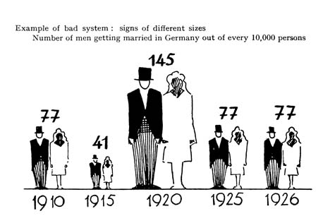
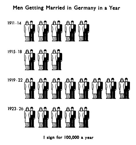
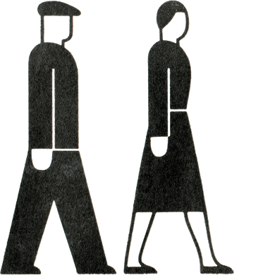
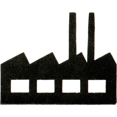
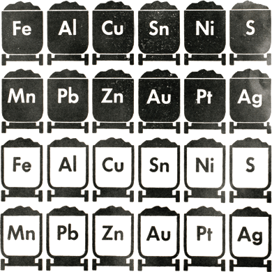
Basically, what Neurath did is to take Gerd Arntz illustrations (Burke, 2009; Kindel, 2012; Annink, Ed. 2012, ) and to develop a pictorial language with a “pictorial dictionary” and a set of “visual syntactic” rules. These rules remain as valid until these days. One of these rules, probably the main one, was to establish that greater quantities should not be represented by enlarging the same image, but repeating symbols of the same size, for example.
In his books, Edward Tufte acknowledges many of the ISOTYPE rules or the logic principles behind them. Nevertheless, the existence of the rules does not imply its compliance, and many of these rules are still being ignored (Burke, 2009). In my personal opinion, this is the case of USA Today examples presented by Bolter, they are just bad graphic examples, and the presence, absence or influence of text has nothing to do with it.
“WORDS DIVIDE, PICTURES UNITE”
This is the Otto Neurath’s catchphrase (Burke, 2009) that better suits the spirit of ISOTYPE. By establishing the syntactic rules and patterns of modern data visualization, he literally offered an alternative language that could work without text but might be “readable” by illiterate population or children and suitable too for international communication. Anyone who has had to navigate through an airport in a country with a foreign language (including Bolter) can realize the convenience of this “graphic philosophy”, even many years after its development.
Images from Gerd Arntz web archive: www.gerdarntz.org
This does not mean that ISOTYPE intended to emancipate image from the text. I would say that there is nothing to emancipate or detach. Text is a set of images highly conventional and subordinated to a context and to a purpose, as ISOTYPE was and the traffic signs are, a language. The examples from USA Today showed by Bolter, according to this are just a bad use of a graphic language, and a bad use of any language can lead to misunderstanding and confusion.
Somehow, Tufte himself cited by Bolter in his book place images and text as equals: “words, graphics and tables are different mechanisms with but a single purpose — the presentation of information” (Tufte, 1983, p.181; Bolter, 2009, p.50).
REFERENCES
Annink, E. (2012). Gerd arntz web archive. Retrieved November 8, 2012, from www.gerdarntz.org
Bolter, J. D. (2001). Writing space: Computers, hypertext, and the remediation of print. Taylor & Francis.
Burke, C. (2009). Isotype: Representing social facts pictorially. Information Design Journal, 17 (3), 211-223.
Kindel, E., & Walker, S. (2010). Isotype revisited. Retrieved November 6, 2012, from http://isotyperevisited.org/2010/09/isotype-revisited.html
Kindel, E., Walker, S., Burke, C., Eve, M., Minns, E. & Perks, S. (2012). Isotype revisited. Retrieved November 8, 2012, from www.isotyperevisited.org
Mijksenaar, P. (1997). Visual function: An introduction to information design. 010 Publishers.
Tufte, E. R. (1983). The visual display of quantitative information. Graphics Press.
Tufte, E. R. (1990). Envisioning information. Graphics Press.
Tufte, E. R. (1997). Visual explanations: Images and quantities, evidence and narrative. Graphics Press.
Twyman, M. (1975). The significance of isotype. Isotype Revisited, London.

The breakout of the visual
IN CHAPTER 4 of his book, Bolter (2011) uses the books of Edward Tufte (and not Edwin [p. 50]) to show that even in a predominantly visual culture, the text is still “in control” of images within certain contexts; and he brings Joseph Minard (who was not a designer as Botler states [p.50], but an engineer [Mijskenaar, 1997, p.28]) and his chart of the Napoleon Russian campaign of 1812 to the discussion as a good example of this. Tufte states that Minard’s chart might be one of the best “statistical graphic” ever designed, (p.28) because it combines many layers of information in a single piece of data visualization.
Translation to english:
Figurative Map of the successive losses in men of the French Army in the Russian campaign 1812-1813. Drawn up by M. Minard, Inspector General of Bridges and Roads in retirement. Paris, November 20, 1869.
The numbers of men present are represented by the widths of the colored zones at a rate of one millimeter for every ten-thousand men; they are further written across the zones. The red [now brown] designates the men who enter into Russia, the black those who leave it. —— The information which has served to draw up the map has been extracted from the works of M. M. Thiers, of Segur, of Fezensac, of Chambray, and the unpublished diary of Jacob, pharmacist of the army since October 28th. In order to better judge with the eye the diminution of the army, I have assumed that the troops of prince Jerome and of Marshal Davoush who had been detached at Minsk and Moghilev and have rejoined around Orcha and Vitebsk, had always marched with the army.
The scale is shown on the center-right, in “lieues communes de France” (common French league) which is 4,444m (2.75 miles).
The lower portion of the graph is to be read from right to left. It shows the temperature on the army’s return from Russia, in degrees below freezing on the Réaumur scale. (Multiply Réaumur temperatures by 1¼ to get Celsius, e.g. −30°R = −37.5 °C) At Smolensk, the temperature was −21° Réaumur on November 14th.
The opposite extreme, according to Botler, lays in the modern merely decorative (pejoratively speaking) graphic recourses used to display information, like those presented by USA Today and other newspapers and magazines. Botler implies that the difference between Minard’s and USA Today’s graphics rest in the way the text “gathers around the image and supervises its reading” (p.49).
Needless to say that to be possible to compare this two examples they must share its nature and a reference point. Both the nature and “reference point” are absent in Bolter’s text. These graphic examples are considered to be info visualizations, known too as infographics (Mijskenaar, 1997, p.30). And its nature inevitably leads us to what I think is the missing reference point: ISOTYPE.
ISOTYPE
It stands for International System of Typographic Picture Education, a term set in 1935 for a pictorial system funded by and developed in Vienna by Otto Neurath prior to 1925 for the Museum of Society and Economy of this city. At that time, Vienna was a socialist state effectively separated from the new Republic of Austria (Burke, 2009).
The economist and social scientist Otto Neurath, initiator and theorist of this method conceived the museum as a teaching one. His aim was to represent graphically social facts and statistics that were particularly important as he envisioned information and particularly statistical one as a resource understanding and power. He gave himself the task of transforming “dead statistics” into meaningful, memorable and accessible to everyone pieces of information. (Burke, 2009)
Source: Isotype revisted
Source: Isotype revisited
Basically, what Neurath did is to take Gerd Arntz illustrations (Burke, 2009; Kindel, 2012; Annink, Ed. 2012, ) and to develop a pictorial language with a “pictorial dictionary” and a set of “visual syntactic” rules. These rules remain as valid until these days. One of these rules, probably the main one, was to establish that greater quantities should not be represented by enlarging the same image, but repeating symbols of the same size, for example.
In his books, Edward Tufte acknowledges many of the ISOTYPE rules or the logic principles behind them. Nevertheless, the existence of the rules does not imply its compliance, and many of these rules are still being ignored (Burke, 2009). In my personal opinion, this is the case of USA Today examples presented by Bolter, they are just bad graphic examples, and the presence, absence or influence of text has nothing to do with it.
“WORDS DIVIDE, PICTURES UNITE”
This is the Otto Neurath’s catchphrase (Burke, 2009) that better suits the spirit of ISOTYPE. By establishing the syntactic rules and patterns of modern data visualization, he literally offered an alternative language that could work without text but might be “readable” by illiterate population or children and suitable too for international communication. Anyone who has had to navigate through an airport in a country with a foreign language (including Bolter) can realize the convenience of this “graphic philosophy”, even many years after its development.
Images from Gerd Arntz web archive: www.gerdarntz.org
This does not mean that ISOTYPE intended to emancipate image from the text. I would say that there is nothing to emancipate or detach. Text is a set of images highly conventional and subordinated to a context and to a purpose, as ISOTYPE was and the traffic signs are, a language. The examples from USA Today showed by Bolter, according to this are just a bad use of a graphic language, and a bad use of any language can lead to misunderstanding and confusion.
Somehow, Tufte himself cited by Bolter in his book place images and text as equals: “words, graphics and tables are different mechanisms with but a single purpose — the presentation of information” (Tufte, 1983, p.181; Bolter, 2009, p.50).
REFERENCES
Annink, E. (2012). Gerd arntz web archive. Retrieved November 8, 2012, from www.gerdarntz.org
Bolter, J. D. (2001). Writing space: Computers, hypertext, and the remediation of print. Taylor & Francis.
Burke, C. (2009). Isotype: Representing social facts pictorially. Information Design Journal, 17 (3), 211-223.
Kindel, E., & Walker, S. (2010). Isotype revisited. Retrieved November 6, 2012, from http://isotyperevisited.org/2010/09/isotype-revisited.html
Kindel, E., Walker, S., Burke, C., Eve, M., Minns, E. & Perks, S. (2012). Isotype revisited. Retrieved November 8, 2012, from www.isotyperevisited.org
Mijksenaar, P. (1997). Visual function: An introduction to information design. 010 Publishers.
Tufte, E. R. (1983). The visual display of quantitative information. Graphics Press.
Tufte, E. R. (1990). Envisioning information. Graphics Press.
Tufte, E. R. (1997). Visual explanations: Images and quantities, evidence and narrative. Graphics Press.
Twyman, M. (1975). The significance of isotype. Isotype Revisited, London.