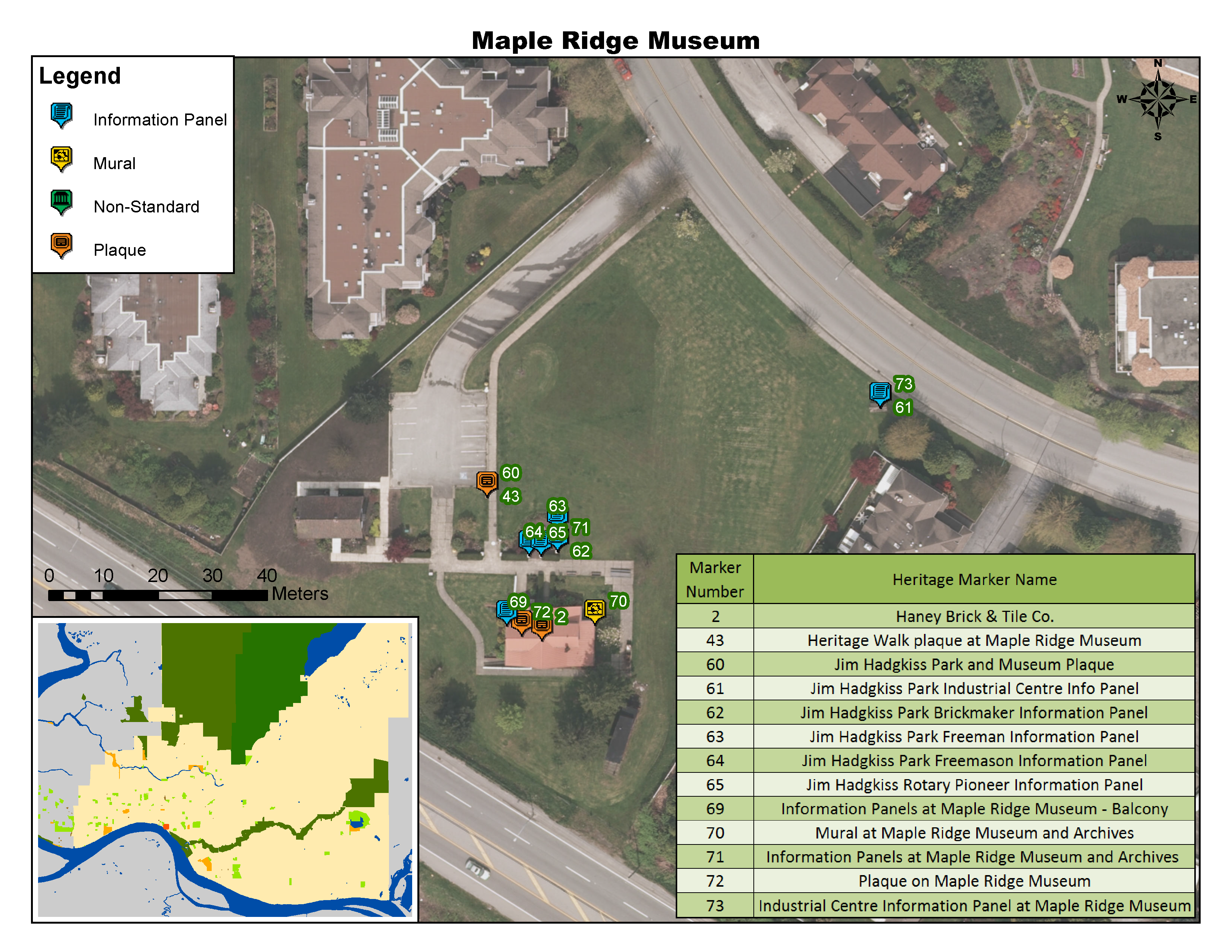
This week we presented our landscape ecology article reviews to the class. The article I reviewed is called “a modelling approach to infer the effects of wind farms on landscape connectivity for bats”. (Article Link Here) The authors wanted to better understand the impact of wind farms on bat commuting routes. The method used for this research is summarized in the diagram shown below, which is divided into three main sections:
1) Creating a Species Distribution Map (SDM)
– Creating variables from existing environmental data (land cover, digital terrain model, and hydrographic maps)
– Input variables into model along with 70% of bat presence data
– Test model accuracy with remaining 30% of bat presence data
– Repeat procedure 50 times to create binary SDM
2) Determining connectivity
– Use 3 proxies of linear variables from previous research with SDM to produce resistance surface
– Select 50 random points in and connect them together by calculating least cost pathways
– Repeat procedure 10 times and summarize results in Potential Commuting Corridor map (PCC)
3) Wind farm interference
– Create map of all existing and future wind turbine locations and add 150m buffer to each
– Overlay wind turbine map with PCC
– If a PCC crosses a buffer, that turbine will be labeled as “affected”
In the end the researchers found areas with the most windfarm impact therefore they suggest those turbines be curtailed during bat migration seasons as well as putting limitations on future turbine construction.
Overall I would rate this article a 6 out of 10. Despite having successfully completing the goals they set out with and having good replicability in their results, 2 potential limitations made me rate the article lower:
1) The researchers chose this specific bat species because of its vulnerabilities to wind farms and migratory nature. They also noted how lots of turbine deaths were bats on their migration. But then the researchers decided to assume all the PCCs they produced were for commuting (daily) rather than migrating (annual) routes because of the lack of information of migration. Why ignore migration completely after putting so much emphasis on it?
2) I felt that the binary SDM was too simple for representing a complex factor like suitability. In nature there obviously isn’t a clear boundary where suddenly it becomes unsuitable for bats. Having a gradient or several classes would have been a better way of representing suitability.
I also found it interesting that several other studies presented used the same methodology and spatial analysis program (MaxEnt), and that this research was just following some of the “standard” processes set by previous research.
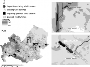
Bat Connectivity Map