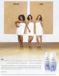
Original Advertisement

Analysis of Original Advertisement
I chose this advertisement for Dove body wash that features three women wrapped in towels standing in front of two blown-up images of skin labeled ‘before’ and ‘after’. The models in the photo are standing so that the heaviest and darkest-skinned woman is under the “before” label with a slightly lighter-skinned woman next to her in the middle, and finally a thin, white woman standing under the “after” label. This positioning of the models implies that the heavier model on the left with her darker skin and curly hair is the less desirable “before” option, whereas the thin model on the right with the light skin and straight, blond hair is the ideal body image. Despite the fact that this body wash isn’t directly claiming any effect on your skin colour or weight, the implication of arranging the models in this order is that by using this product you could lose weight or lighten your skin. The text in the advertisement doesn’t claim to have any specific positive effects but simply says that the product “improves the look” of skin and will give the user “more beautiful” skin without actually defining this beauty. This leaves someone viewing the ad to interpret for themselves what “beautiful” skin means based on the images in the ad. This company is also named after the bird “Dove” which is known for being pure white. which already implies a certain bias in the company that this pure, dove white is an ideal to strive for.
Jammed Advertisement

Explanation of Jamming Philosophy
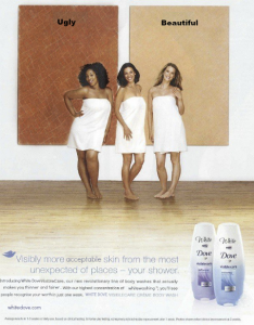
In my jammed version of the advertisement I decided to accentuate the subtle messages in this ad to make this underlying racist message more clear. Since the ad repeatedly claims to give the user “more beautiful” skin, I changed the “before” and “after” labels to “ugly” and “beautiful” so that this message is clear. I also darkened the “before” skin image so that the implication of placing the dark-skinned model below this image is immediately apparent. I was particularly mindful of the fact that this ad claims to give the user “more beautiful” and “better looking” skin when, in reality, beauty is something that is subjective. I chose to change all these places in the ad to words that complement the underlying message given by the image and show what is really meant in this ad by “beautiful”. I replaced the first “beautiful” with “acceptable” and changed the sentence claiming users will see “more beautiful skin” to one that claims they will see “people recognise your worth”. By doing this I am hoping to bring focus to the concept that women must be beautiful and use products such as these in order to have value in our society. I changed the sentence that says the product “improves the look” of skin to instead say that it “makes you thinner and fairer” in order to align with the visual message in the image. I also changed the trademarked key ingredient listed in the body wash to “whitewashing” to shine a light on how advertisements such as this are often made by white people for a white audience and ignore the broad range of women who are also considered beautiful, particularly in different cultures, and instead paints a very narrow view of beauty ideals. Lastly, In order to make obvious the underlying message in the company name, I changed the name to “White Dove” in all places. Although this change doesn’t change the meaning of the name, since it is assumed that all doves are white, it definitely makes the implications of this name clearer.