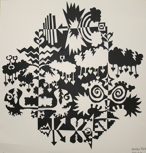
Nōtan is a Japanese design concept involving the play and placement of light and dark as they are placed next to the other in art and imagery. (Wikipedia)

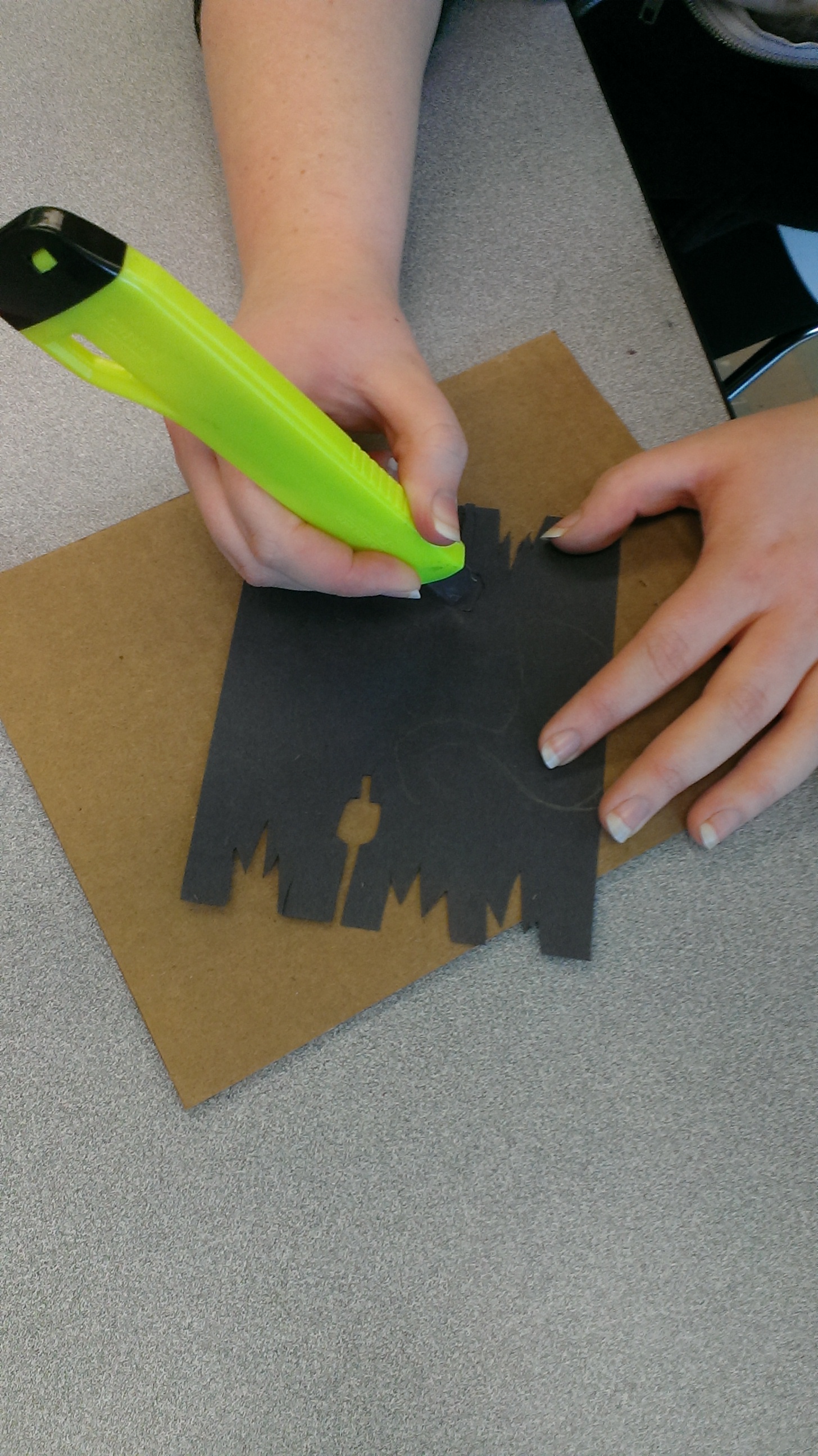
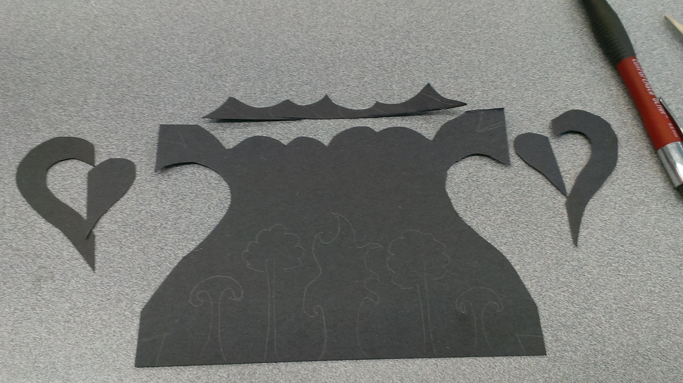
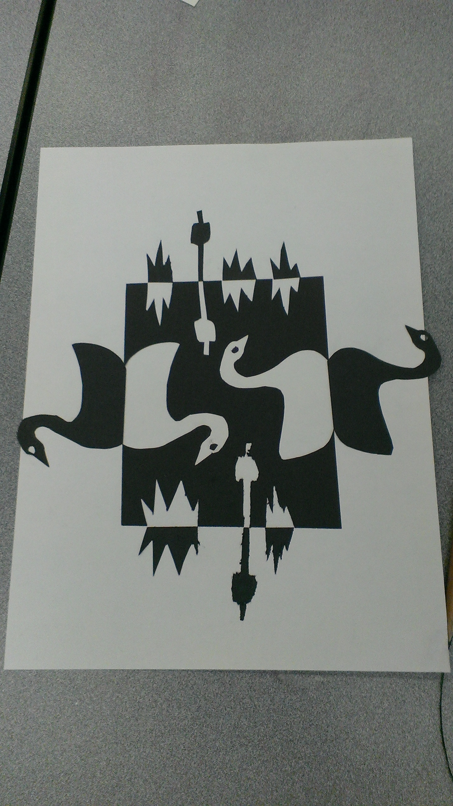
The process
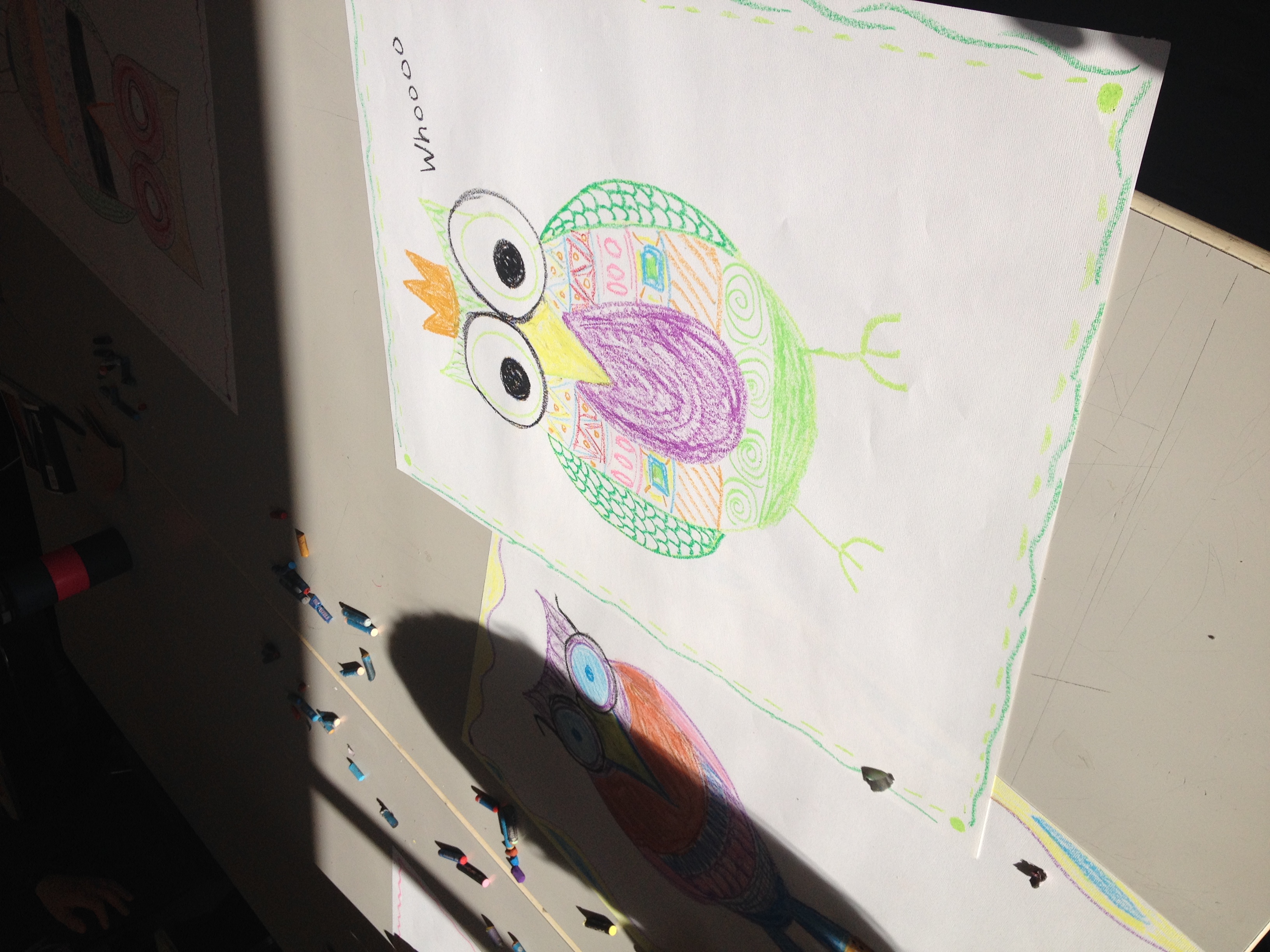
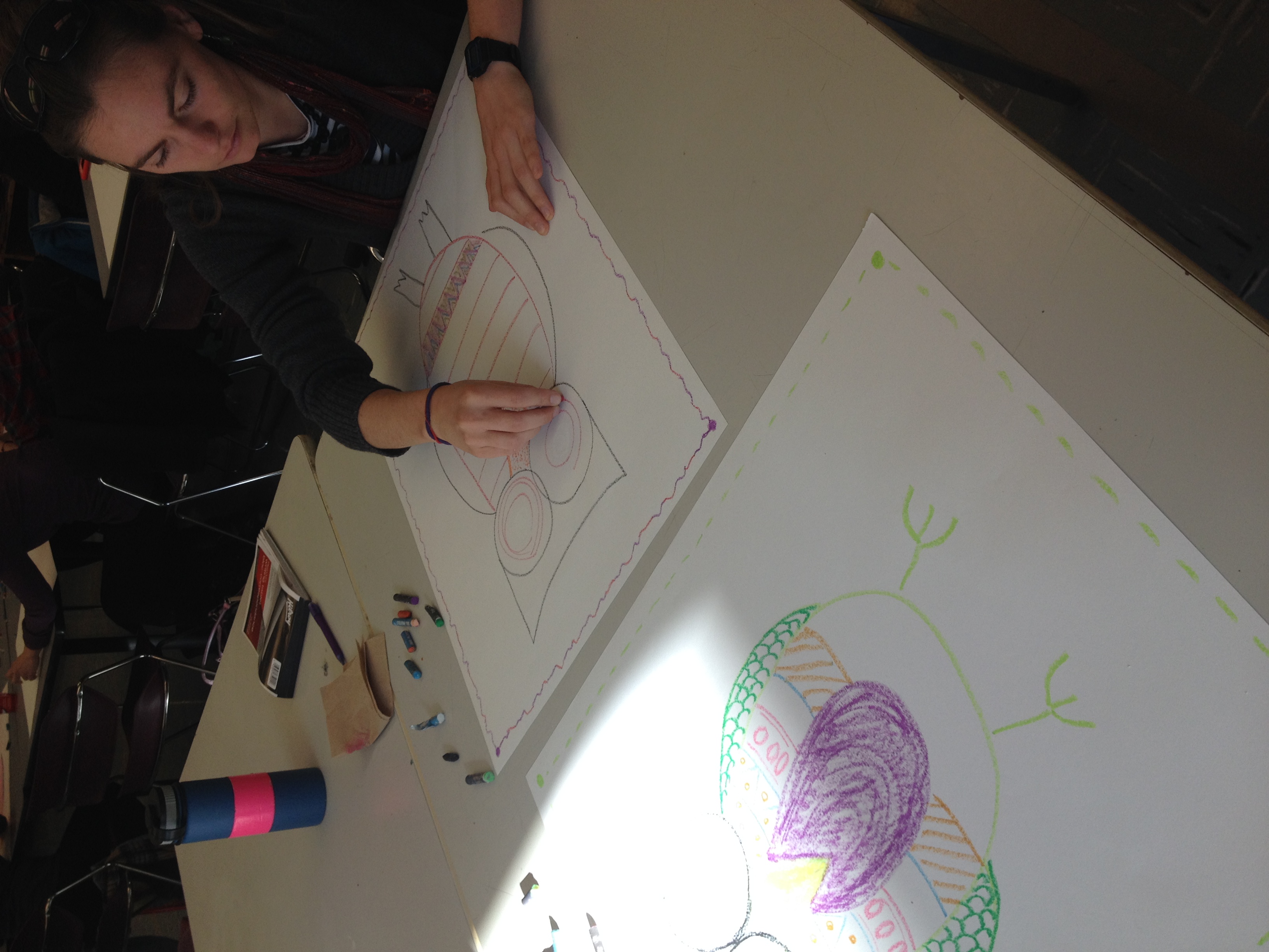
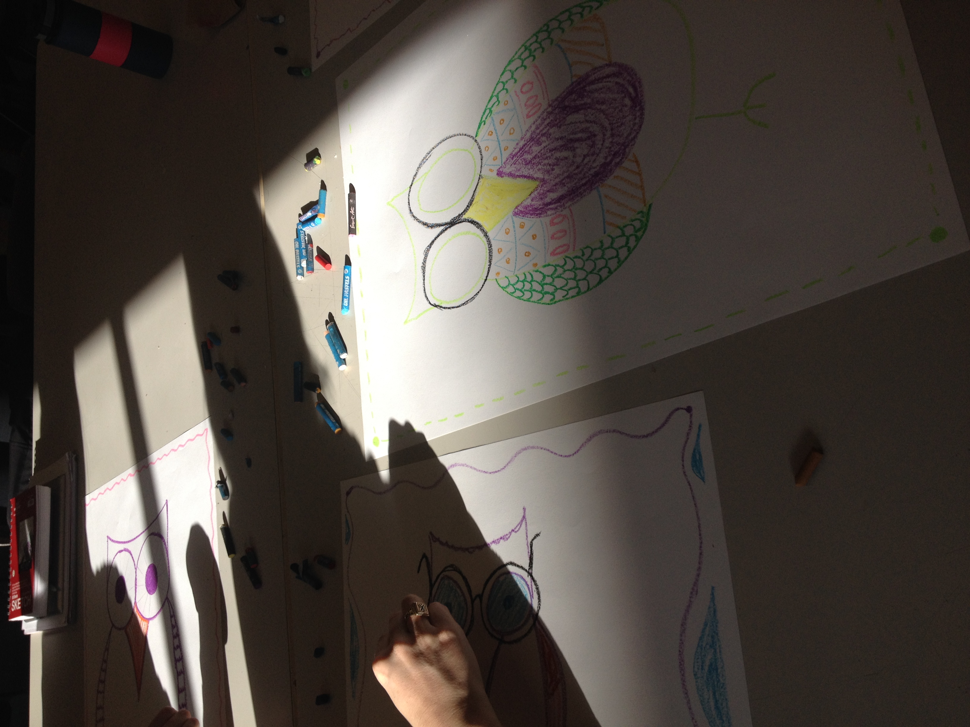
Some final results
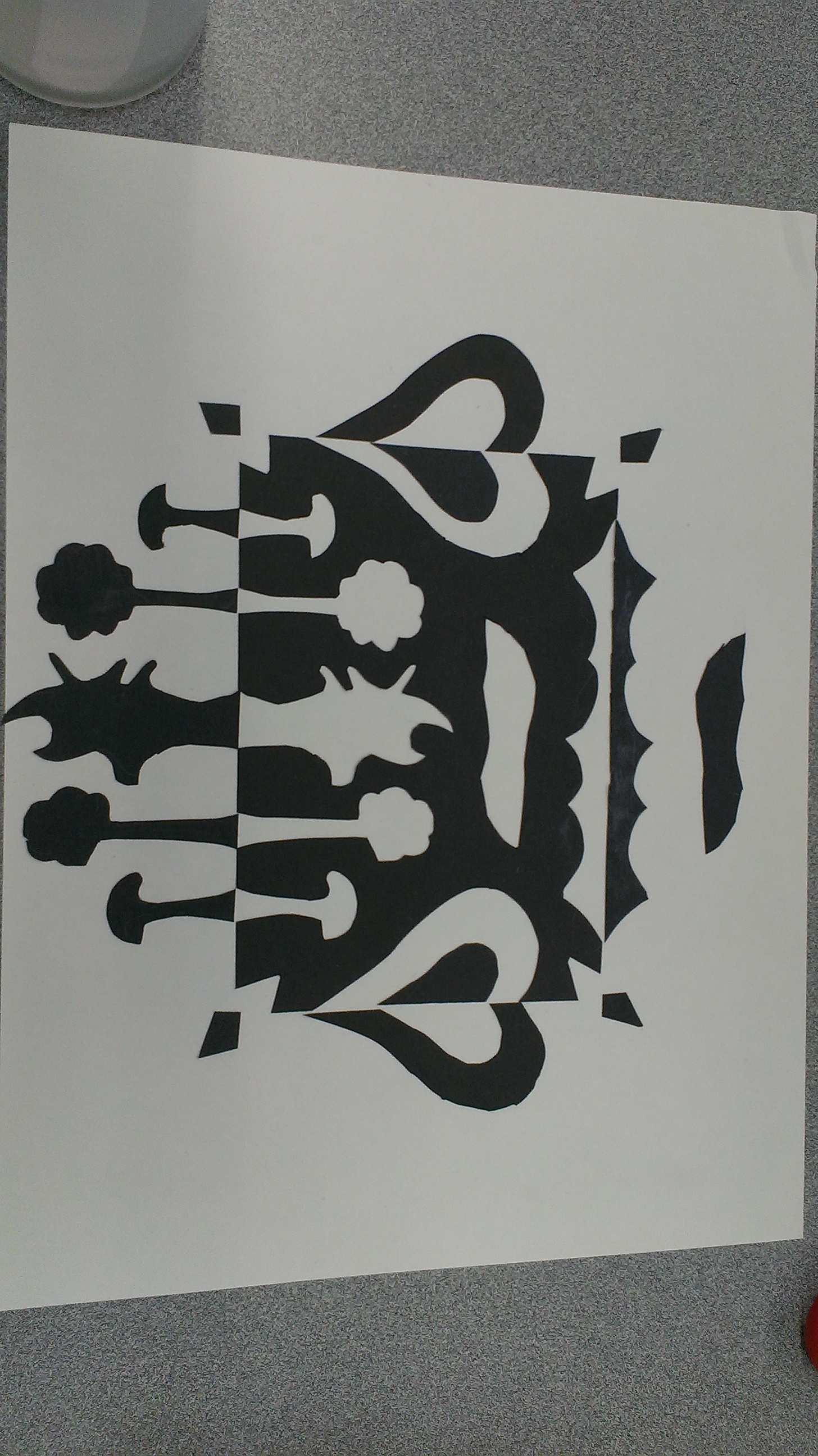
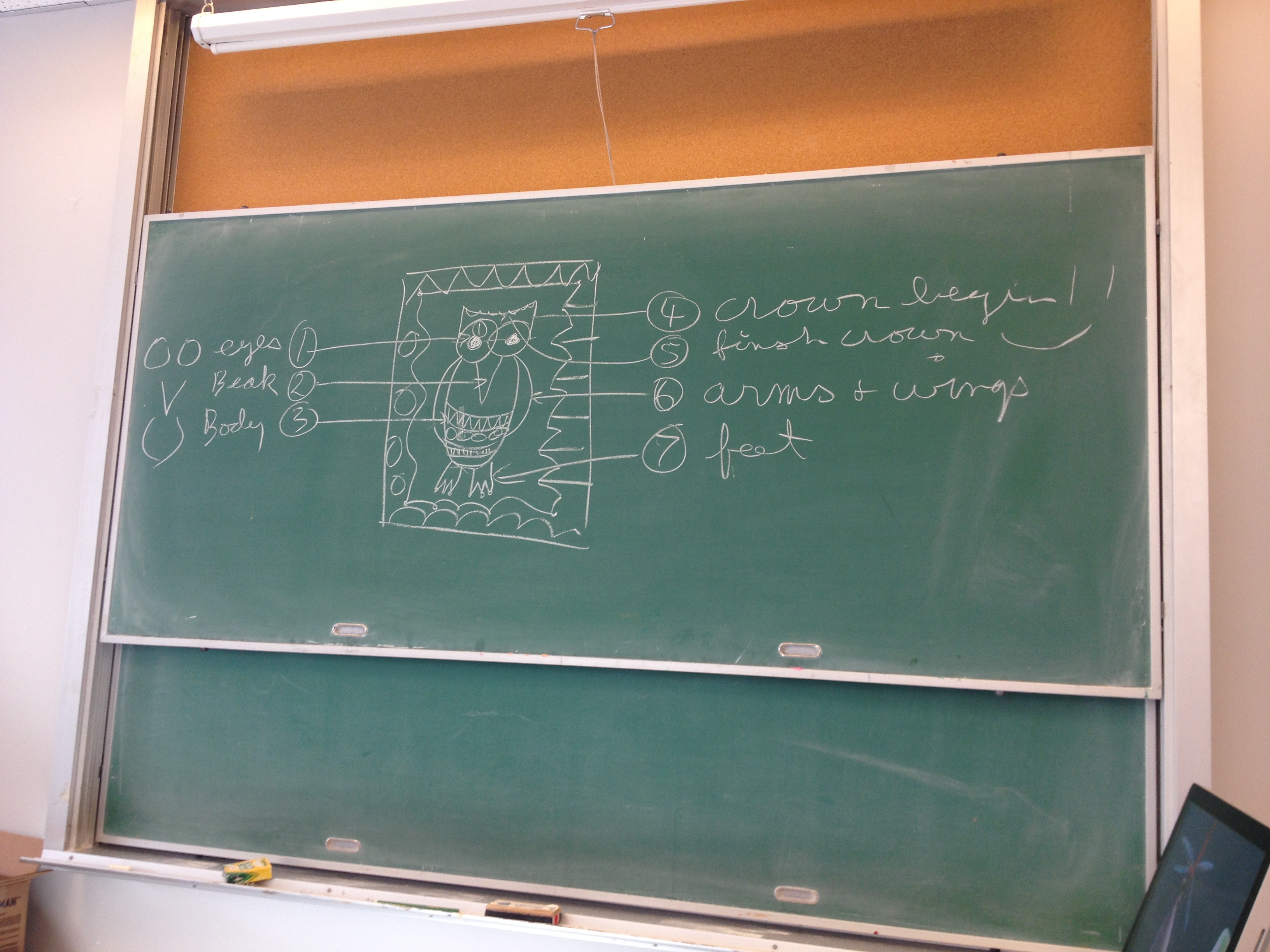
Often times students feel overwhelmed at having to draw something new, or drawing at all. Drawing by design has the teacher draw one step at a time so the students can follow along. In our art class we did a Draw by Design of an owl.
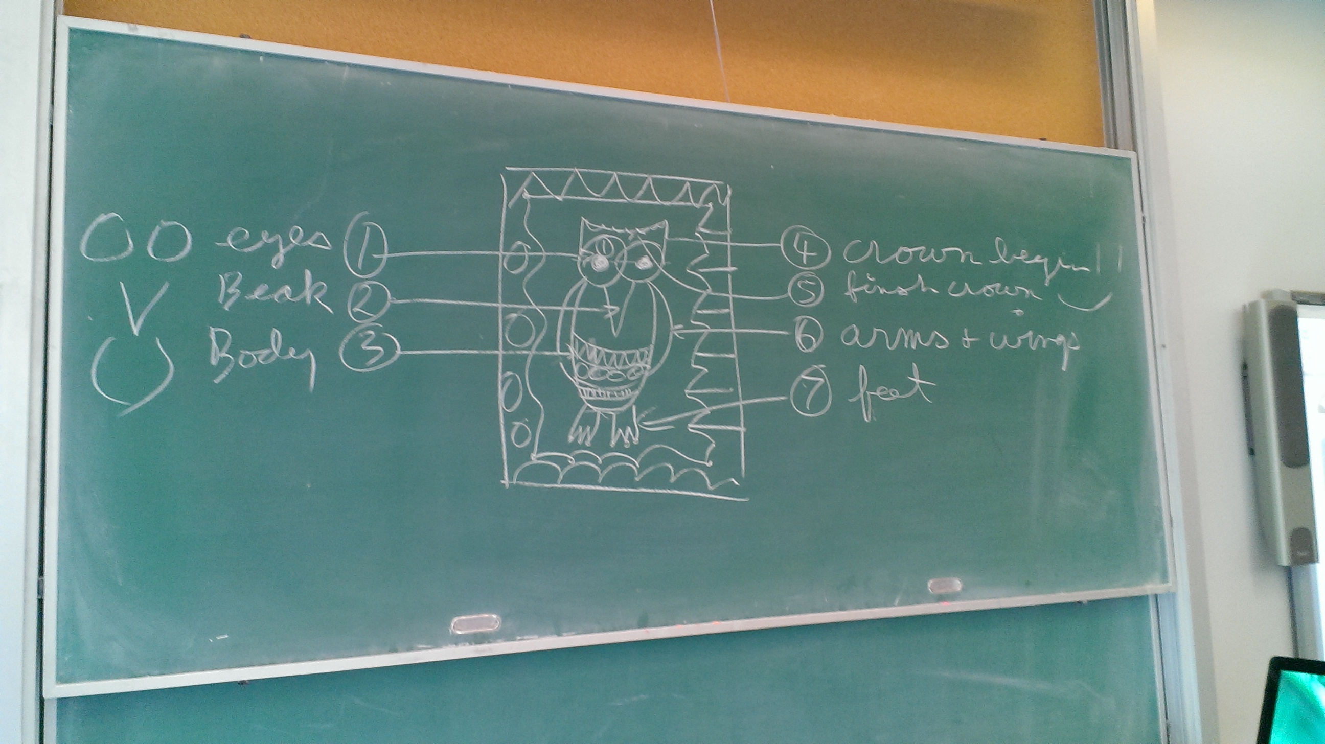
Once the shape (owl) has been created students have the freedom to add whatever designs or details they want. One suggestion we were given is to have a border. This comes in handy for students who finish early and need something else to do.

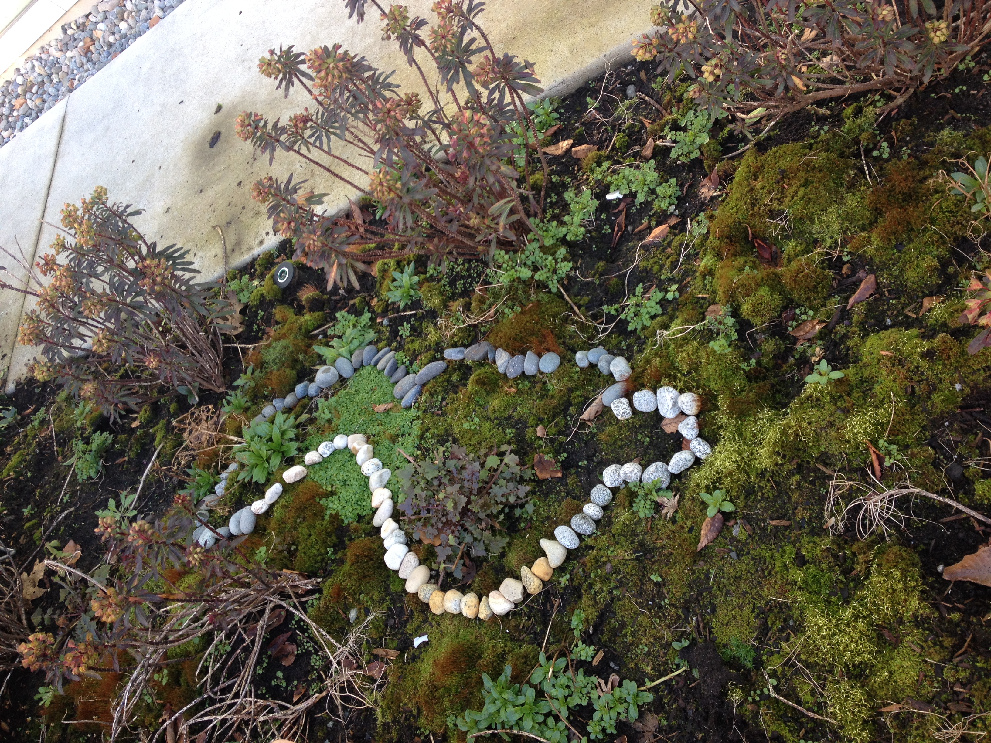
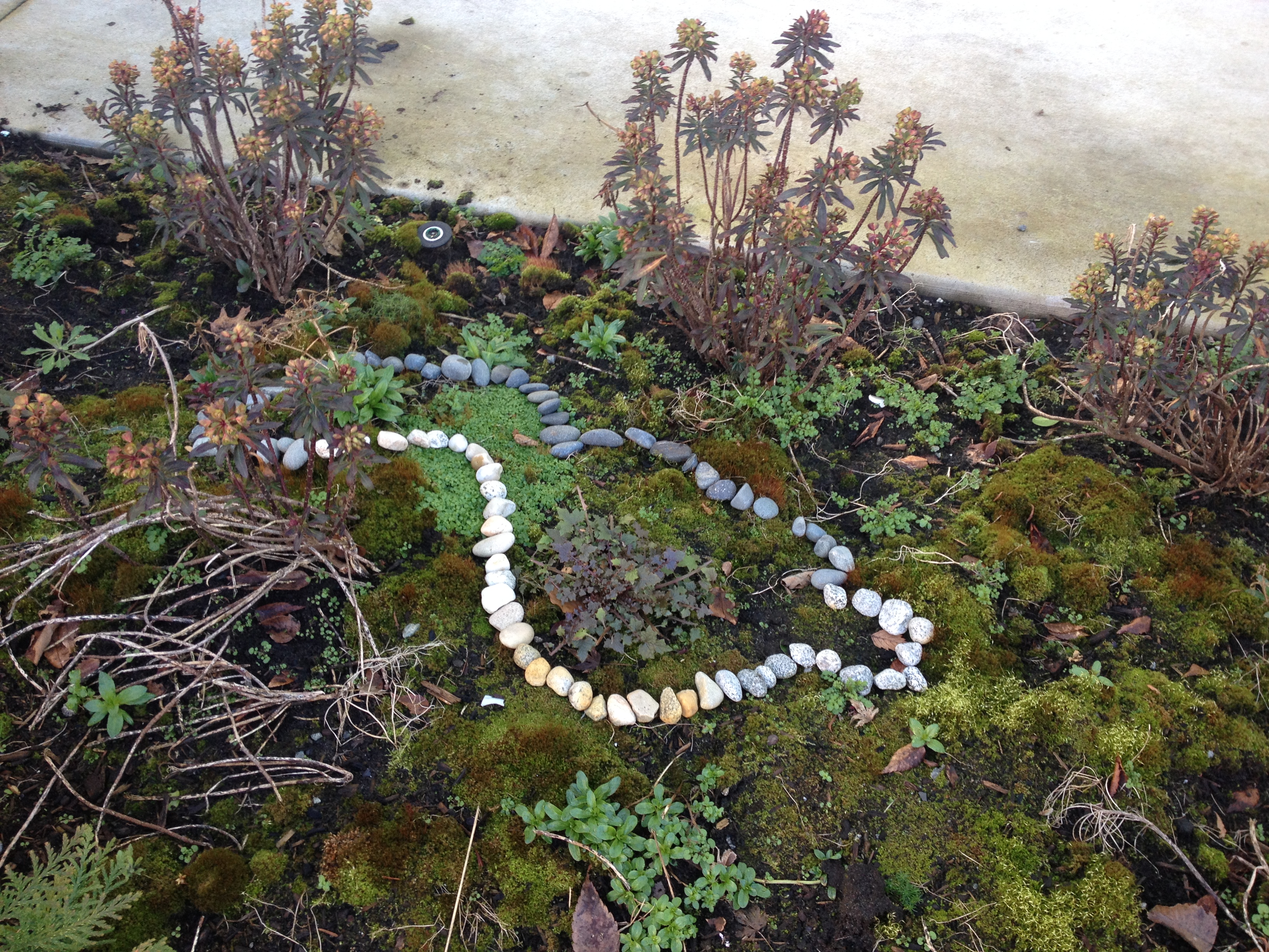
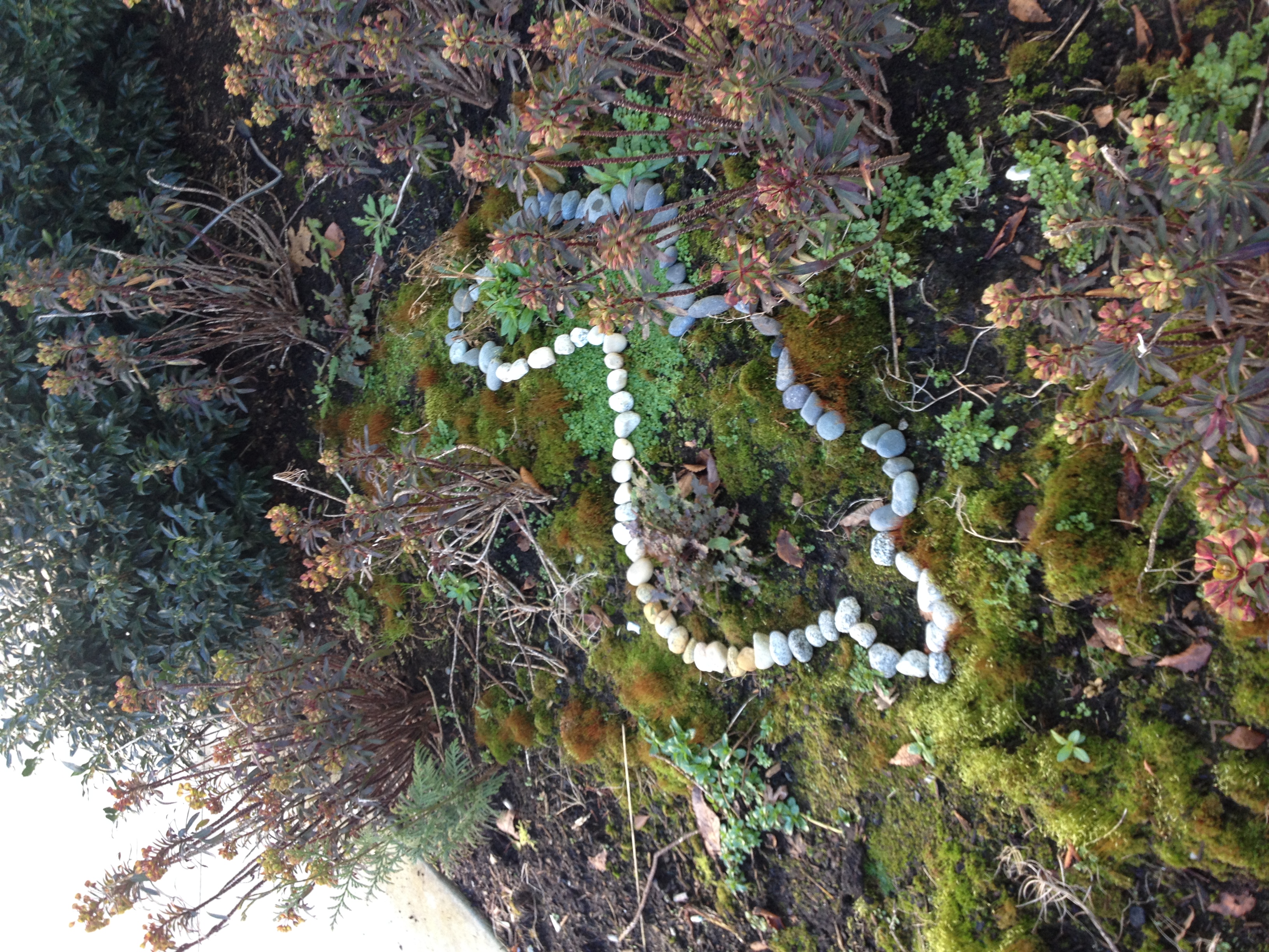
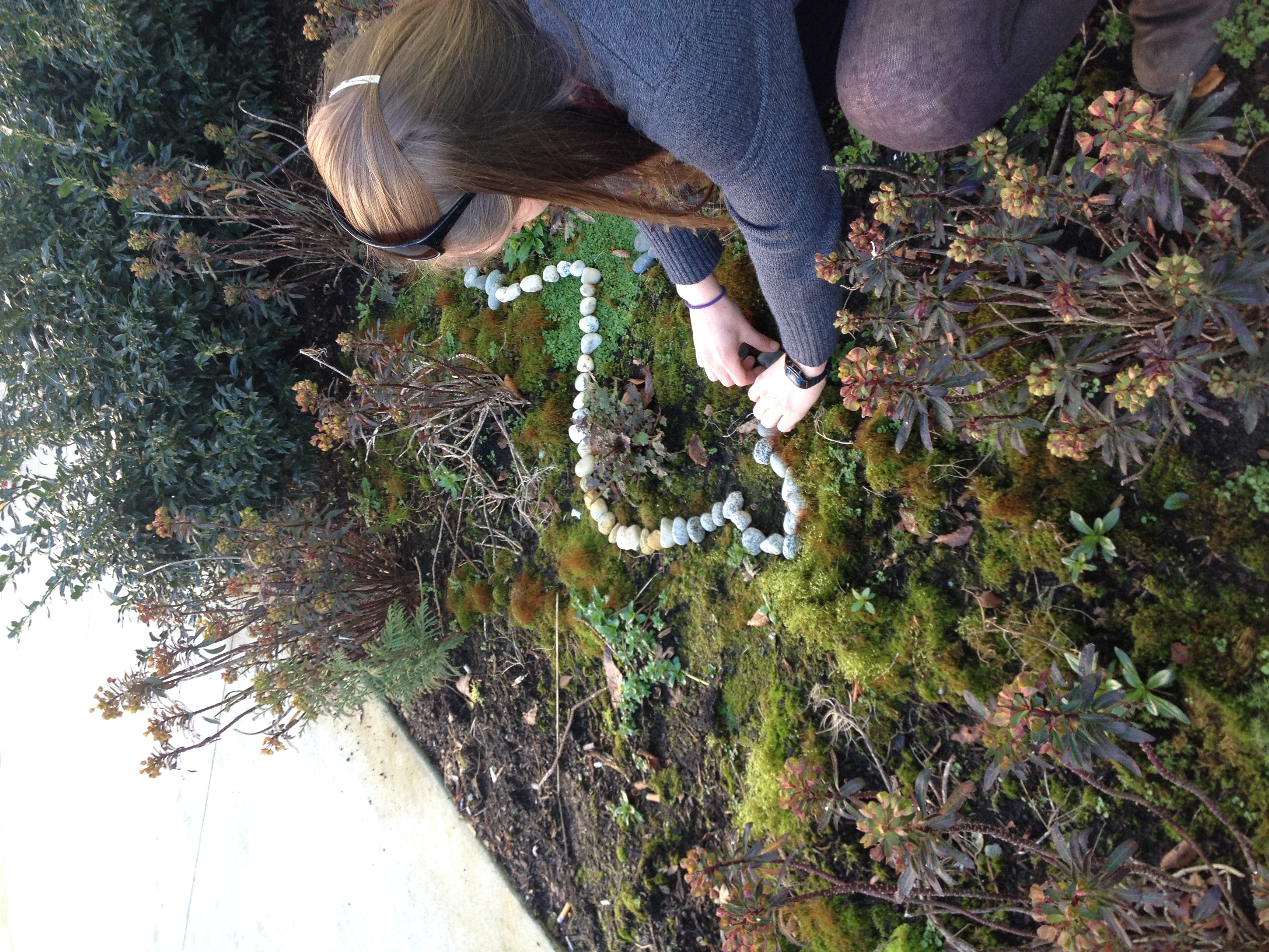
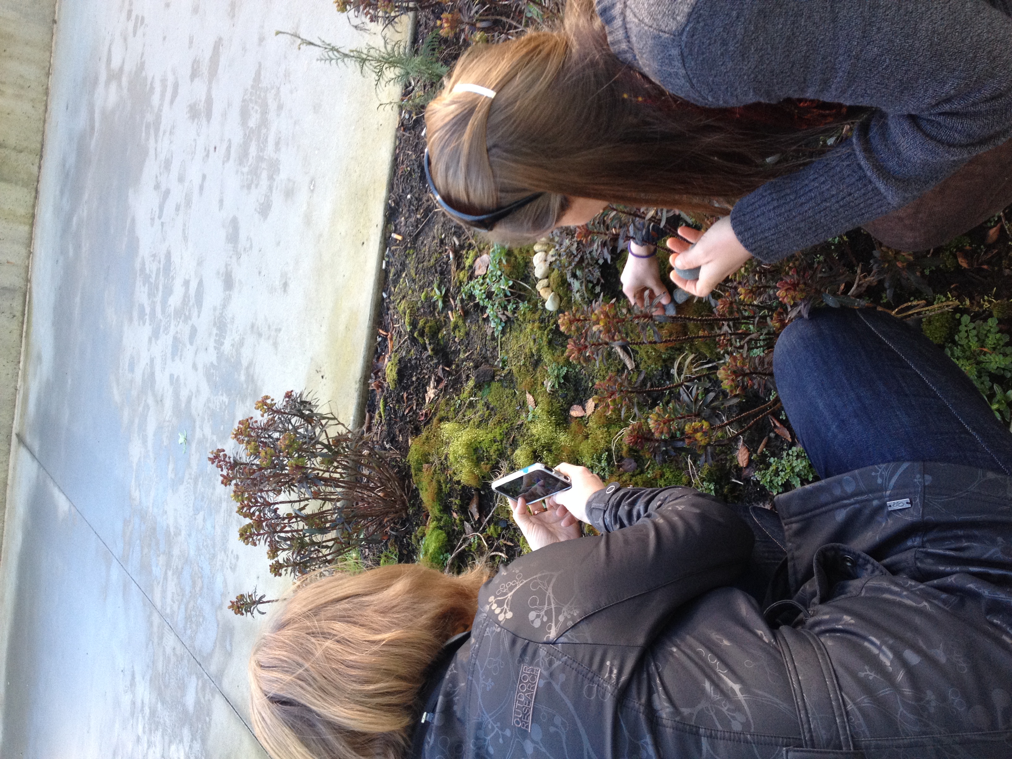
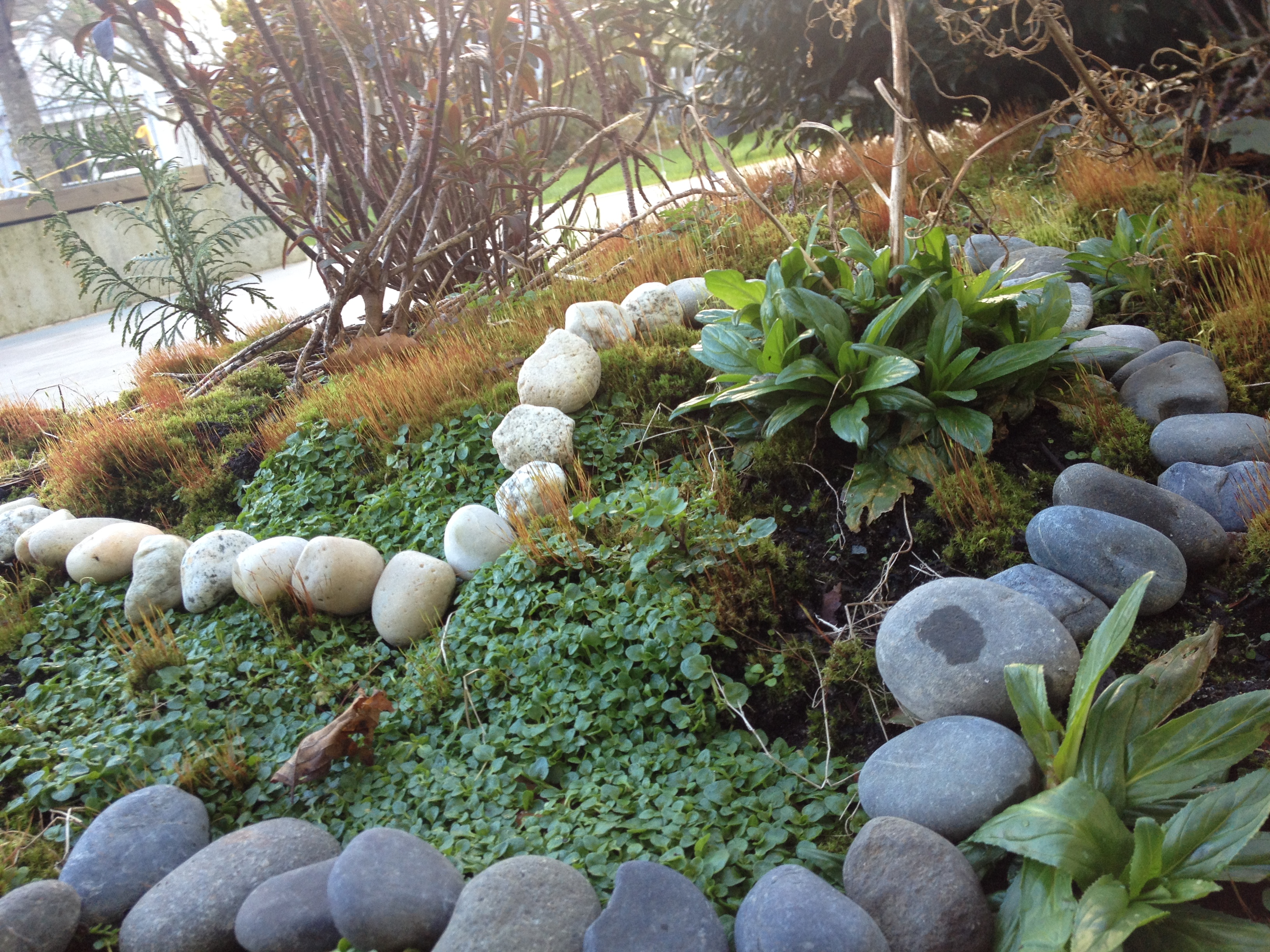
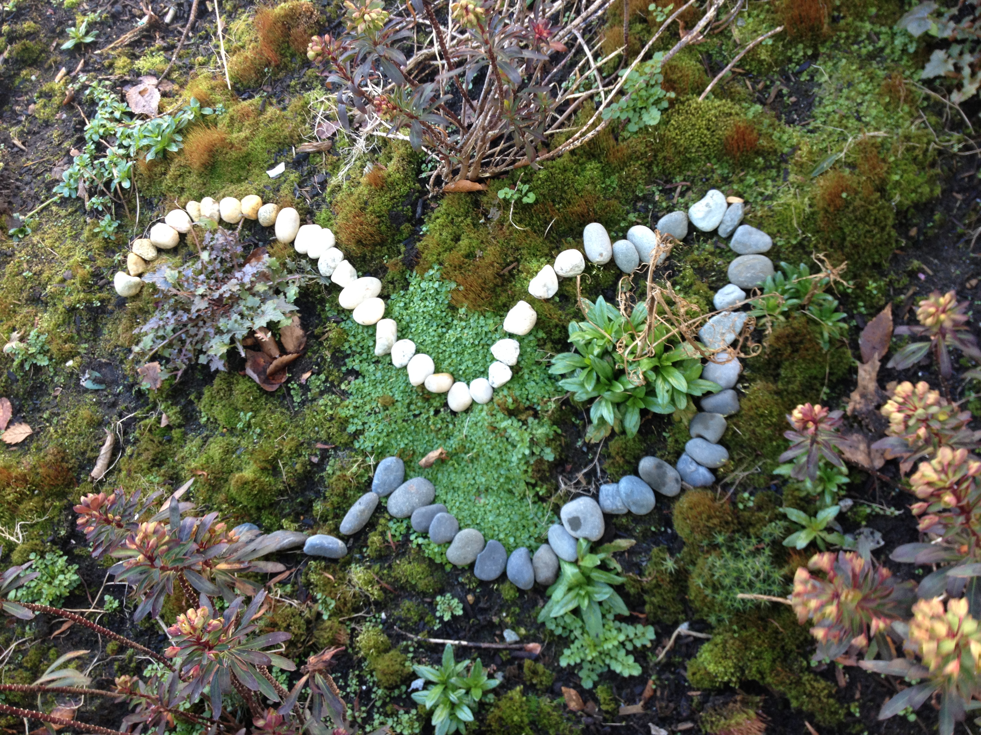
“Andy Goldsworthy is an extraordinary, innovative British artist whose collaborations with nature produce uniquely personal and intense artworks. Using a seemingly endless range of natural materials—snow, ice, leaves, bark, rock, clay, stones, feathers petals, twigs—he creates outdoor sculpture that manifests, however fleeting, a sympathetic contact with the natural world. Before they disappear, or as they disappear, Goldsworthy, records his work in superb colour photographs.”
-Taken from VisualMelt
http://visualmelt.com/Andy-Goldsworthy


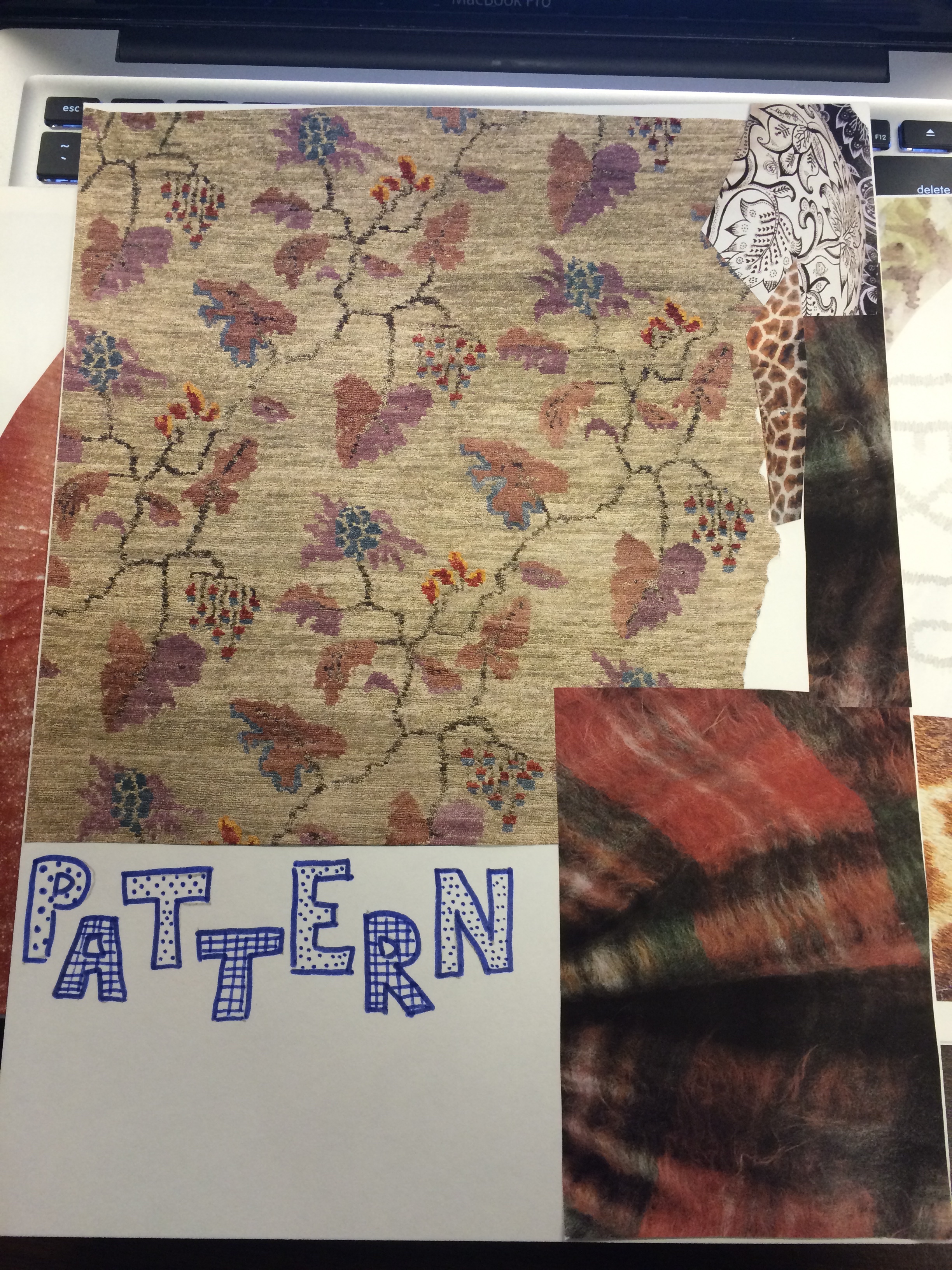 Pattern involves repetition of similar motifs on a surface, which creates rhythm. Pattern can be used to organize or unify an object and/or to create a visual enrichment. Pattern can be created in an organized way or be created in random fashion.
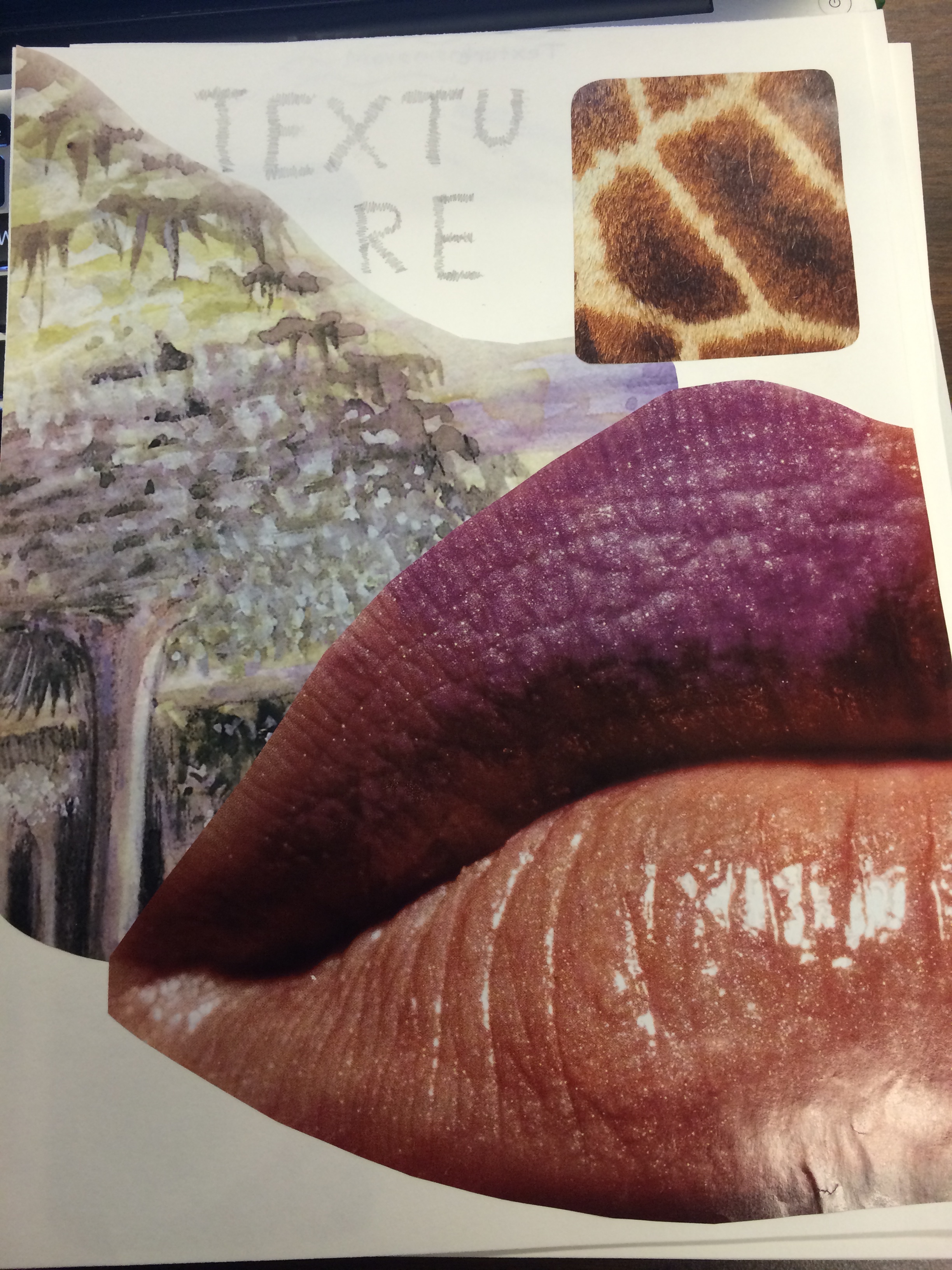 Texture refers to surface quality. Texture can be real or simulated. Actually texture can be both seen and touched. Simulated texture cannot be interpreted by touching; it must be seen. Some exampled of words to use to describe texture are shiny, smooth, rough, coarse, gritty and granular.
Print Making!
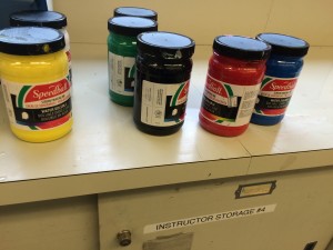
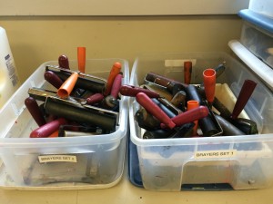
Print making uses ink. Unlike paint, this will stick to your clothes etc! Also, unlike paint, you only need a tiny amount. We use rollers to roll the ink onto our stencils. You know you have the right amount of ink on your roller when it makes a “kiss” sound, if there is no sound you have too much ink!
Stencils were made by drawing on paper, then tracing those drawings onto pre-cut squares of Styrofoam using a ball-point pen. The ben tip rolls nicely over the styrofoam surface, and doesn’t require much pressure to make indentations.
After the stencil is complete, ink is mixed to the desired colour on a board, and rolled onto the roller at the appropriate thickness. Then, ink is applied to the stencil using the roller.
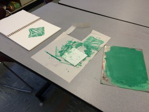
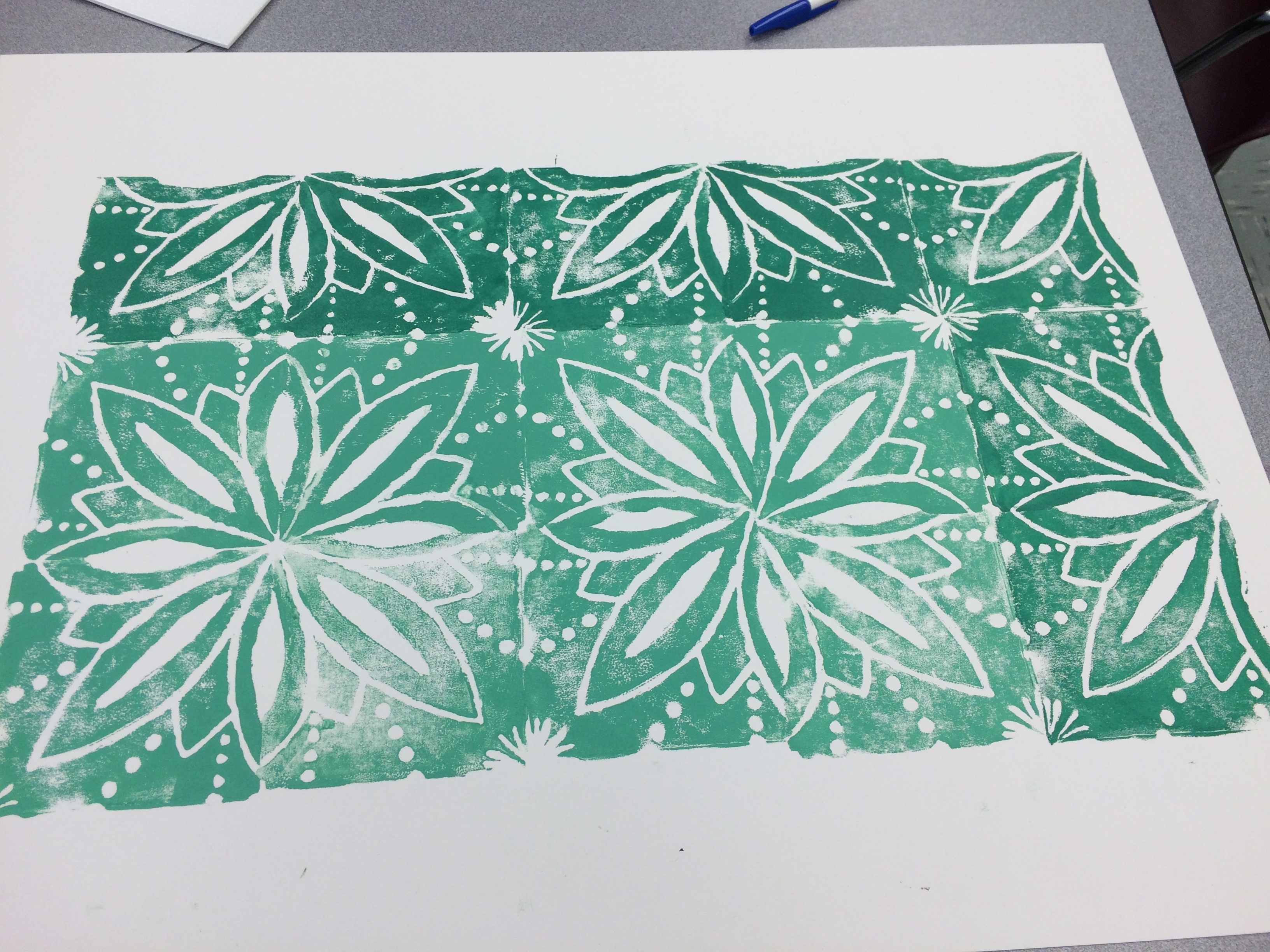
The stencil is “stamped” onto paper, and then re-stamped rotating the piece so that the inner corner touches its print. See our examples below.
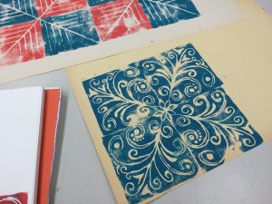

These are some of our finished products
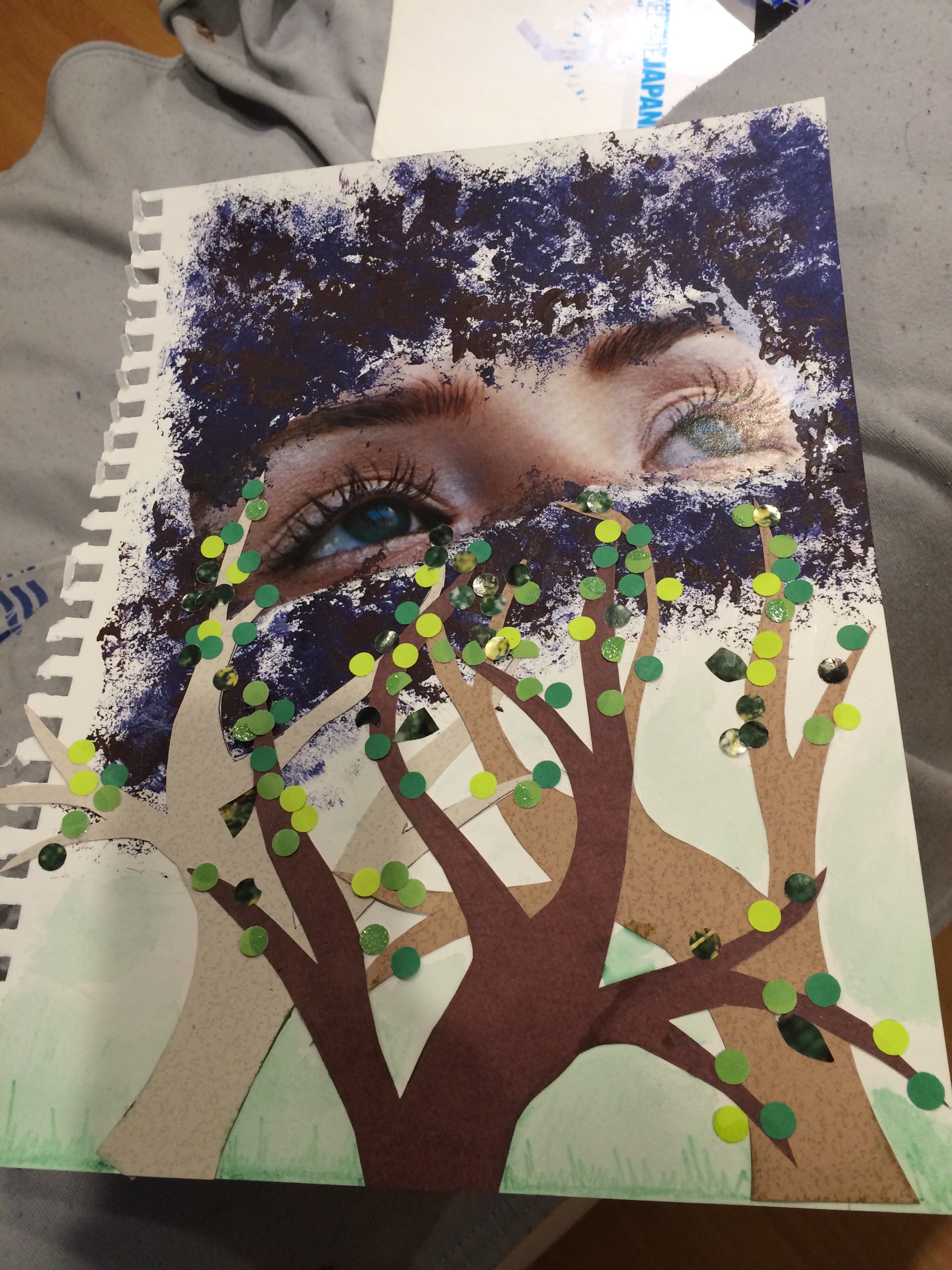
On our first day together we worked on our Visual Journals.
– We were first asked to rip up pages in our book
– Then work with pencil crayons and markers
– Then we were asked to re attach the paper we ripped out
– Throughout the class the teacher periodically introduced us to new material to use on our visual journals. These materials included pastels, hole punchers, stickers, glue, and yarn.
Our group found this activity refreshing as it was a change from the art we were used to. We were not given directions on what to do for our visual journals. We were free to do what ever we wanted and how ever we wanted. This was a change from art we were used to growing up which was always a set project with a criteria.
Some of us struggled with it in the beginning as we didn’t know what to create. We were so used to being told what to make in art. This activity helped us appreciate and value the freedom to create art without direction.
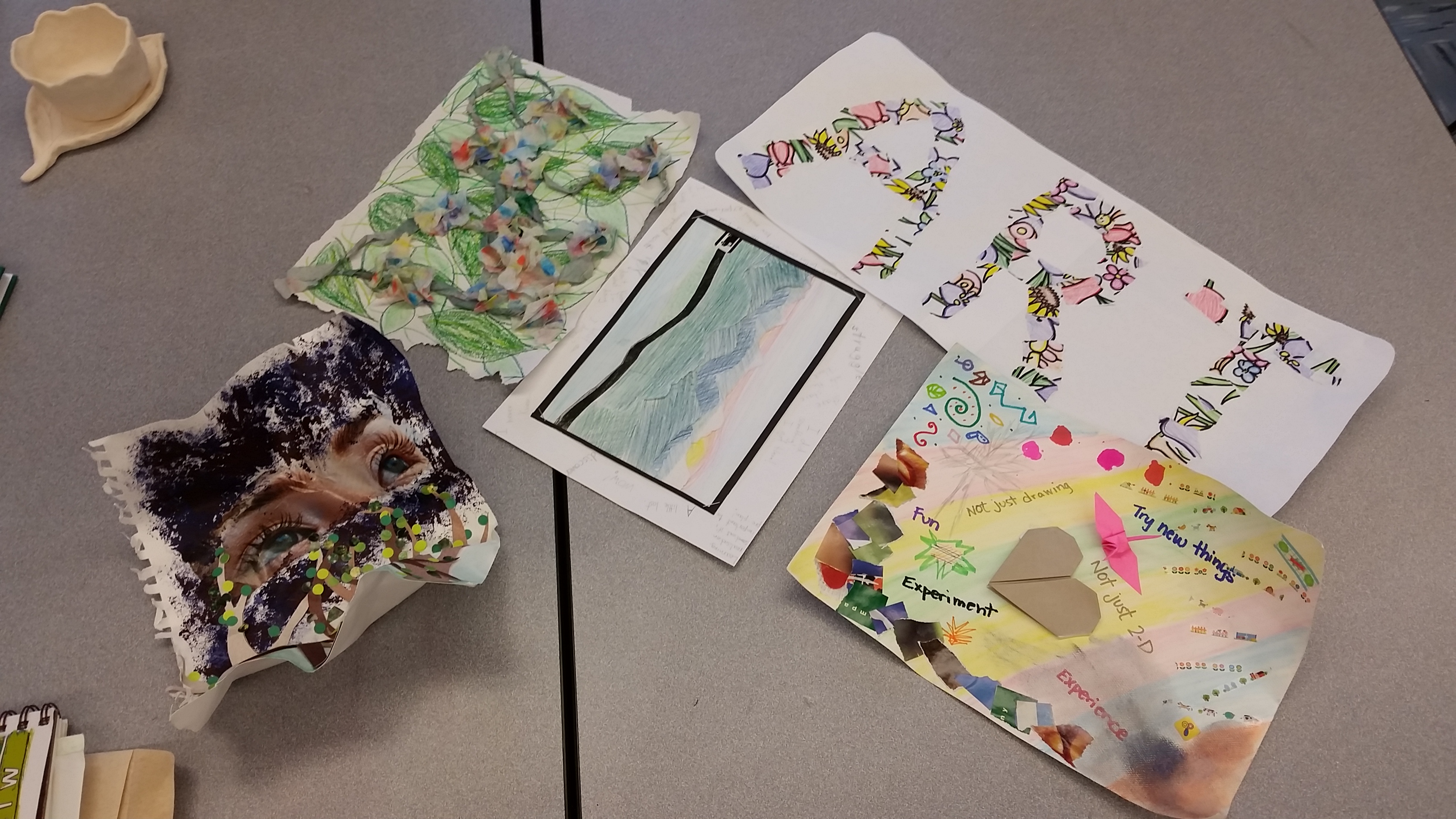
Visual Journal Reflections

We were asked to create a reflection of our visual journals with minimal wording. We were asked to do a visual reflection of our visual journal. It was interesting how different all our reflections turned out.
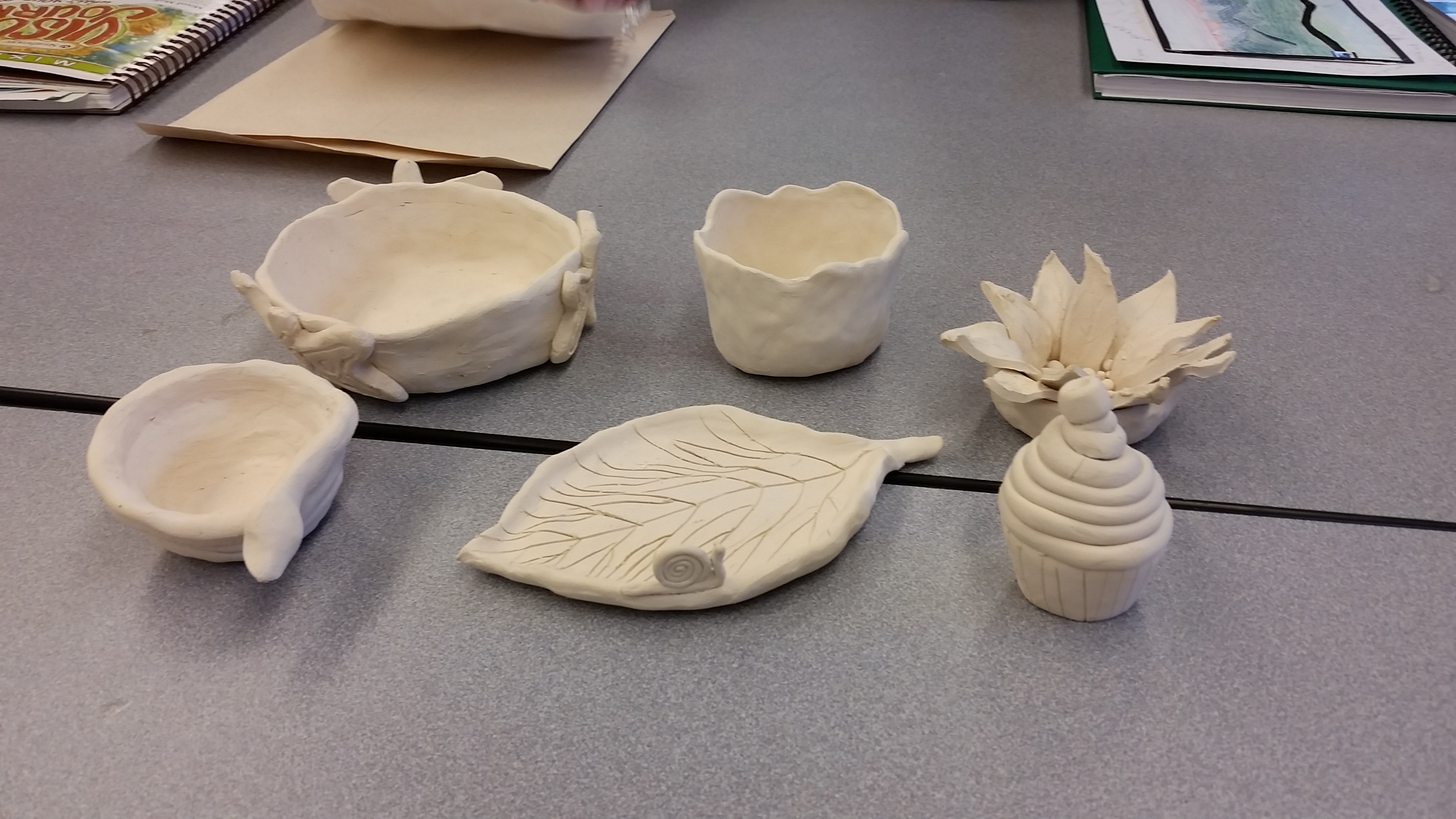
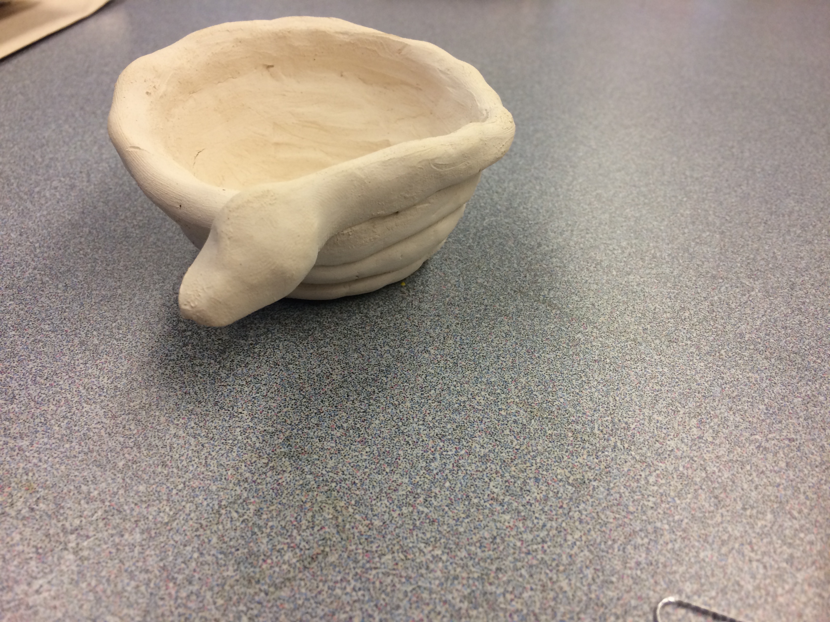
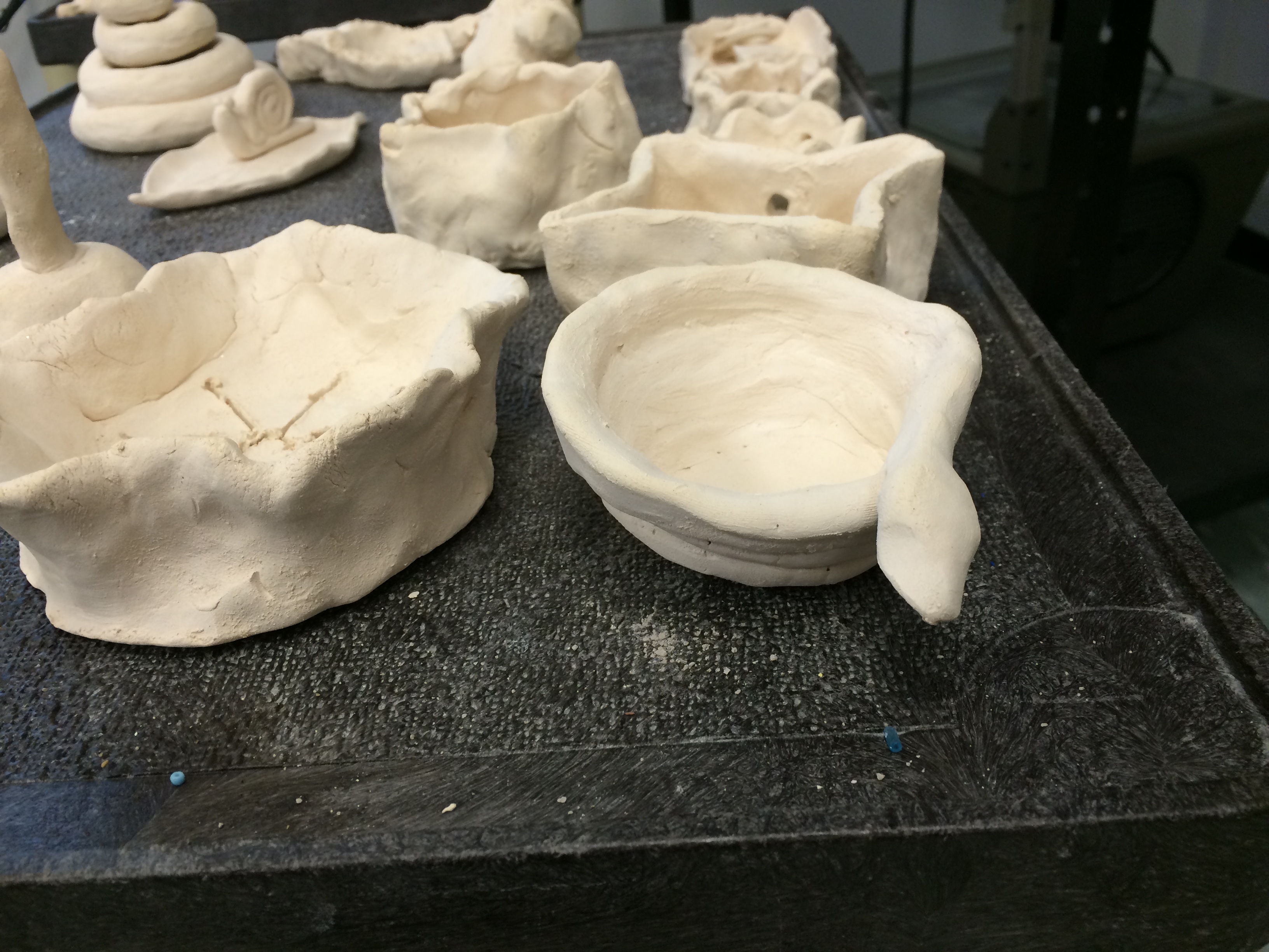
On the same day as Slinkachu we also got to work with clay! We were each given a piece of clay and asked to play with it and create anything we liked.
-We were taught how to cut and handle clay.
– Then we were shown how to mould and create pieces with clay.
-We were also shown how to slip and score the clay to join pieces together.
Majority of the group enjoyed working with clay and created wonderful pieces as seen above.
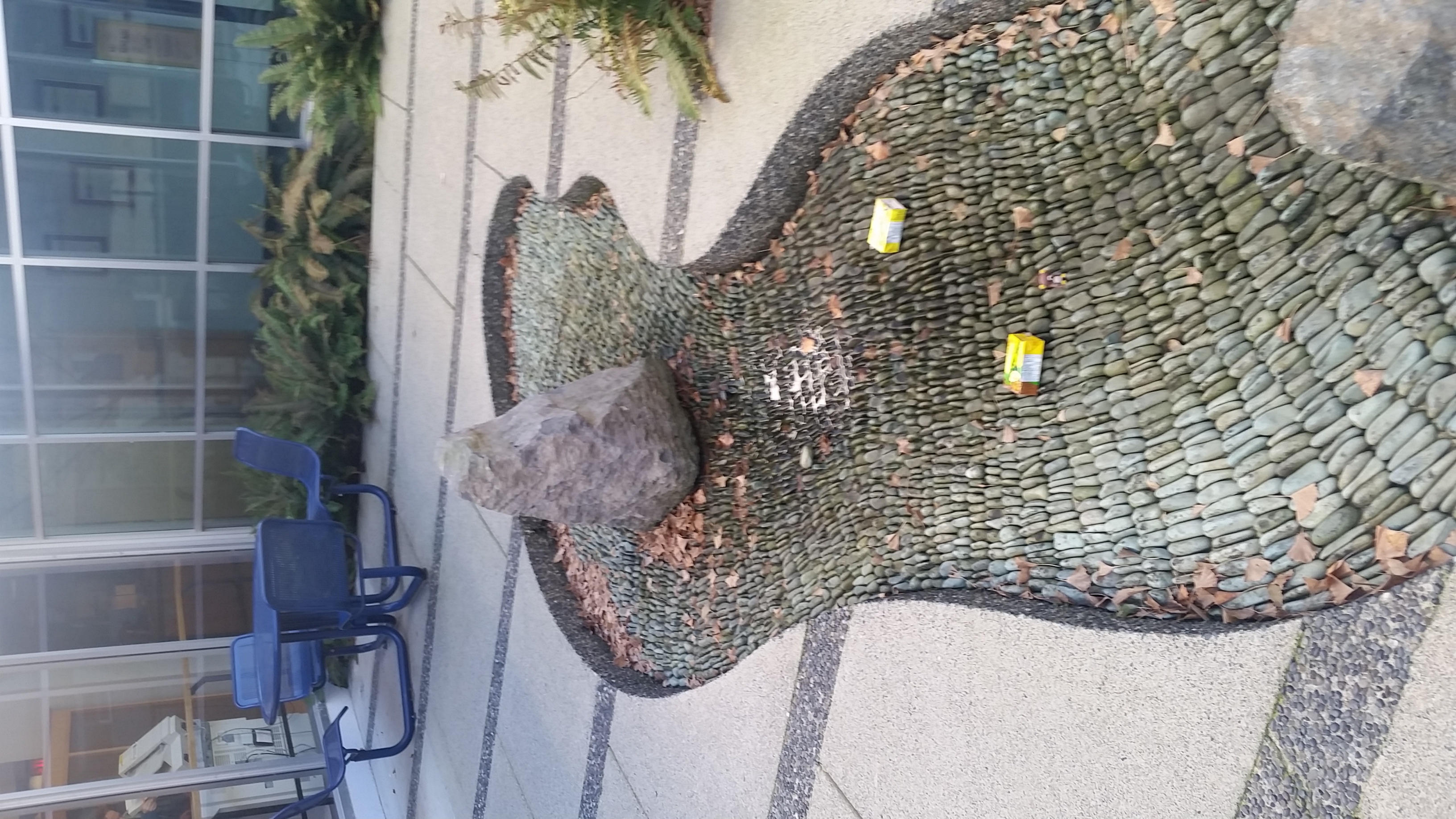
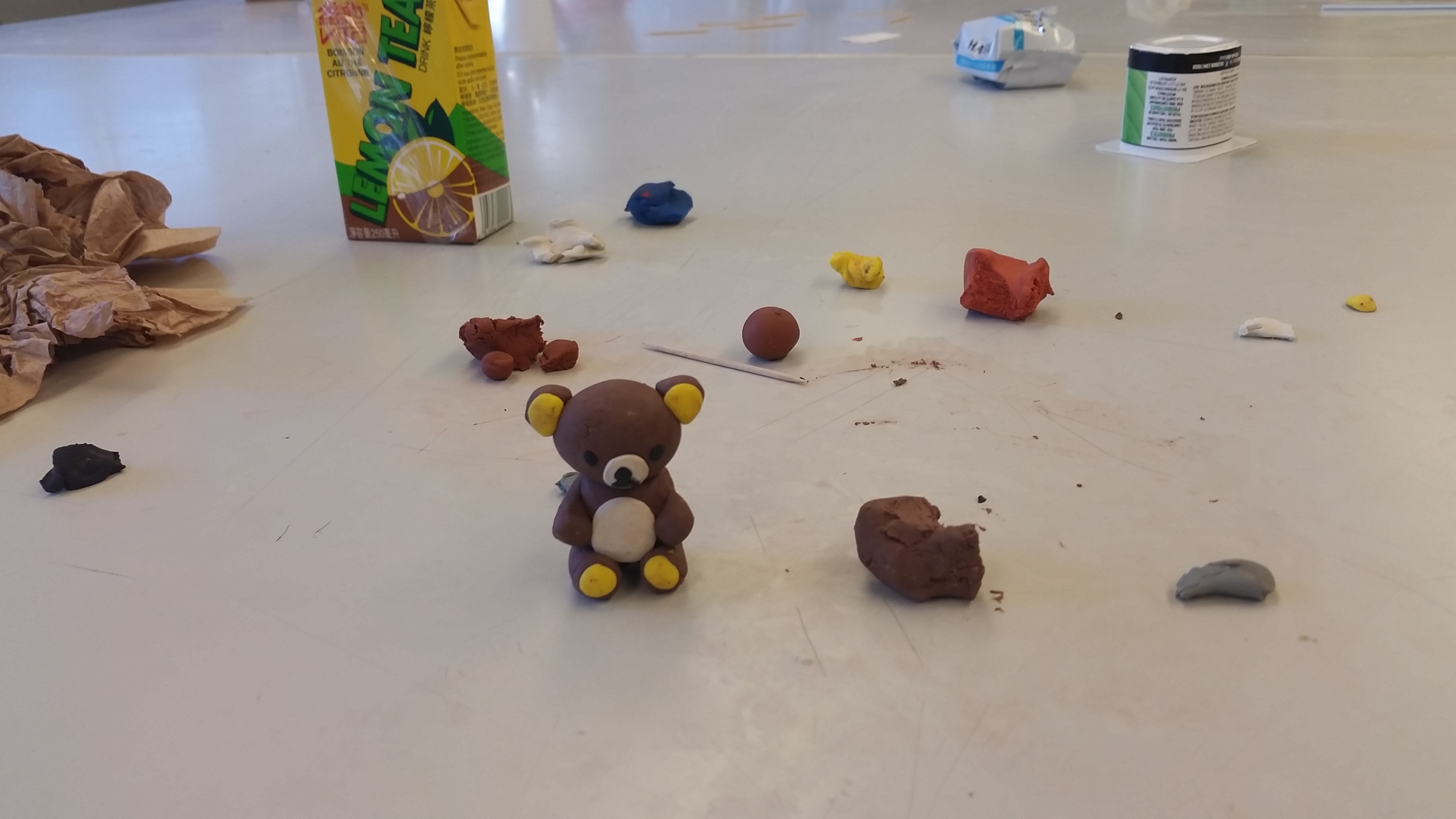
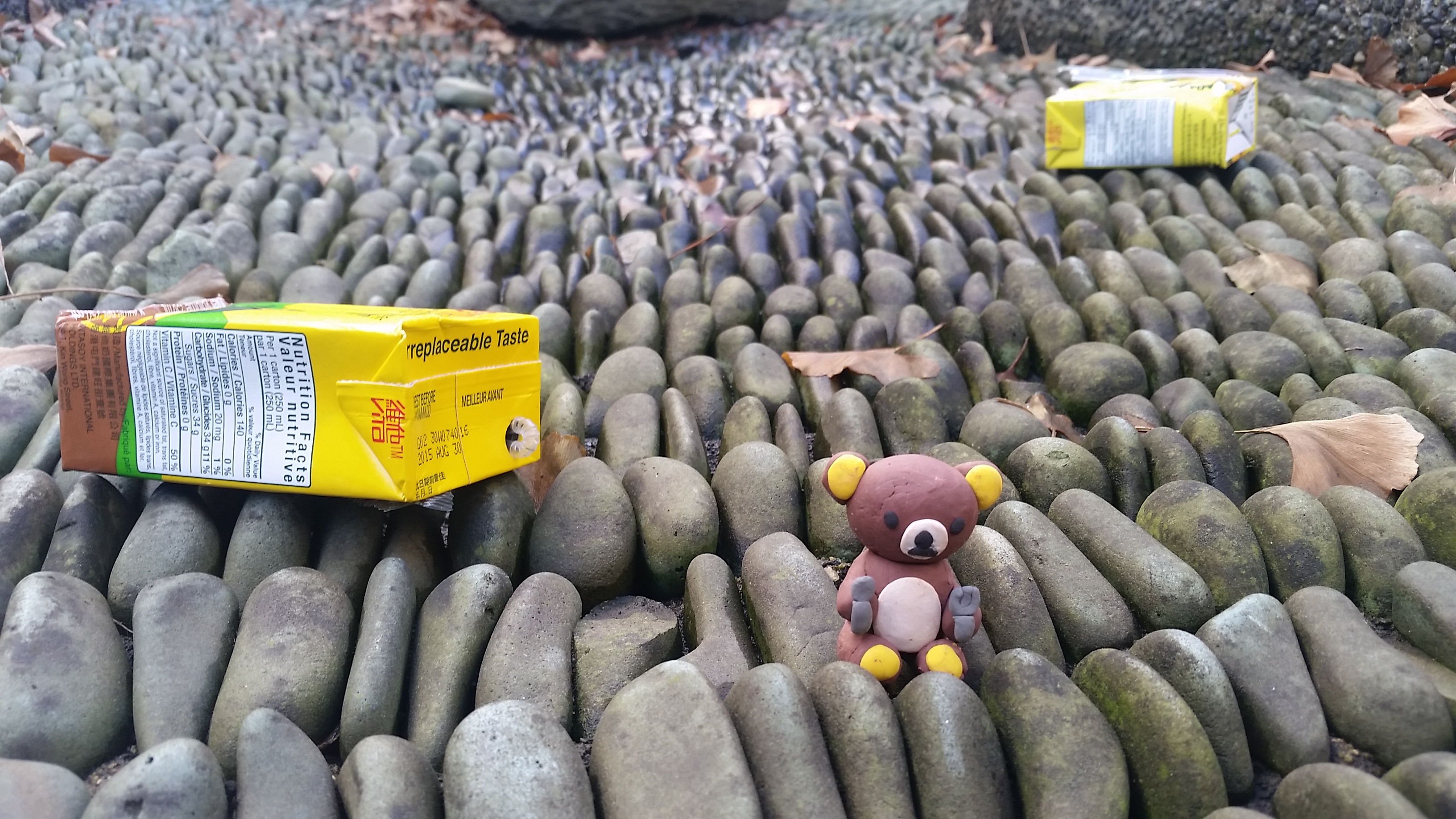
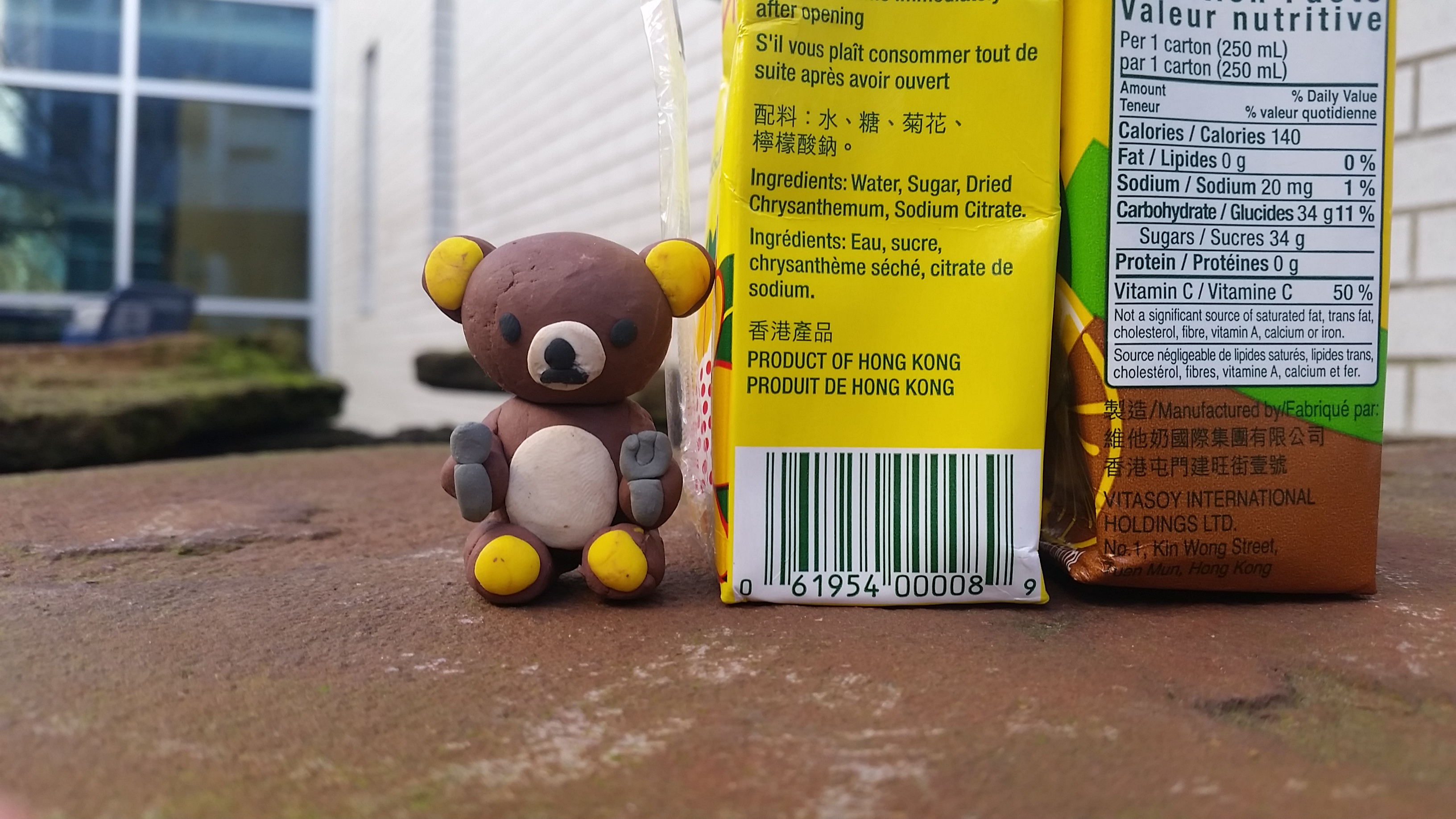

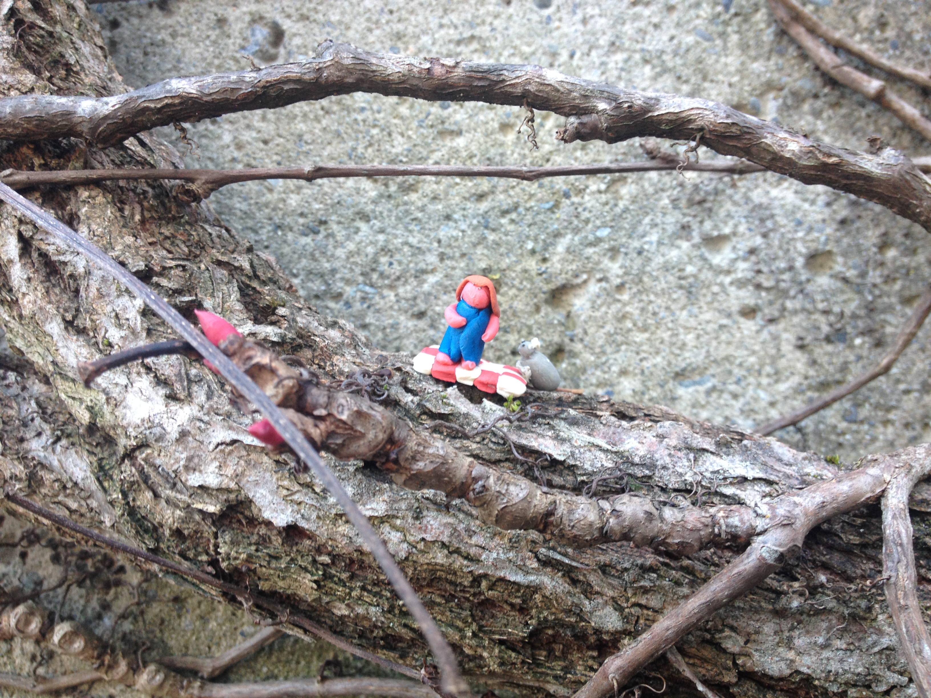
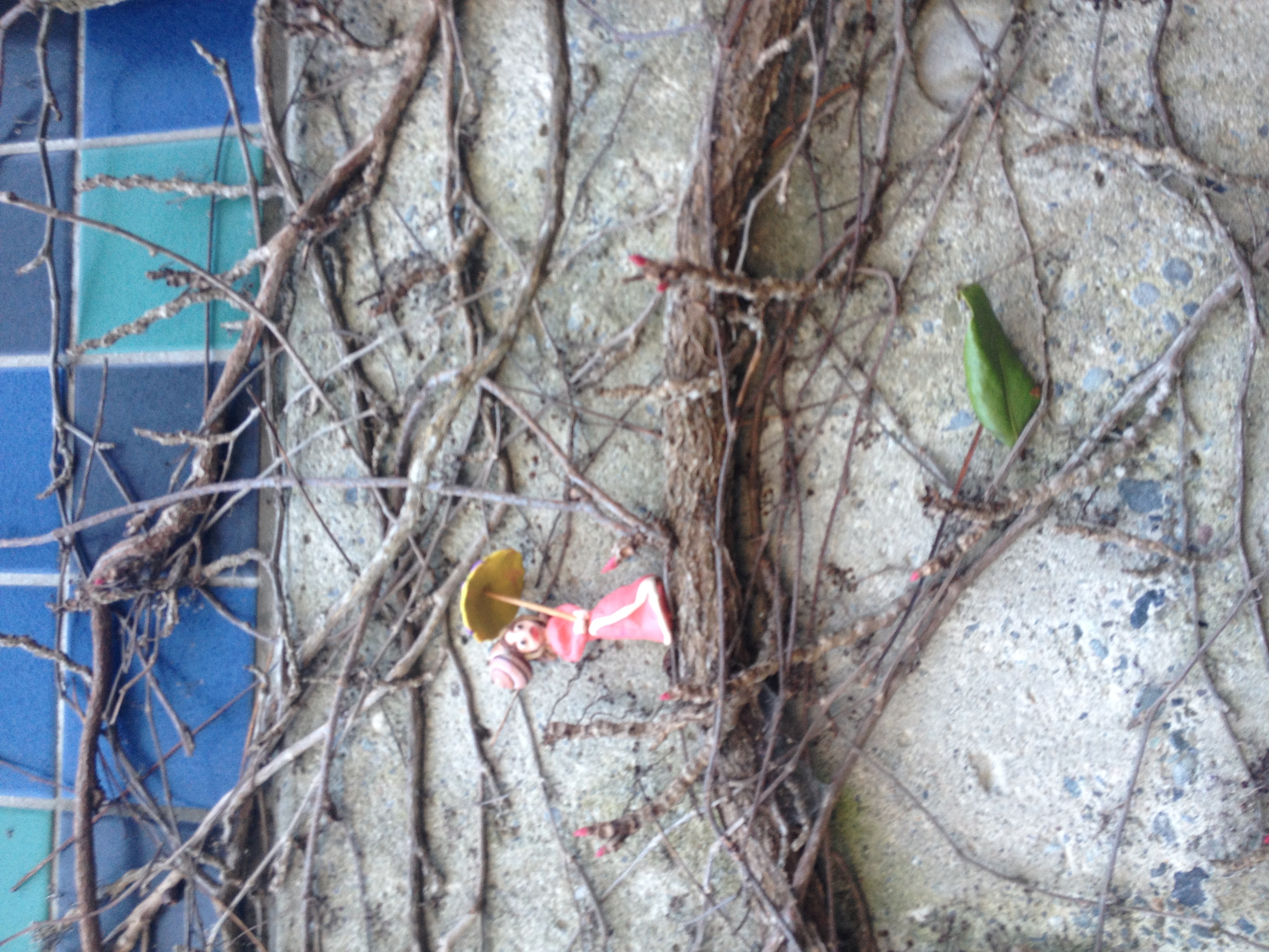
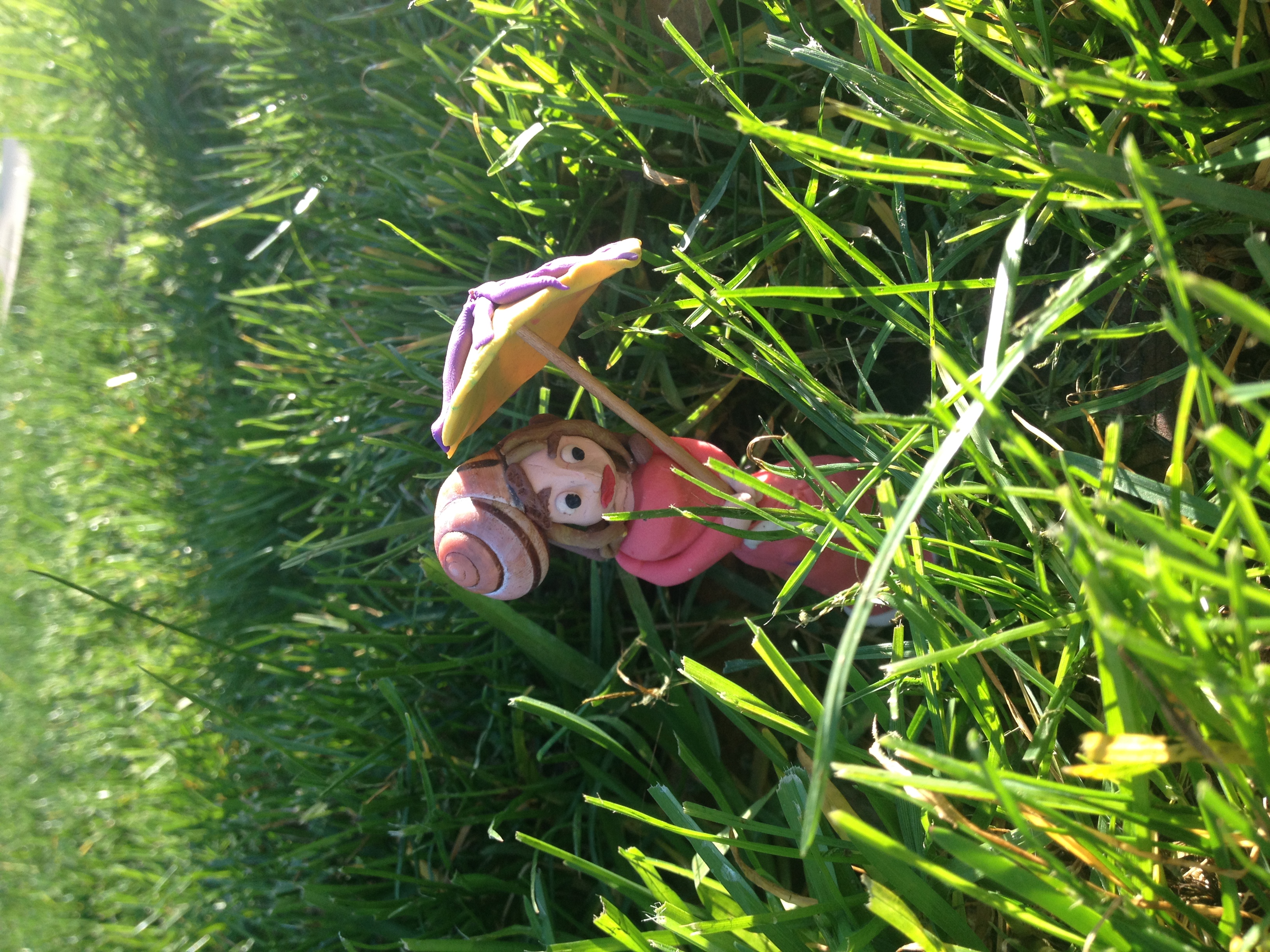
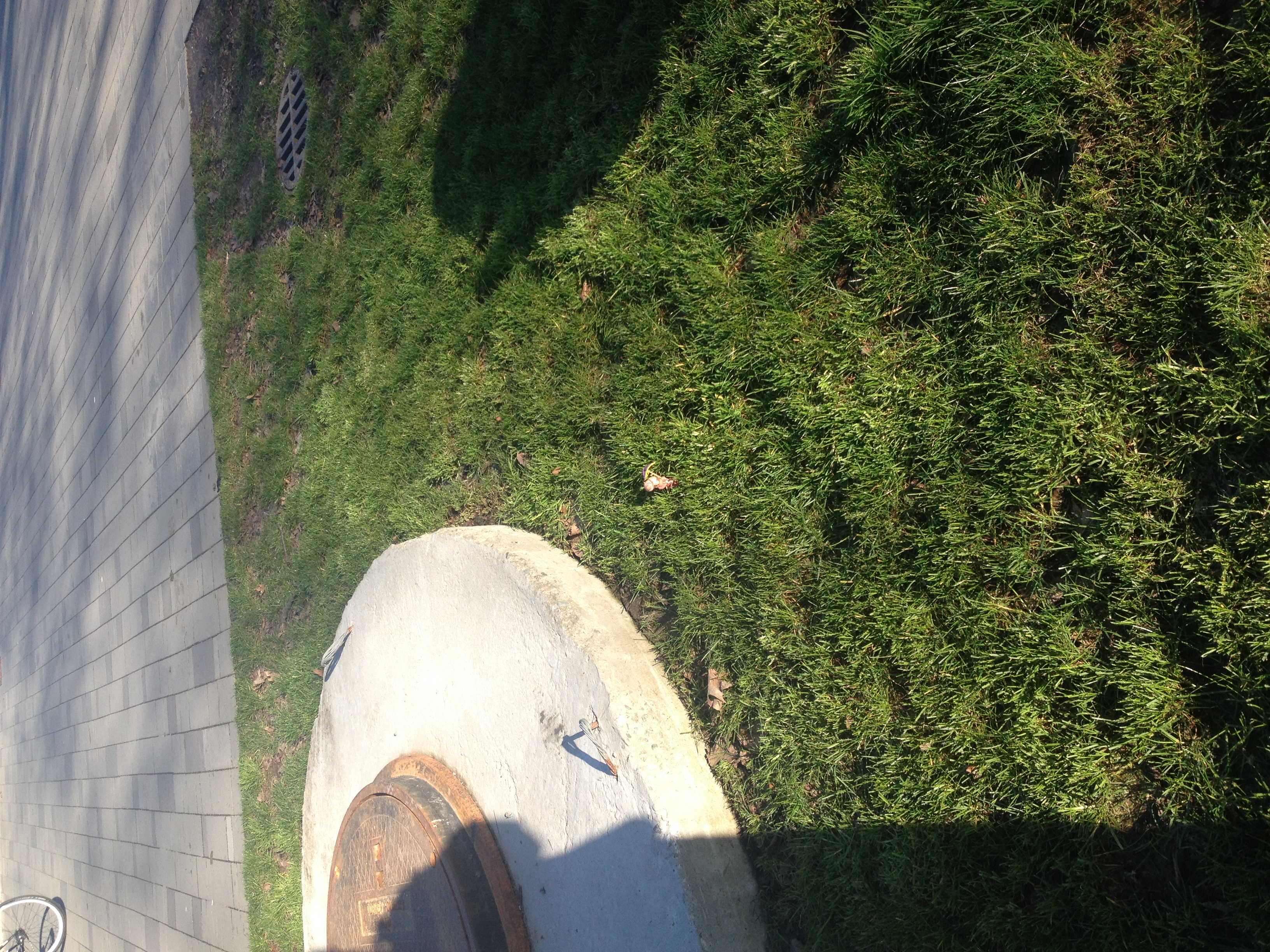
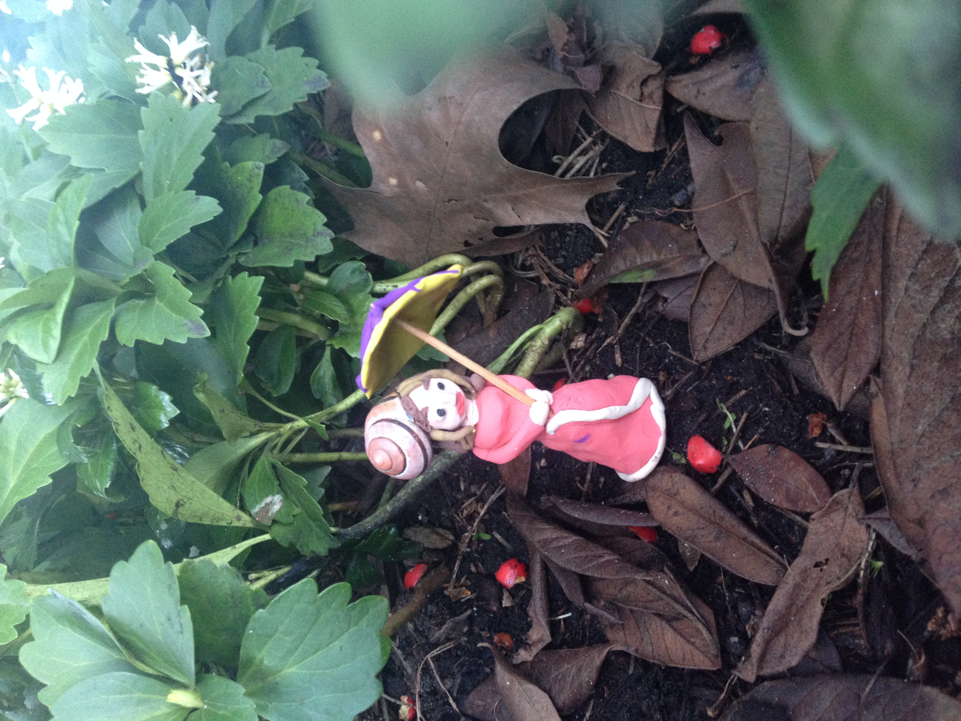
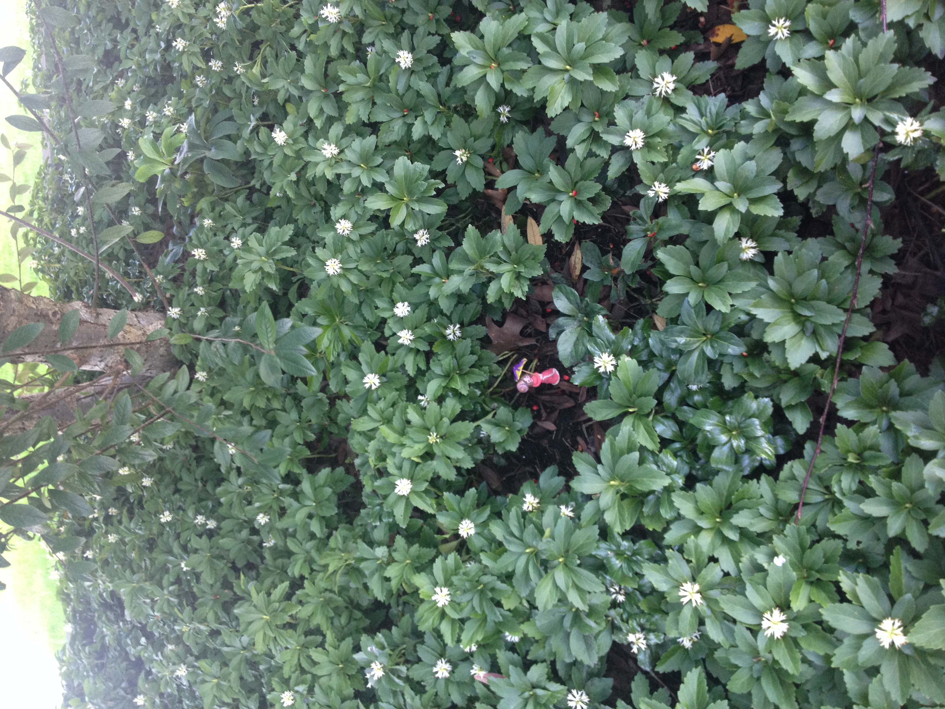
Slinkachu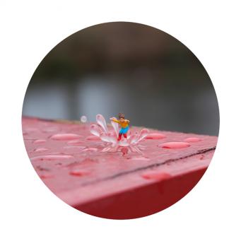
In class we looked into a UK artist who’s work features miniature figures fending for themselves in the bustling city, where they are then photographed and left to the abandon of their urban environment.
“These figures embody the estrangement spurred by the over-whelming nature of the modern metropolis, and incite a renewed perspective of the everyday urban experience to those who find them. This sense of isolation and melancholy, however, is accompanied by sense of irony and humour that makes Slinkachu’s commentary all the more poignant.”
-Photos and Biography taken from Andipa Gallery
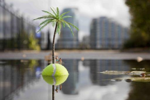
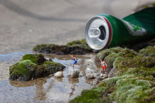
http://www.andipa.com/artist/slinkachu
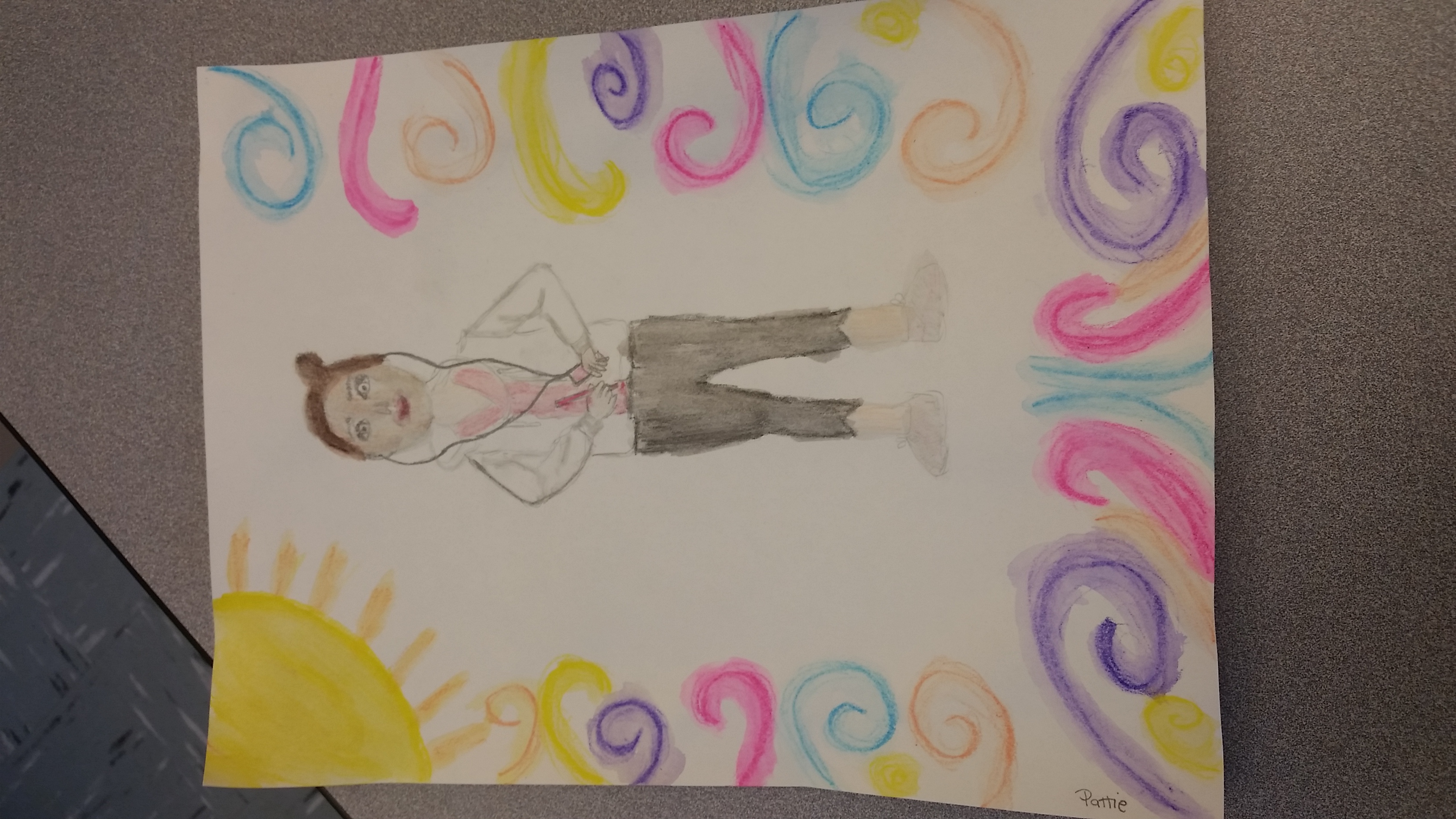
Owl Art
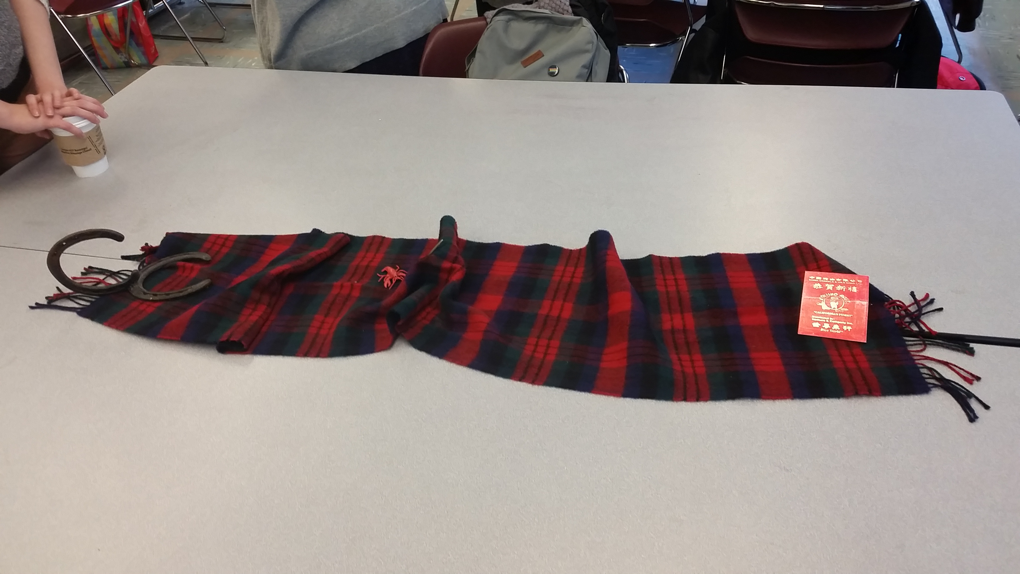
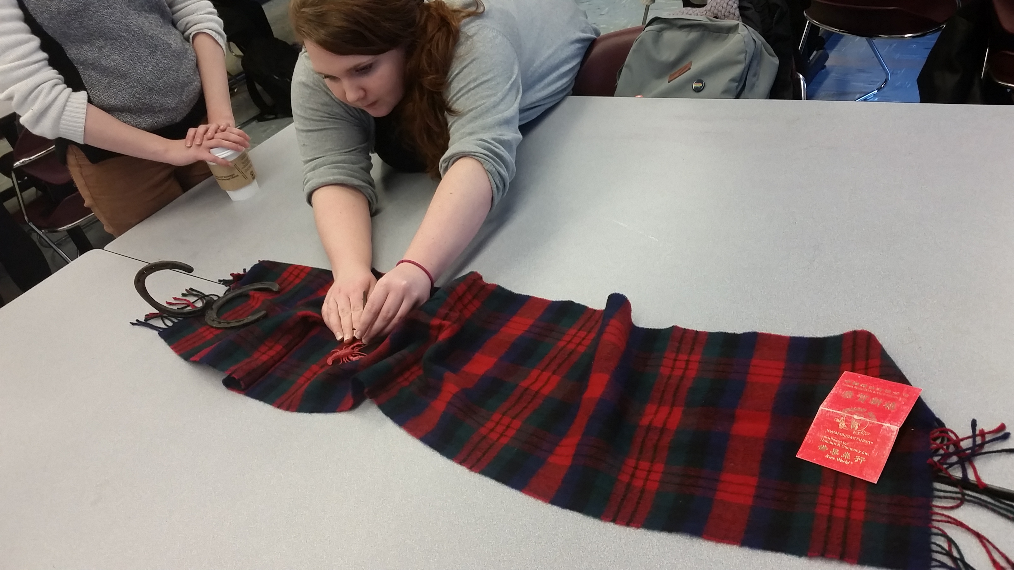
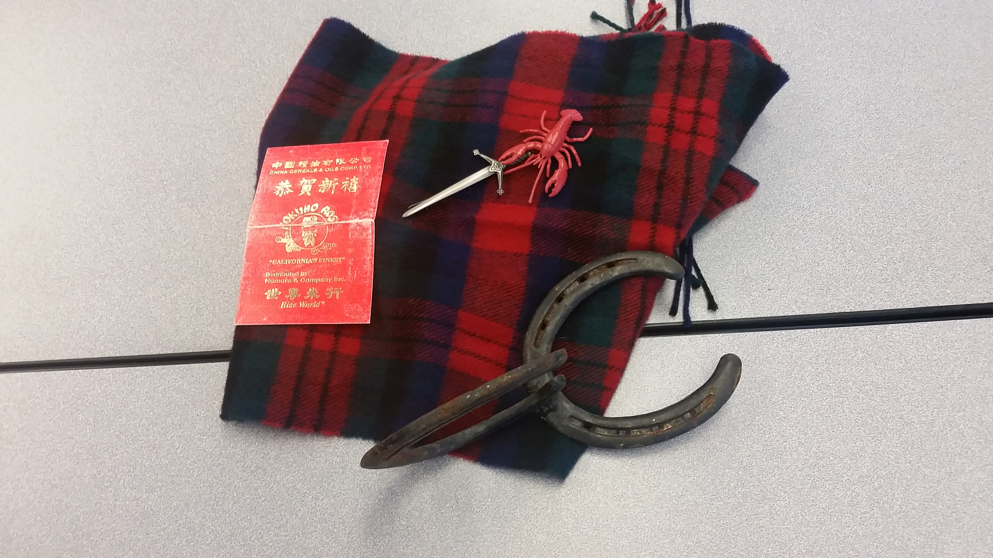
Our Cultural items
Collaborative sketches
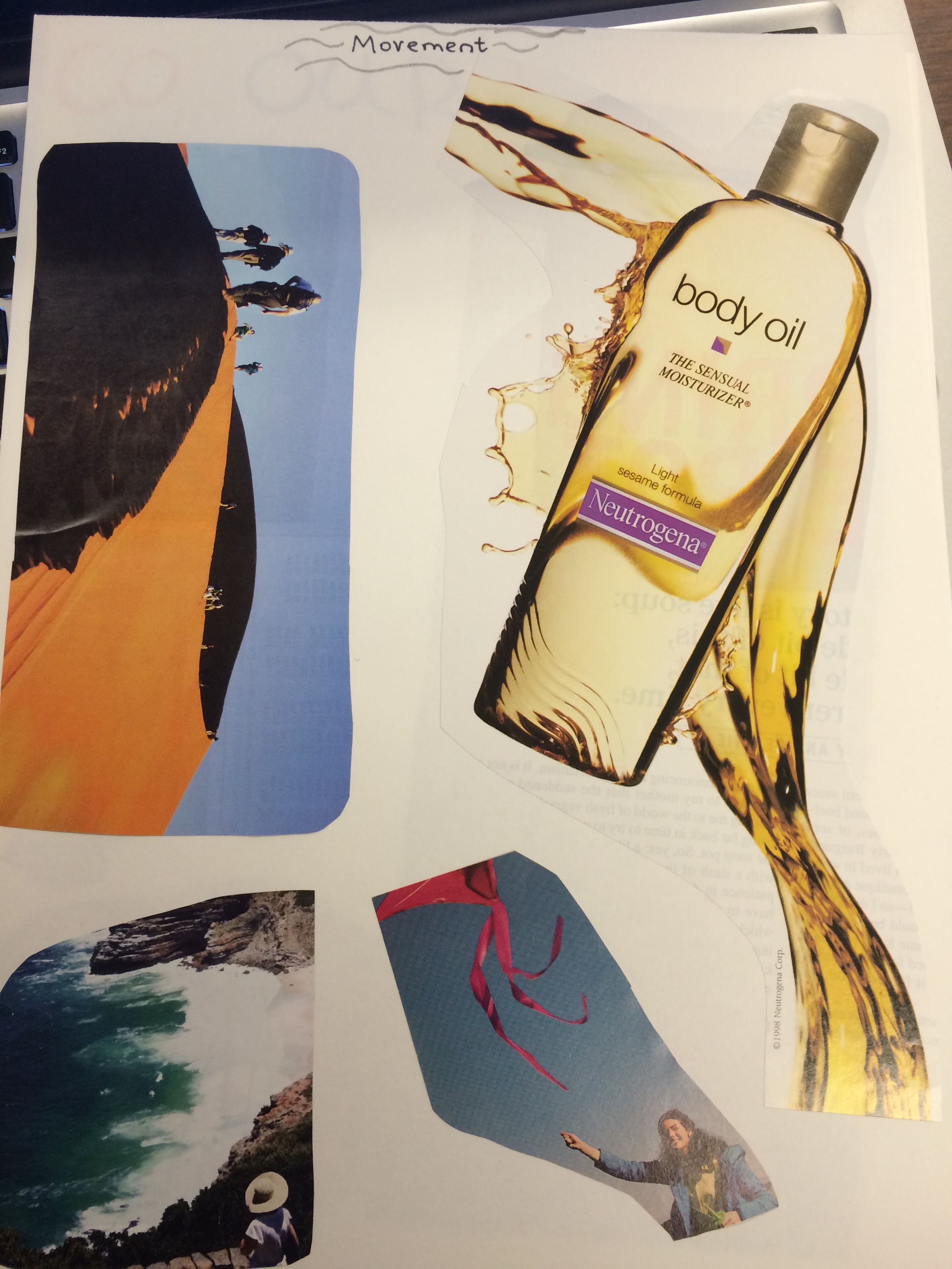 Movement is achieved by manipulating the elements to imply motion, to move the viewer’s eye in a decided direction as he or she looks at an image. Movement may be implied through recognizable images in action and may also be implied through abstract, non-representational marks such as diagonal lines, broker edges and gradation of tones.
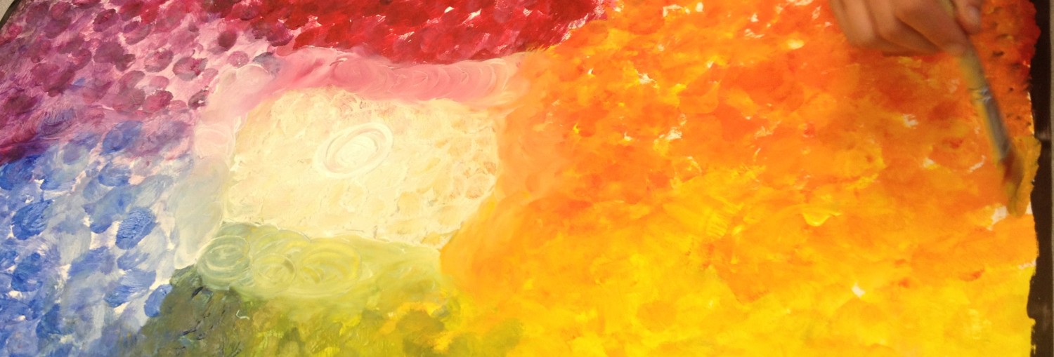
 Colour (another name for hue) refers to the naming words we use to identify specific wave lengths of light such as red, yellow, orange and so forth. A colour wheel can explain the origins and relationships that hues possess (specific descriptions of colour vocabulary may be found in the glossary). Colour may be descriptive, decorative and symbolic. Colour has both tone and intensity. Some words to us to described colour are bright, pastel, warm, cool, in harmony and discordant.
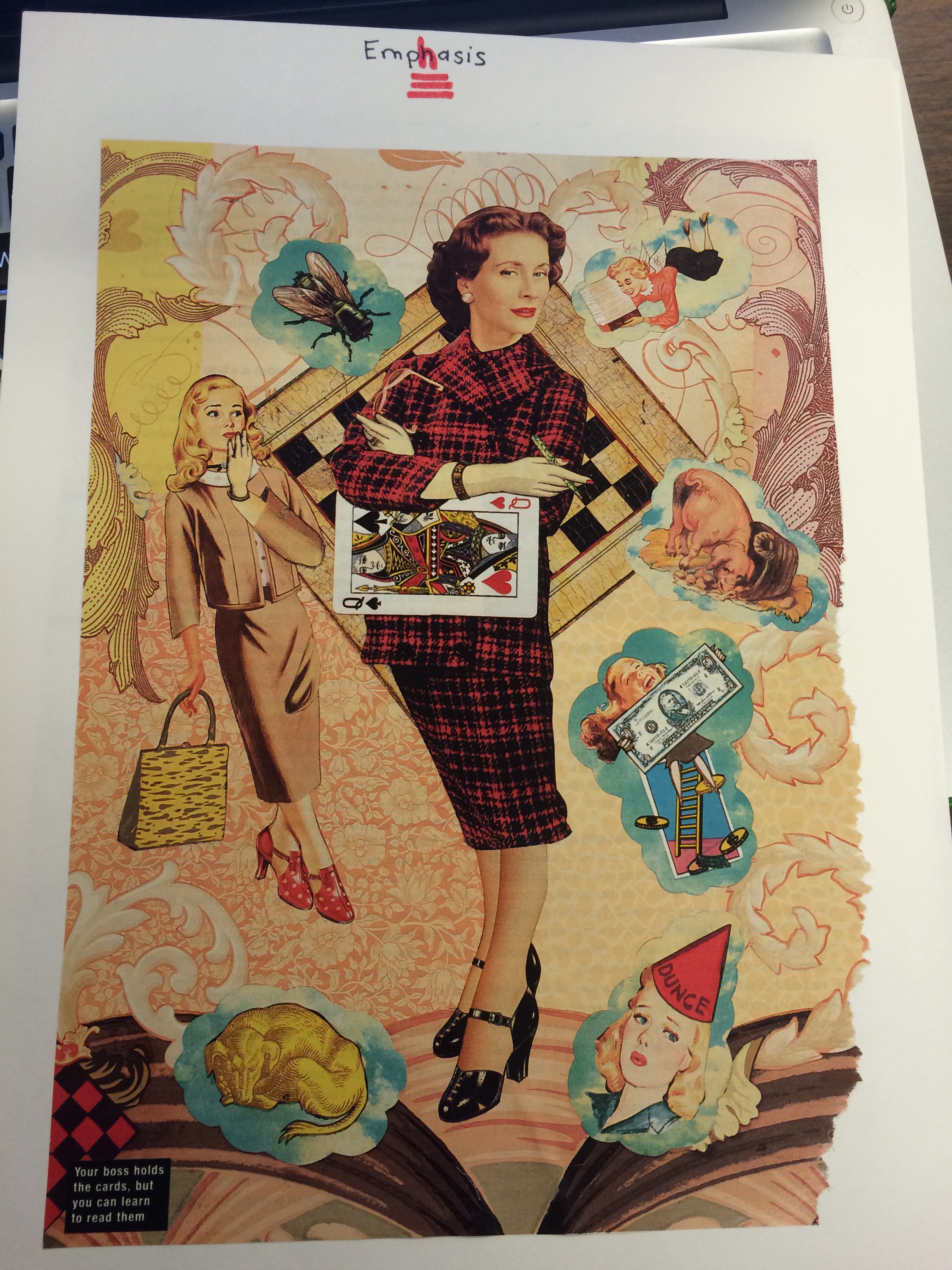 Emphasis refers to the focal point or centre of interest in am image. Emphasis implies both dominance and subordination and can be used to call attention to specific areas within a work.
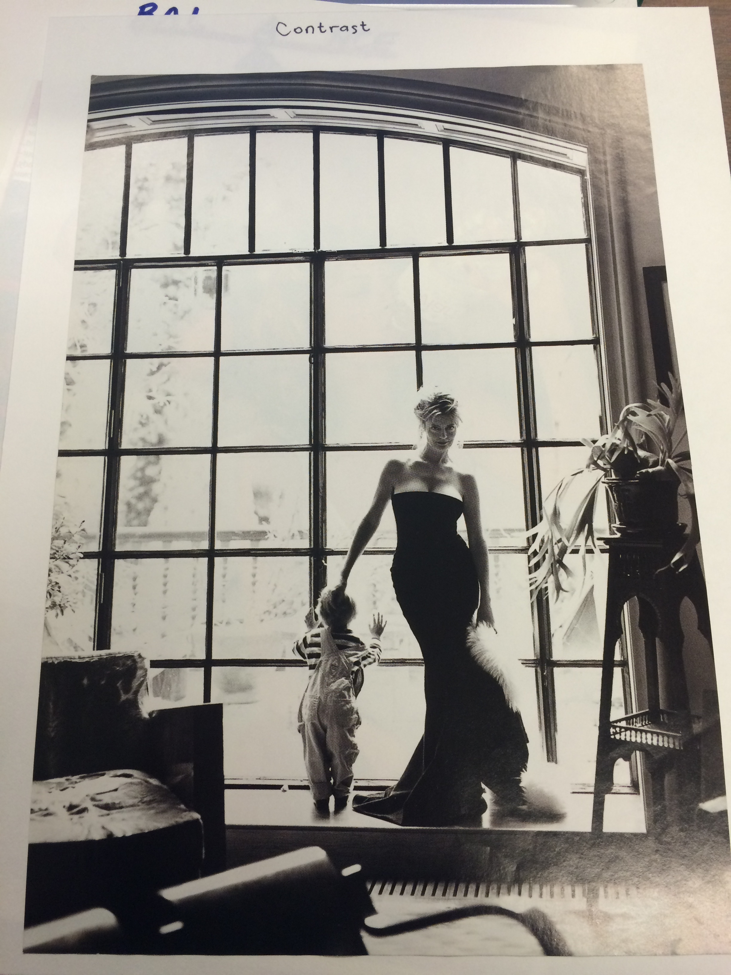 Contrast involves opposition and results from the juxtaposition of qualities that are unlike one anther. High contrast can be used to emphasize, dramatize add variety and surprise. Low contrast can be used to soothe, settle harmonize and comfort.
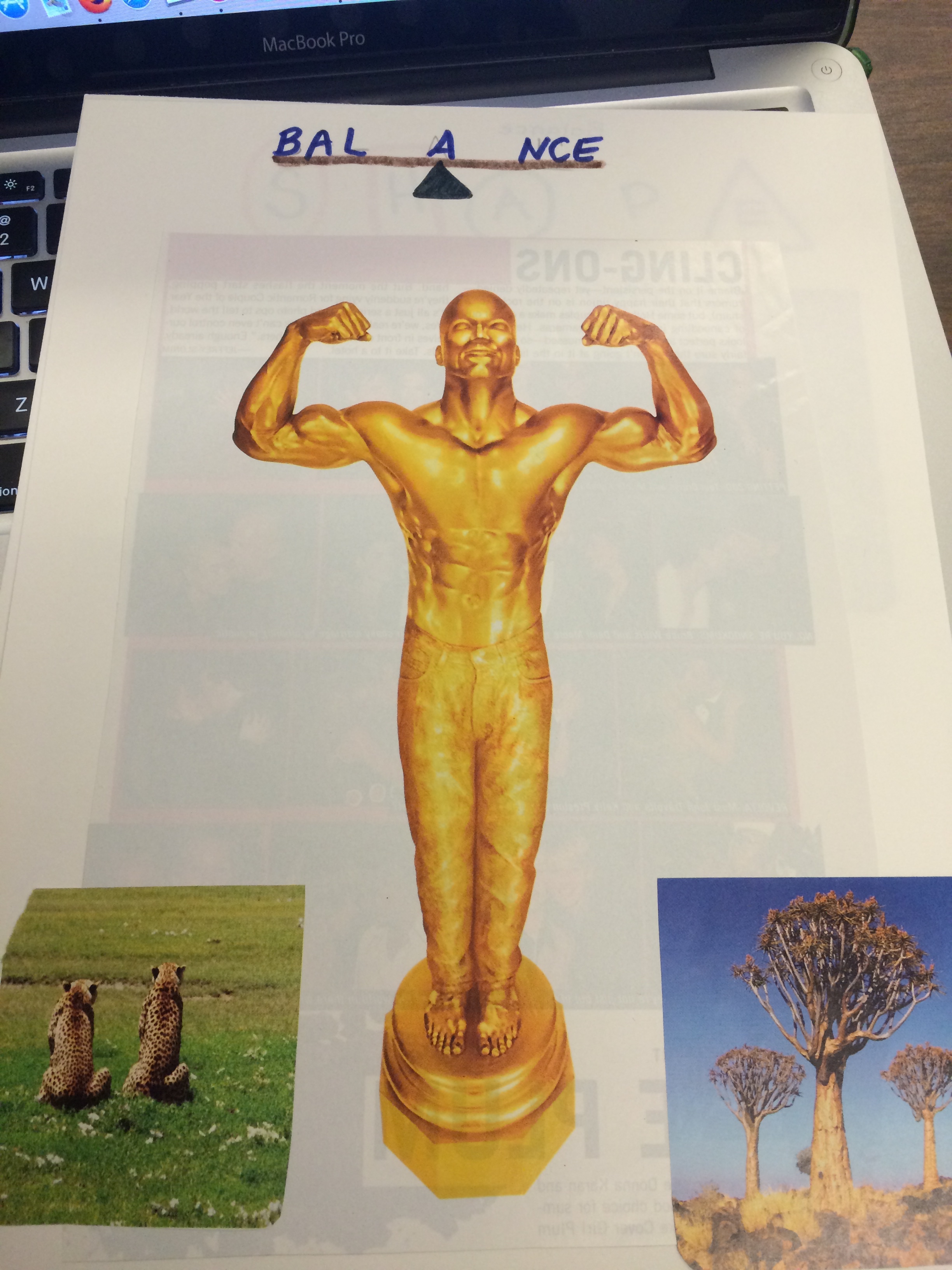 Balance refers to the equilibrium of various elements and involves a sense of order. Order may be achieved in a variety of ways. Order may be symmetrical or asymmetrical, formal or informal or rigid or random. Imbalance can create a feeling of awkwardness or discomfort. it can be used to create an exciting visual response.
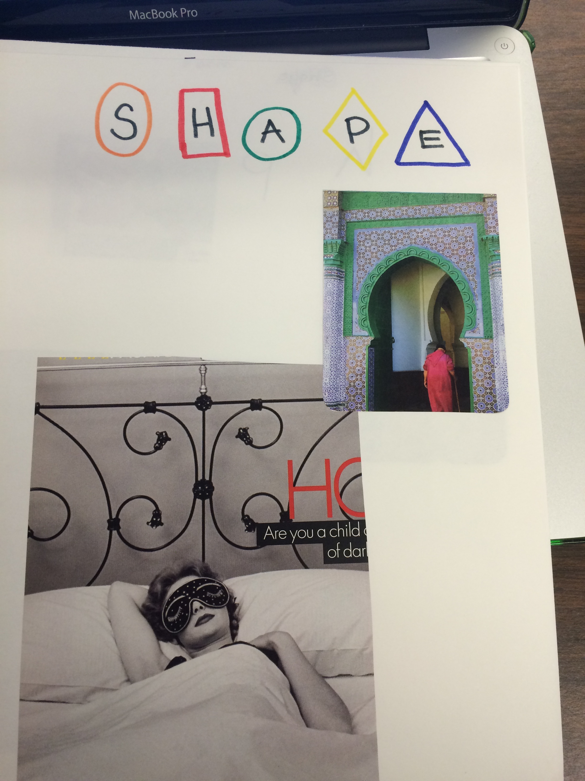 Shape described two-dimensional area that is defined in some way. Shapes may be open or closed, positive or negative and free form or geometric. Some examples of words to use to describe shape are solid, organic, repeated, symbolic and proportional.
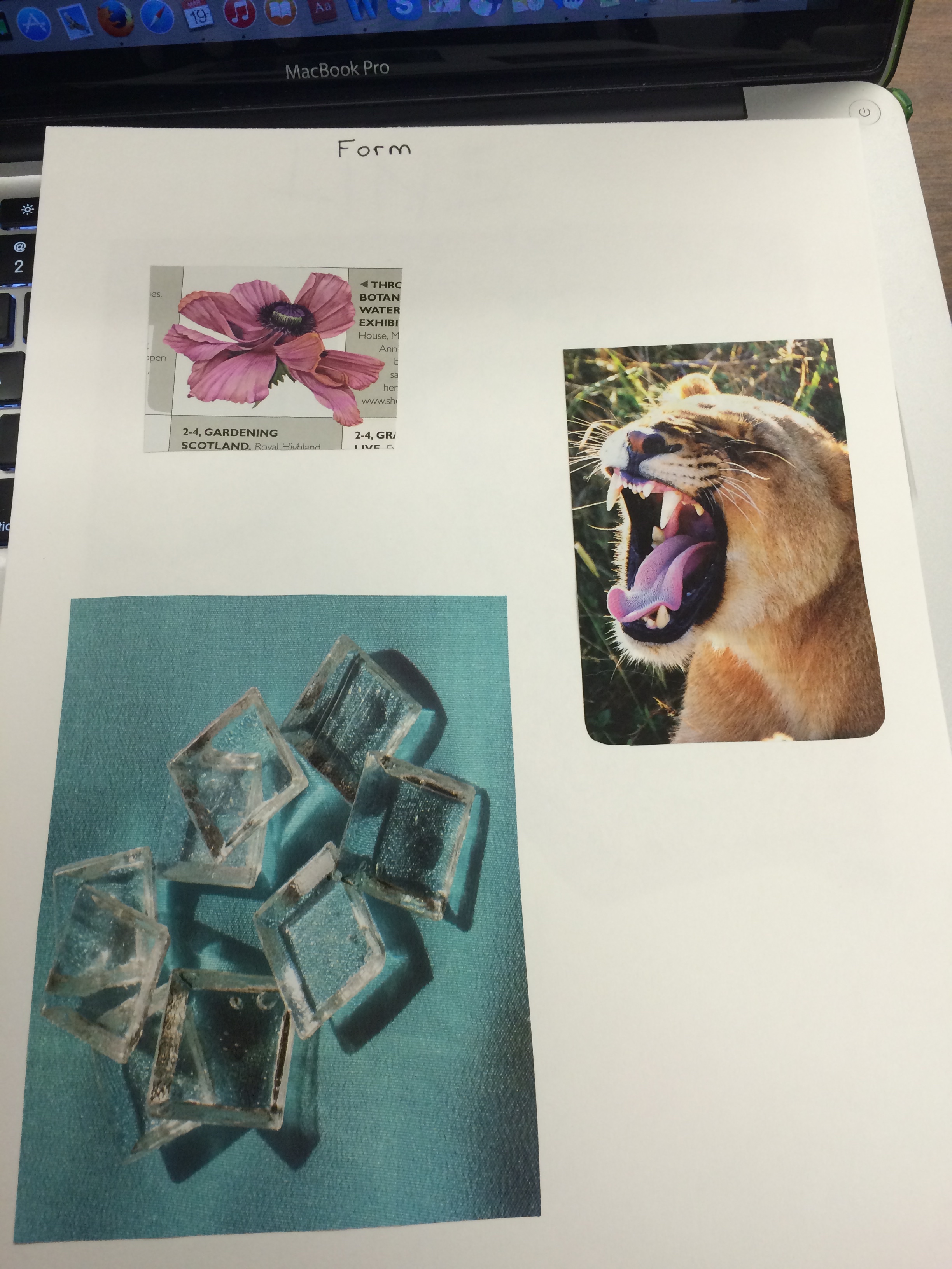 Form occurs when a three-dimensional quality has been achieved in a shape. Form may be implied by the use of tone and/or shadow or form may be actually three-dimensional. Some examples of words to use to describe form are routined, squared, angular, textual, volume and mass.
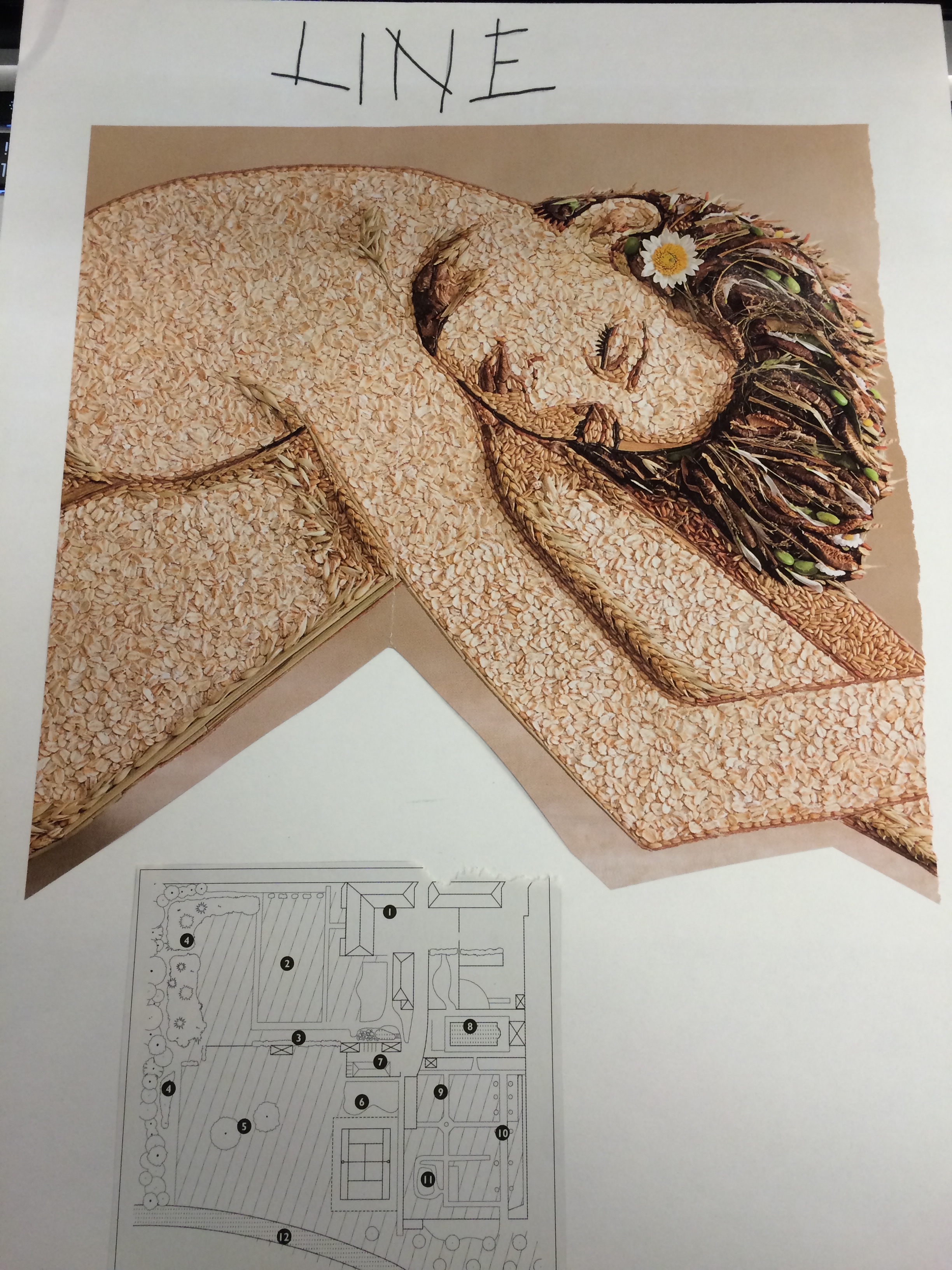 Line is the path of moving dot, where a dot is extended in some manner to determine a line. Line is used to symbolize direction, imply movement, outline forms, suggest mood and determine boundaries of shapes. The quality of line can vary according to the tool and method used, the amount of pressure used and they way a line related to other elements. Some examples of words to use to describe line are jagged/smooth, think/thin, weak/strong, curved, straight, wavy and diagonal.