Alison is a Research Analyst at UBC Sauder School of Business. Working on a variety of data projects, she has been using Tableau for creating interactive dashboards and visualizations.
” In this meeting, I will be reviewing some of the functionality of Tableau for those of you interested in seeing how it works/diving a bit deeper into the capabilities. I’m not going to start from ground 0 (download tableau, import data, drag and drop functionality). If you have any specific questions of “how can I do this”, or “I tried to do this but couldn’t” then please send those along to me and I will try to make sure to answer them, or to provide you with some resources that will be useful.
Hopefully, the other Tableau experts (Sanam Shirazi, Leah Macfadyen) will also be joining us, and I expect them to jump in and correct me in my examples, or offer their alternatives. I’ll try to review some basics about calculated fields, fixed calculations, special data type functionality, parameters and some principles about visualization. Hopefully, I will introduce enough vocabulary for you to have something to Google later rather than go into depth in any specific area. One useful thing to remember – it’s really easy to do one thing in about 10 different ways, so your experience may be different than mine!
If you don’t have it installed – download a free trial here. If you’ve never used Tableau, there are some introductory materials available to you on this page as well. I would start here for anyone with no experience. Or, just download and begin to play.”
Alison will be running a Tableau workshop in the Learning Analytics & Open Data Hackathon 3.0. If you are interested in participating, sign up here for the upcoming hackathon.
Few people have expressed interest in running a Hackathon this year. So in the next LAVA meeting, we will be discussing as a group what Hackathon 3.0 could look like. Alison is a Research Analyst in the UBC Sauder School of Business who helped organize Hackathon 2.0 at UBC last year. She writes:
“For those unaware, we have run 2 hackathons in the past. The first we had researchers with datasets/their own questions, the second we had a single dataset (MOOC data) with a range of questions. Groups were formed, data was hacked, and results were presented. In the past we have used “Hackathon” somewhat more loosely than you may have seen elsewhere, where we haven’t actually required those attending to have any previous experience.
We will quickly review what we have done in the past and then it will be an open discussion.
If you have interested in planning a Hackathon – what would you like it to look like? If you have participated in a LAVA Hackathon (or other) – what did you like, what would you change?”
Power BI vs. Tableau (a totally biased review from a Tableau user)
Alison is a Research Analyst at UBC Sauder School of Business. As part of her role, she is involved in a variety of data analytics and data visualization projects that require adopting different tools and techniques. She writes:
“I have been recently exploring Power BI as an alternative data visualization tool and would like to share with the group. I’m happy for this to be more of a discussion than a presentation, so anyone with experience with either Tableau or (especially) Power BI please be prepared to chime in. In the comparison, I plan on:
1) Showing a quick demonstration of the two tools with a shared dataset
2) Highlighting some of the main functionality differences that I have noticed
3) Discussing which tool might better suit different needs
If anyone has a) any specific questions about functionality in either tool (ie. “can you build X”) please let me know and I will try to answer/bring that up for discussion.”
“Because its 2017”: Equipping educators and scholars for the learning analytics era
Leah Macfadyen is the Program Director of Evaluation & Learning Analytics at UBC Faculty of Arts. As of next year, she will be moving on to a new instructor position at UBC Faculty of Education. As part of the interview process, Leah was asked to suggest an outline for a course that she would develop for Masters in Educational Technology program.
“What do educators need to know about learning analytics in 2017? In September, as part of the interview process for my new position in the Faculty of Education, I was given instructions that I should plan to deliver “a 45-minute talk that provides an overview of a core course that I would develop and teach for the MET program, as well as how I see it fitting within the broader MET program.” You can learn more about the Masters in Educational Technology (MET) program at http://met.ubc.ca/ . In this session, I’ll share with you the outline I developed and spoke about for a course in learning analytics, and explain the underlying logic to my design ideas. I’ll be very pleased to gather feedback from all of you, as well as further ideas. “
Learning Analytics @ The University of Saskatchewan: A Perspective
Craig Thompson is a Research Analyst working on the UBC Learning Analytics Project. He joined UBC in September, having previously worked at the University of Saskatchewan developing Learning Analytics pilot projects for the last 3.5 years.
“In this presentation, Craig will present several tools developed and used at the University of Saskatchewan, including: (1) A personalized student messaging system for delivering automated, tailored advice. (2) A dashboard for instructors to view aggregate demographics about students in their courses. (3) an interactive dashboard for administrators to explore demographics and performance characteristics of students in their programs. (4) Ribbon visualizations of student flows through academic programs (tool developed at UC Davis). Having first hand experience with these pilot programs, Craig will also share lessons learned from the trenches of Learning Analytics.“
On Sep 25th, Abdel Azim Zumrawi (Statistician, UBC Centre for Teaching and Learning) and Leah Macfadyen (Program director, Evaluation and Learning Analytics, UBC Faculty of Arts) spoke about challenges of meaningfully capturing, summarizing and presenting Student Evaluations of Teaching and Learning (SEoT) data at UBC.
Leah opened the session by talking about history of SEoT at UBC. The UBC Senate has been considering student evaluations ever since 1974. Then later in 2007, an updated policy, recommended by Teaching and Learning Committee, was approved by the senate that requires every course section or learning experience to be evaluated by students every time it is offered (with some exceptions). For more information visit http://teacheval.ubc.ca/.
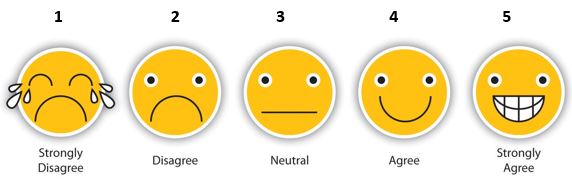
Based on this policy, a modular model is implemented at UBC, where the student evaluations questionnaire includes university-wide questions, as well as, faculty and department specific ones. Most of these questions adopt a 5-point Likert scale to measure respondents agreement. The response categories are then translated into quantitative scores. Below is a visual representation of a Likert scale.
Note: images are not present in the original evaluation questionnaire.
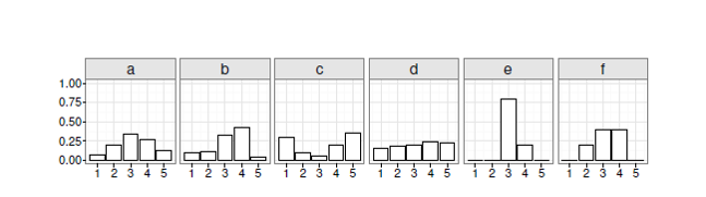
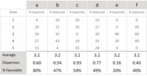
The original SEoT data is ordinal and not ratio scale, meaning that the points are ordered along one spectrum but the distance between them is not known. This poses some challenges when summarizing and presenting SEoT data, as pointed out by Abdel Azim. For instance, using “average” to compare evaluations across individuals and units can be misleading. To demonstrate his point, Abdel Azim shared an example of 6 distributions of SEoT scores that all have the same average but clearly show very different patterns.
One would naturally think that a measure of variability is required to better describe and distinguish these patterns. Abdel Azim argued that “standard deviation” is not an accurate measure of variability for ordinal SEoT data. He suggests adopting a simple and intuitive “dispersion index” suited for ordinal data instead. A dispersion metric would range from 0 (complete agreement) to 1.0 (a 50-50 split between the two extreme scores).
In addition to dispersion index, Abdel Azim suggests looking at “percent of favorable responses” (i.e., those rated 4 or 5) when summarizing SEoT data. Several years of data at UBC shows that overall, students tend to give instructors higher ratings of 4 and 5. However, the percentage may differ from one course offering to another.
Revisiting the 6 distributions of SEoT data in the earlier example, Abdel Azim pointed out that while averages are exactly the same, both dispersion index and percent of favorable responses are very different per case. This signifies the necessity of adopting appropriate metrics for summarizing SEoT data.
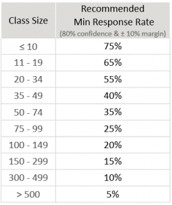
Abdel Azim explained that “response rate” is one other factor that should be taken into account when analyzing SEoT data. Not all students in all classes choose to complete the evaluations, resulting in varying response rates. Extensive statistical analysis of UBC SEoT data has been done to determine minimum recommended response rates for generating reliable score distributions for class sizes, where scores were classified as “favorable” or “unfavorable”.
Justin Lee (Programmer Analyst, UBC’s Faculty of Land and Food Systems) closed the session by sharing his visualization work that allows users to explore SEoT data for his faculty using the above metrics in one interactive dashboard.
Ian is a Learning Technology Specialist in UBC’s Faculty of Education, and will talk about the Mattermost tool: what it is, how it works, and whether we can get data out of it that might tell us anything useful about learning or engagement. He writes:
“Mattermost is an open source communication tool that facilitates communication and collaboration in a chat-type environment. You could call it an open source and UBC-hosted Slack alternative. I’ll be going over the pilot so far, how Mattermost was selected, how it is currently being used in Education, followed by a hands-on demonstration and then opening things up for discussion. That discussion might include analytics potential as well as whether it would be useful for the LAVA group to connect between meetings.
A PhD student from the Department of Language and Literacy Education will be joining me, as he’s interested in using Mattermost as part of a study on team collaboration tools for language learning. I’m hoping he will be willing to share a little about his research.”
Ahead of the meeting, Ian would like to encourage people to register for the Mattermost LAVA group. This was created a few months back in conversation with Leah. It’s just an experiment for now but who knows!
In January 2017, the Institute for the Scholarship of Teaching and Learning and the Learning Analytics Visual Analytics group held Hackathon 2.0 at UBC. The two-day event brought together over 80 students, researchers, faculty and staff to explore educational data. Organizers welcomed participants with a range of expertise, and encouraged beginners to sign up to the event.
“My interest in having a hackathon was to bring people together who either want to learn more about doing data analysis, know about data analysis but want to bring into a new context, which is learning analytics, or don’t know anything about either of those things but are generally interested,” said Alison Myers, data analytics specialist at the UBC Sauder School of Business.
This year the hackathon began with a series of workshops on visual analytics, temporal data analysis and statistics using the R software. The idea was to support participants in expanding their knowledge base and making first steps with their analyses.
Hackathon participants were given data from two UBC Massive Open Online Courses: one course focused on Chinese philosophy, the other focused on the science behind climate change. Data included event-trace data, student demographics, discussion-forum posts, attitude surveys, and summative data, enabling a broad range of analytical approaches. Participants formed groups depending on their expertise and interests.
“I have done research on learning data in the past. Patrick is doing computer science so he knows more about coding. And Vesta has experience with visual analytics,” explained Mario Cimet, a student studying Cognitive Systems at UBC, about his team.
The event was an opportunity for like-minded people to meet and share their passion for data analysis. The hackathon was also aimed at raising the profile and visibility of learning analytics. Learning research data can give instructors feedback about their teaching approaches and resources, and how they’re working in their classrooms. It can inform departments about why certain classes are more popular than others and thus support planning at the program level.
“Learning analytics is using evidence about learners to improve the process [of teaching],” said Cimet. “I think it’s important because any decision that you make that is going to deal with their education, you should do it with as much evidence as possible. You should do based on facts.”
Here are three examples of what the participants were able to achieve during the hackathon weekend:
Course tree, where circle size shows either activity level across all learners, time spent per learner, or frequency of this being the last visited page of the course: http://link.landfood.ubc.ca/courseTree/ by Anh Nguyen, Shirley Lin and Justin Lee
Another course tree, where the width of a line represents the movement from node to node, the size of the circle is the number of unique learners, and the colour of a circle shows whether this was a student’s last activity in the course: http://static.useit.today/ubcxhack.html by Patrick Coleman, Mario Cimet and Vesta Sahatciu
Rama has been working on building an Evaluation Visualizer, “EvalVis” which gives an overview of some of the ISoTL projects going on at UBC (http://isotl.ctlt.ubc.ca/). “EvalVis” is an interactive visual interface that will show innovation projects, area of impact, and evaluation approach. Rama will be showing the in-progress version of the tool, as well as discussing some of the challenges of the project so far.
Work in Progress: Development of an app to visualize a learner’s own learning data
In this session, final year COGS student Valerie Wyns will give a ‘work in progress’ presentation on her project to develop an app, ‘modusloci’, that will allow learners to visually analyze their own ‘learning data’ (e.g. school notes). This development project builds on the hypothesis that if learners can visually make the connections between sources, subjects, topics (particular->general) it will offer them a new perspective on the meta-system in which their knowledge resides, and allow them to understand what they need to understand in a deeper way. Valerie will offer more details of the logic of her project and will explain her plan to visualize both a data map of a learner’s input data, and patterns of the learner’s habits. In particular, she will concentrate on the data mapping function, asking: What aspects of data are salient in a meta-system way? How can she create a platform that is playful, fun, and ultimately useful to the end user?