Reflection on the Course

GEOB 270 contributed to my understanding of GIS functions and applications. From this course, I learned how to use various GIS analysis tools in multiple scenarios to conduct a comprehensive analysis on areas of interest. What surprised me about GIS was how easy it is to use and how really anyone can have access to the governmental data that can be used. All in all, I realized that it is one thing to access the data and be able to throw it all in ArcGIS to create a map, but it’s another thing to actually understand the data and its metadata in order to create ethical, user-friendly maps.

Proposed Locations for the Pineapple Palace Resort and Spa

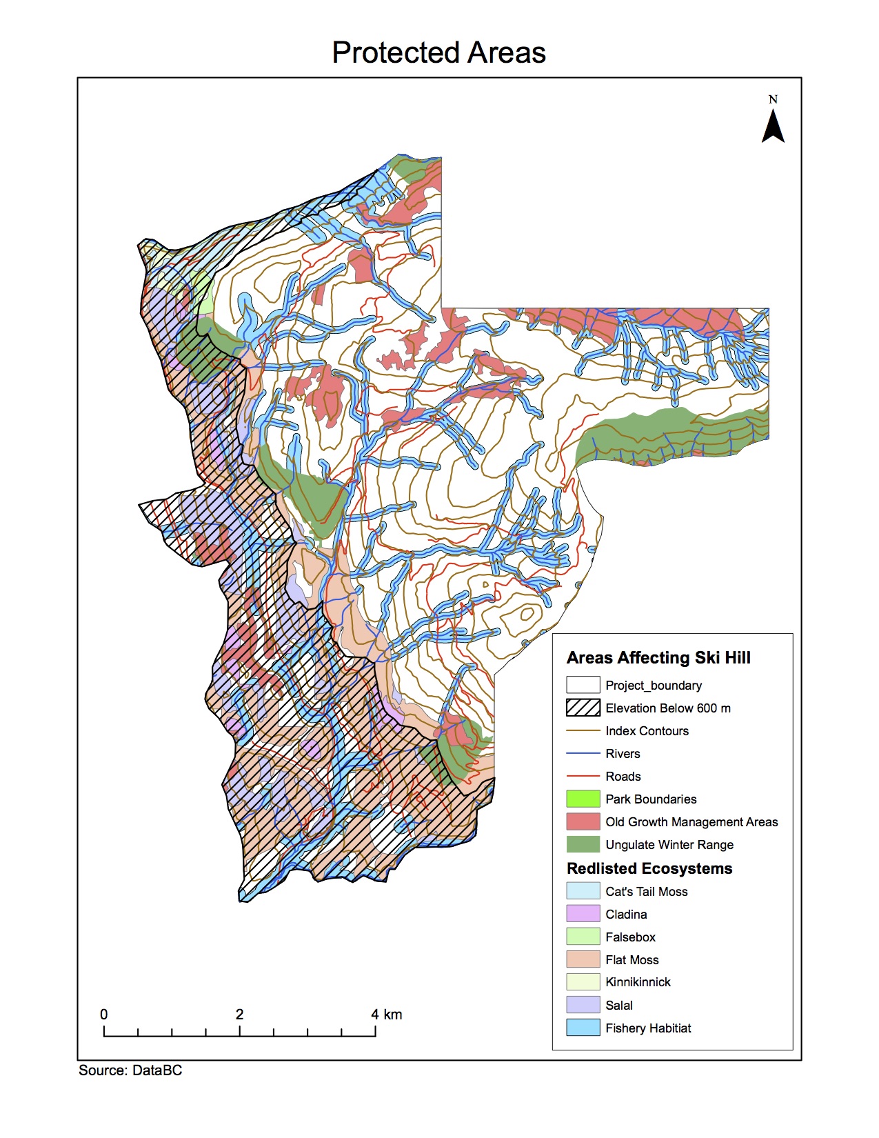
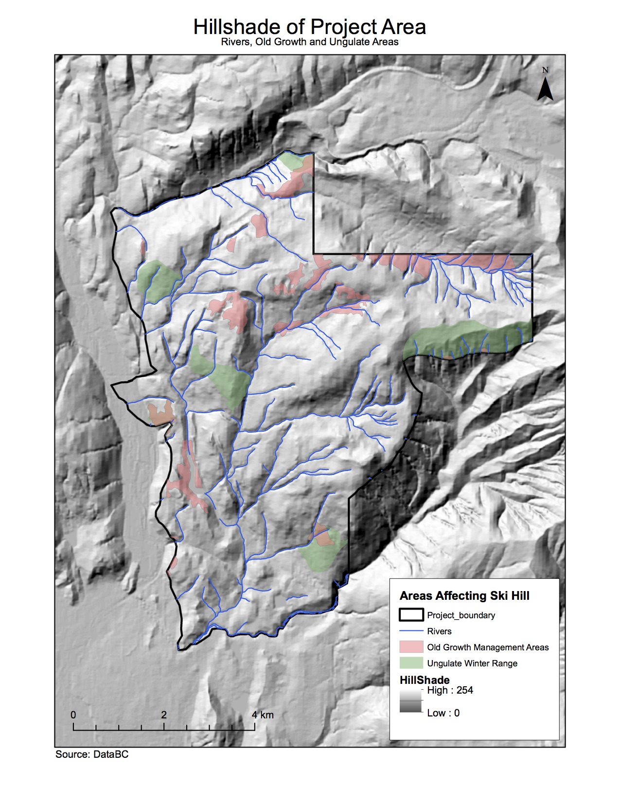
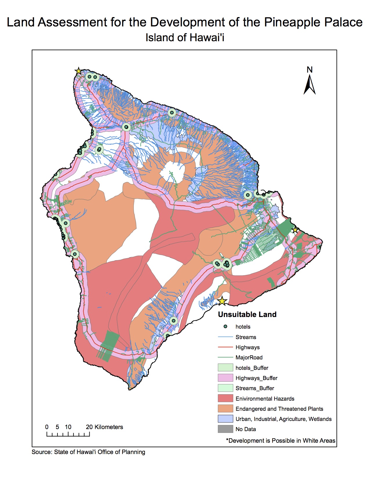
We decided to conduct and analysis on the Island of Hawai’i to ultimately find the three safest locations on which we can build the Pineapple Palace Resort and Spa (yellow stars). We wanted to find locations that kept our guests safe but also allowed them to be near the ocean and have easy access to nearby attractions and towns.

Final Project

For this project I worked with 3 other people: Camille, Kristina, and Nicole. Each person took a different section to work on while we all collaboratively worked on the introduction and conclusion. While I was gathering data and putting them into ArcGIS, other group mates started working on creating the maps, outlining the flow chart, and beginning the write up. When we weren’t in lab, we would communicate via Google docs and Facebook.

As a result of the process, I learned that there are many different factors that you need to take into account when planning to build somewhere. We only gathered data from a handful of different layers, but there are much more environmental concerns that need to be taken into account, such as areas of endangered animal species, soil layer composition, etc. It’s interesting that most of the hotels built on the Island of Hawai’i are in the tsunami evacuation zone, and because we did not want to put our guests in danger, we decided not to build in these zones.

In regards to teamwork/project management, I leaned that it is very difficult to schedule a meet up time with group members outside of the scheduled lab time to complete the project. I also learned that someone needs to take control and lead the group. Because the data is stored on the H drive, which is is linked to one person’s account, it’s difficult to allow other members to work on the map in ArcGIS if they don’t have access to your data.

We had no problem acquiring the data from the Hawai’i Office of Planning website, and we knew it was accurate and could be trusted, but we weren’t really sure if this data was up to date.

Geob270FinalProject

Environmental Assessment for the Garibaldi

Protected AreasHillshade

The Garibaldi and Squamish project is a proposed mountain resort 15 km north of Squamish on Highway 99. In 2010, the BC Environmental Assessment Office released a report stating that the project lacked effect on vegetation, fish, and wildlife habitats. Five years later, in 2015, developers filed an application claiming that they addressed these issues. I have been hired as a natural resource planner by the British Columbia Snowmobile Federation who initially opposed the proposed project. In order to fully assess whether or not building the Garibaldi is plausible, I had to examine BC’s Environmental Assessment’s recommendations as well as project criticisms.

In order to assess and analyze the impact of the project, I had to acquire the data from DataBC, parse the data, filter the data, mine the data, and produce a final map of the data. Ultimately, I found that 53.8% of the total project area falls in protected areas where we cannot build. This leaves a limited amount of space for the project to be developed. Because of the limited space available, and the size/location of the Garibaldi, I do not believe that this project should be allowed to continue. This result does not differ from what I wrote in my initial memo.

ACCOMPLISHMENT STATEMENT

Applied data visualization strategies of data acquisition, parsing, filtering, mining, and representation to my data in order to create a complete impact assessment.

Housing Affordability

QUANTITATIVE DATA CLASSIFICATION

dataclassIf I am a journalist putting together maps of housing cost in Vancouver, I would use the Natural breaks method for my audience because it gives the most accurate and easily understandable representation of the median house prices. However, if I were a real estate agent preparing a presentation for prospective home buyers near UBC I would probably use the equal interval classification method because it makes areas look less expensive than they actually are; therefore, people will be more willing/likely to buy these expensive homes. Technically there are no ethical implications to using this method as opposed to the natural breaks method because you, as a real estate agent, are not changing the data; you are only using a different classification method that works in your favour.

HOUSING AFFORDABILITY

housecostVO

Affordability is measuring the ratio of the housing cost over the median household income. It’s a better indicator of housing affordability than housing cost alone because some people may have higher incomes than other people but still have the same shelter costs. The 12th Annual Demographia International Housing Affordability Survey in 2015 provides us with housing affordability rating categories, which separate the data into levels of affordability/unaffordability depending on median multiple. Because data was collected by professionals in urban planning, the data can be trusted. Although the maps provided show users that Vancouver is severely unaffordable, it is important to note that an unaffordable city does not mean an unlivable city. Affordability only tells us about a population’s ability to pay for housing whereas livability relies on multiple factors such as economic status of a city, social status, education, etc.

ACCOMPLISHMENT STATEMENT

Understood the different methods of classifying data: manual breaks, natural breaks, equal interval, and standard deviation in order to represent how each of these methods led to different looking maps.

Tsunami Risk Areas in Vancouver

GEOB 270 Lab 3 Map (1)In the event of a tsunami, approximately 1.38% of Vancouver’s total area will be in danger. To get the percentage of Vancouver’s total area in danger, I summed up all the areas in danger (I got 1807225.594473 m2) and then I got the City of Vancouver’s total area from the “Vancouvermask” (which was 131033339.950334 m2). I divided the amount of area in danger by the total area in the City of Vancouver (1807225.594473 / 131033339.950334) x 100% and I got 1.38%.

Healthcare facilities in the Vancouver danger zone:  FALSE CREEK RESIDENCE, VILLA CATHAY CARE HOME, BROADWAY PENTECOSTAL LODGE, YALETOWN HOUSE SOCIETY.

Educational Facilities in the Vancouver danger zone: EMILY CARR INSTITUTE OF ART & DESIGN (ECIAD), INSTITUTE OF INDIGENOUS GOVERNMENT (IIG), HENRY HUDSON ELEMENTARY, FALSE CREEK ELEMENTARY, VANCOUVER MONTESSORI SCHOOL, HERITAGE 3R’S SCHOOL, ST ANTHONY OF PADUA, ECOLE ROSE DES VENTS.

To get to my answer, I went into the Arctoolbox function under Analysis Tools, clicked on intersect, and put in “Education” and “Vancouver_Danger” into the input features. This would find the points of education that intersect with/fall in the Vancouver danger zone. Then I pressed “ok” and named it Vancouver_education. I then re-did it for the healthcare data. After I got the points of educational facilities and healthcare facilities that are in the Vancouver danger zone, I checked their attributes table by right slicking on the layer to find the names of these facilities

SKILLS ACQUIRED

  1. Used my knowledge of GIS software and applications to describe data integrity and ethical implications for maps
  2. Managed and changed data projections in order to fix misaligned and improperly referenced data
  3. Conducted a basic geographic analysis involving buffers and reclassification on the City of Vancouver to determine areas vulnerable to possible tsunamis

Misaligned and Improperly Referenced Data

DEALING WITH MISALIGNED AND IMPROPERLY REFERENCED DATA

Different projections preserve different properties (i.e. Mercator preserves angles and directions, Albers Equal Area preserves areas, Lamberts Conformal Conic preserves angles, etc.); thus, when data is projected onto different coordinate systems properties become distorted. When you want to combine different layers of data that are improperly referenced or misaligned you would go into “Properties” in ArcCatalog under the “XY Coordinate System” tab and choose the most appropriate coordinate system. If you need to preform spatial analysis, it is better to change the projection of the layer to a common spatial reference system, which creates a new data layer with a different coordinate system. To do so, you go into ArcToolbox, find Data Management Tools > Projections and Transformations > Project. Input Dataset should be the layer you wish to project and output coordinate system should be the common coordinate system.

USE OF LANDSAT

Landsat is a remote sensing technique used to measure the response of objects and surfaces on the earth. This includes vegetation distribution, land use change, water features, etc. The advantage of Landsat is that observations have been taken since 1972, which provides us with multiple images in different time frames so we can figure out the types of changes taking place. Landsat was especially useful after the Mt. St. Helens earthquake and eruption in 1980 to determine how the surrounding landscape changed.