This week, I continued building on the work I have been doing to pick out interesting lava flows that we could potentially visit during field investigations in August. I focused on outliers in the graph comparing the mean Circular Polarization Ratio (CPR) of the individual lava flows in RADARSAT-2 C-Band vs AIRSAR L-Band that was made using the data collected from the zonal statistics tool. This graph, showing the units of interest is below:
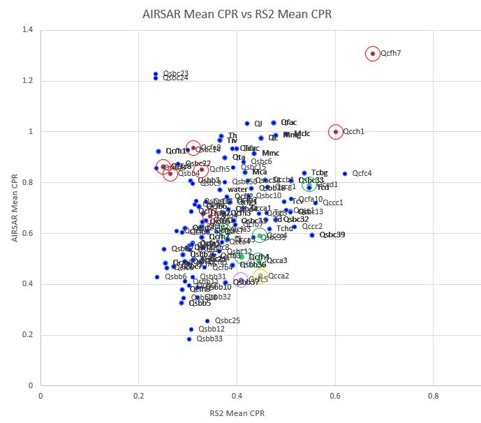
In this graph, there are four different colors to represent characteristics of the different flows. The flow Qcca2 has a similar CPR value in both C- and L-Band and is highlighted in yellow. The units Qcch1, Qcfa8, Qcfa9, Qcfh5, Qcfh7, Qsbb4 and Qcfd4 are of interest because they have a very high CPR value in L-Band compared to C-Band and are highlighted in red. The units Qcc, Qcca3, Qccc4, Qccd1, Qcfa3, Qcfc5 and Qcfh4 are of interest because of their very low apparent thermal inertia values, they are highlighted in green. The unit Qcfc5 is highlighted in purple and is of particular interest because it has a similar CPR in both L- and C-Bands in addition to possessing very low apparent thermal inertia value.
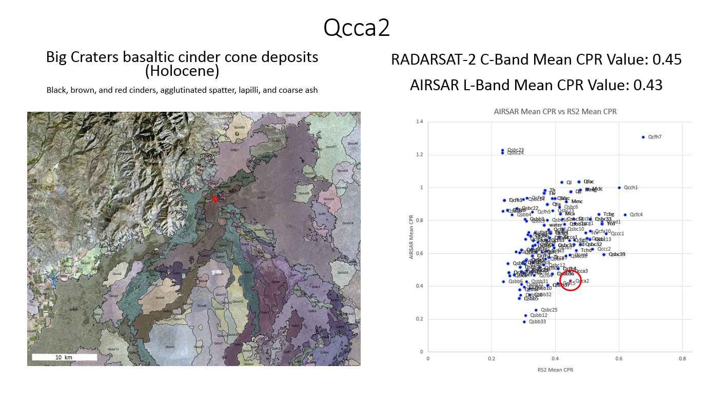
With these flows picked out, I then created a PowerPoint presentation summarize and compare many characteristics of the different flows and pick out interesting ones to visit. Slides from the chosen units in this presentation can then be printed and taken into the field in August for reference. I created three slides for each unit, the first showing the geologic map, a geologic description of the unit, and a screenshot of the AIR Mean vs RS2 Mean CPR graph with the unit highlighted in red, an example of this for the unit Qcca2 is below:
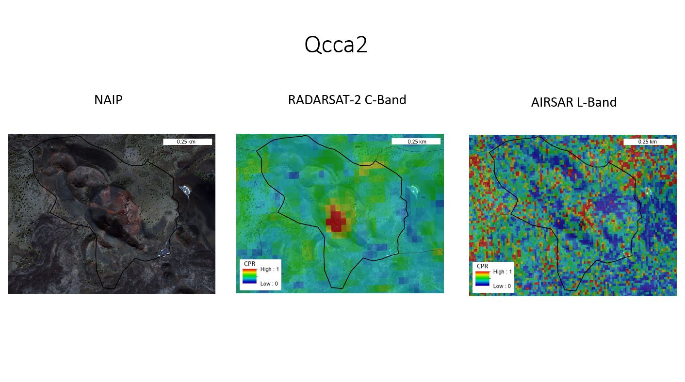
 The second slide includes three images, one showing the National Agriculture Imagery Program (NAIP) image of the unit, the RADARSAT-2 C-Band image and the AIRSAR L-Band image. An example of this slide for the same geologic unit is below:
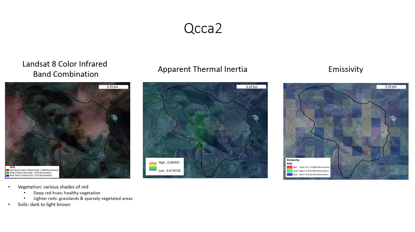
The third slide includes three photos, one with Landsat 8 imagery color infrared band combination designed to highlight vegetated areas in red, the apparent thermal inertia image of the flow, and the emissivity image. Landsat 8 imagery has a total of 11 bands in the visible, near infrared and shortwave infrared ranges of the electromagnetic spectrum. By placing different bands in the red, green, and blue channels, different components in the images can be highlighted in different colors, something that is very useful for various types of analysis. The most useful Landsat 8 band combination for our area of study is the Color Infrared band combination because this image makes vegetated areas bright red and very easy to spot. Vegetation is important in our study because C-Band CPR is very sensitive to vegetation.
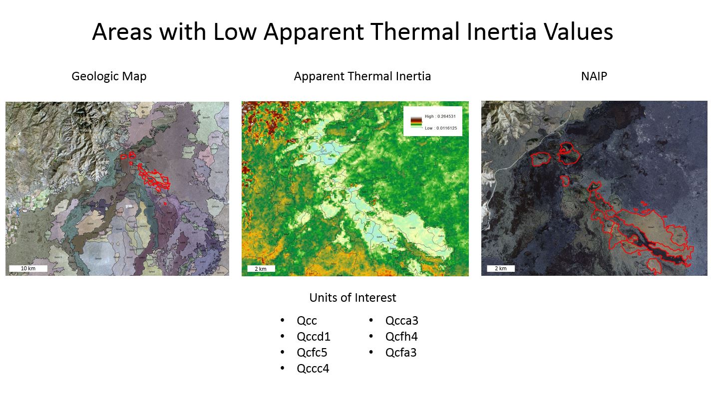
 Finally, the end of my presentation includes a close-up image of the areas with low apparent thermal inertia:
RADARSAT-2 Data and Products (c) MacDonald, Dettwiler and Associates, Ltd. (2015) – All Rights Reserved. RADARSAT is an official trademark of the Canadian Space Agency.
Catherine
July 8, 2016 — 7:21 am
Rachel, you can post the RADARSAT-2 data, as long as you have the copyright statement (which you do).