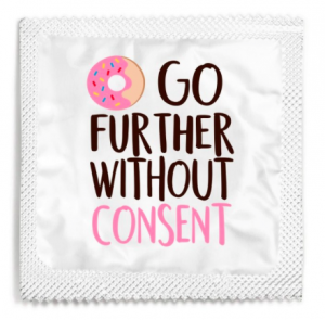
In 2017, Say It With A Condom, a personalized condom manufacturer in the United States, released a new design that went viral in a undesirable way. The company released packaging that used imagery in place of words, followed by the rest of the phrase, in attempt to promote safe, consensual sex. This safe sex campaign, although made with good intentions, was received negatively by the public, as the message was confusing and misinterpreted by many who came across it. It immediately received backlash because people read the words “Go Further Without Consent”, a phrase encouraging rape culture. The use of the doughnut emoji was the focal point of the confusion, as many didn’t comprehend that it was used as double entendre. The image of the doughnut is meant to account for the words “Do Not”, which creates the statement, “Do Not Go Further Without Consent”. It’s easy to see why many consumers misunderstood the personalized condom design, because at a quick glance, only the actual words themselves stick out. Most people solely read the words on packaging, rather than immediately understanding that a little illusion might be a part of the message. The doughnut is easily neglected as an important piece to this puzzle when quickly skimming the short sentence, making it seem as though it is only a cute picture added to make the overall product look pretty. The choice in wording and imagery on this product does not accurately represent the message the company is trying to convey, but instead the opposite.
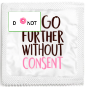
The major issue with the original campaign was the placement of the doughnut alongside the poor choice of wording. Therefore, I decided that my alterations must include an effortless, uncomplicated sentence that cannot be misinterpreted when someone briefly reads it over. In order to do that, I decided to add the words “Do Not”, making the full phrase read “Do Not Go Further Without Consent”. Although an easy fix, I couldn’t leave it plain and simple like this, because there is no interesting or fun aspect to these condoms. Consumers want something that is attention-grabbing, something that looks nice, or something that is entertaining, for example. Consequently, I added the doughnut back into the design, and used it as an O in the word “Do”. By doing so, a factor of fun is added into the mix, but the main message is not being lost or misconstrued. The image is not taking away from the meaning, yet it adds to the overall design of the product.
Although unintentional, the original ad endorsed rape culture and relayed a cynical message about sex. The objective of the packaging was to encourage the use of safe sex and the use of consent, but it clearly didn’t go as planned. Mistakes like this seem small, however they may have everlasting effects on the brains of youth and adults. Accidentally fostering a state of mind where consent is not necessary is extremely dangerous and unhealthy, and should be avoided at all costs. Companies must put careful detail into their designs, as a small slip up like such can create massive issues in the real world.