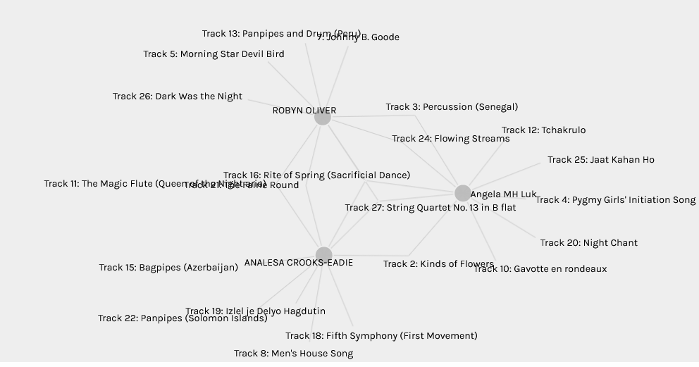
It is interesting how the curations of week 8 tasks provided an appealing look at the data visualization with the use of Palladio. I was fascinated and confused with the facets and groupings for a few minutes until I decided to play around with the different data sources that displayed the visualisation of the curators, tracks, and community groups. This provides us with the ability to customize the data which also provides greater insights into the variability of datasets being used. For my curation, I wanted to focus on different genres and selected the ones that gave me the best feeling when I listened. It was rather interesting to look at my small community and the differences and similarities we shared.
The first network I want to highlight is my community and their tracks, When I read Angela’s post, I see why we were paired in the same community, she said she “was looking for tracks that would capture the diversity of humanity to extraterrestrials. Most of these tracks capture the culture and music of minority groups”. Robyn suggested that she “wanted an equal representation of music from around the globe. Personally, I basically was exploring diversity and equal representation in music which are the keywords that stood out from the other two in my community.
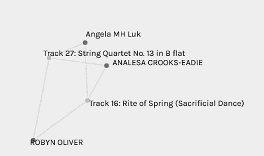
The next network I want to highlight is the one where we all have the same songs in common, “The sacrificial dance string quarter no13”. I can see the connection with sacrificial dance because we all had the “Night Chant” selected which is an ethnic type of musical celebration. It’s important to note that neither of the three of us has “Sacrificial Dance” on our top 10 list. This is data analytics at work but more so predictive analysis. The patterns found in the historical data (our curation quiz) is used to make inferences about uncertain future events. The purpose of predictive modelling is to create a model that will predict the values (or class if the prediction does not deal with numeric data) of new data based on observations. (Brooks & Thompson, 2017, p.61).
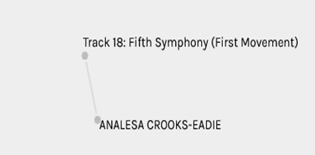
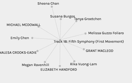
Another network I want to analyse is the “Fifth Symphony”, in my community I was the only one who selected this song, I thought this would be one of the songs that I would be connected to in my community but that was not the case.
However, I wanted to explore to see who had similar interests, this was actually the second most popular music selection in the curation which I am not surprised because of its popularity.
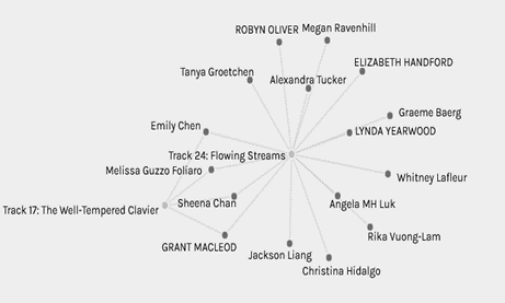
I also wanted to see the visualization of the songs with the most curators “Flowing Streams” versus the least “The Well-Tempered Clavier”, Only four curators have selected both of these songs (Emily, Melissa, Seena and Grant).
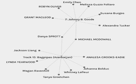
In contrast, my favourite “Johnny B Good” and least favourite “Bagpipes – Azerbaijan” had only two people that selected both songs.
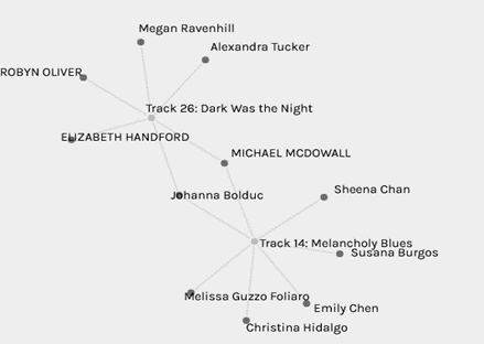
For my next network, I wanted to examine the blues genre from my list, so I selected “dark was the night” and “Melancholy blues”, I thought there would be more curators due to the similarities but only Michael and Johanna chose both.
Reflection
In reflection, it is evident that data-driven to problem-solving approaches will continue to expand because we are in a data-driven era. Comparing the curation of songs to an educational standpoint you can see similarities with the emergence of online learning environments, such as Massive Open Online Courses (MOOCs), large volumes of data are being generated. Similarly, the widespread use of Learning Management Systems (LMS) such as Moodle and Canvas utilized in Higher Education has caused a massive growth of the data that educational institutions are required to manage. Significant amounts of learner activity take place externally, and so records are distributed across a variety of different sites with different standards, owners, and levels of access (Ferguson, 2012). While these are great developments, there are also concerns when dealing with algorithms, they can often reflect biases of the dataset. For example, I did not see Jonny B Good on my list, and I chose it as one of my top 10. The network graph makes it visible that there are inconsistencies in the data. Maybe the reason for this is the fact that algorithms can depend upon data that is often limited, efficient or incorrect?
From a statistical perspective, we selected ten songs from the Golden Record, we can never be completely certain that the relationship exists between two variables because there can be sources of error to be controlled, for example, curator bias or simple mistakes.
References
Brooks, C.A., & Thompson, C.D. (2017). Chapter 5 : Predictive Modelling in Teaching and Learning.
Ferguson, R. (2012). Learning analytics: Drivers, developments and challenges. International Journal of TechnologyEnhanced Learning,4(5/6), 304
 Follow