In what way is the ‘User Inyerface’ game designed to manipulate my attention and responses?
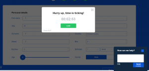
This game might be the answer to weaning myself off my internet addiction! If all my interactions online involved this level of frustration I would take up knitting. The game’s graphic user interface (GUI) is horrible. Interacting with it is incredibly frustrating. I made slow progress through the various form filling activities, figuring out cheats as I repeated my efforts, before eventually giving up after 10 or more attempts. I got as far as the third page but concluded I was never going to be quick enough to match the date of birth with the number slider on that page.
According to thedarkpatterns.uxp2.com website: “Brignull defines “dark patterns” as instances where designers use their knowledge of human behavior (e.g., psychology) and the desires of end users to implement deceptive functionality that is not in the user’s best interest.” (2021) I appreciate what Brignull is trying to do and the examples he provides are helpful. I have personally fallen victim to several of the dark patterns listed on his website (e.g., Privacy Zuckering, Hidden Costs, Forced Continuity). However, there is something about his definition and the notion of what is in a ‘user best interest’ that throws me off a little. I do not think we should or do expect all businesses to act in our best interest. There is a whiff of nannyism about such an idea. However, when a business markets itself as caring or a ‘public good’ but acts in another way, it is reasonable to shine a light on how their actions contradict their public statements.
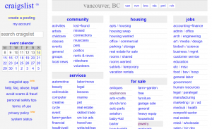
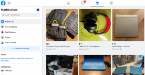
In order to reflect on how web and interaction designers employ practices to lead the attention of people towards or away from certain elements in digital environments, and to promote or discourage certain kinds of behavior I have decided to examine my own journey from occasional craigslist user of many years to recently regular facebook Marketplace (fM) user (despite the fact that several years ago I gave up using the main facebook site for any kind of social media). I used craigslist when I had a specific need to buy or sell an item locally. I bought and sold, for example, my kids’ bikes on craigslist. In all the time I used craigslist I never felt like I was spending a lot of time on the site or that I was being distracted by the machinery it used to display the items. Its user interface might be described as functional, plain, text heavy and not the simplest to navigate. Its pages are mostly white, when images of items are displayed they are not attractively framed and the font used, at least to my eye, is not very appealing. In contrast fM has a much more appealing design layout; using a good combination of pleasing colors and text, images that are nicely arranged and search bars that are easy to navigate. This is even truer if we compare both platforms displays on mobile devices. fM is aesthetically more appealing than craigslist but this is not the reason that it has stolen my attention.
fM personalizes the buying and selling experience much better than craigslist. It provides a small amount of information about how long the person you are buying or selling from has used the site; what other items they have for sale; which groups they belong to; more precise mapping of where they are located and; if you have friends in common on the site it will inform you of this. This information gives a buyer a little more trust in the seller; this may of course be a false impression. Additionally, communicating (messaging) with an individual is typically quick and seamless on fM. Craigslist, by contrast, does very little to dispel the impression that you are buying from an anonymous stranger. fM seems like a smarter way to shop than craigslist but this is not the reason it has stolen my attention.
The reason fM has stolen my attention is because of its sophisticated use of recommender systems. facebook is constantly gathering information on its users and using this to among other things suggest additional content. While shopping for a used couch it might also be suggested to a user that they consider related items such as armchairs. Every time you log on to the site the homepage will display an array of potential purchasing items based on your most recent searches. Some of these items you may have directly searched out and some may be only tangentially related. From armchairs to camping chairs that you did not know you wanted until you saw them displayed on your feed! I do not have push notifications turned on for fM, which protects me from even greater distraction, but even without those reminders I still find myself drawn to the site much more than I ever did when using craigslist. Somehow I allow this to happen despite knowing what I do about facebook and listening as I have to the Wall Street Journal’s recent expose, the facebook files.
References
ux2p Dark Patterns. (2021, November 14). ‘The dark side of UX Design’ https://darkpatterns.uxp2.com/
This is a great post Derek!
I, too, have gravitated to using facebook marketplace even though I do not really use facebook at all. You have really contextualized this weeks task. I really enjoyed reading.
Hi Mandy,
Thanks for reading my post and commenting.