Task 7 – Mode-Bending

I contemplated using TikTok for this task as I am not a user and wanted to see what the hype was all about. However, I decided against it for 2 reasons:
1. I am aware of the privacy concerns with TikTok and although I really don’t think any of our devices and apps are fully secure, I decided to avoid adding one more app to the
2. I didn’t want to get sucked into the TikTok culture and waste my summer days scrolling through mindless videos. I’m aware that there is some really creative and informative content on TikTok, but for now, I’m going to stay away.

I did want to try out a new tech tool that I haven’t used before, so after some handy Google work, I decided to try the Adobe Spark Video App for the iPad. It’s a really basic video making tool that allows you to blend photos, videos, icons and audio to create audiovisual presentations. I found it to be very user-friendly and although I am used to having more creative control with my video editing through Final Cut Pro and iMovie, I appreciated the limited options as it forced my creative mind to keep focussed with a more streamlined approach. This would be a great tool to introduce to my primary tech students as an introductory video creation activity.

Check out my video below!


Design by Liana Ranallo

Task 10 – Attention Economy

“User Inyerface – a bagaar frustration” 

At the onset of this task, I was prepared to be confused. After simply reading the title and tagline, I knew the intention of this game was to manipulate my mind and purposely cause confusion throughout the game. I am always up for a challenge, so I removed all distractions and began to focus on the task. I think that lowering expectations is the first part of attempting success in a task such as this where we have prior knowledge of the potential challenges we might face moving forward. We generally expect things to work and function at their best. We live in a society where everything is instant and curated to be the most user-friendly, that we expect all digital interactions to work efficiently and effectively. And when they don’t, we are easily frustrated, annoyed and are likely to either abandon the task, or find a new task that is less challenging. It makes me think about the time I moved to Italy and had to go to the post office. I spent 40 minutes in line, in a poorly ventilated room, on a scorching hot summer day, everyone sweaty with papers fanning themselves, only to be told they were closing for lunch and I had to return after lunch. Coming from a country where we didn’t spend much time waiting for service (granted this was over 15 years ago, pre-covid), have the privilege of air-conditioned buildings, and where services didn’t close down for lunch breaks, it was all new and frustrating to me.  Once I understood the way their system worked, I adapted my ways of acting in order to feel less frustrated and have a positive experience. The ability to adapt – a necessary life skill and tech skill.

As I began going through the steps of the game, I knew I was going to have to adapt my thinking, read each detail very carefully and maintain a positive attitude in order to complete the task. Instead of the logical UI I expected from other media platforms, I would require more attention to detail on this task. The term “The ADD (Attention Deficit Disorder) Generation” has been given to Millennials because of how they have been “debilitated by the availability of hyper stimulating new media.” (Senk, 2014). Senk further suggests that students have come to think of “extended processes like reading solely in terms of an endpoint: to have the answer, and to have it now.” The game “User Inyerface” is an example of our need to have the answer now. It challenges our ability to focus on the extended process of reading, rather than the visual cues that is typically offered through intelligent UI design. 

Although maintaining the positive attitude was a bit of a challenge after repeated failures with some of the tasks,  I did manage to complete the task in 10 minutes and 53 seconds. Some of the areas that were most problematic for me included the following :

  • Site Cookies: the use of large button to attract the user, even though it was the incorrect response.
  • I Immediately noticed the NO button. Again, use of correct buttons with incorrect answers purposely used to confuse the user.  
  • Age – the months were all out of order which caused the user to slow down and go through each month rather than  
  • Help box – when I started getting frustrated I thought I’d elicit the use of the Help box. Only to receive a response  for me to wait as there were 471 people ahead of me, yikes! This part did make me laugh though.
  • Speed of movement – When I sent the help box to the bottom, it took a very long time for the box to disappear, and then it kept popping back up. Frustration continues!
  • Timer Popping Up every so often reminding me to Hurry! 
  • Personal Information: I didn’t trust this site, so I purposely chose not to input any factual information, until it told me my age and birthday didn’t match. How was I to know that my personal information would not be used to sell to other platforms? How was it going to be secured? Lack of important information. 
  • Once I clicked in a box, you had to delete the words there instead of just type the response and couldn’t use a tab function to move to the next box. Poor design feature that was purposely created to take up more time to complete the task. 
  • Gender – was told gender didn’t match. Huh? 

Although I was not familiar with the term “dark patterns”, after reading Brignull’s (2010) article, and understanding that it is a deceptive tactic that humans use to “manipulate, control and profit from each other,” I now understand what the term is referring to. I experience this type of UI deception regularly when searching for free images to use for my work or personal designs. The webpages for ‘free’ are now inundated with a variety of ‘download here’, ‘download now’, ‘click here’ buttons and it is a game of Whac-a-Mole in order to actually access the free download file. By that point, we as consumers have clicked on numerous ads that have allowed the site to profit on our frustration or lack of attention. We witness the use of dark patterns on a daily basis on the world wide web and the depth of artificial intelligence that manipulates our interaction with web and app-based media. Much of the latest versions of Social Media platforms that were originally intended for friends to keep in contact, are now filled with curated ads, page suggestions and influencers ready to profit from the users. All it takes is a quick slip of attention to accidentally click and find yourself visiting the page of someone you never met or a company ready to sell you products. The never-ending ‘sign up for free’, followed by credit card information and incessant emails or the added fees as pointed out by Brignull, are just some of the clickbate we are inundated with in this digital age.

Although this game was entertaining, it was also educational in how UI design is being used to manipulate users. Large corporations are out for profit, and although they may ‘unintentionally’ create dark patterns, it is up to the users to be educated about these patterns, avoid falling victim to them and call them out in the hopes of creating necessary change. 

References:

​​Brignull, H. (2011). Dark Patterns: Deception vs. Honesty in UI Design. Interaction Design, Usability, 338.

Senk, S. (2014). Attention to the text: Delay and the “ADD generation” The Project. doi:10.1353/tnf.2014.0022

Golden Record – Network Assignment

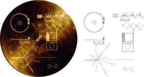
This is how I manipulated the data points to show all the tracks on the outer circle, in numerical order.

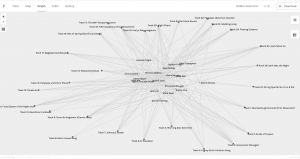
The follow up to the first part of the Golden Record Curation assignment invited us to use the Palladio app to interpret the data collected via a dynamic visual representation. I personally found the data presentation to be overwhelming at first glance. The labels used to represent the data were the first hiccup as I was required to decipher what the facets, edges, nodes and other titles were referring to. All the data was represented by dots and I immediately thought, ‘I would have preferred to have the song names and people represented by different symbols or colours to help provide a better visual for my thought process.’  

At this moment, my mind went to Howard Gardner’s Theory of Multiple Intelligences (Garder, 1983). Although his theory is flawed, I do believe each of us hold certain strengths in learning and are challenged in other areas. I would consider one of my areas of strength to be Bodily-Kinesthetic Intelligence and immediately felt the need to physically move data points around to help me interpret the information. 

I played around with the Settings option and discovered the Side Nodes feature. I decided to simply click and drag each track out to the edges to keep the tracks on the outer edge, while being able to see how many people interacted with each track. Once I was able to physically manipulate the chart for my own ease of understanding, I was actually able to better interpret the data being presented. When I couldn’t move one of the nodes as the dot representing it was so tiny, I realized they were different sizes for a reason (insert lightbulb moment here). At this point, everything made much more sense and I was able to easily visualize the popularity of each piece of music. I was unable to view my data in connection with the group as I was hospitalized and am catching up with my coursework, however I did compare my selections with the most popular songs and uncovered that I included all of the top song selections in my own playlist. These included:

  • Track 3 – “Percussion (Senegal)”, 
  • Track 9 – “Tsuru No Sugomori – Crane’s Nest” 
  • Track 11 – “The Magic Flute” 
  • Track 18 – “Fifth Symphony”
  • Track 23 – “Wedding Song”

Although I was not privy to the rationale behind the other participant’s selections, the overall popularity of these particular tracks demonstrate the diverse nature of each song, and the importance of their unique representation to our planet Earth. Beethoven’s Fifth Symphony definitely stood out as a favourite piece, which to me indicates the impact that one piece of International music has had on generations of people, and the ability for a wide variety of individuals to make a connection with one song. 

I was also interested in seeing which songs were selected by either no one, or a small number of participants. I discovered that only 2 or 3 individuals selected the following pieces of music:

  • Track 8 – “Men’s House Song”, 
  • Track 27 – “String Quartet in Bflat”, 
  • Track 17 – “The Well-Tempered Clavier”. 

It made me wonder if the same people selected these less popular songs, and what criteria they used to select these pieces. Without the direct ability to access their criteria, it is next to impossible to understand why these pieces were selected by only a small group of individuals. 

I further looked into the communities and used the Nodes feature to again spread out the tracks to better see the connections. With this visual representation, I was able to interpret the following:

  • Community 1 (Most popular Tracks): I found this group had the least amount of connections: 3, 7, 11, 18, 24 – with many individualized songs selected by the participants
  • Community 2 (Most popular Tracks): 5, 20, 23, 25
  • Community 3 (Most popular Tracks): I found this group to have the most connections with at least 3 or 4 people choosing the following tracks: 1, 2, 3,  9, 10, 11, 16, 18, 26. Perhaps this is the community I would have been added to based off of my song selections.
  • Community 4 (Most popular Tracks) : 18, 20, 24, 25

I can see how the app may have created these communities using the most popular tracks to associate them together. I was also trying to decipher if the data provided included songs that were not selected, as that too could have tied the individuals together in a community.  All of these connections are simply based on a mathematical equation and demonstrate the who and what of the community connections. What it is unable to provide is the why, the rationale behind each individual’s choice and how that logic was used to make the selections. 

Overall, I enjoyed learning about this Golden Record Curation as I was unaware of its existence. Participating in this assignment and using the Palladio app was a learning experience that allowed me to understand more about connecting and interpreting data. When watching the video of “The Internet: How Search Works” and relating it to this assignment, I recognize the role that algorithms play in modern day data collection, management, analysis and interpretation. Just as an algorithm was used to create communities in this activity, search engines use the data we provide them to place us in their own ‘communities’ which they determine are relevant. Although advertising, corporate money and politics play a considerable, yet perhaps less obvious role in the curated communities we are part of on the internet, in the end, we are all just little dots of data in the world wide web on this amazing place we call Earth. 

References: 
Code.org. (2017, June 13). The Internet: How Search Works. Retrieved from https://youtu.be/LVV_93mBfSU

Gardner, H. (1983). Frames of Mind: The Theory of Multiple Intelligences. New York: Basic Books.

Golden Record Curation

The Golden Record – The most epic album of all time.

After listening to the podcast and reading more about The Golden Record, I was intrigued to compile my curated list of 10 songs that I determined would best represent the music on our planet Earth. In the podcast, Voyager Golden Record, Timothy Ferris, who led the music selection for The Golden Record, stated that he wanted to select music that represented strong mathematical features and could properly introduce us by representing our human values. 

When listening through the list of songs included in the Voyager record and deciding how to narrow down my capsule to 10 songs,  three notable factors played a role in my selection process:

  1. The Country of origin
  2. The selection of musical instruments used in the piece 
  3. The emotional response the piece of music elicited 

Unlike Timothy Ferris, I did not attribute a mathematical element to my collection as to me, music is an emotional rather than logical experience. Because music is an artform which can elicit different responses from different people, it is naturally challenging to have the same experience as another person, let alone another lifeform. Still, I wanted to use music that represented a variety of emotions including joy, fear, calm, excitement, melancholy and serenity.  I found it challenging to choose only 10 pieces that represented all parts of the Earth while also representing different emotions and exhibiting unique instrument sounds. I wanted to ensure that there was a variety of musical instruments from the different instrument families (percussion, string, brass, woodwind), including both female and male vocals. It was challenging to encapsulate these criteria with only 10 pieces, while equally representing the different geographical locations across the globe.

According to the Nasa website, songs on the Golden Record were “selected to portray the diversity of life and culture on Earth”. With that in mind, and using the criteria aforementioned,  I chose to represent the diversity of Earth’s people, cultures and sounds with the following 10 selections:

  1. Greetings from Earth –  To represent all the language sounds experienced across all geographical regions of our planet.
  2. Bach, Brandenburg Concerto No. 2 in F. First Movement, Munich Bach Orchestra, Karl Richter, conductor. 4:40
  3. Australia, Aborigine songs, “Morning Star” and “Devil Bird,” recorded by Sandra LeBrun Holmes. 1:26
  4. Mexico, “El Cascabel,” performed by Lorenzo Barcelata and the Mariachi México. 3:14
  5. “Johnny B. Goode,” written and performed by Chuck Berry. 2:38
  6. Japan, shakuhachi, “Tsuru No Sugomori” (“Crane’s Nest,”) performed by Goro Yamaguchi. 4:51
  7. Peru, wedding song, recorded by John Cohen. 0:38
  8. Senegal, percussion, recorded by Charles Duvelle. 2:08
  9. Beethoven, Fifth Symphony, First Movement, the Philharmonia Orchestra, Otto Klemperer, conductor. 7:20
  10. “Melancholy Blues,” performed by Louis Armstrong and his Hot Seven. 3:05

References

NASA. (n.d.). What are the contents of the Golden Record?. Voyager. https://voyager.jpl.nasa.gov/golden- record/whats-on-the-record/

Taylor, D. (Host). (2016-present). Voyager Golden Record [Audio podcast episode]. Twenty Thousand Hertz. https://www.20k.org/episodes/voyagergoldenrecord?rq=golden%20record