
Task 9: Network Assignment Using Golden Record Curation Quiz Data
In task eight our class of 23 students took the Golden Record compilation of 27 of earth’s greatest musical hits selected for Nasa’s Voyager satellite and were tasked with narrowing that selection down to 10. To do this, one had to employ some bias or methodology, whether that be by personal preference or some set of metrics. This week in task nine, we got to explore our choices in relationship to others. With the aggregate meta data of the survey provided by our professor we utilized the Palladio tool developed by Stanford University Humanities department through a grant project. This tool allows us to see graphical connectivity in a unique way from other tools.
When we upload our data set the default graphical representation is based on the community including both the target (songs) and the sources (students) and the edges or the connective relationship between them. This is an undirected, weighted graph as the spatial representation is abstract, but the size of the nodes and the number of edges is directly correlated to the intersecting relationships. From this representation we can start to have a different understanding of our own data that we could not otherwise.
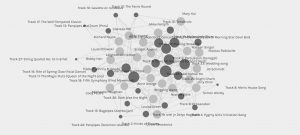
We can manipulate this representation to show different types of relationships in a graphical representation. For example, if we filter this down into ‘communities’ of targeted music as a function of the quantity of edges connecting the nodes, we can almost see a representation of musical genres take form.

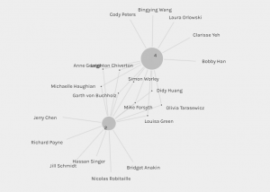
If we want to analyze the relationships between participants and create a community of nodes that represents a common thread of edges, we can do that too. If we want to filter it down further using the facet function which allows you to filter a subset of the data, we can. For example, if we want to look at the relationship between the two most popular songs (Track 25: Jaat Kahan Ho and Track 18: Fifth Symphony) first and second respectively, who selected them and the connections between who selected them both it would look like this.
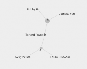
Interestingly I find myself at the adjacent node between two of the least popular selections (Track 27: String Quartet No. 13 In B Flat, Opus 130, Cavatina and Track 17: Bach, The Well-Tempered Clavier.
I spent a long time playing with the functionality of this tool and had a hard time disassociating my mind from trying to identify a correlated spatial representation of the data, but at least in the graph tab this data is a representation of relationship. While it is weighted and counted it is not a directed graph regarding points and places between nodes. Had we included such data at the geographical location of both the songs and the timeline of the music, we could have used Palladio to Map out the spatial relationship over time and space in a directed graphical representation.
The Palladio tool helps us to identify relationships, but it cannot identify the reasons why those exist, only that they do. To establish the why, we would need to survey each participant about the method they used (if at all) to make their selections. Reading some of my colleague’s work, I believe they did use a set of criteria. Admittedly, I went on pure feeling, however I now realize that my choices were not consistent for task of submitting the survey which I did on a different day than my reflection piece in my blog. In the absence of a strict methodology, like in my case, perhaps an in-depth survey about why the person felt they way they did about the pieces of music along with metadata about their background might shed light on a theory that could be represented using this tool. Palladio as powerful as it is, can only find, filter and represent relationships using graph and network theory.
I do not believe there is a large enough data set for me to draw any conclusions about the political implications of the music selection groupings. I find it impressive that of the 23 participants all 27 pieces of music were selected multiple times. I believe this is a testament that every piece of music selected by the NASA scientists was no doubt a beautiful representation of humanity. I do wonder however how much they would have access to globally in 1973 as opposed to 2023. For example, there is a lot of African music I love, but I didn’t select the pieces from the Voyager selection, they just weren’t the best examples to me of some of the incredible representations of African music. Even with the European classical, as I mentioned in my last blog post, none of those pieces would have been my first choice and it was hearbreaking that some of the best materpieces were left out in my opinion. I think it is a very subjective matter. The fact that there is such a wide representation, clearly speaks to the spirit of hope and unity. Even at the height of the cold war, they included pieces from radio Moscow. I wouldn’t dare to assume any political implication. Perhaps if each participant were now asked to select their own 27 pieces, it would be fairer to draw certain inferences.
Resources
Backgrounder on the Voyager Golden Record: https://voyager.jpl.nasa.gov/golden-record/whats-on-the-record/music/
Palladio Tutorials & FAQs: https://hdlab.stanford.edu/palladio/help/
References
Systems Innovation. (2015, April 18). Graph theory overview [Video]. YouTube.
Systems Innovation. (2015, April 19). Network connections [Video]. YouTube.