I learn best when I can see the direct results of my work, which is one of the reasons why I find working with GIS rewarding. I am able to see the results of my work in the form of a map. I’m continuously surprised at the pride I feel in relation to even the simplest of maps when I am the mapmaker. The quality of my maps improved over the course of these past months, but there is still lots to learn.
Category: GEOB270
Assessment of Northern BC Pipelines
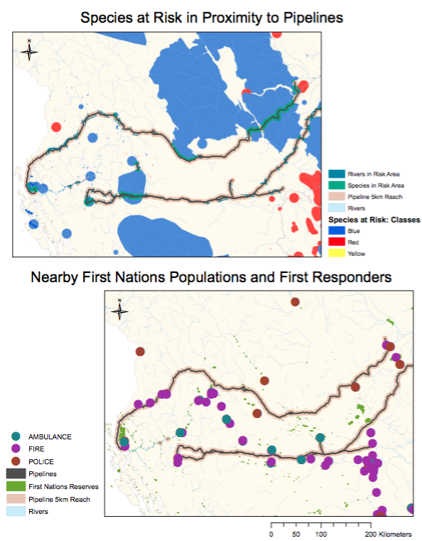
This study analyzes two pipelines transporting Liquid Natural Gas (LNG) across Northern BC to the coast. The location of these pipelines affects a number of species at risk and First Nations populations. 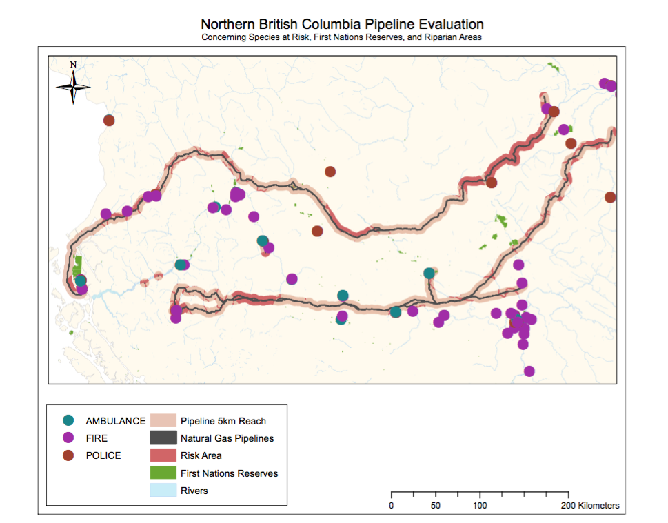 Additionally, we chose to include the location of all first responders in the area to determine the safety of these communities. We established a 5-kilometre buffer zone around the pipeline to account for the reach of any type of spill. The goal of this study was to determine who is most affected by the location of these pipelines and establish an understanding of the situation of these pipelines. This was accomplished through a series of analysis using ArcGIS to create 3 maps, each emphasizing a different aspect of the project. The first shows all the elements previously discussed like First Nations communities, First Responders, Species At-Risk, and the pipelines. The second and third maps are intended to highlight the biological and social implication respectively.
We conducted all of the analysis as a group of three sitting around one computer working on one map. I found this very useful because each of us was able to share at least one skill or trick with the group. It facilitated the process of creating a map completely from scratch. I learnt a lot about the value in working together because it allows you to examine things from an angle you might not otherwise consider.
Environmental Impact Assessment: Garibaldi at Squamish
The Garibaldi at Squamish is a proposed development project for a year-round resort 15 km north of the town of Squamish. There main focus of the resort is a ski hill. According to the plans it would take 20 years to build and create 900 construction jobs during development and 2500 service jobs after completion. There is some concern over the economic viability of the resort due in part to chancing climate and environmental conditions. Since 1974, it has been reported that skiing under the elevation of 555m above sea level is no longer viable due to the changing climate. Given current day understandings of climate change, this number has been increased to 600m. I am a natural resource planner hired by the BC Snowmobile Federation to examine the Environmental Assessment’s recommendations and Whistler’s criticisms to evaluate 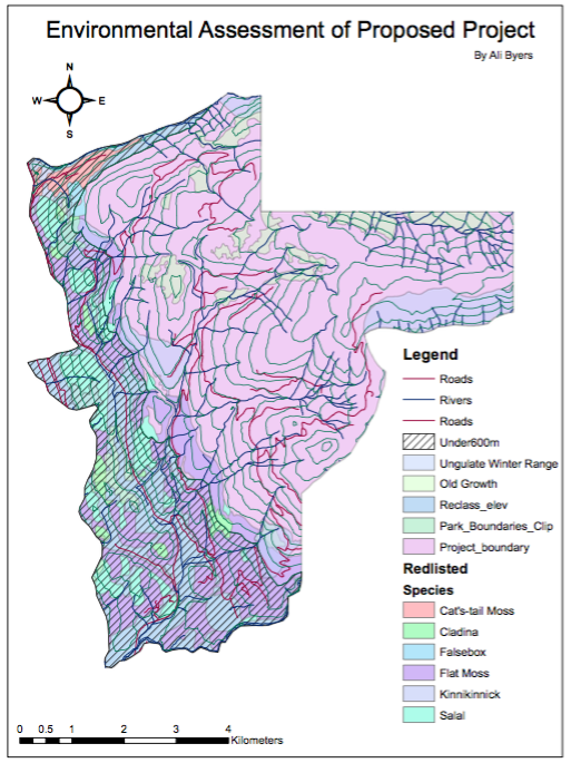 whether or not I can condone this project. Currently, I am opposed to it, but perhaps this analysis will prove support the project’s development. To determine whether or not this project is a viable option in term of the surrounding environment I will analyze available data using GIS software.
To conduct a complete environmental assessment we must take into account the species living in the proposed park area, the elevation scheme, the distribution of fish-bearing streams, and the presence of old growth forest areas. All of this data can be found on the province of BC’s website. I found layers of data related to old growth forest management, species winter habitat range, endangered species, river systems, and elevation as well as the park boundary coordinates. I delineated all the layers using the park boundary to only show information relevant to the park. I then sorted the data to obtain the areas of each consideration in question. For example, I calculated the percentage of old growth regions in the park. The total percentage of the area of the park affected by the various environmental factors is 46.5% and out of that 31.8% of the land is below 600m. Give than quantity of land below 600m combined with the amount of red-listed species and old growth management that 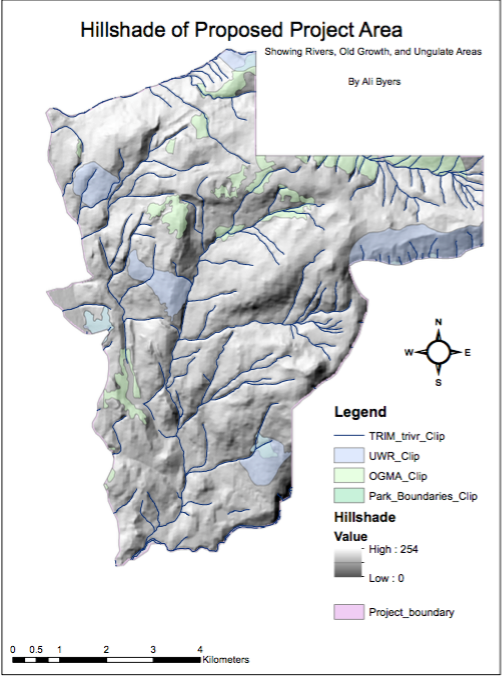 would be affected I can’t condone the development of the project. Economically it wouldn’t be viable because there isn’t enough land to ski on. In my opinion, the elevation and the lack of sufficient snow for skiing is the greatest environmental concern. Second to that is the disappearance of endangered species habitats. In my opinion, these are the most important environmental factors. Unfortunately there is no way to mitigate the elevation however; the red-listed species could be put in protected areas of the park as a form of mitigation.
In this case, I personally agree with the findings of the report and of these maps. However, as a proud environmentalist I can see how it would be difficult to be impartial in conducting assessments like this. I expect that I will find myself working against my own values in the future if I continue in this field.
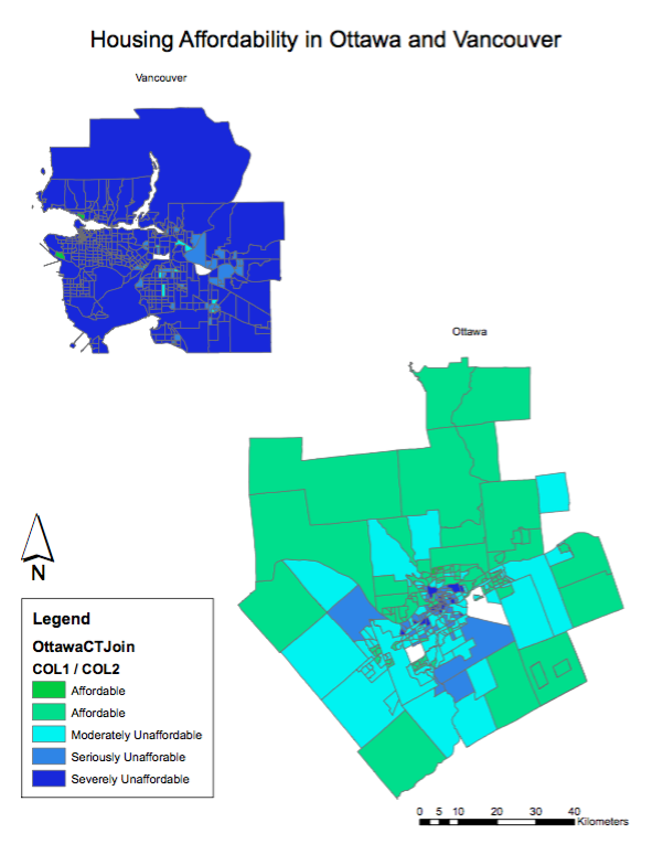
Housing Affordability: Ottawa vs. Vancouver
Affordability measuring takes into account the mean income in the city and compares it with the average cost of a house to evaluate whether or not the average person can afford to buy a house. It is a better indicator than just housing cost, because it tells you who is buying these houses. These categories come from StatsCan and therefore are quite reliable, for example if they came from the City of Vancouver and they were telling us Vancouver was very affordable, that would be less trustworthy. Livability of a city is a very subjective term, because Vancouver is repeatedly ranked as one of the most “livable” cities in the world, yet it has the least affordable housing market in Canada. Therefore, affordability does not equate with livability and is not a good indicator.
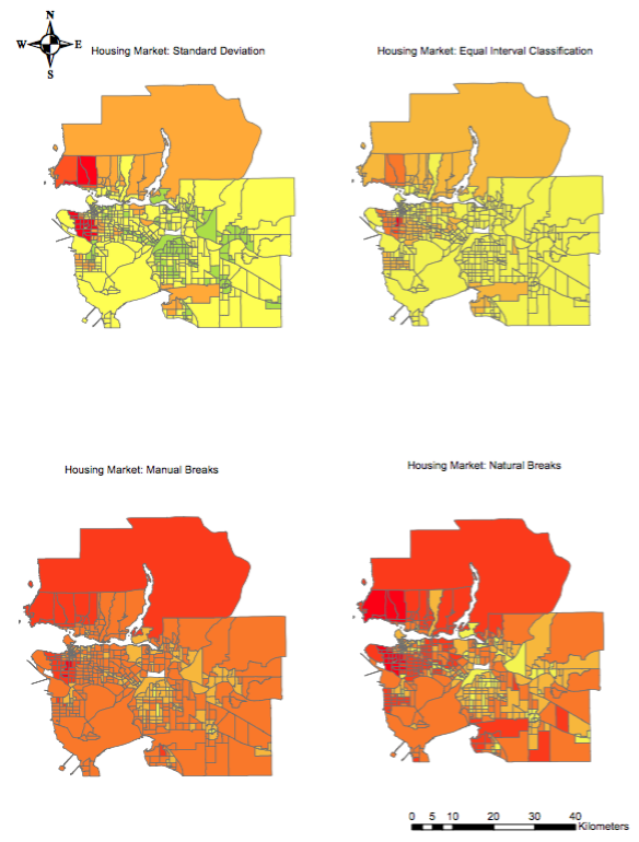
Quantitative Methods Demonstrating Vancouver’s Housing Crisis
Each quantification method highlights a different aspect of the data. The manual breaks show how skewed the market in Vancouver is and highlights the high costs of housing. On the other hand, the equal interval map makes it seem like housing in Vancouver is reasonable and equally distributed. Standard deviation shows a relatively evenly distributed housing market, whereas natural breaks method shows the relative cost of the housing market and demonstrates how expensive the entire city is. Each method pushes the data towards a certain conclusion and therefore shows how data can be manipulated and used to create knowledge.
Tsunami Risk in Vancouver
Approximately 15% of all of Vancouver’s land mass is at risk in the event of a tsunami. This percentage was determined by creating a layer for the City of Vancouver and using the attribute table to determine the area of the layer. Then a separate layer was created to illustrate the areas of Vancouver in danger in the event of a tsunami. These areas are either lower than 15m of elevation and within 1 kilometre of the shore. The total area for this layer was also determined and these two numbers were divided to determine the percentage of the city that is at risk to a tsunami.
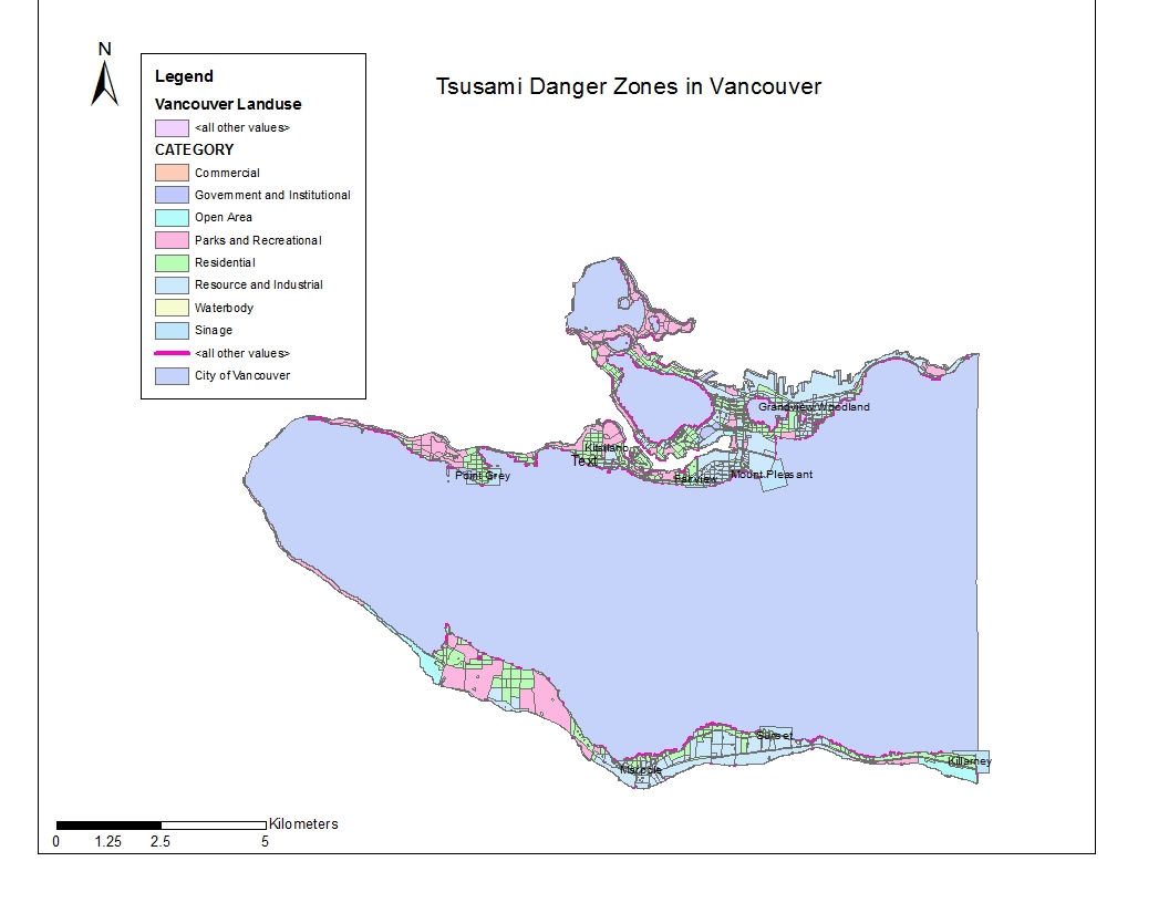
There are certain educational and healthcare facilities that are found within the tsunami risk zone in the City of Vancouver including, but not limited to Point Grey Private Hospital, False Creek Elementary School, and the Royal Canadian College. To determine this, vectors of all the educational and healthcare facilities in Vancouver was added to the map and then intersected with the danger layer to show which facilities are in danger.
ACCOMPLISHMENT STATEMENTS:
Learnt how to combine different layers to create one layer demonstrating a number of aspects.
Expanded knowledge of the social-economic potential of ArcGIS in relation to natural hazards.
Gained experience converting data sets from raster to vector and vice versa and deepened an understanding of the difference between the two.