Why Get Physical?
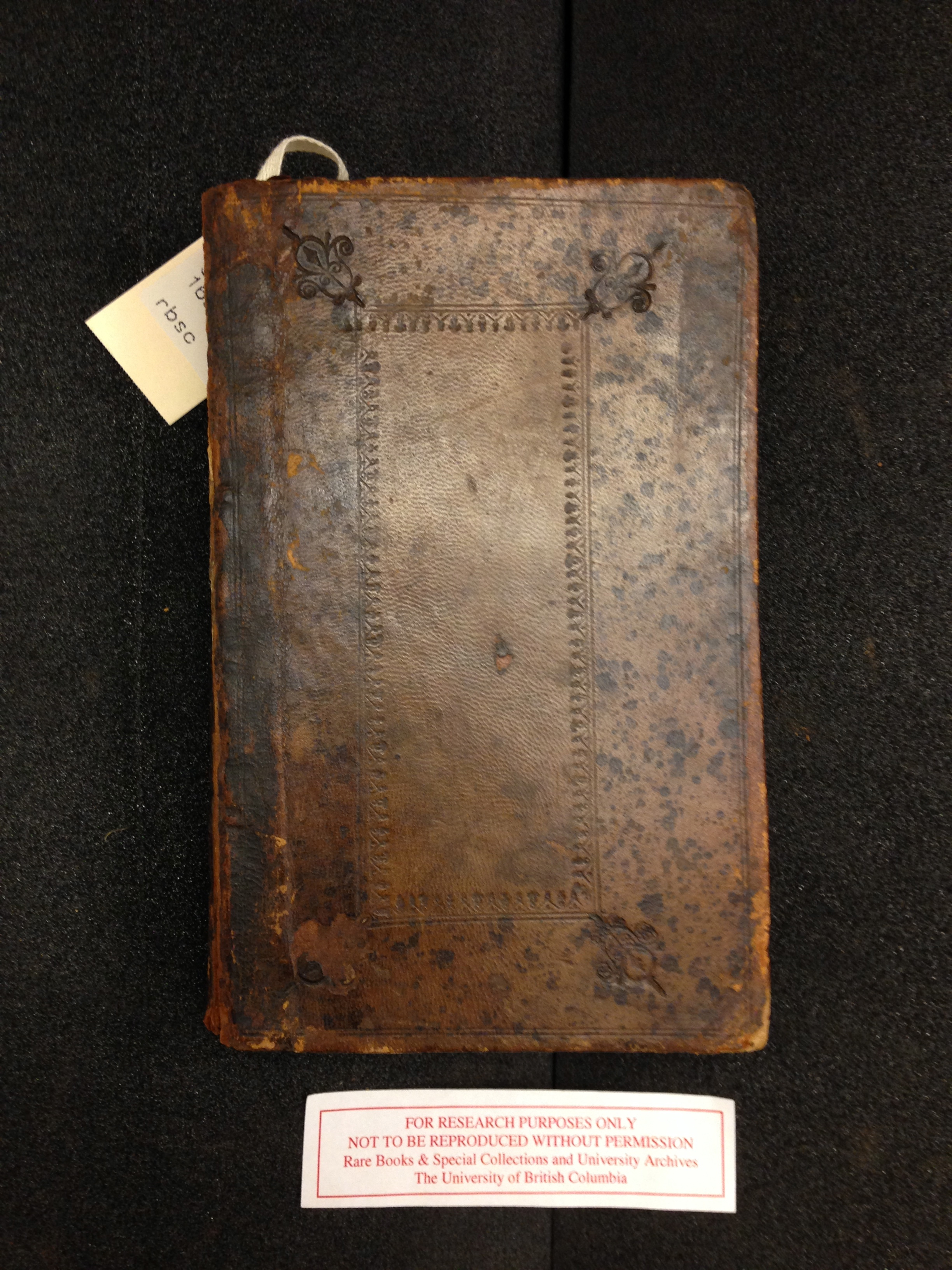
The front cover of The Family Dictionary.
At first glance, the copy of The Family Dictionary held in UBC’s Rare Books and Special Collections makes for a fairly unassuming object. Spotted with age, its former grandeur seems to have been lost over the years: its leather cover is warped, the decorative embossing is misaligned, and the front cover has come loose. Reminiscent of a well-used sofa, its subtitle, “Household Companion”, is perhaps a better descriptive fit for the worn brown exterior that bears the marks of its age and use.
Not too shabby for something printed in 1696, however. Looking at this time-worn object, I was struck by how long of a life it has lived – I could not help but wonder what kind of people had owned it, how they had used it, and how it happened to pass from generation to generation of book owner and collector. It would be interesting to see two different copies of this ancient book to compare how they fared through time; unfortunately, UBC only owns one copy, so this particular analytical avenue was unavailable to me. (There are digitizations of the same edition available online through the Early English Books Online (EEBO) database that offer an opportunity for comparison of the digitized text and layout, however – more on that later.)
What I find interesting is what the physical characteristics of even one book can tell us about its intended audience and how it was marketed to them, how it was read and used, the contemporary conventions of book production, and the life and personality of its author. More broadly, of course, these things can then illuminate what everyday life was like for people reading, what the social and political atmosphere of the time period entailed, and what current commonalities we can draw from studying a specific historical time period through its literary artifacts.
The Mystery of the Missing Page
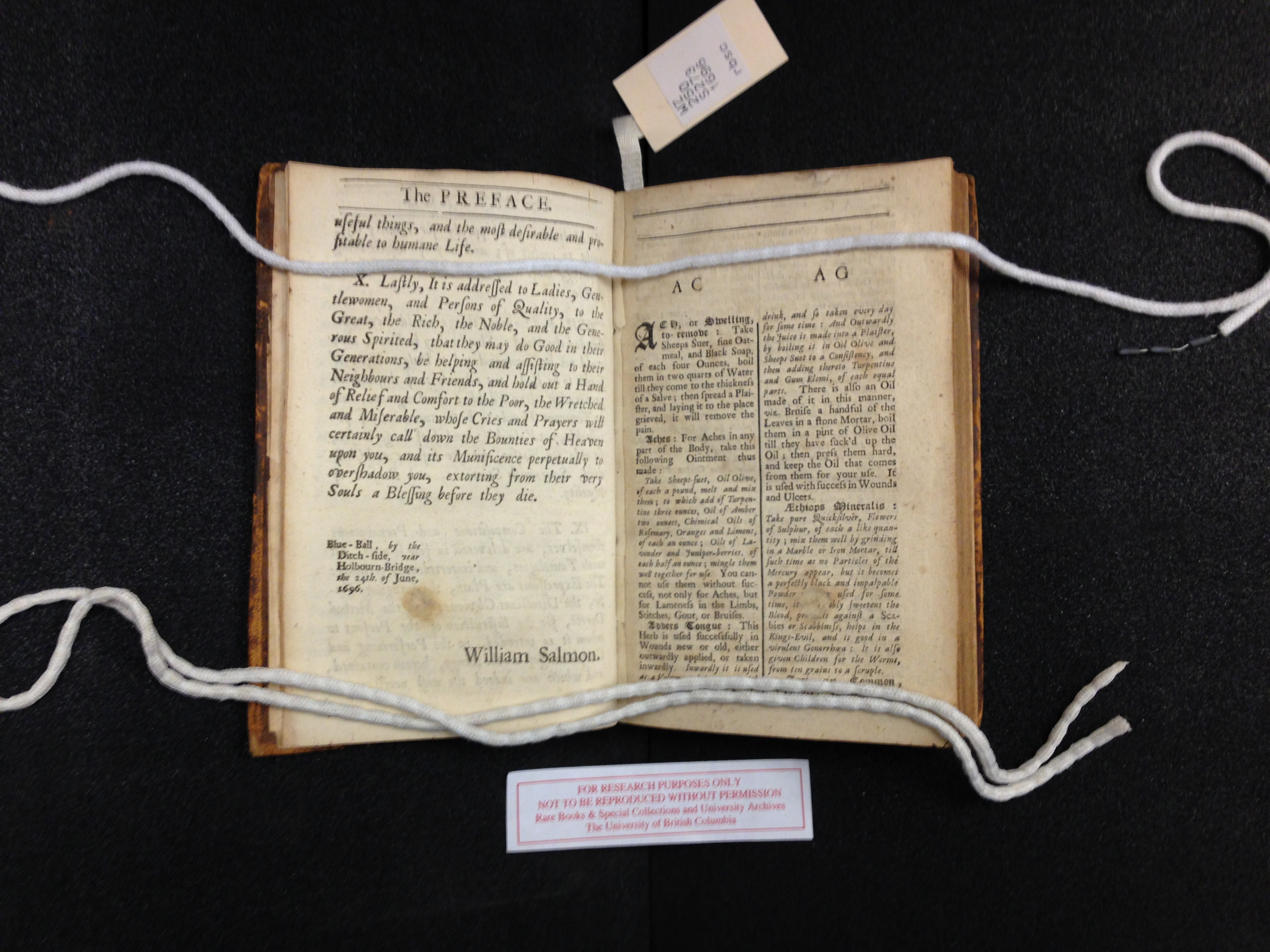
Click on the photo for a closer view of the evidence of the missing page.
In the specific copy of The Family Dictionary that I had the opportunity to study, I noticed that the page after the preface has been cut out: this is evidenced by a thin tab of paper sticking out where the page was originally bound to the rest of the text block. Page cutting is an inevitable finding in the study of old books, and the motivations for it can often be quite revealing when considering the book as both an economic and a visual object. More elaborate manuscripts are often harvested for their illustrations, which are prized for their beautiful, intricate, and skillful renderings. On the underground book market, these free-floating book leaves can fetch a hefty price, sometimes more than what the intact book would itself be worth. Historically, collectors have sometimes curated their own literary scrapbooks, crafted from pages and excerpts of books, to display and preserve their interests and bookish inspirations. When I came across evidence of a cut page in The Family Dictionary, I couldn’t help but wonder if someone had harvested it with similar intentions as those described above.
Of course, I had to investigate this mystery: I checked the page against the digital editions on the EEBO database to see if the missing page was there. I found that the pagination on the digital copy was different from the physical copy, suggesting that these copies were from different printings; as such, the pages did not correspond exactly. However, I did discover a feature on the last page of the preface in the digital version that was missing from the printed copy: an advertisement extolling “The Virtues and Uses of the True Balsam de Chili, to be had at Dr. Salmon’s House, at the Blew Ball by the Ditch side, near Holborn-bridge, London”. Perhaps in the printed copy this advertisement had its own page, and it was subsequently cut out. When, for what reason, and by whom is unknown.
Typography
The choice of typeface on the digital interfaces that we are used to can be overwhelming – supplied with a hefty stock of preloaded fonts in most computer programs, we are only limited beyond that by the number that we are willing to download (and only rarely pay for). In the era when books were printed with physical type, however, financial considerations tended to act as a limitation of choice – or at least, an indication of some of the economics of book production. The cost of purchasing and storing the fonts, as well as employing workers to print with them, meant that large-scale book production was not something to be taken up without a strong financial incentive.
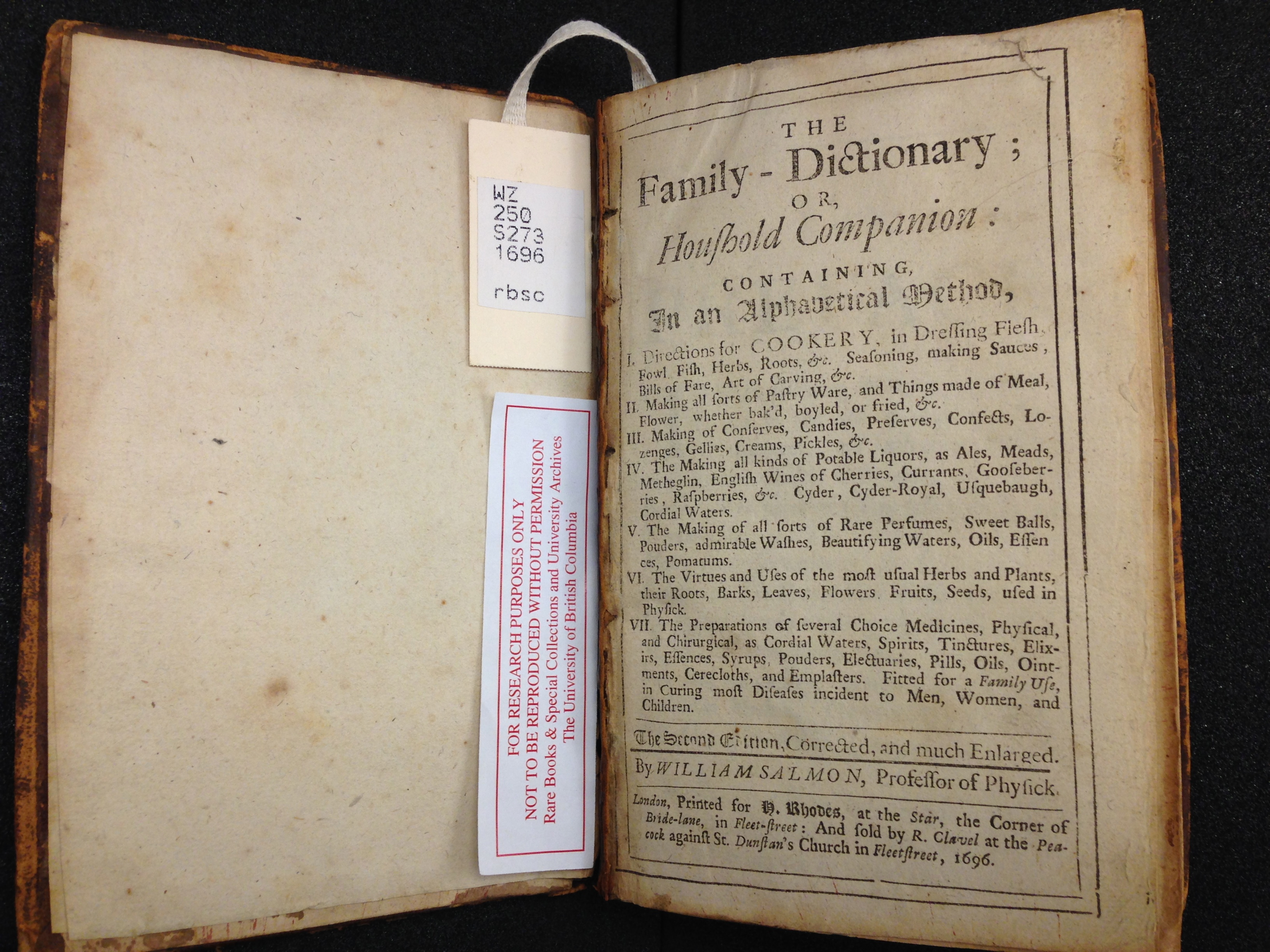
The title page of The Family Dictionary, with its large array of typefaces.
This came to mind when I opened The Family Dictionary to the inside cover page – the plethora of different typefaces was striking. I counted ten different variations in size and style: small, large, italic, bold, Roman, and Gothic in various combinations. In a word processing program, changing between these styles would be a simple matter of selecting the text and adjusting the style, but in analog printing methods, one would have had to possess enough individual letters of each font to spell out all of the words that one wanted to print. This was an expensive as well as a time-consuming venture. The number of editions and printings that The Family Dictionary went through probably meant that someone deemed this investment to be worth it – it was clearly a popular (or, at least, a much-printed) book. (More on this here.)
Aside from revealing aspects of the book’s economic context, the typography serves a visual purpose – it is used to emphasize the title and author’s name, and make other notable pieces of information stand out, ensuring an impactful introduction to the rest of the book.
Organizational Features and Eccentricities
This dictionary of culinary recipes and home remedies is organized in alphabetical order in double columns. The relatively small font allows many different recipes to fit on one page, and each title is emphasized by its bold Gothic typeface, allowing recipes to be looked up alphabetically by their most prominent ingredient. (The second edition lacks a more precise index that would allow one to cross-reference recipes by common ingredient; however, this addition is present in the third edition of the book that came out nearly ten years later.)
Page numbering begins somewhat haphazardly on page 17, at the end of the “AP” section. I would speculate that this could be the result of a printing error that was not noticed until later, but it could also potentially be due to a shortage of numbered type with which to print the page numbers. This is only my tentative guesswork; what I find more interesting is that these possibilities speak to the physical processes of organizing and setting type and printing a book.
Other features that betray the process of production include the catchwords and sub-numbering at the bottom of each page. These visual printing marks were used to ensure that page ordering was followed correctly in the often complicated and confusing process of printing and pagination. To increase the efficiency of book production, multiple pages were often printed on both sides of a larger sheet of paper, and subsequently folded and sorted into booklets to form gatherings. In order for the pagination to be successful, this process required one to keep track of the order of each page within the book using reminders like catchwords. These words, or fractions of words, were printed at the bottom right hand corner of each page underneath the main body of text as a reminder of which word was supposed to be at the start of the next page. The additional sub-numbering functioned as an indicator of the page’s position within a gathering, while the larger numbering at the top of the page marked the order of the overall book.
A Dictionary… of Recipes?
A dictionary is commonly conceived of as a lexical index for a certain language – a dictionary of English words, for example – or a translation resource for two different languages, formatted in alphabetical order. The dictionary format is and has been used more widely, however – take the encyclopedic Oxford Dictionary of National Biography, or dictionaries that are directed at specialized fields, for example. (The dictionary as a genre has a lengthy history of its own that includes many branches off from and variations on its style – but to delve too much into that topic would be a digression to which I unfortunately do not have enough time to devote here.)
A “Family Dictionary” is an interesting concept to consider, however. Rather than a cookbook or a medical reference (both of which roles this book fulfills), The Family Dictionary is instead posed as an entire lexicon of things that a family should know or would need to refer to – an essential domestic resource, in other words. Much like a linguistic dictionary, becoming fluent in the language of a certain place (in this case, the home) would be much easier with this type of book in hand – or at least, William Salmon would have loved for you to think so.
learn more about:
the book market | the author | the recipes | sources
or, go home