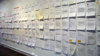
For the month of January Never Dying Worm, at UBC’s AHVA Gallery, ran contemporaneously to the Morris and Helen Belkin Art Gallery’s Letters: Michael Morris and Concrete Poetry exhibition, and included Form Letters, a work by Vancouver-based artist Heather Passmore. Comprised of three hundred form letters, marching five high and dozens deep, Form Letters ran the length of the gallery’s front window and, hugging the wall’s north wall, extended into the interior space of the gallery. Viewed from outside, the front window functioned like a vitrine: giving the rows of letters the precious appearance of encased specimens, or historic documents – not unlike the appearance of many of the concrete poetry works, viewed behind glass in the Letters exhibition.

Form Letters, at “Form Letters,” March 18 – April 21, 2011, The New Gallery, Calgary Alberta.
Unaccompanied by the digital reproductions of commissioned drawings which usually complement the work, this evocation of Form Letters was visually stark: standing alone as an overwhelming grid, with all of the references that it entails – to mathematics, technology, Modernism, historical painting, weaving, social control, the built environment of the city… A visible and knowable system, oscillating between a feeling of comfort and one of smothering constraint. The typed document is also a gridded space, as described by Liz Kotz at the Belkin’s Concrete Poetry Symposium in February. With its mechanically prescribed dimensions and orientation, the typed page is an ordered space which ‘dirty’concrete poems – like Steve McCaffery’s Carnival (1973) or bill bissett’s Neon-Om (1967) – subvert to their own ends. Kotz went on to inquire about the relationship between the grids of modernist and post-modernist painting, and those of the typed page in concrete poetry. Within this focused field, Kotz is concerned with what lies Between Poetry and Painting – which is incidentally the title of the 1965 Institute of Contemporary Arts exhibition oft cited for its influence on Morris’ work – seen while he studied at the Slade, in London.
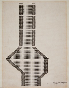
bill bissett
Neon-Om, 1967
typewriter ink on paper
25.2 x 20.2 cm
Collection of the Morris and Helen Belkin Art Gallery Archives
In relation to this exhibition title, Morris’ works in the Letters exhibition can be understood as working in the spaces between traditional media. The Letter paintings, for example, transgress into sculpture by breaking the physical flatness of traditional painting with angled, inset mirrors – and then there’s something cinematic about the movement playing across the mirrors. As well, the paintings’ gradients might refer to photography, their titles refer to language, and if performed in front of, they might transform into theatrical sets, or play a trick of camouflage and recede into the architectural space. Passmore’s Form Letters, on the other hand, concerns itself with ‘the spaces between’. In a more relational sense Passmore addresses primarily the administrative space between artists and the curators, juries or committees who assess their work. The abstract processes of deliberation and evaluation are reified taking on a stubborn material form. The letters are also testimony to the galleries’ normally invisible bureaucratic language and labour, which has emerged from the artist’s archives to haunt the gallery walls.

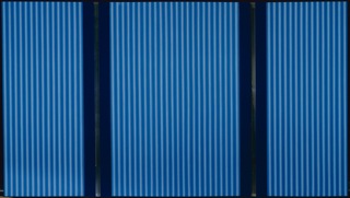
Michael Morris, Los Angeles Letter, 1968, acrylic on canvas, mirror and Plexiglas
184 x 327 cm
Collection of the Morris and Helen Belkin Art Gallery, The University of British Columbia
Purchased with the support of the Canada Council for the Arts Acquisition Assistance program, the Morris and Helen Belkin Foundation, and the Christopher Foundation, 2011
Where much concrete poetry investigates the visual and affective structures at work in typed language – making the language strange in order to expose what’s been there all along – Form Letters examines the rigid conventions of bureaucratic acceptance and rejection in particular: ‘making the language strange’ by crowding so much of it, so close together, and in its other evocations, by contrasting it with lush drawings which visually work their way around the language. Passmore remarks that “when you have to use a sort of political speak or office speak, you’re changing the whole culture of the room when you do that … definitely it’s something that needs to be noticed.”
Like the grids discussed by Kotz, the systematic straight lines, and regular size and rectangular shape of Morris’ paintings are physically suggestive of control and calculation. “I don’t know that they’re about the bureaucracy of the art world,” says Passmore, when discussing the somewhat coincidental relationship between the Letter paintings and Form Letters, adding, “They sure look bureaucratic.”
While discussing his work, Morris gestured towards the fact that his paintings came, in part, from the desire, as a young and relatively unknown artist, to “address the world” – Paris, London, New York, Peking, Rome, Los Angeles, Madrid – to clamour for notice and acclaim. Fifty years later, and in a qualitatively different artistic context, the desire Morris alludes to, Passmore’s Form Letters has laid bare. “UBC was good context for my letters to act instructively,” noted Passmore, “to demystify the process of being an artist for students.”

Form Letters, mixed media on form letter, 2008 – ongoing