
Quantitative Data Classification and Ethical Implications
The image below shows four different quantitative data classification methods to visualize the housing cost in the city of Vancouver, BC. The goal of the exercise was to show how the same data can be presented in very different ways depending on how the categorization is designed.
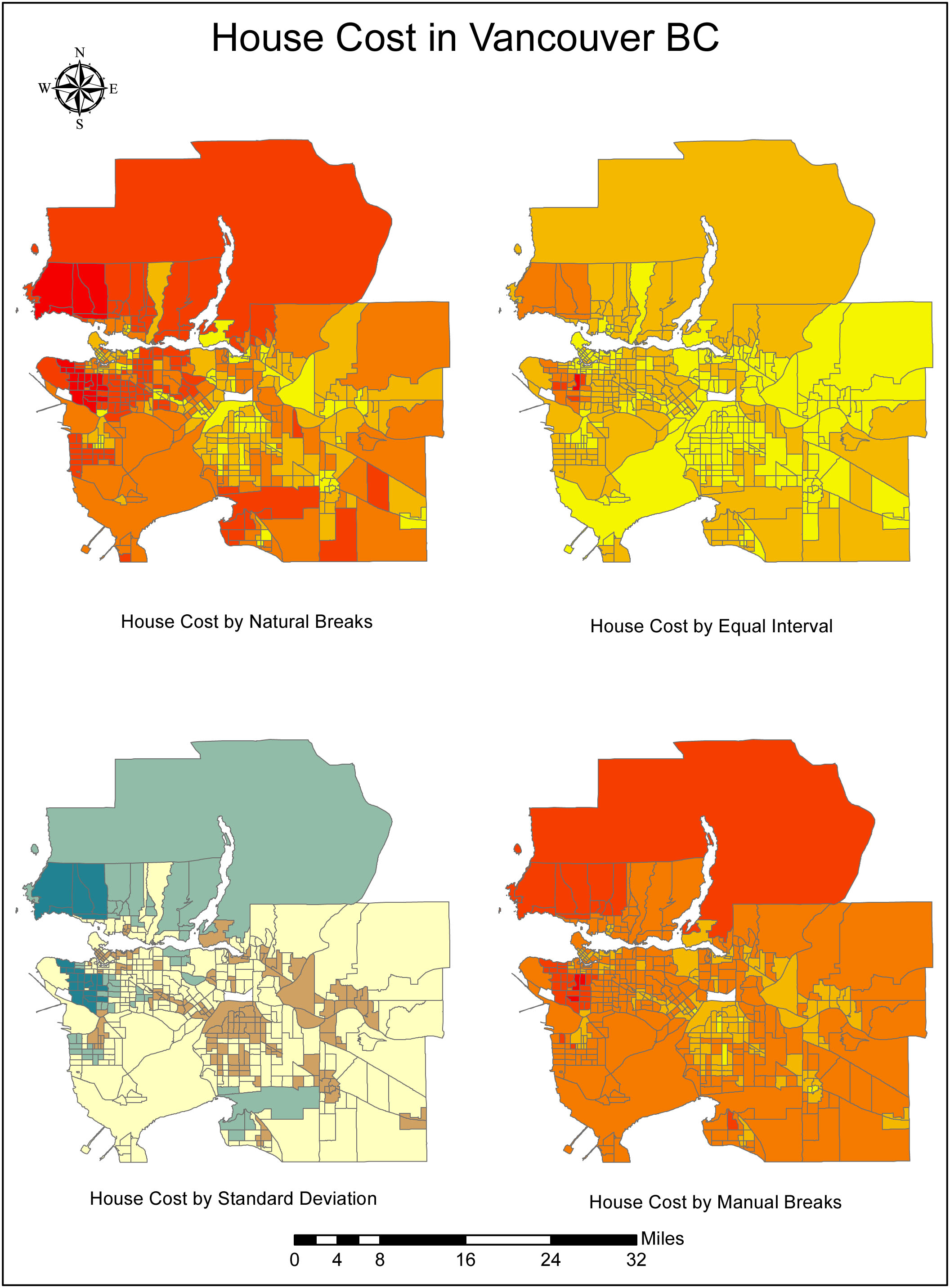
The map classifying housing cost by standard deviation for example represents a more relative picture of the cost per house in Vancouver because it shows where the lowest housing cost is in relation to the most expensive. In order to show prices as fixed brackets of cost, the Manual Breaks map would work better, but the brackets should be thoughtfully chosen so that the map is visually appreciable. If let’s say 90% of the houses fall in one category, then the map is not doing it’s job, unless the brackets are referring to another source of information with which it is being compared. Natural breaks as per the Jenks Natural Breaks algorithm does a fair job of separating the categories, but the numbers won’t be well rounded. For example, a natural break might be at $854,938 whereas a manual break would work better when placed at $900,000.
The map by Equal Interval creates an illusion that the housing cost is not as dramatically higher than with the other maps. A map showing a stronger variation in cost categories would be more appreciable than a map lumping the majority of the houses in the same category. Again, this method automatically attributes a break and is best used when categorizing proportions or percentages rather than cost brackets.
How information is presented should be (but will surely never be) unbias; nevertheless, with a clear legend and indication of the type of classification, the map becomes closer to the truth of what it is meant to depict. Ethical implications arise in the manner and context in which the map is presented, not in the classification itself. Some background information on how the data was classified should be included in the presentation if not on the map itself, as well as date and references on the data used to produce it. If the legend is clear, and the classification method is discussed or referenced, then the presentation should be ethically sound. It is also important not to forget that any audience has the due diligence of questioning the source of the information they are being presented, and educate themselves if necessary. Maps are an interpretation of data and therefore subjective to the purpose of its designer.
(Note: This map was completed by a student as a learning exercise during a GIS course (GEOB 270) at the University of British-Columbia)