This task was a little daunting at first, as I initially found the Palladio program tricky to navigate and challenging to make sense of. After spending some time uncovering the various functions of the program, however, I was able to identify patterns and limitations of the data presented. These patterns were not obvious at first, and I enjoyed the process of attempting to uncover the hidden meanings behind the networked data. Looking at the initial networks produced by the program, I was overwhelmed by the massive blob of data sitting before me. Despite my initial feelings of being completely lost, I felt as though I gained a better understanding of the patterns and choices made by my peers with each new new network breakdown I looked at.
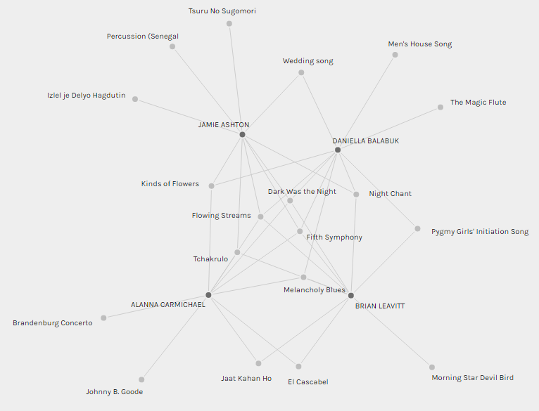
I was placed in a group within the program with Jamie, Daniella, and Brian. What struck me most about this grouping is that while a few selections were shared among all of us, a number of selections were only shared between two or three of us, and several tracks were outliers that only one person in our group had selected. I assume that we were grouped together due to the similarity of our selections, but it is interesting to see that despite the similarities, many of our choices still differed. Each of us selected at least one track that no one else in the group selected, and Jamie had the most unique choices with three tracks that were only chosen by her. I found it interesting that while the five tracks we shared (Dark Was the Night, Fifth Symphony, Melancholy Blues, Flowing Streams and Tchakrulo) all sounded completely different, 3/5 of these tracks are undeniably Western. While this is likely related to the overwhelming Western influence of the original 27 tracks we had to choose from, it is still interesting that the majority of our group’s common selections leaned this direction.
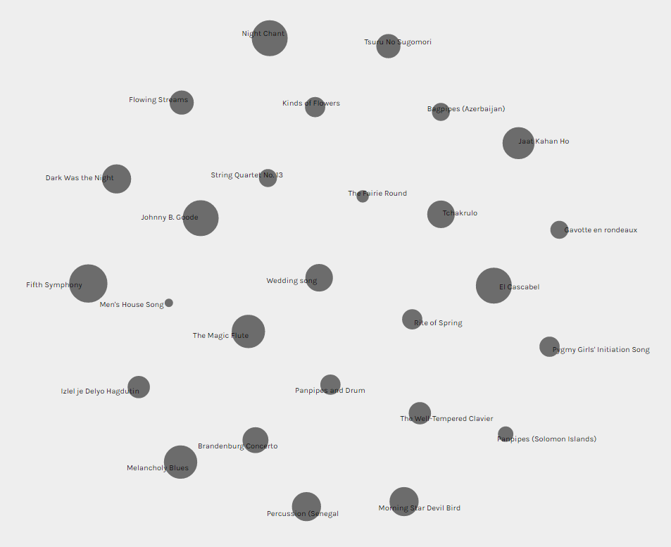
After this initial analysis of the tracks selected by those in my group, it was interesting to look at the overall popularity of each track among the entire class. It was fascinating to compare the popularity of tracks overall to the representation of those tracks within my group. In the screenshot below, the size of each dot coincides with its popularity among the class; the bigger the dot, the more people who chose it as part of their Golden Record. I was interested in seeing if the selections made by my group were representative of the class as a whole. Did our choices reflect those of the larger group? While some of the most popular tracks were well-represented in my group, such as Fifth Symphony and Melancholy Blues, others were not. For example, despite Johnny B. Goode’s popularity within our class, I was the only member of my group who selected this track. Similarly, The Magic Flute was a reasonably popular choice by the larger group, but the only person who chose this track in our group was Daniella. Other commonly selected tracks, such as El Cascabel and Jaat Kahan Ho, were only shared by two members of our group. It strikes me that this exercise ties in with considerations of reliability and validity in research, as it demonstrates the necessity of large sample sizes to ensure that data is reliable and representative of a wider population.
It is also important to recognize the limitations of the data represented in these networks. While we can see which tracks were chosen by each person in the class, and the patterns created by these choices, we do not have any insight into the reasons behind the selections just from looking at the networks. After viewing the networks produced by Palladio, I was interested in gleaning a deeper understanding of the reasoning behind my peers’ track selections, especially those in my group. Reading my peers’ justifications and reasoning behind their choices left me with a richer understanding and a different perspective on the task that I would not have been privileged to if I had only looked at the networks. Without this information, I would have likely interpreted the data differently, and I would have been required to infer the reasons behind my peers’ choices. I think that this demonstrates the value of mixed method research that looks at both quantitative and qualitative data. While both qualitative and quantitative data represent important information individually, they tell a more cohesive story when considered in conjunction.
