Task 9 – Network Assignment Using Golden Record Curation Quiz Data
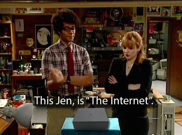
One of my favourite shows is called ‘The IT Crowd’ – the premise is that two IT ‘nerds’ work in the basement of a big corporation and their manager has lied her way into the job, not really knowing anything about computers. At one point, one of the guys (Moss) convinces boss Jen that he has come into possession of ‘the internet’ for her to show off at her head of department meeting to impress everyone. While it is somewhat laughable to imagine someone thinking ‘the internet’ is as simple as a little black box, it does, in a simple way, show the difference between the internet and the web. The internet is tangible hardware and the web is the connection of data via hyperlinks.
This was an interesting task, and just like when learning any new technology, I liked playing around and tried clicking on different things to see how it would affect the display of our data.
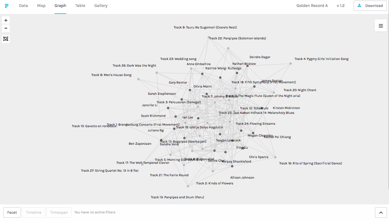
At first glance on the initial loading, you see a web of interwoven names and song choices. Clicking on the various facets displays and groups the data in different ways. Our names and song choices are the nodes and the connections between them are the edges. In some ways this activity was like falling down the internet search rabbit hole for me. Just like when you web search, click on a link, then click on another link (and repeat and repeat), I would click various facets and watch the data be rearranged again and again.
I find it interesting that Johnny Be Good was the most popular choice (having the highest degree of connectivity), but for me personally, it is the LAST one I would have chosen to include. As the Systems Innovations video (2015) stated ‘connectivity is often interpreted as a positive thing, but it might not always be so.’ Was it chosen most often because people believe it is representative of humans on Earth and extraterrestrial life would get a better understanding of us by hearing it, or was it chosen because it was familiar song (I’m guessing most, if not all, of us had heard it before), had English lyrics, and the curator understood the purpose and intent of that particular song? So while this graph tells us it has a high degree of connectivity, it cannot tell us why it was so frequently chosen. I can only speak for myself and state why I DIDN’T choose it. From what I could read of this data, I had some similarities with classmates Selina, Meipsy and Chris, but we would have to have a conversation about why we chose what we did. The data only tells a story at face value.
I think the bottom line here is that just like with the algorithm of web searches, the Palladio graph gives a visual representation of our choices, but it cannot determine the reason why people chose what they did. Just like with web searching, the various algorithms apply weight based on many things including ‘the words of your query, relevance and usability of pages, expertise of sources, and your location and settings. The weight applied to each factor varies depending on the nature of your query—for example, the freshness of the content plays a bigger role in answering queries about current news topics than it does about dictionary definitions’ (Google, 2021). As touched on in the video, it is a big responsibility to be part of deciding how these decisions get weighted. Just think how prolific the statement ‘just google it’ has become in our culture! ‘If lots of websites think a page is interesting, then it is probably the one you are looking for’ (Code.org, 2017). Probably. But not certainly. So I suppose the Golden Record curation, as well as Google search results, are just BEST GUESSES for the broadest group of people.
References
Code.org. (2017, June 13). The Internet: How Search Works. Retrieved from https://youtu.be/LVV_93mBfSU
Google.com. (2021). How Search algorithms work. Retrieved from https://www.google.com/search/howsearchworks/algorithms/
Systems Innovation. (2015, April 19). Network Connections. Retrieved from https://youtu.be/2iViaEAytxw