
Preamble
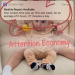
I had to share this Instagram post because I felt it connected to this exact module. I am completely guilty of interchanging the terms internet and web. I think many people;
1: Don’t really know how each function independently /dependently with one another.
2: Feel overwhelmed with the language based in the technology that they swap the terms when they see fit.
After watching, A Journey to the Bottom of the Internet, and participated in the ‘close your eyes’ task – I did not picture water, instead, I pictured the web of nodes and edges, which previous to this module, I called ‘links’.
Using Palladio with the information from Module 9 provided, I realized that the web I pictured, was not so coherent, equitable, or even single layered. The vastness and weight of clicks and links heads significant power over our decisions.
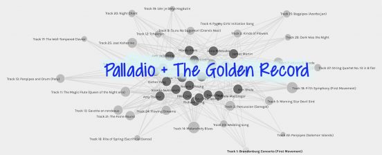
IMAGE 1- Big Picture
Here was my first time discerning tracks and curators and simply pulling them apart. Big job!
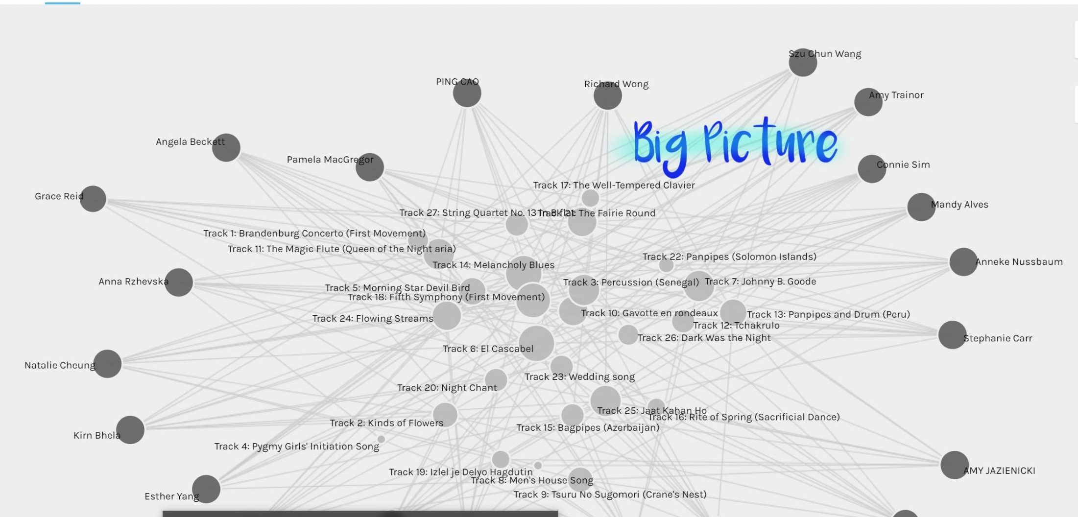
image 2- “Intangible edges and COMMUNITIES”
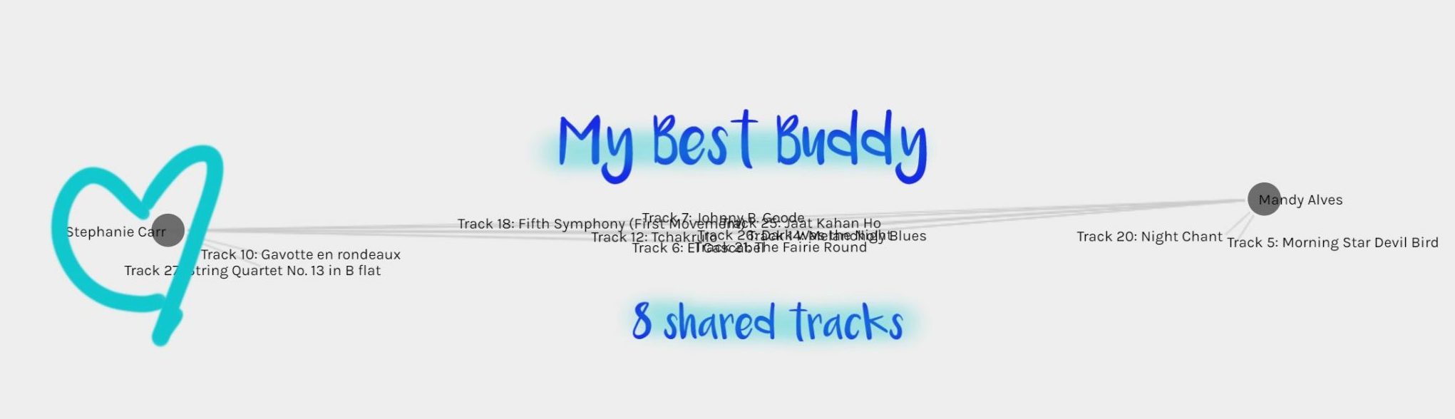
I have never heard the term ‘nodes’ and ‘edges’ but I think I have a decent grasp on it (now). The reason I have the grasp is from the Systems Innovation’s videos. Particularly in Graph Theory Overview, the narrator states, “edges can also be intangible, like relations”. Ok- so Pallido can show me a community (end nodes) that I belong to based on our shared edges. After playing with Palladio with the assurance I would not break it, I figured out how to create the community based on our track preference and even weighted the songs in the community (the songs most chosen). My community includes: Connie S, Richard W, Derek D, Anna R, and Stephanie C.
I then wanted to find out who Palladio thought my best friend was. After eliminating and linking myself with the members individually based on tracks, it seemed Stephanie C and I had 8 songs in common! I thought that was pretty remarkable considering the odds of such a choice. I actually have had a couple of classes with Stephanie and I recall commenting on her posts in the pasts and sharing some similar opinions on Discussion board chats- crazy!
I visited the Palladio homepage and their tag line: “Palladio. Visualize complex historical data with ease” – this does seem to justifies the purpose of the project. However, I would be remiss to assume we get to “see” everything here. My community was created based on the tracks we chose, but it doesn’t look at why they were chosen, our socio-economic background, culture, etc., therefore the final image produced, the TOP TEN Golden Record songs, is kind of superficial. What I mean is, if these ten songs were being sent to space- this would have been a really poor way to collect the information. It provides only half the story. But then how do we include the ‘null’ information, the other part of the story we don’t even know who is writing! This made me think of last week, and the pressure I felt choosing a list that was going to represent all of humanity although I don’t really have a grasp on what that looks like. This made me think of Dr. Smith Rumsey where she states, “we should carry more obsolete information” [13;52]. I think the problem is, how do we represent this obsolete information?
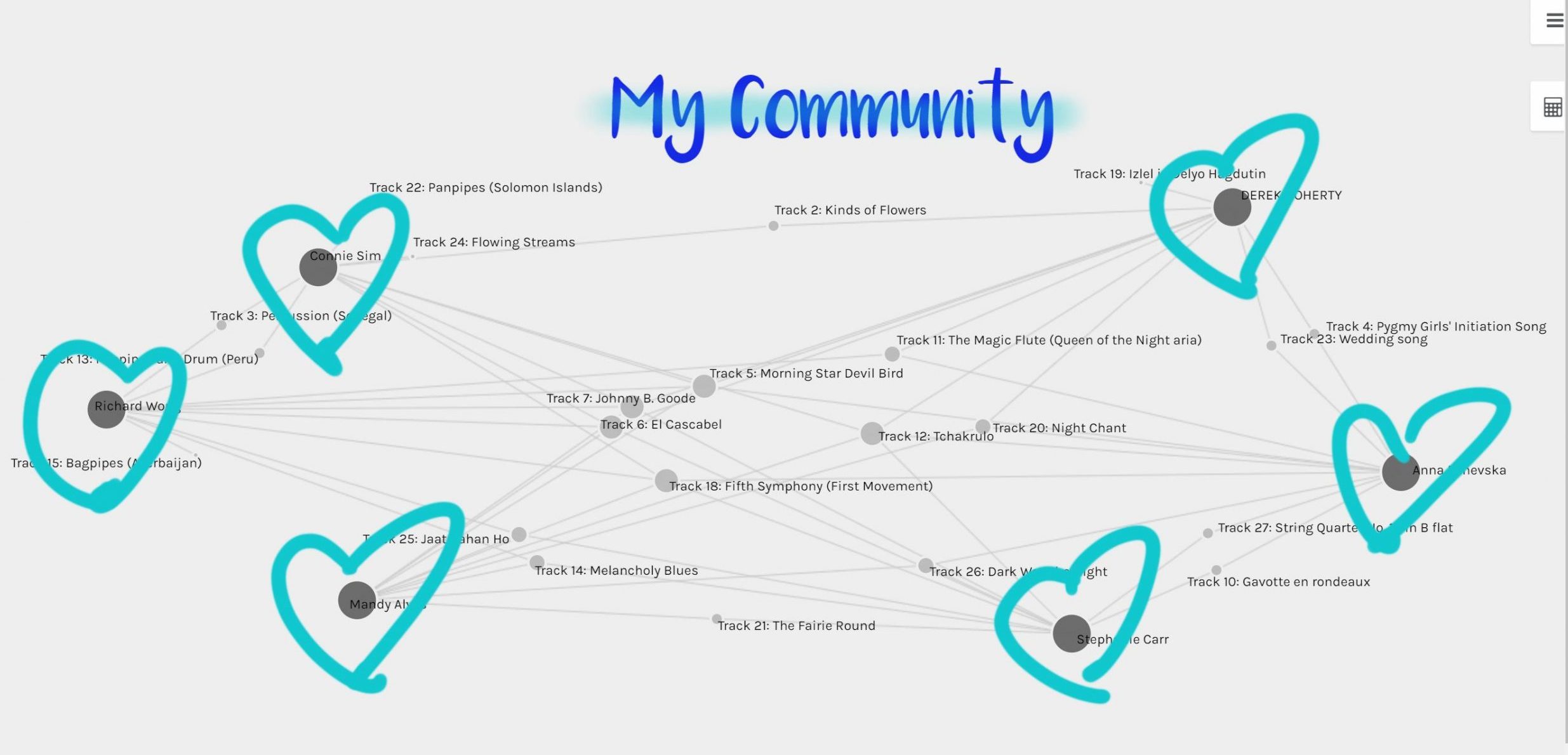
Image 3- Just the music
I then decided to focus on the music. I was simply curious to find out which songs were the most ‘popular’. In my mind, I translated the degree of connectivity discussion from the YouTube tutorial to this image:
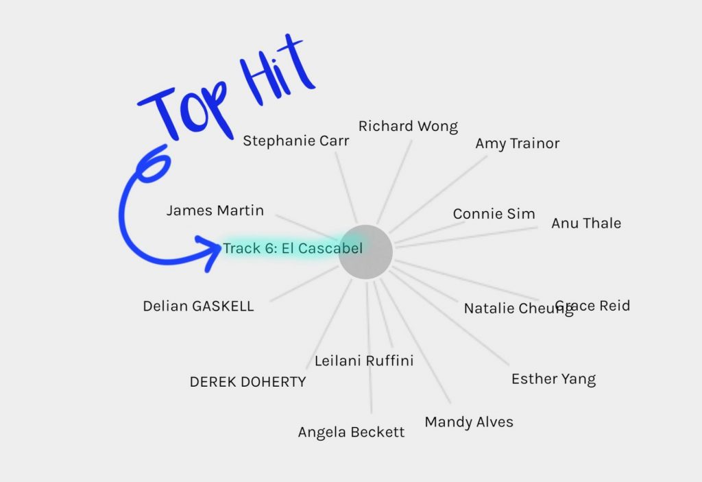
“El Cascabel” was one of the most chosen tracks from the list of curators, meaning it had a high level of connectivity. I first noticed this from how large the circle was in the first example, in this graph, the edges(tracks) are weighted. I don’t know why, but I had a feeling this song was going to be a popular choice. Like the video stated, the degree of connectivity is not always as a positive thing (they use the example of a virus). I also think this example supports how misinformation within the web grows exponentially. If you have nodes (people) connected to the same misinformation (node) it then becomes ‘popular’ (sorry for the casual term of popularity. The discussion of page rank in “The Internet: How Search Works” tell us the relevant results are brought to the ‘top’ of a google search– however, if the question one is asking in the search bar is a false theory, for example, they will immediately be drawn to sites that discuss or even support some of this ‘flawed’ information.
In the example above, we are again missing the why to the visualization, all we know is 15 people are connected to the track. Maybe If there was information located along the out degree about who is choosing the tracks and why, there would be another layer of understanding.
In the example below, I wanted to remove the connections and have the songs kind of float around based on their weights. I felt like this was a refreshing view. But was it refreshing because I am left to make my own assumptions about the nodes?
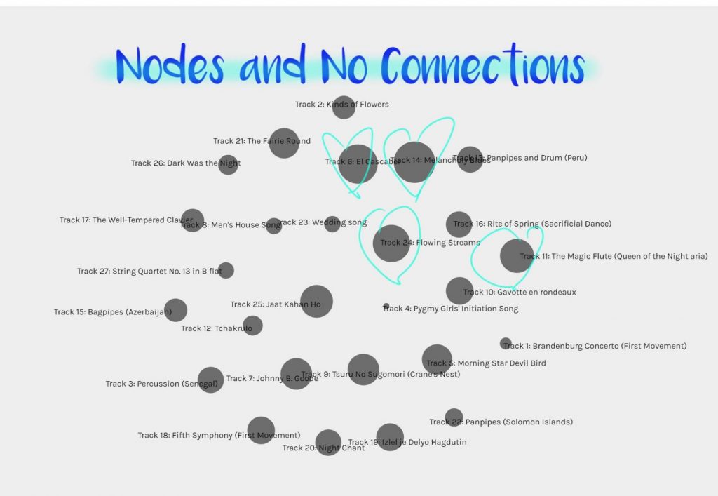
I began to wonder why Pygmy Girl’s Initiation Song was so low on the popularity list? So I went back to listen to it one more time. I found the pitch really high and the audio a bit muffled. I was most bothered by the pitch so I quickly shut it off. I am assuming now that most people felt the same way. Pitch- is that a blanket similarity we mostly share- what does this mean, why are we reluctant to hear music with a high pitch? Is it because of the era we are raised in, the cultural background we hail from? Again, this visual does not answer these questions. In fact it makes me ask more questions.
Final point
Although this Palladio project seems to offer an unbiased visual representation of data, it in fact is NOT the case. Even though simple diagrams are created by and through technologies, they still come from the minds of humans- humans that have their own set of biases- intentional and unintentional.
This was challenging for me, but I really learned so much about the internet and web and why it imperative to see them as separate entities.
References
Code.org. (2017, June 13). The Internet: How Search Works . Retrieved from https://youtu.be/LVV_93mBfSU.
[Nat and Friends]. (2016, December 16). A journey to the bottom of the internet [Video]. YouTube. https://www.youtube.com/watch?v=H9R4tznCNB0.
Smith Rumsey, A. (2017, July 11). Digital Memory: What Can We Afford to Lose [Video] YouTube. https://www.youtube.com/watch?v=FBrahqg9ZMc&t=2277s
[Systems Innovation]. (2015, April 18). Graph theory overview [Video]. YouTube. https://www.youtube.com/watch?v=82zlRaRUsaY&t=3s.
[Systems Innovation]. (2015, April 19). Network Connections [Video]. YouTube. https://www.youtube.com/watch?v=2iViaEAytxw&t=12s.