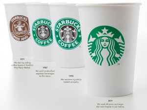
Lately there has been alot of talk about the drastic change to Starbuck’s new logo. Personally, I think the new logo is not as attactive as their previous one and reading Josh’s blog about whether it matters or not, i’d have to agree and say that it does. I’m sure that thier coffee has not change along with the exceptional personalized customer service and that they are expanding their product line but I don’t think they should’ve taken the whole border out. It kind of looks like a whole new logo. It probably would’ve looked way better if they just took out the coffee part. Definitely a risky move by starbucks but it could be better for the future of the company. Starbucks has a strong brand built on that logo and it wasn’t a complete change, and the logo is still recognizable.
NOT just another UBC Blogs site

