Women in advertising as objects
by angela warren
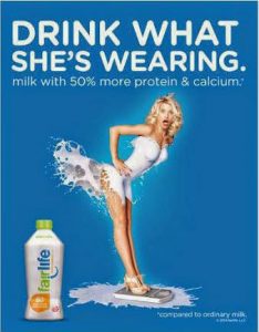
This advertisement was released by the Coca-Cola Company, which is promoting their new protein beverage. At a glance, the advertisement is attractive because a young and thin female with a thigh-high and strapless dress is centered on the posting. Also, the advertisement’s choice of words is informal, which creates a casual and amusing message. However, let us deconstruct this advertisement and look pass the surface where we can witness the negative criticism behind this advertisement. Firstly, right away we notice the female, which is an eye opener, especially if she is showing her skin. She is wearing attractive heels and has her right arm sitting on her hip. Moreover, the advertisement uses the protein drink as a dress and exposes nearly her entire bottom as she leans forward and the dress is supposed to flair upwards. What does this suggest about women in general? The posting suggests that women are objects and implies that all women are flirtatious, especially the ones who are unconcerned about exposing their bottoms, particularly if they are thin and tall. Moreover, the advertisement shapes the female body in a way where her breast is large and protrudes outwards while her waist is narrowed down to create an hour-glass shape. The use of women as objects reflects how the advertisement industry is using women to attract consumers, specifically for diets, beauty, clothing, alcohol beverages and more. Even though consumers are aware of advertisement strategies, they continue to buy into these products when female celebrities are used such as athletes, models, actresses, and Youtube public figures. The shaping of the female body also reflects the “ideal” female body shape as having large breasts and bottom and a thin waist. Secondly, this advertisement uses a blonde white female, which reflects the underrepresentation of women of colour in the advertising and modeling industry. The use of white females reflects the white dominant society and suggests that the colour of the protein milk suits a white female skin only. Thirdly, the advertisement quotes at the bottom right corner , “compared to ordinary milk”, which now implies that the protein beverage is more better and healthier that traditional milk. Moreover, the quote is places in the bottom right corner, which hides the fact that they are comparing it to the healthier daily, which proves to be healthier.
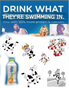
My jammed version of this advertisement is slightly different. I wanted to continue promoting the new protein beverage, which was the purpose of the advertisement. However, my version states “Drink What They’re Swimming in”, compared to the original advertisement, which mainly focused on the “she” pronoun. By stating the “they” it becomes more inclusive and reflects the images of both male and female, especially older adults, in any shape, age, race, and gender. My version does not focus only on white young, and slim women as it does not focus on her body, but rather on her face, which does not make the advertisement as seductive as the original one. In addition, it removes the fact that the women is an object and that she becomes an individual with the two figures at her side as the protein beverage itself becomes the only object in the advertisement. The animated cows in the advertisement represents that traditional milk still continues to be promoted and does not replace that fact that the protein beverages is a comparison, but rather the protein beverage may be an alternative to traditional milk.