Monthly Archives: November 2023

Task 12: Speculative Futures

Prompt (pulled from Situation Lab’s prompt generator): 

Describe or narrate a scenario about a gift found a decade into a future in which order is deliberately coordinated or imposed. Your description should address issues related to environment and elicit feelings of anxiety.

Click on each of the interactive elements to hear journal entries and task notes. Turn on your volume.


I decided to format this as a digital weekly task manager. Agendas and journals have been utilized since written language began, but in recent decades, more and more digital tools have been used where physical planners and agendas had been predominant. Today, platforms such as Google Calendar and Notion are more common than ever before for workflow organization. However, in a decade, I imagine that these platforms and the regular associated practices of usage have shifted to be entirely multimodal; following trends of media convergence, these planners could contain personal notes as well.

Based on the prompt, the gift is camping gear; order is coordinated through strict mandates and regulations on everything from housing to employment to health; the environment is in disarray due to increased global temperatures and ongoing forest fires; and anxiety is apparent through the resurgence of new illnesses, vaccines, respiratory illnesses, and the inability to live life as it once was, ie. spending summers camping. This scenario was inspired by Situation Lab’s prompt listed above, the Speculative Future award (Core77, 2022), the discussions by Dunne and Raby (2013), and the podcasts by Ford (2020) and Greenspan (2021). 

References

Core77. (2022). Speculative design award: Core77 design awards 2022.

Dunne, A., & Raby, F. (2013). Speculative everything: Design, fiction, and social dreaming. The MIT Press.

Ford, A. C. (Host). (2020, September 2). Tommy Orange: Reopening. [Audio podcast episode]. In The Chronicles of Now. Pushkin Industries. 

Greenspan, S. (Host). (2021, September 28). Cycle 1: Databody. [Audio podcast episode]. In Bellweather. Bandcamp Radio.

Lab, S. (n.d.). The Thing From The Future. Situation Lab. Retrieved December 14, 2022, from https://situationlab.org/project/the-thing-from-the-future/

Task 11: Option 2 – Text-to-Image

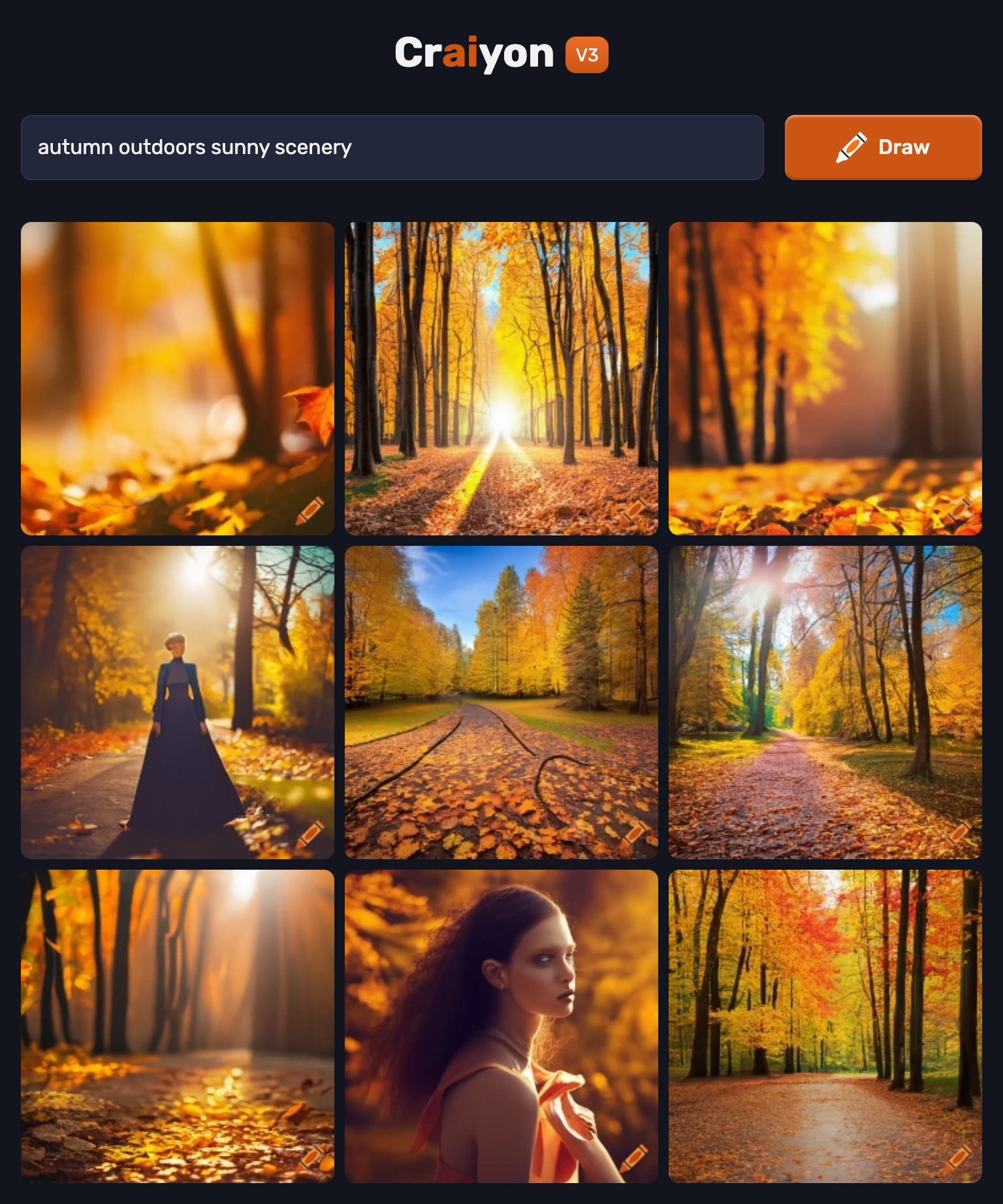
I provided Craiyon 4 text prompts focused on seasons, which yielded the images below:

None of the images look truly ‘realistic’ although I asked for photographs to be generated rather than artwork. Each prompt was the same, save for the season itself. The colour palettes are all similar to what we in North America associate with each season, but the images themselves are unnatural; edges to objects are blurred out, stems from flowers are missing, etc. 

Overall, these images were both what I had in mind, and yet, they completely differed from what I would have liked to see. The four images provided showcased an understanding of the seasons which are very stereotypical in more temperate northern biomes, such as the more populated regions in North America. This could be due to the fact that these regions experience the four seasons to greater extremes than more tropical, savannah, or arctic regions with less fluctuations in seasonal palettes and types of precipitation. However, it could also indicate a bias towards these regions; thinking back to the map of connections and nodes in Module 9, this bias is plausible. 

Another thing which differed from what I was expecting was the inclusion of people. Although I did not ask for people to be included, each prompt included at least one or two images of people- based on appearance, they mostly are white women. While their faces are never accurate nor normal, which is common in AI-generated content, the fact that almost all the people included had conventionally attractive features or silhouettes based on common representations in media provides more evidence for the ways that AI can be biased through the databases from which it pulls information. 

AI pulls information from available user-generated content. Programs like Lensa (Beach, 2022) have only grown more powerful through the amount of content being uploaded and signed away through licence agreements about which most users may be in the dark. I would venture a guess and say that much of the images that are linked to seasons (through hashtags or other content identifiers which the algorithm can pick up) is produced by certain demographics, which leads to them becoming more commonly depicted in these images. The algorithm is being trained on the largest content creation markets, and so the values of more powerful, more ‘online’ nations and societies are being projected as the norm from which these algorithms can pull information.

References

Beach, C. (2022, December 7). The AI Portrait Generator Lensa Makes Our Dystopian Nightmares a Reality. PRINT Magazine. https://www.printmag.com/design-news/lensa/

Hall, D. (n.d.). 99% Invisible (No. 382). Retrieved December 12, 2022, from https://99percentinvisible.org/

Heilweil, R. (2022, December 7). AI is finally good at stuff. Now what? Vox. https://www.vox.com/recode/2022/12/7/23498694/ai-artificial-intelligence-chat-gpt-openai

Mars, R. (Host). (2017, September 5). The Age of the Algorithm (no. 274)  [Audio podcast episode]. In 99 Percent Invisible

O’Neil, C. (2017, April 6). Justice in the age of big data. TED. Retrieved August 12, 2022.

TED-Ed. (2013, May 20). What’s an algorithm? – David J. Malan. [Video]. YouTube.

Task 9: Network Assignment Using Golden Record Curation Quiz Data

Going into this assignment, I was quite curious to see how diverse the song selections would be throughout the class. I have a lot of experience studying music, arranging compositions, and performing with various musical ensembles and orchestras, so discussing diverse repertoires is something I adore. One of my main fears whenever examining this kind of data is that one group or musical genre will be overly represented, which has historically oftentimes been the case; however, I was pleasantly surprised to see that many of the most popular options (represented by the larger nodes) were from all over the globe. 

I focused much of my examination on the ‘edges’ in each community. Edges, as explained by Systems Innovation (2015), represent the path walked between two nodes. In this case, edges represent individuals and their connections to one or numerous song choices; it is through the songs located at these connective nodes that a walk can be formed between individuals and their choices. The community with the most edges, which indicates the most overlap in song choices both amongst different classmates and across multiple songs in the same community, took place in Community 1, seen below.

The actual groupings of the tracks themselves are quite interesting to me. While I know theoretically that they have all been grouped based on the similar choices of participants, it still feels strange seeing the tracks which have been grouped together, as the tracks placed in each community are oftentimes wildly different from one another. For example, placing Track 2, 9, 20, and 23 (in the image above) in the same ‘community’ feels inherently incorrect based on the diversity of genre.

However, these ‘bizarre’ groupings make sense in the context of the task, as it supports the idea that the majority of the participants of the quiz tried to choose diversity to better represent the human experience. The task was, after all, to curate a list of 10 songs to capture the beauty of Earth and humanity.  Although we cannot be certain of the exact reasoning behind every individual’s song choice simply by examining this visual, we can clearly identify that people who chose certain songs over others tended to align their other choices with others, rather than having very little overlap. To support this, my own name is present in each of the communities except for Community 3, seen below, as I chose neither of these options; yet, with all the other communities, I tended to choose at least two of the available tracks grouped within that community.

One way this visualisation may fail is in showcasing which pieces were not chosen as frequently. As all we could do within the quiz was to input our choices without any extraneous explanation, there is no way to understand why certain pieces truly resonated with the group over others. Null choices are not as easily examinable with these visualisations due to this, although we can clearly identify which songs were more popular over others through looking at the size and strength of song nodes, which correlate positively with increased student choice.

References

Code.org. (2017, June 13). The Internet: How search works[Video]. YouTube.

Systems Innovation. (2015, April 18). Graph theory overview.  [Video]. YouTube.

Systems Innovation. (2015, April 19). Network connections. [Video]. YouTube.