Category Archives: Chikyū bankoku

Coding in Chikyū bankoku sankai yochi zenzusetsu

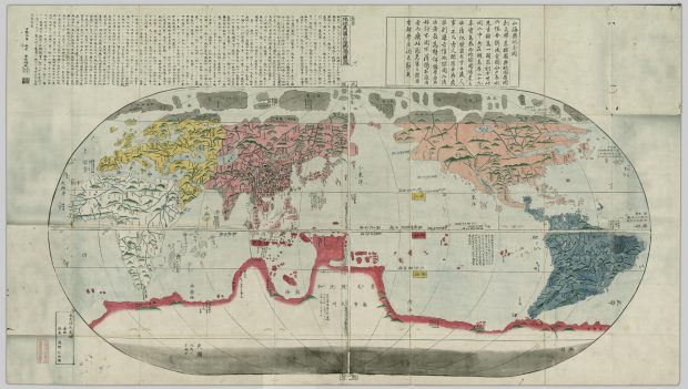
Maps are definitely one of those concepts that are hard to confine with one definition. In fact, I think that all of the different definitions that we discussed in class are not only relevant, but necessary in building a wider perspective with which we can view maps. Corner says that maps are “a fantastic cultural project, creating and building the world as much as measuring and describing it”, while Turnbull says “Maps are theories and they are socially and culturally constructed.” These definitions are indeed true in the sense that maps hold tremendous cultural significance and also biases, respective of whoever the maps were created by and who they were created for. A simple example is how different geographical regions throughout history had centred themselves in their worldview, or how sizes of certain regions are exaggerated while others depicted much smaller than we now know them to be. The definition I will be focusing on today is that of Berry, who claims that maps are “a form of graphic representation that takes as its frame of reference the physical environment, which it normally treats from an aerial perspective, with some attention to verifiable spatial distribution. Furthermore, a map relies on a combination of codes—particularly an iconic code—to construct that environment.” And particularly, I will be looking at what kind of coding is visible in the Chikyū bankoku sankai yochi zenzusetsu map from 1790.

Most of the coding that we can see in this map is quite straightforward. First of all, I am not quite clear on whether this map would be considered topographical or topological. The map does not necessarily denote the different gradients of elevation as topographical would suggest. On the other hand, it also does not resemble the sort of symbolic representation that we associate with topological maps. That being said, the first bit of coding that is very obvious in this map are the mountains. I would assume that the green inverted W-shapes scattered across the land masses are meant to denote any regions that are mountainous. Do these generic symbols of elevated regions mean that the map is topographical? I am under the impression that legitimately topographical maps show much more detail in changes in elevation, while the mountains in this map seem to be more symbolic. That being said, this sort of coding is very effective for the reader, in that most likely anyone who saw this map, having no prior knowledge of the coding system, would recognize the green shapes as mountains. Another clear example are the blue lines that run through the land masses. These seem to denote rivers, and once again, most people would likely arrive at this conclusion upon first viewing this map. 

Now, the more interesting bits of coding have to do with the visible biases(?) that we can see in the map. First of all, how do we know which sections of the map are meant to represent land masses and which are meant to be ocean? We know that the colored areas are land, but this is largely because we already have a pre-existing image of the world map in our minds. If not, we could potentially perceive the colored regions to be oceans, that the green hills are islands, and that the blue lines are simply common routes taken by boat. Furthermore, why are the different sections of said land colored differently? Using the knowledge we have about the world and from maps we’ve seen previously, we can assume that this is to separate the world into geopolitical regions. But is there a reason for the specific colours? That I can not answer for sure.

Finally, the most intriguing aspect of the “coding” that I saw in this map comes from the respective sizes of certain areas. Most blatantly, Japan is centred in the Map, which is to be expected. What is more interesting to me however, are the absolutely massive sizes of Europe and the Americas in this map. Particularly interesting to me, was that Europe and Africa were drawn to be relative in size, which we know is not actually the case. It may be important to note that this map was a copy of one brought to Japan by Matteo Ricci. To me, it seems as though there many have been a political agenda behind the depictions of certain areas being drawn larger than life, while others not so much. But then, why is Antarctica drawn to be literally a third of the entire earth, and a short boat ride away from the southern tip of Africa?  

Maps Defined Entry 1: Chikyū bankoku sankai yochi zenzusetsu (1790)

Maps defined: Blog entry 1
Onigiri: Chikyū bankoku sankai yochi zenzusetsu (1790)
https://open.library.ubc.ca/collections/tokugawa/items/1.0213204

Anh Luu
2/24/2021

(a) Mary Elizabeth Berry, “Maps Are Strange,” Japan in Print

“A map is a form of graphic representation that takes as its frame of reference the physical environment, which it normally treats from an aerial perspective, with some attention to verifiable spatial distribution. Furthermore, a map relies on a combination of codes—particularly an iconic code—to construct that environment.”

(b) James Corner, “The Agency of Mapping”

“Mapping is a fantastic cultural project, creating and building the world as much as measuring and describing it.”

For my response, I decided to discuss two map definitions. One from Mary Elizabeth Berry (a) and one from James Corner (b). The reason being that Berry’s definition focusses on the physical environment and codes used to represent it, and Corner’s definition focusses on the cultural viewpoint. These are two very noticeably different definitions, however I felt from my first impression of this map that it embodies both, especially since it is a world map. My initial impressions of this map had me quite fascinated, firstly because I grew up in Canada the world map I am used to has the focus of North America on the left side. This also brings my eyes to become more attentive to where all of the continents are placed and how they are represented through colours and iconic codes. I think this map is great to observe since it reminds me that the way the world is perceived is different for everyone and always changing!

I will discuss Berry’s definition in harmony with Corner’s definition. As defined by Berry, a map relies on a combination of codes – particularly an iconic code – to construct that environment. We can see from this world map that it relies on plenty of iconic codes to represent the environment. Mountainous areas are represented by icons of green mountains. We know that this probably does not mean that the kinds of mountains are distinguished by colour since the mountains are not coloured in with other colours like grey or brown, but only green. From that we can draw back to Corner’s definition concerning cultural contributions to maps and think about if the map creator, Nagakubo Seikisui is familiar with green mountains as the reasoning behind the iconic code of green mountains rather than grey or brown mountains. If the creator had the opportunity to discover or witness more mountains than the ones he’s seen locally or in the places he has travelled, would the iconic codes to represent mountains be different, or possible revised once more? Looking at other iconic codes we notice that rivers are clearly outlined and a darker blue and other bodies of water such as lakes and oceans are a lighter blue, which is a familiar sight in maps. There are patches of dots along the shorelines and islands, which I am not sure what they represent, but they can definitely be recognized as an iconic code with the means of representing something that should be there. Something else we notice is that land is separated by respective colours. It is not clear whether the colours have certain cultural meanings behind them, but we know for sure they play part as an iconic code separating the continents from one another. However, the north and south are coloured in grey, and from that we can assume that represents the different poles or the cold feature of those regions.

Since this map is called “revised map of the world”, it makes me wonder if the cultural views are changed in order for this map to be created as revised version, derived from what would have been an original or a previous version of the map. Would a continent being drawn bigger represent a cultural viewpoint regarding with what degree of importance that it holds? Or another theory I would have is about the undiscovered and ambiguity of the area, if the region is unknown and not much about it is heard of would it just be drawn bigger or smaller with not too much reasoning behind it? Thinking about this and the many revised versions that can come about from a map from “fantastic cultural” world building is really fascinating and we can see a lot of reflections from the cultural viewpoint of the map creator and the world as they see it.

Chikyu bankoku sankai yochi zenzusetsu

Nagakubo’s map, the chikyu bankoku sankai yochi zenzusetsu, is a world map from 1790 based off Matteo Ricci’s world map. While Nagakubo’s map looks very different from today’s modern world maps, the continents and regions are still very identifiable in terms of general shape and location. The map utilizes various coding, such as colour, lines, writing, and images, to identify major landscapes and borders. The continents are separated using colour and major mountain ranges are depicted through out the map, as well as bodies of water such as rivers and seas, which are also labeled in some cases with writing. However, visual labels are only reserved for land masses and there is a lack of visual coding for major cities and countries (excluding the use of writing). The map also utilizes longitude and latitude lines that are superimposed subtly onto the map.

In comparison to the world maps that exist today, the continent sizes of Nagakubo’s map differ to large degree. North and South America are treated with equal sizing to Asia and contribute for almost the same amount of visual space within the map. Europe is also portrayed to be of almost equal size to Asia, while Asia appears smaller than its real size due to the enlarging of the other continents. The reason of the continent sizing is most likely due to Matteo Ricci’s map that was used in reference, which also portrayed North American and Europe larger than they really are in relation to the other continents. This distorting of continent sizes may be correlated to eurocentrism of the time, thus imposing a larger and more “important” Europe into a world context. It is interesting that Antarctica is given a “larger than life” visual representation on Nagakubo’s map, imposing about a quarter of space of the entire map. Regarding why Antarctica is treated as such as a large landscape, it may be due to an “unknown” factor, as Antarctica had not yet been explored at the time of this map’s creation.

Nagakubo’s map seems to be missing various elements to it, such as Australia. It is interesting that, if Australia were to be added, the entire map would require shifting in order to accommodate for it. The map seems to be shrunk near the north and south poles, where Africa and South America directly beside Antarctica’s border. The sizing of the continents seems to fit perfectly within the frame they were placed in, providing a “whole” or “complete” feeling, where no one part of the map holds a more significant amount of space than the other (except for Antarctica). Perhaps the continents were resized simply so they could fit equally within the map with equal treatment and visual importance. While the map is not very effective in displaying proper size relevance, it does portray all (most) of the continents in an environment that allows for visual understanding of the different regions and their locations around the world and providing a sense of placement within the world for the people who viewed it.

Maps defined–Chikyū bankoku sankai yochi zenzusetsu (1790)

In “Maps are Strange,” Berry (2006) describes a map as a graphic representation where a combination of codes is used to construct the environment. In premodern and early modern mapmaking art, the most common codes could be classified as iconic, linguistic, and presentational. This essay will focus on these codes and their appearance in the chosen map. The selected map is the 1790 Chikyū bankoku sankai yochi zenzusetsu, roughly translated to Sekisui’s map of the world.

Berry asserts that constructing a map is vital in helping the audience pick out and create important constructs concerning that space. For example, Sekisui’s map of the world has Asia (or rather China) in the middle. This is significantly different from popular maps, such as the Mercator projecting. This map puts Africa and Europe, with America and Asia on the sides, at the center to indicate the power relations bestowed by colonialism and modern-day politics, which involves an underdeveloped Africa due to European and White imperialism. Similarly, Sekisui’s map of the world alludes to China’s centrality in the world. In the old days, China referred to itself as the central kingdom surrounded by its tributes, such as Choson Korea and Japan. By putting China at the center, the map creator communicates that China was the most powerful empire, and the world revolved around it just like colonialism made Europe the king.

According to Berry (2006), the iconic code inventories the environment by communicating the features of a space the mapmaker chose to represent. Sometimes, the map might have a key to help the audience understand the representation and logic used. The most common iconic signs are line, which indicates things that take a linear or line appearance, such as roads and rivers, figures, such as triangles to mean a mountain or circles to suggest cities, and color blocks to show significant differences between signs, such as deep or shallow tints to signify power differences.

The chosen map shows these three codes in profound ways. For example, lines are particularly easy to identify in contents and regions that are not densely populated, such as Africa (white), Europe (yellow), North American (slightly reddish), and South America (bluish). South America has more lines than other continents. These lines appear to signify rivers rather than roads because, in 1790, not many roads would have been highly developed, as extensively as indicated in this map.

This map has many figures. Most are hard to understand due to clarity issues within the diagram and the Chinese letters that often have a Japanese feeling. However, one can see raised regions to mean mountains, joined raised places to signify a range, and the dots to indicate population. Notice how Asia has more dots than other areas, thus asserting its status as the most populous empire in humankind’s history.

Last but not least are the hues to indicate differences. For instance, the map creator used white for Africa, yellow for Europe, red for Asia, orange-red for North America, dark blue for South America, and dark red for the Antarctic border. It is hard to determine why these colors were used. However, drawing from the history of Europe and Asia, such as the spread of Christianity and colonization, one can argue that Europe and China were in perfect contradiction to one other despite their growing visibility in global politics. Although the map has a Japanese effect, the relative powerlessness of Japan at that time, including self-isolation and its relations with China indicate that China was more powerful.

Berry (2006) argues that codes show three more features: stability, generic, and versatility. First, stability means that a particular element within a map will mean the same thing every time it appears on the map. For example, the lines in each continent indicate rivers. I arrive at this conclusion because the lines occur and increase in frequency when the raised figures showing mountains are present and many. That is why South America has more lines, but short and irregular, possibly suggesting a river basin or system, such as Amazon. In Africa, the lines are more continuous and last longer, indicating many long rivers, such as the Nile.

Second, generic refers to the “limited, fixed, and putatively standard variables” (p. 64) that remove the life from each representation and imbue it with generic characteristics, such as lines to indicate rivers and dots to mean people, regardless of the unique aspects of each region.

Third, versatility speaks to the representation of finely visible and invisible things, such as social constructs or environmental concepts. For instance, many rivers and high places in South America could allude to its fertility. In contrast, the widespread representation of this in Africa could indicate that some regions are wet, whereas the vast spaces in the center are either drier or unexplored. Unexplored is a better perspective considering that even though the map indicates that the Antarctic region is unpopulated, the areas below Africa and South America have lighter hues to indicate their unexplored nature. Again these are just speculations as the map’s keys are not clear.