Task 10: Attention Economy
So, no… I didn’t get to the end of the game. I tried to stay on there, but I eventually became bored and felt that I had had enough so just decided to leave it and do something else with my time. This would be true for any other website that I would look and might potentially do something similar. If I ever am on a website that has this many pop-ups and links (which is rare), I just leave and choose to look up whatever I am searching for in a different way or a different site. Thankfully, sites that I use frequently don’t have a lot of extras. If they do have advertising, I am usually so focused on my original search that I don’t pay a lot of attention to them.
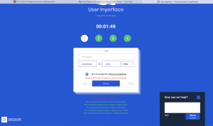
The first thing I noticed was the reverse use of colour. For example, NO was placed in a green circle, which is largely in associated with “go” and (if not paying attention) might lead a user to click on that instead of reading the smaller print below. Also, the use of a green colour box reading “lock” with the “close” option labelled as @lose making it harder to locate immediately.
Another thing I noticed was the use of a timer clocks, and wondered if it might force a user to feel pressured and make a choice? As for wanting a five criteria password, I thought I would give this a try (with a fictious email, of course, because I would never enter in my own) and, admittedly, had to do a double take when it told me my password was “not unsafe”.
It made me laugh that nothing happened when I wanted to choose “Yes” when prompted in red “This site uses cookies, is that a problem for you?”. I also laughed at the terms and conditions and how it resolves all responsibility of the contents of its website, and also when I explored the “help” option and it informed me there were 433 people ahead of me.
One thing I kept on wondering was, “does this actually work”? Do users really not pay attention to what they are reading what is in front of them and just click away on everything? And, are users really drawn that heavily to advertisements placed within pages? Understandably, this was an “in-yer-face” frustration so the choices were purposeful and most likely presented in an exaggerated form, but it has sparked a curiosity for me to intentionally notice the more subtle ways web and interaction designers might try to lead my attention towards or away from sites that I visit.