So this project might have some interesting possibilities. The first thing I did was look at the raw data and capture the choices from most popular to least:
Jaat Kahan Ho_M4 19
Morning Star Devil Bird 16
Fifth Symphony_M8 15
El Cascabel_M6 14
Johnny B. Goode 14
Percussion (Senegal) 13
Flowing Streams_M7 12
Melancholy Blues 12
Tchakrulo_M2 12
Wedding song_M1 12
Night Chant_M3 11
The Magic Flute 9
Brandenburg Concerto 8
Izlel je Delyo Hagdutin_M5 7
Panpipes and Drum 7
Tsuru No Sugomori 7
Dark Was the Night 6
Pygmy Girls’ Initiation Song 6
The Well-Tempered Clavier 6
Bagpipes (Azerbaijan) 5
Gavotte en rondeaux 4
MensHouseSong 4
Rite of Spring 4
The Fairie Round 3
Kinds of Flowers 2
Greetings from Earth_M10 1
Cranes in their nest_M9 1
String Quartet No. 13_NotonList 2
One thing I noticed right away is that most of my entries were wrong; not sure what happened there. So when I captured all the above data, I added mine correctly. That showed that I had made 2 choices it seems no one else did, although I find that doubtful. First, it seems I chose the Greetings track and no one else did. As well, I seem to have been the sole chooser of the Cranes track; again, it seems doubtful. In any event, the above data has my numbered choices tagged as _M9 or _M2 to show where my own choices ended up.
I also lost a bunch of data because I wrote directly into Canvas, something I almost never do. Thus, when it crashed (and I had not saved for awhile, I lost observations).
Oh, right, other data I lost: Female: 13; Male: 11. These numbers could easily be wrong, as I designated male/female simply by an arbitrary decision around the first name.
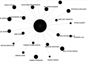
So, after I had written another thousand words or so, I tried to upload palladio files. Turns out, we cannot. And, I lost all that I’d written. Still, the graphics were nifty:

I also put the data into another program that manipulates like Palladio.

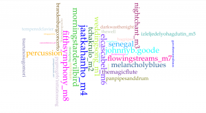
This is from Voyant Tools.org. The placement and colors have no meaning, only the size of the letters. As you can see, Jaat Kahan Ho was the most popular choice followed by Morning star.
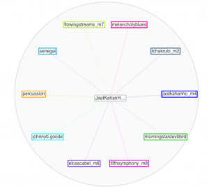
Where you see _m2 or _m8 shows my choices in the music. I was interested in seeing how I lined up. Not all that well, actually . . .
The Palladio files cannot tell me anything, really. They especially cannot tell me why a choice or correlation occurs. It can show me some limited relationships, such as clustering names according to top choices, but what does that tell us? Nothing, really. It might provide a starting point to ask questions of those who are clustered to see if choices are more than coincidence.
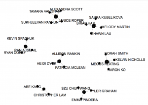
This graphic shows clusters according to group connectivity:

Again, the visual shows people whose choices are similar, but this is a correlation and not causation. We cannot know why these choices coincide as they do. In fact, from my own close examination of the textual/numerical data, I learned that I have been miscategorized; thus, this representation is misleading. Still, it’d be a fun thing to do at a party, or ahead of time, especially to guests who might not know each other. Then, you could cluster people according to music choices. And, you don’t have to be limited to music; you could do anything . . .
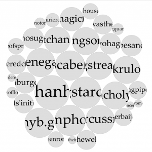
Here’s a mandala representation of the songs, again from Voyant.com:

The blurriness results because I have to scale up the graphic to make it visible. Here’s another one, this time in Termsberry:

So I did not scale this one, just to see how it turned out. You can see how much time ca be wasted playing around. But it is interesting to have your perspective turned upside down.
I have used other data capturing devices, particularly ones that analyse the presence and relative associations of adjectives, adverbs, verbs, and nouns. These are useful to identify the level of emotion in a text, and have even been used in court cases.
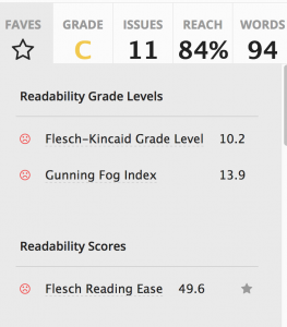
Another popular text analysis tool is readability. I have written plain English documents and these tools can be revealing. I also usually have my students do a few exercises using these tools to help them improve their writing. I put this paragraph and the previous one through a free app at https://app.readable.com/text/?demo

The site also comments on adverbs and so on. The biggest errors in my text, above, include sentences that are too long and words that are too complex, like, complex. Still, it’s expected that 84% of readers could understand what is written.
I love playing with words this way, and I find that I see so much more than when I simply review the words, even when I give a close read.
Generally, this exercise added another tool for me to use in my classes.
So after I tweaked a few sentences of the above paragraphs:
So I did not scale this one. I just wanted to see how it would turn out. You can see how much time can be wasted playing around. But it is interesting to have things turned upside down.
I have used other data capturing devices. I have used ones that analyse the presence and relative associations of adjectives, adverbs, verbs, and nouns. These are useful to identify the level of emotion in a text. This has even been used in court cases.
Another popular text analysis tool is readability. I have written plain English documents. These tools can be revealing. I also usually have my students do a few exercises using these tools. It helps them improve their writing. I put this paragraph and the previous one through a free app at https://app.readable.com/text/?demo
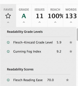
I ran it again through the readability app. The scores improved more than I had anticipated:

So, it is intriguing to see how words can mean . . . and Alice was perhaps more insightful than she realized in her comments to Humpty Dumpty:
“When I use a word,” Humpty Dumpty said, in rather a scornful tone, “it means just what I choose it to mean—neither more nor less.” “The question is,” said Alice, “whether you can make words mean so many different things.” “The question is,” said Humpty Dumpty, “which is to be master—that’s all.”
Lewis Carroll, Through the looking-glass
