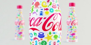
You can’t judge a book by its cover, a lesson taught to me over and over again since I was a toddler. While I agree with this messages philosophical meaning, I have to admit I always judge a book by its cover. In fact I judge everything by its cover, package and appearance. Today in class we talked about packaging and brands and what they mean to us. I think that in order for brands to portray the right message they have to really put some creativity and effort into their packaging. As a consumer we are constantly faced with choices when we go to the supermarket or the mall. When I face that tall isle of snacks and chocolates my eyes automatically are attracted to the sparkling colorful packages with creative designs. I think many corporations understand this and that is why recently we have seen a renaissance in the packaging of products. For example Coca Cola, who have the generic old school red pop can have come up with a Coke Kids concept. The proposed package keeps all the functionality of the coke bottle but adds the “wow” factor.
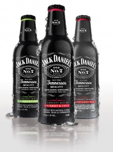
Another beverage company who recently launched a new product is Jack Daniel’s. Known for their quality whiskey, Jack Daniel’s is introducing a line of whiskey infused beverages. As Jack Daniel’s drinkers are mostly men the packaging for this product was crucial. Men do not like the idea of drinking coolers or “girly” drinks. The bottle is not sleek but is instead thick with the classic Jack Daniel’s font. By packaging this beverage in such a manor Jack Daniel’s can expect to retain it’s male drinkers while still adding innovation and creation to the Jack Daniel’s brand.


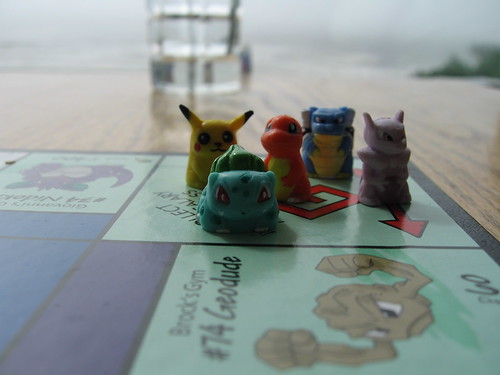
 Monopoly is constantly creating new addition of its popular board game, including


