
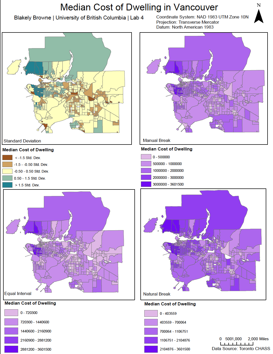
In this portion of our lab, we analyzed the different modes of data classification one can do in ArcGIS. Stepping away from this lab, I now see how the concept of map bias takes place, as we, as map makers, have the ability to choose a scale of which conveys a certain idea through varying visual representations. For example, the manual break, as seen above, makes more of Vancouver visually appear as low-cost, while other types show more of the true nature of Vancouver’s extremely expensive housing market.