Synchronous & asynchronous communications

Standard
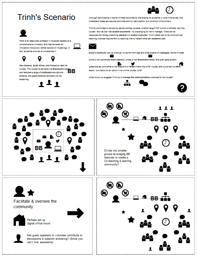
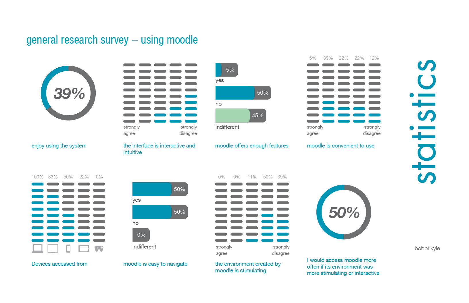
Since my Moodle course is a geared towards post-secondary students of design and dynamic media, I decided to add an activity that would fit with the curriculum I’ve been roughing in. The class is structured as an online companion to a face-to-face design class, extending opportunities for learning outside of classroom hours. In terms of course weight, studio courses are critical at 6 credits. Students cannot proceed to the next year without having successfully completed the studio class because this class serves to focus the years other required courses, and course electives. Everything learned in these other classes is applied in this one concentrated studio. It is understood and required that students spend a large amount of their own time prepping for, and working together on the materials for this course.
At the beginning of any design studio project students must explore topics of interest and present interest areas for the development of design solutions. For some this is easy, for others it is hard. Typically students will begin the exploration alone then present their areas of interest to their peers and instructor in class (or outside of it). Due to time restraints this usually happens in groups and not all students have the benefit of this in-person research and questioning. An opportunity lost is also the “legacy” that is left by these explorations for ALL students to read, absorb, learn, and ideate from peer ideas and posts. It is also difficult for students to keep track of what their peers are working on, yet they will have to intelligently monitor and critique peer work several times during the semester. In this sense an asynchronous forum is extremely beneficial because it allows for constructive presentation and feedback between peers over the long term. Students may at any time browse, comment and continue to monitor the progression of peer work as well as their own.
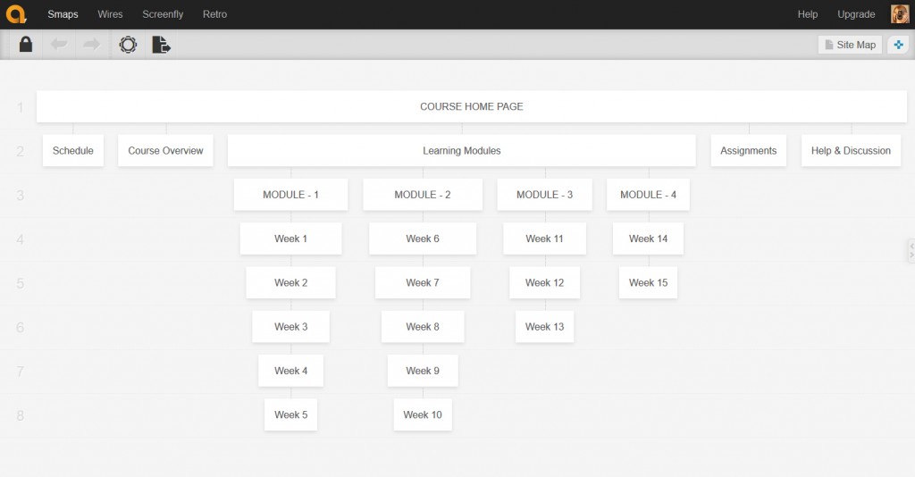
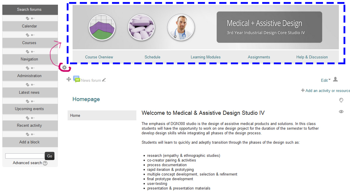
For my activity I decided to rough in my Module 1 > Week 2 activity “Areas of Interest”
You can log in using the username: Visitor
password: Password123!
I created a discussion forum for students to post their interim areas of interest and I asked other students to comment on at least 5 of their peers posts.
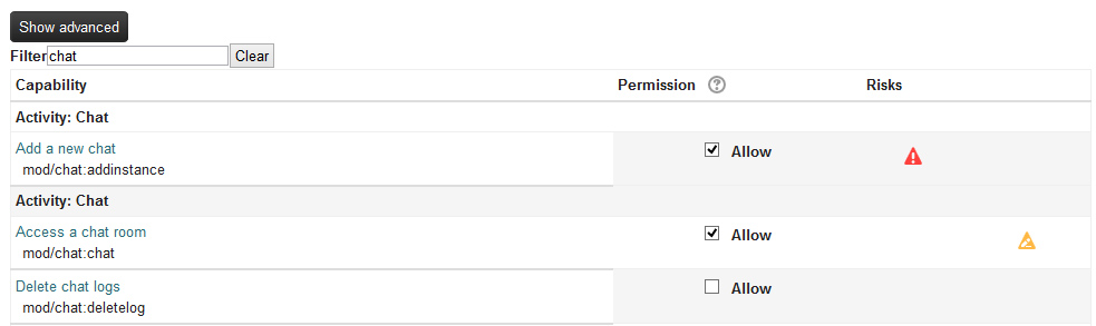
Students that spend long hours in the studio have the benefit of this discussion through a shared studio space, but students that cannot spend a large amount of time on campus tend to miss out on these opportunities. The asynchronous forum will allow these students to still engage and contribute in this process. Synchronous feedback in a community of inquiry or practice is also key as students must actively question their decision making processes; this often occurs organically through the spontaneous presentation of peer thoughts and ideas. I decided to create a single instance of a live chat activity to allows for a degree of this to take place outside of the studio. I also turned on the ability for students to create/add their own chat rooms in case the main chat is already in use.
(I’m still playing with the logistics of how this might be restricted to a certain class in a certain week so as not to overload or bog down the server.)
My rationale for including both synchronous and asynchronous activities was based on the opposing benefits and drawbacks for each activity and Anderson’s mention that “it is possible to combine synchronous, asynchronous, and independent study activities in a single course” (2008). I think that where possible, students can have access to these “optional synchronous activities” (2008) to enhance their learning, thus I made the asynchronous activity mandatory, and the chat rooms an added optional activity. I’m hoping that this type of approach can constitute the ‘right mix’ when applied thoughtfully and effectively.
I injected these at the beginning because “knowing what you know and don’t know focuses learning” (Chickering & Gamson in Garison et al., 2000). This seeks to make early use of student-driven “appropriate feedback on performance [… and] help in assessing existing knowledge and competence” (2000). I thought this would be a key opportunity to combine aspects of prior assessment, knowledge building and synchronous and asynchronous communication. Establishing this practice early hopefully helps to reinforce the high expectations set in the intro module, and also hopefully guides students towards a model of sustained inquiry and use of the meta-cognitive strategies that they will need to succeed through the term (you can read my related intro module post here).


References

Anderson, T. (2008). Teaching in an online learning context. In Anderson, T. & Elloumi, F. Theory and practice of online learning. Athabasca University. Retrieved from http://www.aupress.ca/books/120146/ebook/14_Anderson_2008-Theory_and_Practice_of_Online_Learning.pdf

Chickering, A., & Gamson, Z., in Garrison, D. R., Anderson, T., & Archer, W. (2000). Critical inquiry in a text-based environment: Computer conferencing in higher education. The Internet and Higher Education, 2(2-3), 87-105.


Ideating with Icons

Standard


This week’s instructional design scenario kicked me into icon-ideation mode. In the spirit of nerdity I thought I’d share my approach:

This was a complex problem with multiple factors. I’ve been taught that whenever there’s a large or messy situation you can best look at the whole picture if you extract the different pieces, re-arrange and play with them (yep, I said play). In this mode you can often come up with an idea you wouldn’t have otherwise. In IxD/INDD this is typically done with paper cutouts, icons or sticky notes to represent aspects, stakeholders or factors. People generally think this process is odd or silly but it does have a really important gain:
When you’re done forming a new representation of your potential solution you can then try to visually see if there are any holes, critical pieces left over, or items not well addressed before you invest time in development. This can lead to several “aha” moments where you test the validity of multiple ideas very rapidly (rapid viz). I’ve been taught that this is best done as a group to gain differing perspectives. I realized this week, that this class is innovative for me because it allows this sort of a text-based ‘design charrette‘ to occur on the forums. In total I had about 8 different  ideas (icon formations) to suggest potential change, but my document was huge so I tapered it down. I represented the situation visually, then offered the community solution that was best supported by our readings. The neat part about this approach (and the approach we use on the forums) is it can actually reveal several valid strategies and I always look forward to reading those provided by my peers.
In terms of the problem scenario, volume of communications was one of the main issues communicated in this case; having 4 or more means of teacher-student communication amongst 150 students is not sustainable. I suggested that Trinh set down some firm rules regarding teacher-student communication and restrict email/personal communications to one main avenue, perhaps within/through Blackboard itself. I also made a few other suggestions with regards to the formation of a learning community:
Anderson states that “emerging best practices now recognize the flow of communication in online courses to be much less ‘teachercentric,’ […] teachers do not have to respond immediately to every student question and comment, and playing a less dominant role in class discourse can actually support the emergence of greater learner commitment and participation” (2008). Trinh can easily add an auto-responder to her own email instructing students to post questions in the forums, she can also add something to this effect on her blog and twitter. This means that she is freed up to perhaps employ a model of student-student help and interaction through the use of help forums and peer forums.
This supports the learner-centered model that Trinh is ‘committed’ to where “appropriate combinations of asynchronous and synchronous voice, text, and video” (2008), can support a learner-centered environment. Perhaps now is the time to develop on the asynchronous activities. She could use ‘technology as lever’ in this case to divide the large community of 150 students into smaller groups, employing a peer model of reciprocal co-teaching. Blackboard provides several tools to facilitate this.


For my oddball exploration I used quirktools.com>wires  😉

Hijacking the Moodle Layout

Standard

Since part of my flightpath deals with exploring, pushing and manipulating LMS frameworks to do things that aren’t necessarily a ‘typical’ use scenario, I spent a lot of time hijacking the normal course layout (after deciding on the aims, goals, needs and appropriate interactivities and materials that is).

Once I had thought about and composed the items listed above, I decided to create a sitemap to figure out what my layout would look like. I used a free service called Smaps for this.

In my graduating project at ECU I did a few general student surveys regarding students’ feelings towards using Moodle and their impressions of usability (part of the ethnographic research process). This was actually the reason that I took this approach.


One of problems frequently identified was the ‘endless scroll’ format and bread-crumb navigation. Many of the students expressed their wish that it behave more like a website or blog, so I wanted to play with this idea.

I used a short youtube video on making Moodle behave like a webpage to inform my approach and also brushed up on my inline CSS styling and HTML skills at Code Academy.

I realized that the top section or course “summary” always stays at the top of the page, so it’s a good place to put a static site banner and navigation images/button that display on all pages.

The other thing that I realized is that I can create and link my “pages” to these buttons, then force Moodle to display only one page at a time.

Administration > Edit Settings > Course Format:


This essentially ‘hides’ the long list of pages, showing them only when they are clicked on in the navigation. (I had to work with them all showing first, then switch to this when I was done to make it behave this way). Overall I had a lot of fun. I’m glad I attended to the important stuff first, then dove into the design/HTML code last. I was able to make the layout look nice by using inline CSS styles, and by creating content columns using divs. This saved me a lot of time since I tend to dive into design first. The overall verdict is that Moodle isn’t half as bad as I thought, it does perhaps have some flexibility in terms of course design that other LMS’s might not offer. It does require a lot of work though :\

If you’re interested, you can read my reflection post and access my non-UBC Moodle site on this page: https://blogs.ubc.ca/bobbik565a/intro-module/

Initial Moodle Impressions…

Standard
Okay, I’ll admit that my initial experience with the Moodle back-end creating a Moodle install and setting up a course from scratch was a bit frustrating. I did this on my own hosting provider/server with the idea that I’d transfer stuff over to the 565 setup later. I’m a believer in exploring the interface to see if it’s intuitive before resorting to the traditional RTfM approach (that’s usually step 2). [Please forgive my informal conscious-stream-of-thought style narrative here].

The first thing I did (after setting up the course) was to try to create the “general” or “summary” information page that appears at the top of a course…so I went to the toolkit provided and began to follow some of the instructions there. I ended up with a page link inside of the top listing. Hmm, that’s not quite what I was after. I’m pretty sure you can have an image at the top of the course as well as some content.
So then I tried: “Edit Course Settings” > “Description” and added my content there. Check it…huh, this ends up somewhere else too, probably at the top-level of the course listings perhaps.
So off to the Moodle support site and Google search to find my solution. But how does one refer to this section exactly? There’s no label, button or indication.
A bit of fumbling around lead me to finally watch a Youtube video (for a related topic) which gave it away. Ohhh, it’s the tiny little grey gear icon floating randomly above the first week that I should have intuitively known to click (sarcasm here). Okay, fine. Time to delete all that other stuff I created in the wrong spots and get serious now.
So I upload a nice but compressed banner image (because I feel like there should be something to greet the student and let him/her know they are indeed in the right place). I save the page and try shrinking the window to see what happens to my image on smaller screen devices. D’oh! It’s not responsive. Okay, no worries, in a web page or WordPress you can simply go into the HTML editor and delete the image dimension assigned to it by the image uploader, then it will adhere to 100% of the page width, and will re-size itself when the page is shrunk.
No dice. Hmm, okay. Fine. I’ll wrap it in a DIV with a style of 100% width, make sure there’s no size dimension for the image, and it should re-size both as the page shrinks .. but wait, how the heck do I use HTML elements and CSS styling in Moodle?
Back to Google Search & Moodle Docs re:HTML/CSS formatting and styling. This was fairly useless, advice was: create your own theme. What about inline styles? It’s a messy and a pain, but it should work. Maybe, but the editor doesn’t support code hinting or indenting; so am I going to go blind working with it? Hmm, it allows for new lines without inserting a line break…
Try adding some custom HTML/CSS and we have a winner! Okay, its unintuitive to get started, but I can have more control over the layout using HTML instead of the standard editor (sort of) maybe this is cool!?!

Phew, for a while there I was feeling a lot like the screaming goat.

Value of Visual Representation?

Standard

I’ve realized that I’m a visual representations kind of girl… more specifically I’m a big believer in visual organizers.

Why? We’ve been provided a number of key and important frameworks in this class that I want to be able to return to (on an ongoing basis) to inform my decision-making processes. I realized that while I might remember how one aspect of a key framework can benefit my thinking, I can’t possibly remember everything. It’s neither accessible nor efficient to have to continually re-scan texts in order to identify which aspects fit or don’t, or why one framework might be of more use than another. Basically I feel like these frameworks and their specifics get marooned in a text somewhere, so I’m trying a new approach this term. I started a Google spreadsheet with each framework in a tab/table and summarized the specifics beside it. This allows me to organize, to (hopefully) retain something in the process, and to create a quick reference that I can pick at and draw from. Each sheet/tab links to a copy of the full text so that I can re-read when I need to dive in deeper. This seems infinitely easier to keep myself organized and is working admirably for my ETEC 510 class. This week’s activity allowed me to test it, so my approach with it was a bit of a science experiment!
Here’s a peek at what I’ve got so far:


Myriad Connections

Standard

The logistics of group work can sometimes be a challenge, but more often than not, it is incredibly stimulating! I tend to think of it as building a mosaic; each member brings with them a unique set of skills and new ways of thinking. When you figure out how to make these different facets of skill and experience fit together, the results can be mind-expanding and the final picture can become much richer for it. : )

This very much describes how I felt about our rubric project. We were fortunate to agree on a base framework early on, then we each came up with a number of questions and aspects of importance to research. We started quite wide in scope, then we narrowed it… then we widened it again. It was a great experience. We decided that it was important to keep a systems-based framework that addressed important overall goals, reworking this where needed, and adding/tailoring important facets that directly applied to our context. We were hoping for a balanced approach that considered both the micro/macro levels. We also decided to make the sheet into a worksheet that can be printed and actually used to evaluate and compare LMS’s (each LMS gets a page to evaluate it, then these pages can be compared to weigh out the decision).  Since we were identified as members of the YesNet’s LTAC (Learning Technologies Advisory Committee) our rubric is geared towards the LTAC team.The sheet provides an opportunity to give an overall numerical score and observational notes regarding how each LMS addresses each specific criteria. Some minor inspiration was also taken from other systems/software/usability rating scales like the SUS scale and SSM.

The main takeaways for me are that it’s difficult to be narrow and comprehensive at the same time. Perhaps this balance is important in order to be flexible and transferable? Also, if two or more approaches work well perhaps they can help inform one another? A hybrid approach can be used in some cases too, although this is a bit scary to tackle. I also realized that it is difficult to take into account the needs of all stakeholders involved so I’m glad that we were a multifaceted team.

Anyway, that’s my thought bubble for today. Many thanks to my group and I hope we did well!