Task 9: Network Assignment Using Golden Record Curation Quiz Data
Analyzing the implications and outcomes of the visualizations revealed connections between other classmates and myself in music choices that I would have not recognized, even if I went through every classmate’s lists on their blogs tenfold. The formation of communities with similar responses supports the analysis with visual aids. The data is much more visually clean and the ability to interact with the data allowing a deeper understanding of knowledge provided. I thoroughly enjoyed Wikigalaxy as well due to its ability to interact with the knowledge provided.
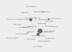
Upon analyzing the visualizations, it became apparent that the communities based on my music preferences and selections were relatively small in comparison to other facets. This outcome was in line with my choice to adopt a distinct rubric, which led to a divergent categorization process compared to that of my colleagues. Upon reflecting on my chosen rubric, I discerned that my approach might have introduced a notable degree of personal bias, potentially contributing to the formation of smaller communities within the visualizations compared to those of my colleagues. These relatively smaller groupings within the visualizations indicate the need for a nuanced and possibly broad interpretation, considering the impact of the chosen categorization criteria of the original golden record is to encompass all of humanity.
One thing to consider with this Palladio is that we should recognize the potential implications of the limited sample size and class composition. With a class of 300 students with more diverse career backgrounds, I am curious to see what the data would look like in comparison to our class. I wonder if there will be a linear or exponential growth in both edges and nodes in comparison. I am also curious to see other classes from previous terms to compare/contrast our web structure.
The presence of “null” data in visual representations serves as a critical indicator of the intricacies and potential limitations within the dataset. These instances of missing or excluded information can shed light on the diverse factors that may influence participants’ choices. Omissions may arise from various sources but may not be explicitly conveyed through the visual data. Recognizing the significance of these “null” elements is vital in comprehending the complexities of human decision-making and ensuring a more nuanced interpretation of the visual data’s implications.
Reflecting on this visual analysis journey has been an intellectually stimulating and personally rewarding experience. Delving into the interactive visualizations and their implications of human choice has deepened my knowledge of data representation and human behavior. I found excitement in unraveling the nuances embedded within the data and in grappling with the multifaceted nature of it. Data is not static but dynamic through its imports and exports. This experience has not only fostered a deeper appreciation for the intricacies of visual data interpretation but has also ignited a newfound enthusiasm for exploring the dynamic relationship between data visualization and human cognition. My new favourite word is web!
Images of my community compared to biggest community:

References:
Cornec, O. (2015). WikiGalaxy: Explore Wikipedia in 3D Retrieved November 5th, 2023
Systems Innovation. (2015, April 18). Graph theory overview [Video]. YouTube.
Systems Innovation. (2015, April 19). Network connections [Video]. YouTube.