Task 8 – Golden Record Curation

After reading an overview of the project on the NASA, I made a mental note that although I did not yet have criteria for selection, my goal was to be as  unbiased as possible.  I skipped the podcast because I find that authors rarely pull off being neutral and I did not want to be swayed by anyone’s opinion. Instead, to get more facts,  I watched a short documentary that explained how it was made and how to decode it.

Prior to listening I did some breathing exercise to clear my mind and be present, trying to avoid reading the titles and closing my eyes when listening. I played them in order hoping they would “speak to me” and lead me to a selection metric as I still did not have a plan. I got nothing from the first two, then the third (still with eyes closed) evoked a feeling.

So I decided to chose 10 songs that: 1- Conveyed an unequivocal feeling  (whether the emotion or the song itself be pleasant to the listener). 2- The emerging feeling was pure and unbiased by lyrics or context. The idea is that this feeling would transcend humanity.

Of course, I could be extremely naive in thinking that I am unbiased and the feelings that I perceived are universal. I am however, surprise at my final 10, (let’s just say they are not songs I’d put in my spotify list), but they did indeed “touch me”. I am also surprised by the ones that I did not pick, like the Mexican one; I am half mexican and this is a folkloric dance song that my mother performed in International expos when I was younger. I actively listened, detaching from all positive associations, and got nothing from it.

So here are the songs and separately below, are the feelings that I perceived. I am curious to know if others got the same.

  1. Bach – WTK 2, no 1, Glenn Gould
  2. Men’s house song – Papua New Guinea
  3. Navajo night chan
  4. Panpipes and drum song – Peru
  5. Melancholy Blues-L Armstrong
  6. Jaat Kahan Ho – India – Surshri
  7. Fairie Round – cond David Munroe
  8. Bach – Gavotte en Rondo – A Grumiaux
  9. Beethoven 5th, part 1, Otto Klemperer
  10. Cranes in their nest-Japan(Shakuhachi)

……. (Scroll for associated feeling)


  1. Bach – WTK 2, no 1, Glenn Gould: Hope
  2. Men’s house song – Papua New Guinea: Worry
  3. Navajo night chant: Unity
  4. Panpipes and drum song – Peru: Rejoicing
  5. Melancholy Blues-L Armstrong: Relaxed
  6. Jaat Kahan Ho – India – Surshri: Melancholy
  7. Fairie Round – cond David Munroe: Innocence
  8. Bach – Gavotte en Rondo –  Grumiaux: Dialogue (communicating)
  9. Beethoven 5th, part 1, Otto Klemperer: Power
  10. Cranes in their nest-Japan(Shakuhachi): Loneliness


Assignment 6 – Emoji Story

Can you guess?*

*NOTE: My reflection below might give many hints, can you try guessing without reading it first? : )

.

.

.

.


My instinct was to go with a movie or books with a title that would be easy to decompose and represent with one emoji per word. The titles coming to mind where either too easy or too short. I decided to make this task more interesting and challenging by choosing one my favorites and just figuring it out.

The title was challenging. I initially aimed to break it down with emojis but it proved to be difficult as the title itself is a play on words that encompass a feeling. I had no choice but to choose emojis based on the story. This proved to be even more challenging because the story is sensory-delight composed of ethereal scenery with minimalist dialogue and action wrapped in a bewitching score. Essentially, how to convey a story in emojis, where the original is largely symbolic and left to viewer interpretation. In this sense I didn’t know if it was ekphrasis or reverse ekphrasis.

Furthermore, after laying out the emojis I questioned my interpretation of the narrative and if the sections that I chose to represent where commonly recognized as being central or if I had selected themes based on my connection to them. I noticed that the primary criteria in my emoji grouping and layout was to convey emotion vs. accurate linear storytelling.

By the standard of phonetic writing, however, picture writing lacks narrative power. The picture elements extend over a broad range of verbal meanings: each element means too much rather than too little…We cannot tell whose side the writer is on. (Bolter, 2001 p. 13).

Finally, I was surprised that the least significant challenge was a lack of emojis. I even omitted certain emojis for fear that they might be too literal. I am extremely intrigued to know if those who guessed correctly will do so analytically, trying to decipher a pattern, or if they will look for an overall impression to trigger recognition. Without framing, this emoji narrative can be interpreted “..in an open order fixed by the reader and/or viewer’s interest” (Kress, 2005, p.16).


References

Kress, G. (2005). Gains and losses: New forms of texts, knowledge, and learning. Computers and Composition, 22(1), 5–22. https://doi.org/10.1016/j.compcom.2004.12.004


Bolter, J. D. (2001). Writing space: Computers, hypertext, and the remediation of print (2nd ed.). Mahwah, N.J: Lawrence Erlbaum Associates. https://doi.org/10.4324/9781410600110


Assignment 5 – Twine Game

When creating the twine story, I aimed to connect with the player. I was inspired by this party trick/joke/conversation starter I enjoy. I don’t know its origins or if it’s based on any theories, or where I even got it from, but I’ve been reciting it for decades. It seems to entertain and most of the time  people relate to it. The original joke has funny more questions, but I chose to remove them to give the game a mysterious feel.

Achieving this feel was very challenging: I am new to Twine and any form of coding and tagging. I had to change my “wysiwyg” (what you see is what you get), mindset and learn how to enter text precisely to obtain design elements. I was too far in by the time I realized it was ambitious and I would be limited creatively.

After perusing Twine basics, I needed to understand how to work with open-ended answers and variables; these were important in creating a tailored experience for the user. This was a challenge in itself as rather than instructions, I find it easier to reverse-engineer an example similar to mine. I was grateful to find forums for Twine users which could provide these. This was evocative to Engelbart’s belief that “a community of users… collaborated in pilot trials and lessons learned that then fed back into future requirements of the evolving processes and tools (paras. 4–5).”

Another major and very time-consuming hurdle was achieving that mysterious feel with limited images. Besides actual wording, It had to be done using the text variables: style, font, colour.  As stated by Bolter (2001):

Like computer icons, medieval illuminated letters functioned simultaneously as text and picture… Medieval illumination embodied a dialectic between writing and the visual world; it was a means by which writing could describe or circumscribe the world— not symbolically through language, but visually through the shape of the letter itself (p.65)

After many hours and failed attempts, I gave up on trying to add google fonts to the style sheet. By incorporating colour, style and spacing via Harlowe, I somewhat achieved the “dark” feel I was aiming for. I hope this feeling is conveyed via text and engages the player.

Let me tell you who you are (1)

References


Bolter, J. D. (2001). Writing Space. Routledge. https://doi.org/10.4324/9781410600110


A Lifetime Pursuit – Doug Engelbart Institute. (n.d.). Www.dougengelbart.org. Retrieved October 18, 2021, from https://www.dougengelbart.org/content/view/183/153/

Assignment 4


Potato Stamp

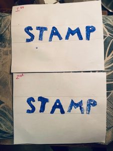
I was a bit anxious getting started as I only had two potatoes so I could not afford to mess it up. Although I am comfortable with drawing, painting and crafting in general this was my first time making a stamp and I found it to be more technical and precise, than creative. In fact, the only creative part of this task was picking the word and stamp colour.

A lot of planning was involved in creating the stamps. In regards the letter themselves, I paid attention to making the size, font (style), and width consistent. I found it difficult to gauge if the surface of the letter was even enough to create a full impression on paper. The letters with straight lines which did not have closed counters where the easiest to carve. In this case “T” and “M”. Alternatively, the letters with curves where more challenging, especially the letter “P” which had both curves and a close counter and having to carving out backwards made it the most difficult part of the assignment and I almost cut the potato in half.

When it came to the layout and spacing, I drew lines on the paper as guides to make both copies the same. I felt it was the only way to control the spacing between the letters given the asymmetry of the potatoes. I made mistakes in trying to reproduce the first copy and its particularities; The overall layout and spacing between the letters were similar but I miscalculated the amount of paint on the letters which made them look different from one copy to another.

I was surprise that the longest part of the process was creating the letters and trying to figure out the logistics of the layout. This took approximately 45 minutes, whereas the actual stamping part took only 20 minutes. It reminded me of Paul Collier’s comment in Upside Down, Left to Right:

That’s where technology has really pushed forward, is that we can change things in an instant. Here you set up a paragraph or sentence, if you get it wrong, or if you haven’t planned your way forward through that, then you have to take it all apart and start over again.

However, once I had set up and stamped the first copy, the second one was much faster to produce and I could imagine getting into a flow and perfecting my method to produce better versions. I quite enjoyed the task beyond the crafting part, it made me consider the arduous labour and patience required in the early days of printing but also how every word in the codex would have been more valued than it is today.

References:

Danny Cooke. (2012, January 26). Upside Down, Left to Right: A Letterpress Film [Video].  https://www.youtube.com/watch?v=n6RqWe1bFpM&t=143s

Spam prevention powered by Akismet