Task 11:

I approached the exercise with the mindset of being an impartial judge. I first noticed the lack of information behind the prosecution’s recommendation. Did the defendants have prior convictions? Were they influenced by the risk assessment? What was the algorithm behind based on? On a side note, the use of colour was influential UX-wise;  a lot red/yellow was definitely eye-catching and I was curious is visuals play role when data is presented in real life, but I digress.

After reviewing two cases my plan was to base detention on the following criteria, in order of importance:

  • Severity of the crime (assault justified detention vs. less “dangerous” crimes such as drug possession. My concern was safety to the public.
  • Risk: Violence (I would detain red and yellow if paired with another violence indicator)
  • Risk: Flight, if red and paired with “dangerous” crime
  • Defendant’s comment and their age. I wanted to hear their voice and the age could possibly provide a clue about priors if paired with the type of crime. For example; a robbery charge over 30 year old might indicated that it is not the first one.
  • Prosecution’s comment.
  • Risk: Commit a crime

I recognized my own biases: gender and race. My studies in race inequality and systemic discrimination might lead me to be more lenient with people of colour and women. I also realized that my perceptions of “dangerous” were subjective, as were the indicators that I was using and how I was pairing them. With all this in mind, I tried to be as fair as possible and used this method for the next 5 cases.

This made me uneasy as without an actual points value I was pretty much just winging and feeling more unsure as I went along. I questioned whether I was trying to avoid detaining and/or deliberately opposing the prosecution’s recommendation and should reassess my method. Then I got hit with the news clipping and this changed everything. Suddenly my release “mistakes” began influencing me and I became less conservative with the DETAIN button; Risk of Flight and the prosecution’s recommendation moved to the top of my list. It reminded me of the Crime Machine podcast, as it was no longer about the cases themselves, but about MY Fear/Jail Capacity numbers, my reputation and the burden on the public.

For the last 10 defendants I shifted again and relied almost solely on the prosecution’s recommendation and the assessment despite my instincts. I notice my mindset changed and I found comfort in relinquishing my responsibilities and being backed by the data, the weight of the implications and outcomes was no longer just on my shoulder. What struck me is how easily I converted and how I was able to talk myself into it and justify it as “well they must know better”.

After the exercise I felt unsettled with the decisions I made and the consequences they might have if it was not a simulation. The two cases that stuck with me the most are that I released a mother, arrested for drug possession and woman arrested for reckless driving, mainly based on the prosecution’s recommendation and the risk assessment. Did I act on misinformation based on more misinformation? Were my biases the same ones that were used to create the assessment and also influence the prosecution. Additionally, my definition of “dangerous” to the public no longer made sense. Reckless driving was definitely dangerous for the public, and I can’t bare to overthink the drug possession arrest of a mother.

Dr. Cathy O’Neil defined “Weapons of Math Destruction” as having the following properties:

  • Widespread and important
  • Mysterious in their scoring mechanism
  • Destructive

She noted that recidivism algorithms are limited to particular types of data. For a real bail hearing risk assessment, the algorithm might only focus on a person’s record of arrests and convictions and their responses to a questionnaire about crime in their neighborhood and/or in their family, she called them “proxies for race and class”. Risk assessment scores are then used by judges to determine bail, sentences, parole etc. O’Neil believes that these score should be used to help defendants, not against them.

To challenge these type of assessment, ProPublica followed up on over 7000 people arrested in Broward County, Florida, in 2013 and 2014 to see how many were charged with new crimes over the next two years, as per their the COMPAS risk assessment. They found the assessment were unreliable and only 20 percent of the people predicted to commit violent crimes went on to do so. They also showed that these same risk assessments predicted that black defendants were twice as likely to commit future crime.

This was definitely a startling task. In 15 minutes, my idealistic convictions succumbed to the pressures of getting those cases out with infrastructure approval and a complete disregard of the impact on defendants and their dependants. And all this based on flawed and concealed information. The expression that Amanda Levendowski used in the Enron podcast to describe biases that are encoded now echoes in my mind: “Garbage in, garbage out.”

References:

McRaney, D. (n.d.). Machine Bias (rebroadcast). In You Are Not so Smart. Retrieved from https://soundcloud.com/youarenotsosmart/140-machine-bias-rebroadcast

O’Neil, C. (2017, July 16). How can we stop algorithms telling lies? The Observer. Retrieved from https://www.theguardian.com/technology/2017/jul/16/how-can-we-stop-algorithms-telling-lies

Garbage in, garbage out (computer science). (2021, October 7). Wikipedia. https://en.wikipedia.org/wiki/Garbage_in,_garbage_out

ProPublica, Angwin, J., Larson, J., Mattu, S., & Kirchner, L. (2016, May 23). Machine Bias. ProPublica; ProPublica. https://www.propublica.org/article/machine-bias-risk-assessments-in-criminal-sentencing

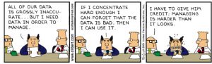
Addams, S (2001). ‘Bad Data’. In United Features Syndicate (Ed.), www.dillbert.com  

Task 10: Attention Economy

I initially approached the game noticing techniques from the Dark Patterns reading in mind, as well as UI faux-pas:

  • Misleading use of generally recognized and intuitive symbols and colours.
    • Underlines and different colour text that are not links
    • Use of green instead of red for negative affirmations
  • Confusing wording (must, should, can, etc)
  • Double negatives (if you do not…)
  • Hiding command that would expedite the process (deselect/select)
  • Disturbing pop ups with useless commands. (Timer and Help, “close” looks like trademark, the # of people ahead of me starts at 430 and increases by one when I click “Help”)
  • Conflicting directives (Upload/Download in the same area)
  • Confusing layout (selection boxes are inconsistently above or below the image)
  • Forcing me to disclose personal information and upload a photo
    •  Including making it mandatory to select an option that I don’t like
  • Inconsistent, inoperable and time consuming data entry fields (Age vs. birthday, Mrs. vs. Gender, door number picker)
  • Forcing me to accept their cookies and spurious Terms & Conditions

I was moving at a good pace until the image identification pages. That’s when my approach went from analytical to game mode-big mistake!  I started playing like I would and escape room, trying to use logic when selecting the images. Dissecting semantics, clicking everywhere looking for hidden links. I tried so many combinations to get past those four repeating screens and failed:

    • Glasses plural, therefore a sheet of pane is just glass
    • “a” vs. no preceding articles.
    • Not selecting items that had other objects in the image.
    • Not to mention a deep dive into the existential meaning of “light” (that almost broke me). 

All throughout, the timer and moving 1-2-3-4 were a constant distraction, almost antagonizing me. I finally vowed to quit at the 30-minute mark and I did. Five minutes into writing my experience, I went back to the game and tried one more option; selecting all the images on every set and voila. I am still not sure if that’s what actually worked or if the game was playing me and was going to let me pass regardless after a certain number of attempts.  To be honest, I don’t care to find out if it means one more second on that site.

Well-played BAGAAR, 37 minutes of absolute frustration achieved!


Task 9: Network (Golden Record Quiz)

The Golden Record data in Palladio was not initially clear to me, I first needed to learn how to decipher the data by reading other Palladio user guides.

I played with the facets (curator vs. track. vs community) to generate tables and graphs that would provide me an overview of the most selected songs to find connections. This did not add more insight as I was lacking any context behind song selection. I then arranged the data to display weighted track nodes (biggest on the bottom) and compare my selection with that of my peers.

I thought I could find a pattern or a link to more than one song. Without intel on why curators chose the songs, the idea was that perhaps I could identify those who used the same criteria as I had by the degree of connectivity of tracks. However, that would presume that their rationale was the same as mine and I had no corroborating information to support this. I based my track selection on feeling, itself intangible and immeasurable. I admitted that my selection method was flawed as it was solely based on my perception and had no qualitative data.

The main problem with the Golden Record Palladio data is that other than seeing node and edge information, and the limited ability to play with facets, the data revealed “who” (curators) and “what” (track selection) but not “why” (criteria). In the real world, this small sample could not be considered representational as it lacks values that would permit a proper analysis. Even if used as predictive model, it would fail in its primary task, which was to chose songs that can, as much as possible, encapsulate the human race.

Two strands of thinking tie together here. One is that the algorithm creators (code writers), even if they strive for inclusiveness, objectivity and neutrality, build into their creations their own perspectives and values. The other is that the datasets to which algorithms are applied have their own limits and deficiencies. Even datasets with billions of pieces of information do not capture the fullness of people’s lives and the diversity of their experiences. Moreover, the datasets themselves are imperfect because they do not contain inputs from everyone or a representative sample of everyone… creating a flawed, logic-driven society and that as the process evolves – that is, as algorithms begin to write the algorithms –(Rainie and Anderson, 2017)

This implies that one cannot justify or prove that the song selection is inclusive of all cultural, socio-economic, political factors, or even if those factors played part. Further, assumptions and links to song choice cannot be made without a clear profile of the curators themselves because biases cannot be identified.

I was intrigued by the possibility of adding more data into Palladio, integrating values like curator gender, class, etc. Additionally, the Golden Record Curation Data Gathering “Quiz” might include multiple choice questions explaining song selection as facets. For example:

Which of the following did you mostly base your song selection on:

      1.  Personal preference
      2.  Cultural representation  
      3. Song popularity
      4. Other.

Even then, these values would be biased by my own thought process and what I assume are plausible choices.

If algorithmic bias is merely a data problem, the often-touted solution is to de-bias the data pipeline. However, data “fixes” such as re-sampling or re-weighting the training distribution are costly and hinge on (1) knowing a priori what sensitive features are responsible for the undesirable bias and (2) having comprehensive labels for protected attributes and all proxy variables. (Hooker, 2021)

The original tracks for the Golden Record where chosen by renowned astrophysicist Carl Sagan and his team of first world, successful and educated astronomers, sound engineers, musicologists, record executives, journalists and artists. Were they qualified to make such an important decision on behalf of mankind? Probably. However, much like the Palladio data, it was very exclusive from the start.


References

Conroy, M. (2021). Networks, Maps, and Time: Visualizing Historical Networks Using Palladio. Digital Humanities Quarterly015(1). http://www.digitalhumanities.org/dhq/vol/15/1/000534/000534.html

Rainie, L., & Anderson, J. (2017, February 8). Code-Dependent: Pros and Cons of the Algorithm Age. Pew Research Center: Internet, Science & Tech; Pew Research Center: Internet, Science & Tech. https://www.pewresearch.org/internet/2017/02/08/code-dependent-pros-and-cons-of-the-algorithm-age/

Hooker, S. (2021). Moving beyond “algorithmic bias is a data problem.” Patterns2(4), 100241. https://doi.org/10.1016/j.patter.2021.100241

‌ Wikipedia Contributors. (2018, November 18). Voyager Golden Record. Wikipedia; Wikimedia Foundation. https://en.wikipedia.org/wiki/Voyager_Golden_Record

Task 8 – Golden Record Curation

After reading an overview of the project on the NASA, I made a mental note that although I did not yet have criteria for selection, my goal was to be as  unbiased as possible.  I skipped the podcast because I find that authors rarely pull off being neutral and I did not want to be swayed by anyone’s opinion. Instead, to get more facts,  I watched a short documentary that explained how it was made and how to decode it.

Prior to listening I did some breathing exercise to clear my mind and be present, trying to avoid reading the titles and closing my eyes when listening. I played them in order hoping they would “speak to me” and lead me to a selection metric as I still did not have a plan. I got nothing from the first two, then the third (still with eyes closed) evoked a feeling.

So I decided to chose 10 songs that: 1- Conveyed an unequivocal feeling  (whether the emotion or the song itself be pleasant to the listener). 2- The emerging feeling was pure and unbiased by lyrics or context. The idea is that this feeling would transcend humanity.

Of course, I could be extremely naive in thinking that I am unbiased and the feelings that I perceived are universal. I am however, surprise at my final 10, (let’s just say they are not songs I’d put in my spotify list), but they did indeed “touch me”. I am also surprised by the ones that I did not pick, like the Mexican one; I am half mexican and this is a folkloric dance song that my mother performed in International expos when I was younger. I actively listened, detaching from all positive associations, and got nothing from it.

So here are the songs and separately below, are the feelings that I perceived. I am curious to know if others got the same.

  1. Bach – WTK 2, no 1, Glenn Gould
  2. Men’s house song – Papua New Guinea
  3. Navajo night chan
  4. Panpipes and drum song – Peru
  5. Melancholy Blues-L Armstrong
  6. Jaat Kahan Ho – India – Surshri
  7. Fairie Round – cond David Munroe
  8. Bach – Gavotte en Rondo – A Grumiaux
  9. Beethoven 5th, part 1, Otto Klemperer
  10. Cranes in their nest-Japan(Shakuhachi)

……. (Scroll for associated feeling)


  1. Bach – WTK 2, no 1, Glenn Gould: Hope
  2. Men’s house song – Papua New Guinea: Worry
  3. Navajo night chant: Unity
  4. Panpipes and drum song – Peru: Rejoicing
  5. Melancholy Blues-L Armstrong: Relaxed
  6. Jaat Kahan Ho – India – Surshri: Melancholy
  7. Fairie Round – cond David Munroe: Innocence
  8. Bach – Gavotte en Rondo –  Grumiaux: Dialogue (communicating)
  9. Beethoven 5th, part 1, Otto Klemperer: Power
  10. Cranes in their nest-Japan(Shakuhachi): Loneliness


Assignment 6 – Emoji Story

Can you guess?*

*NOTE: My reflection below might give many hints, can you try guessing without reading it first? : )

.

.

.

.


My instinct was to go with a movie or books with a title that would be easy to decompose and represent with one emoji per word. The titles coming to mind where either too easy or too short. I decided to make this task more interesting and challenging by choosing one my favorites and just figuring it out.

The title was challenging. I initially aimed to break it down with emojis but it proved to be difficult as the title itself is a play on words that encompass a feeling. I had no choice but to choose emojis based on the story. This proved to be even more challenging because the story is sensory-delight composed of ethereal scenery with minimalist dialogue and action wrapped in a bewitching score. Essentially, how to convey a story in emojis, where the original is largely symbolic and left to viewer interpretation. In this sense I didn’t know if it was ekphrasis or reverse ekphrasis.

Furthermore, after laying out the emojis I questioned my interpretation of the narrative and if the sections that I chose to represent where commonly recognized as being central or if I had selected themes based on my connection to them. I noticed that the primary criteria in my emoji grouping and layout was to convey emotion vs. accurate linear storytelling.

By the standard of phonetic writing, however, picture writing lacks narrative power. The picture elements extend over a broad range of verbal meanings: each element means too much rather than too little…We cannot tell whose side the writer is on. (Bolter, 2001 p. 13).

Finally, I was surprised that the least significant challenge was a lack of emojis. I even omitted certain emojis for fear that they might be too literal. I am extremely intrigued to know if those who guessed correctly will do so analytically, trying to decipher a pattern, or if they will look for an overall impression to trigger recognition. Without framing, this emoji narrative can be interpreted “..in an open order fixed by the reader and/or viewer’s interest” (Kress, 2005, p.16).


References

Kress, G. (2005). Gains and losses: New forms of texts, knowledge, and learning. Computers and Composition, 22(1), 5–22. https://doi.org/10.1016/j.compcom.2004.12.004


Bolter, J. D. (2001). Writing space: Computers, hypertext, and the remediation of print (2nd ed.). Mahwah, N.J: Lawrence Erlbaum Associates. https://doi.org/10.4324/9781410600110


Assignment 5 – Twine Game

When creating the twine story, I aimed to connect with the player. I was inspired by this party trick/joke/conversation starter I enjoy. I don’t know its origins or if it’s based on any theories, or where I even got it from, but I’ve been reciting it for decades. It seems to entertain and most of the time  people relate to it. The original joke has funny more questions, but I chose to remove them to give the game a mysterious feel.

Achieving this feel was very challenging: I am new to Twine and any form of coding and tagging. I had to change my “wysiwyg” (what you see is what you get), mindset and learn how to enter text precisely to obtain design elements. I was too far in by the time I realized it was ambitious and I would be limited creatively.

After perusing Twine basics, I needed to understand how to work with open-ended answers and variables; these were important in creating a tailored experience for the user. This was a challenge in itself as rather than instructions, I find it easier to reverse-engineer an example similar to mine. I was grateful to find forums for Twine users which could provide these. This was evocative to Engelbart’s belief that “a community of users… collaborated in pilot trials and lessons learned that then fed back into future requirements of the evolving processes and tools (paras. 4–5).”

Another major and very time-consuming hurdle was achieving that mysterious feel with limited images. Besides actual wording, It had to be done using the text variables: style, font, colour.  As stated by Bolter (2001):

Like computer icons, medieval illuminated letters functioned simultaneously as text and picture… Medieval illumination embodied a dialectic between writing and the visual world; it was a means by which writing could describe or circumscribe the world— not symbolically through language, but visually through the shape of the letter itself (p.65)

After many hours and failed attempts, I gave up on trying to add google fonts to the style sheet. By incorporating colour, style and spacing via Harlowe, I somewhat achieved the “dark” feel I was aiming for. I hope this feeling is conveyed via text and engages the player.

Let me tell you who you are (1)

References


Bolter, J. D. (2001). Writing Space. Routledge. https://doi.org/10.4324/9781410600110


A Lifetime Pursuit – Doug Engelbart Institute. (n.d.). Www.dougengelbart.org. Retrieved October 18, 2021, from https://www.dougengelbart.org/content/view/183/153/

Assignment 4


Potato Stamp

I was a bit anxious getting started as I only had two potatoes so I could not afford to mess it up. Although I am comfortable with drawing, painting and crafting in general this was my first time making a stamp and I found it to be more technical and precise, than creative. In fact, the only creative part of this task was picking the word and stamp colour.

A lot of planning was involved in creating the stamps. In regards the letter themselves, I paid attention to making the size, font (style), and width consistent. I found it difficult to gauge if the surface of the letter was even enough to create a full impression on paper. The letters with straight lines which did not have closed counters where the easiest to carve. In this case “T” and “M”. Alternatively, the letters with curves where more challenging, especially the letter “P” which had both curves and a close counter and having to carving out backwards made it the most difficult part of the assignment and I almost cut the potato in half.

When it came to the layout and spacing, I drew lines on the paper as guides to make both copies the same. I felt it was the only way to control the spacing between the letters given the asymmetry of the potatoes. I made mistakes in trying to reproduce the first copy and its particularities; The overall layout and spacing between the letters were similar but I miscalculated the amount of paint on the letters which made them look different from one copy to another.

I was surprise that the longest part of the process was creating the letters and trying to figure out the logistics of the layout. This took approximately 45 minutes, whereas the actual stamping part took only 20 minutes. It reminded me of Paul Collier’s comment in Upside Down, Left to Right:

That’s where technology has really pushed forward, is that we can change things in an instant. Here you set up a paragraph or sentence, if you get it wrong, or if you haven’t planned your way forward through that, then you have to take it all apart and start over again.

However, once I had set up and stamped the first copy, the second one was much faster to produce and I could imagine getting into a flow and perfecting my method to produce better versions. I quite enjoyed the task beyond the crafting part, it made me consider the arduous labour and patience required in the early days of printing but also how every word in the codex would have been more valued than it is today.

References:

Danny Cooke. (2012, January 26). Upside Down, Left to Right: A Letterpress Film [Video].  https://www.youtube.com/watch?v=n6RqWe1bFpM&t=143s

What’s in my bag?

About me: My name is Johanna, but most people call me Jo. I am in my mid 40’s and live in Ottawa with two very energetic but loving daughters (aged 6 and 8) and two boy cats who are very therapeutic when said daughters get into mischief. I am instructional designer in the air navigation field.

The contents of my bag seem to capture my current reality of chaos intertwined with nostalgia.

Although I might present as overall “put together” my bag would betray me and say otherwise. My day-to-day pandemic life involves working from home and then rushing to drive kids, run errands, etc. Arriving everywhere late or at the absolute last minute. The deodorant, loose make-up pieces, are my attempt to look someone decent before I get out of the car. The make up brand printed in text on the individual pieces is the least expensive you can buy at Shopper’s Drug Mart because I constantly lose stuff or forget my cosmetic bag and therefore keep rebuying everything.

There is ONE earring that I can’t wear as I am missing the other one. Also shown, is part of a wrapper from a chocolate bar that I had for breakfast with a coffee I picked up on the way back from dropping off my kids at school. There are loose cards because I took them out of my wallet to fit in a small clutch and never bothered to put them back. You can see the mask I never wear as it has been “marinating” in the dirty bottom of the purse and I have yet to take it out and wash it. A broken earbud is strewn about, I use it to listen to podcasts while I multi-task or music when I want to connect to disconnect.

The nostalgia part relates to the much needed and healing vacation I took three weeks ago. In doing this assignment I see that I have been holding on to remnants from this trip, maybe to postpone a full reintegration to new normal. There is a credit card receipt from a shoe store. The date and time-stamp instantly transport me to that day, as I walked aimlessly and carefree in Spain and stopped to buy sandals. You can see a couple of rocks that I picked up at a vineyard. It was such a perfect day that I needed a tangible object to hold as a way to physically feel my presence and gratitude in the moment.

Not shown (because I used it as is a camera), is my phone and the most important item that encompasses my relation to text technology. My phone connects me to every part of my life via a text interface. I use my phone to work, to pay for everything, to socialize, to schedule, to research, to retain data, to process information, to predict outcomes and make decision.

Should archeologist come across my untouched bag in a distant future perhaps their overall impression of its contents would be: “interesting, random and messy”, and that would be fair.

Spam prevention powered by Akismet