GEOB 270 Lab Posts

5 – Environmental Impact Assessment

  • Pulled and organized the appropriate data from DataBC in a geodatabase for the project analysis.
  • Clipped data to allow proper analyses to be conducted within the proposed project area.
  • Mined the data by calculating areas of interest, reclassifying digital elevation models based on elevation and subsequently converting it to vector files, merged vector data of interest, built multi-field queries for appropriate analysis, and buffered streams to within the ranges of environmental protection.
  • Produced a summary map of findings (Figure 1) and put together a memo which outlined objectives, methods, results and recommendations (below).
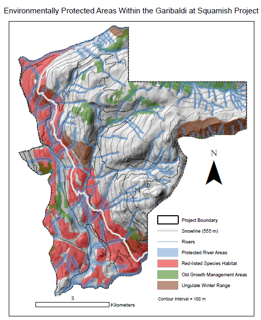
Figure 1. Environmentally protected areas within the Garibaldi at Squamish project.

Garibaldi at Squamish Project

Evaluation of Criticisms and Recommendations

Introduction 

The Garibaldi at Squamish project is a proposed year-round destination mountain resort on Brohm Ridge.1 Its proposed location is 15 km north of Squamish on Highway 99, 80 km north of Vancouver and 45 km south of Whistler.2 The project was approved one year ago (2016) with 40 conditions; the resort itself containing 124 ski trails, 21 lifts plus resort accommodation and commercial developments.3 900 construction jobs are estimated required to build the project, which will take 20 years, along with creating 2500 jobs at the resort once completed.4

The initial application for a Project Approval Certificate under the Environmental Assessment Act was submitted in 1997 (by Northland Properties and Aquilini Investment Group of Vancouver) and was rejected after 13 years of review (2010) by the BC Environmental Assessment Office.5 Primary concerns of the BC EAO were, in no specific order of importance, potential effects on vegetation, fish, wildlife habitat, areas of social significance, economic interest, local heritage, and health.6 The report outlined these concerns, and the project proponents submitted a supplemental application that claimed to address the concerns of the BC EAO.7 A community consultation was completed by the Resort Municipality of Whistler in the subsequent 2 months after the supplemental application being submitted opposing the project.8

My goal in writing this report was to evaluate the substance of these criticisms, and provide recommendations based on the relative importance of certain issues. Appendices of this report contain a map outlining the project area and protected areas contained within, as well as a pdf document outlining answers to specific questions asked of me.

Analyses

Initial analysis was completed to calculate what area of the proposed project is skiable, based on a 1974 report that stated that skiing under 555 m was unreliable due to climatological variation.9 Using provided data on elevation, I was able to delineate the 555 m boundary, and calculate the percentage of area under 555 m in the project area. This ‘unreliable’ skiing area took up 29.9% of the proposed skiing area.10

Environmental assessment of protected areas was then completed on 4 areas of concern, (1) old growth forests (OGF), (2) ungulate winter ranges (UWR) of Mule Deer and Mountain Goat, (3) red-listed species habitat, and (4) rivers. Data for OGF and UWR were taken directly from the Government of BC database in their most recent version, while data on the red-listed species habitat and rivers was provided. My analysis for areas of concern 1,2 and 3 consisted of overlaying the data on the project area (viewable on attached map) and calculating their area as a percentage of the project area. My findings were as follows: OGF constituted 6.78%, UWR of Mule Deer and Mountain Goat, 7.89%, and red-listed species at 24.8%.11 My analysis on area of concern 4 (rivers) was slightly different, since I applied a buffer area (area of legal protection) around the rivers based on their elevation due to their fish-bearing potential. Areas under 555 m were buffered 100 m and areas over the boundary 50 m. Percentage of protected river habitat in the project area was calculated same as above, and was found to be 26.4%.12 The total combined area of protected areas in the project constituted 52.5%, over half of the proposed area.13

Recommendations

Two areas emerged as greatest environmental concern to me, the highest being the rivers on the property. Their importance as breeding grounds for fish are of great importance to society and must be protected accordingly. To avoid damaging these areas, the construction plan must adhere to buffers I have outlined and ensure that areas that must be crossed are done using well-constructed bridges, with well fenced off areas surrounding them. The resort should consider fencing off all buffered areas not only to protect the fish habitat, but ensure the safety of patrons so they may not go off the trail and blindly fall into the water. Second only to the fish habitat, the winter habitat of mule deer and mountain goat should be maintained during the construction of the resort. Not only should the area be maintained, but access to these areas from outside the resort should be maintained through bridges under roads and avoiding building on these potential routes. Along with the protection of their habitat, patrons will benefit by being able to see these non-aggressive animals in their natural space. This discussion is not to say the other protected areas are unimportant – on the contrary, steps should still be taken to ensure their protection is completed as the law requires.

Conclusion

The proposed Garibaldi at Squamish project contains over 50% environmentally protected area, with some of the most important areas taking up a large portion of that area. Action (outlined above) should be taken to ensure that these areas remain intact during and after the construction process. Along with that, some 30% of the area is potentially unskiable. Measures should be taken by management to ensure that should climate change so severely that skiing becomes obsolete in the area, the resort could still be used for other various activities.

1,2,3,4,5,6,7,8,9 Information taken from the document Lab5_2017_EIA under Lab Background.

10,11,12,13 Calculations and detailed methodology provided in attached paper.

I personally think the project is a good economic play for the region, and will offer some much needed competition to Whistler-Blackomb. That being said, I’m aware of the environmental concerns the project has created. As long as the project follows the regulations that have been created to make sure that the area is protected and within the interest of all parties involved, it should be able to be completed. This is in line with the memo I have written above. I understand that some projects require individuals to go against their own moral values, and I can see how this project would cause some distress for a select few people, but trust must be placed in regulation that has been put in place.



Standard
GEOB 270 Lab Posts

4 – Housing Affordability

  • Downloaded, joined and displayed census data (2011) from the Government of Canada which highlighted the spatial relationship of shelter cost and median income based on census tracts for Vancouver, BC and London, ON.
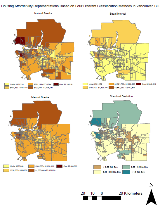
  • Utilized various quantitative data classification schemes to display housing data.
  • Used ratios to represent data according to an established housing affordability index.

Question pulled directly from the lab: Since you are a journalist, putting together maps of housing cost in Vancouver, which classification method would you choose for your audience and why? What if you are a real estate agent preparing for prospective home buyers near UBC? Are there ethical implications for your choice of classification method? The data is from 2011 – it is now 2017 – should you even been using this data? 

A: If I were a journalist, I’d use equal interval due to its simplicity for the readers. If I were a real estate agent, I’d use manual breaks and enter the values in that best represent the customer’s price range (e.g. anything in red they can’t afford, and the colors get lighter closer to their price range). Of course, there are ethical implications when selecting a classification method – data could be represented in certain ways that could skew the map reader’s view. For example, manual breaks could be entered in such a way that make a place look more pleasing to live. Along with using more pleasing colors, a map creator could attempt to create a different message to reader (perhaps in marketing campaigns?). Since this data is from 2011, ideally, we would not be using it but since it is the most recent available there is no way around it. Using this data for any financial advising would not be advised since a lot can happen in six years, and a warning would have to be displayed to any potential map user.

Figure 1. Housing affordability representation based on four different classification methods in Vancouver, BC.

Figure 2. Housing affordability comparison of Vancouver, BC and London, ON.

Figure 2 (above) uses the Housing Affordability Ratings from the Demographia International Housing Affordability Survey which is a ratio of median house price to median household income. The ratios are as follows:

Affordable: 3.0 and under

Moderately Unaffordable: 3.1 to 4.0

Seriously Unaffordable: 4.1 to 5.0

Severely Unaffordable: 5.1 and over

It is clearly a better measure of housing affordability than simply using housing cost alone because it takes into account the income of the people living in the area – the home buyers. These ratings have undergone several peer reviews and intense discussion through the survey and are to be trusted as the best housing affordability index available. The affordability index is directly related to the city’s livability. If one is to enjoy life in the city, they must be able to afford their housing and accommodation. I know first-hand as a visiting student from Alberta, the cost of housing in Vancouver is the primary concern I have for establishing myself here although I love the city, the area and the people.


Standard
GEOB 270 Lab Posts

3 – Planning for a Tsunami

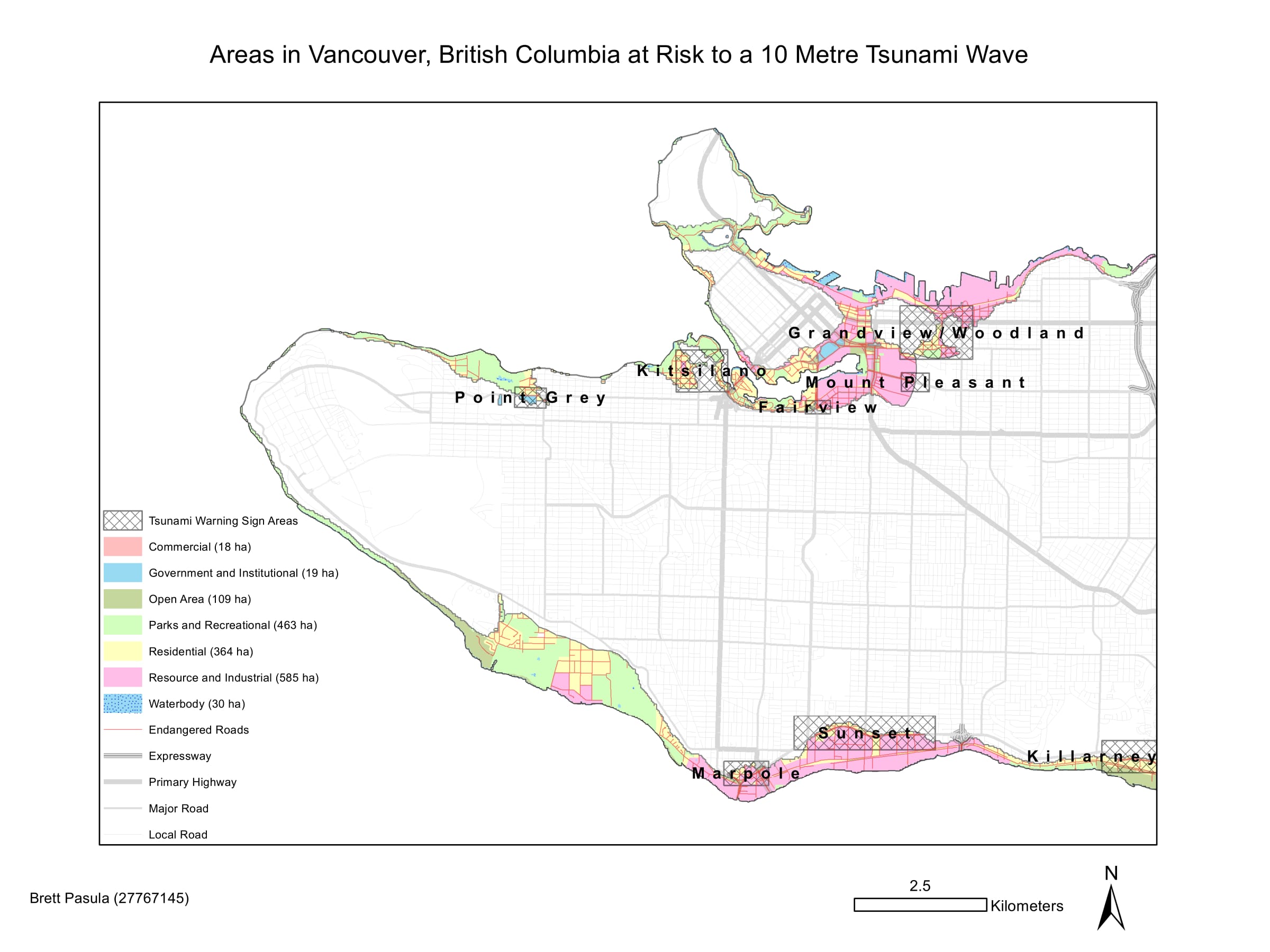
  • Performed buffer analysis, reclassified and converted raster layers to vector, and intersected layers of interest by combining a 1 kilometer zone around the shoreline along with areas lower than 10 meters elevation in Vancouver which may be susceptible to a tsunami or storm surge.
  • Performed proximity analysis by delineating points and areas of interest (education, healthcare, roads and general landuse) that were within the danger zone, and created summary tables to provide users a simple view of the extent of affected points and areas of interest.
  • Created a new feature class to highlight areas that require signage to indicate tsunami risk.

Figure 1. Areas in Vancouver, BC at risk to a 10m tsunami wave.

Figure 2. Effect of a 10m sea level rise at the False Creek Tidal Flats.

The following list contains the education and healthcare facilities within the Vancouver danger zone:

  • Anthony of Padua
  • Ecole Rose des Vents
  • False Creek Elementary
  • Emily Carr Institute of Art and Design
  • Henry Hudson Elementary
  • False Creek Residence
  • Broadway Pentecostal Lodge
  • Yaletown House Society
  • Villa Cathay Care Home

As highlighted by Figure 2, the new site of St. Paul’s Hospital is directly in the way of a tsunami (10m) should it strike Vancouver. In addition to that, the False Creek Tidal Flats are subject to severe liquification due to the soft, fine-grained nature of the sediment which underlies the area. Both are cause for concern should an earthquake strike off the Pacific coast.

Standard
GEOB 270 Lab Posts

2 – Spatial Data

  • Gained insight on how data is stored and managed in the ArcGIS software package by familiarizing myself with various interfaces as well as previewing, managing and exploring properties of spatial data.
  • Understood how coordinate systems and map projections affect geographic maps by changing map projections, repairing misaligned and improperly referenced spatial data, and learning how to follow the best practices so senseless mistakes do not occur.
  • Learned the difference between spatial data models (raster, vector) and performed additions to attribute tables along with minor calculations.
  • Explored the use of remotely sensed imagery by creating composite images using different bands of satellite data.

Q: How can one fix misaligned and improperly referenced data?  

Misaligned and improperly referenced data could be due to two things (1) the GCS, or geographic coordinate system is incorrect, or (2) the projection is incorrect. The GCS, or geographic coordinate system uses a datum from which all coordinates are referenced to. Some examples of these are WGS1984 and NAD83 (or the older version NAD27). Projections are representations of a 3D surface onto a 2D plane. They can drastically change the way your data appears if data layers in the GIS are using different projections. Some examples of popular projections are Lambert (conical) and Mercator (cylindrical).

Note: ESRI’s ArcGIS software package may utilize projection-on-the-fly, where your initial data set imported into the GIS is used as a reference to which all other data sets will be projected to.

To correct misaligned and improperly referenced data, the easiest way is to use the Projection too in the ArcToolbox. By selecting this tool, you can choose which data set you would like to correct and select the GCS and projection you’d prefer to utilize based on the goal of your map.

Q: What are the advantages to using remotely sensed Landsat data for geographic analysis? 

Using remotely sensed Landsat data is extremely useful when you need to be able to distinguish areas that, to the human eye, are not as easily distinguishable. Landsat data is a collection of different wavelengths (or “bands”) that have been reflected back from the Earth. The sun is the initial source of energy for the bands. If you were to combine the red, green, and blue bands, you would get a true colored image. This is the principle of Landsat data – combining different bands to get the best contrast between two or more areas that you want to compare. Another example (that was used in my lab) is to combine the green, red and near infrared bands to create a false color image where vegetation is displayed as shades of red, water as black or very dark blue and bare soils as grey with a cyan/greenish hue. The new color contrast created by the combination of the bands allows for easy geographic analysis.

Standard