In Task 9, we are analyzing a network (graph) database generated from the previous Task 8 – Golden Record Curation Quiz.
The initial graph I was presented with, after loading the data file:
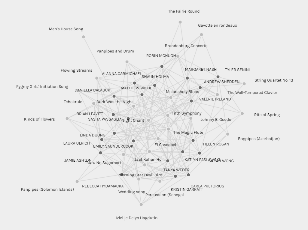
As you can see, without interpretation, analysis, or manipulation, the graph is of little use. The visualization might be interesting in the sense that you can tell how interconnected everyone’s choices are, but beyond that surface thought, there is little of use you can tell from a zoomed out view without manipulation. I think this is a good insight into most graphs and datasets. Their usefulness depends on manipulation, interpretation, and analysis – all things that both create meaning and change meaning. One then must know the motivations and intentions behind the analysis, interpretation, or manipulation to fully contextualize the resulting conclusions. It is also important to note that this graph itself is not “raw” data. The data has already been manipulated by forming links between each song selection, and then creating groups based on the strength of each song selection. By default when I loaded the data, the individuals were also highlighted and the songs were not, giving initial implicit assumption that the individuals and their connections are what is important versus the song choices.
Looking at the group I was placed in, group 1, I pulled the graph apart to see connections more clearly:
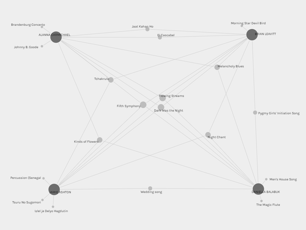
In this group of four individuals, you can see that I have one song that is not directly connected to the group, two of the others each have two, and one has three unconnected songs. We all share four songs, and there are several songs connected by three and two connections. One interpretation of this is that I am more similar to the others in this group than they are to me, and I could extrapolate from this that I am the “center” of this group. I don’t think this would be an accurate interpretation, however. You could also count the number of secondary connections, in which case Daniella would be seen as the “center”. This all implies that there is a “center”, and that it is important, which would be an assumption and decision made by whoever is interpreting the data.
I also looked at the one song that I did not share with the rest of this group, “Morning Star Devil Bird”. I looked at all of the connections that existed to that song, seen at the top right of this graph:
If it isn’t completely clear, the line of people in the top right are all directly connected to that song, and there is also a line from that song all the way to the bottom left where my node is. I pulled the nodes apart and organized them to see the links from my other song choices as well. What I find fascinating about this is that there are so many connections between people who are connected to non-“Morning Star Devil Bird” songs I chose, and people who also chose “Morning Star Devil Bird”. Perhaps this is just a result of a relatively limited set of songs to choose from, and secondary or tertiary connections are inevitable in such a small sample size. It does seem to imply that this one song choice connects me to a completely different set of people than the rest of my song choices, but those people are also fairly similar to people who are connected to my other song choices. If this were a graph of political opinions, this would be the one outlier belief where someone diverges with their political party of choice.
What does it mean to group people at all? Considering the group I was sorted into, we all only have four songs in common. How much of a group are we when we all collectively only share 40% of our choices? There is also no strength of preference taken into account. What if my very favorite song was the one that is not directly connected to any of these group members? Should I still be in this group? Alternatively, all non-choices are considered the same, but I could have several songs that I specifically dislike, and perhaps they should be included by the algorithm to make sure people are not linked by songs they specifically dislike. This graph also assumes that all song choices are intentional and complete. Each individual was required to select 10 songs, no more, no less. There could be some (I am one) who only wanted to select 4 or 5 songs, and the rest were relatively meaningless. How can people be grouped upon choices they did not want to make? Conversely, there could be some who wanted to select additional songs which would have changed their groupings, but were unable to by the limits of the data collection method.
When people are grouped by algorithms, there is no choice. The assumptions of importance by the algorithm creator are rarely questioned, and are taken as unbiased fact. What does this do to people who are grouped in a way that they would strongly disagree with if they knew why they were grouped in the way they were? Grouping by algorithm also tends to subtly reinforce sameness over time. If your life is shaped by algorithms that push people with similar likes, interests, thoughts, and opinions together, an important part of society is changed. Opinions are reinforced and made more extreme, instead of tempered and reexamined. Exposure to new experiences, cultures, and contexts are slowly limited. A large part of this issue is that most people do not understand how algorithms work, even if they are aware that they are at play in the daily technologies and systems they interact with. Algorithms also tend to be proprietary and secret – they are often used to generate vast wealth, and so are well-guarded intellectual property. If we do not want to cede control of our lives to the unknown motives and biases of those who create and utilize these algorithms, they must be made public and open-source.
Hey randomly assigned Golden Record group friend!
I really appreciated your musings on the idea of centering/central points for data. I think its a really interesting one when analysing visualisations. Also, the idea that “Their usefulness depends on manipulation, interpretation, and analysis” is SUPER vital – and I feel it is a statement that could extend to be an important point for all of our text and technology topics.
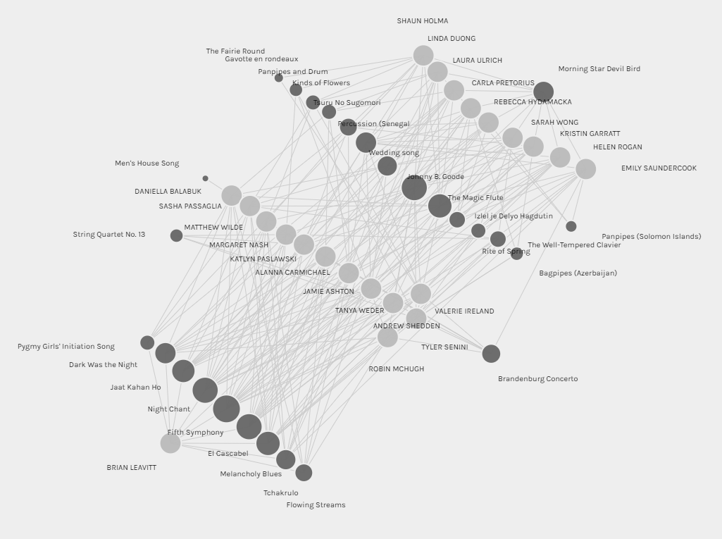
What parameters did you use to get that final visualisation? The one that looks a little like a wave with the Morning Star Devil bird song? I’m seeing so many other visualisations across the group and wonder how people achieved those! I guess needing to intricately know the software and its available functions is another vital piece of this data visualisation/null data conversation 🙂
Finally, your grouping critique very much resonated, and I brought up similar points in my discussions. Algorithmic based grouping simply can’t be taken as good or objective, when there is so little insight into grouping motivation and absolutely no choice to move at all. I think you highlighting the fact that your favourite song may not be used as a primary group connection point as so poignant. I also only wanted to select 4 or 5 songs, so share that sentiment as well.
Thanks for this. I feel like you’ve really hit the nail on the head on some points I could see but couldn’t quite verbalize in the front and center way you did here. Great writeup!
Hi Jamie,
For the final visualization I isolated only to connections to people who selected the song Morning Star Devil Bird, and their song connections. Then I manually rearranged the data to get the ‘wave’. I think that is a really important point about data conversations – you can make it show so much/so little, but it is all about how it is arranged.
I wonder if the 3-5 songs we both only wanted to select would overlap at all, or if they would be completely different? It would be interesting to see if our group is ‘meaningful’ or not.
Just linked to this! You can read it here if you’re curious https://blogs.ubc.ca/jamiedimitra/linking-assignment/interpretation-analysis-and-manipulation/
For me, I couldn’t get over that it is only a single data collection. As well, my list contained errors; somehow, I put the wrong choices in. So that had me considering how much of the data–regardless of any other manipulations–was incorrect, skewed, or deliberately altered.
I know that, when I am forced to complete data inputs, I fudge the input; e.g. sites that want data to access information, for example. I refuse to buy through Apple because you have to register, and they use that to follow your purchasing to push advertising on me.
I am more and more struck by how much of the information we receive is manipulated and tailored to seduce me into thinking/believing/responding–and mostly, buying–utter crap.
Hi Margaret,
It is a tough balance – more data is required for algorithms and analysis to be even somewhat useful and reliable, but you can never be sure what they are going to do with the data you provide. I also usually try to provide somewhat unreliable data as well, when it doesn’t seem essential. For example I usually enter the wrong birthday and age. Sadly Apple is one of the most privacy focused companies out there – which tells you how bad most of them are.