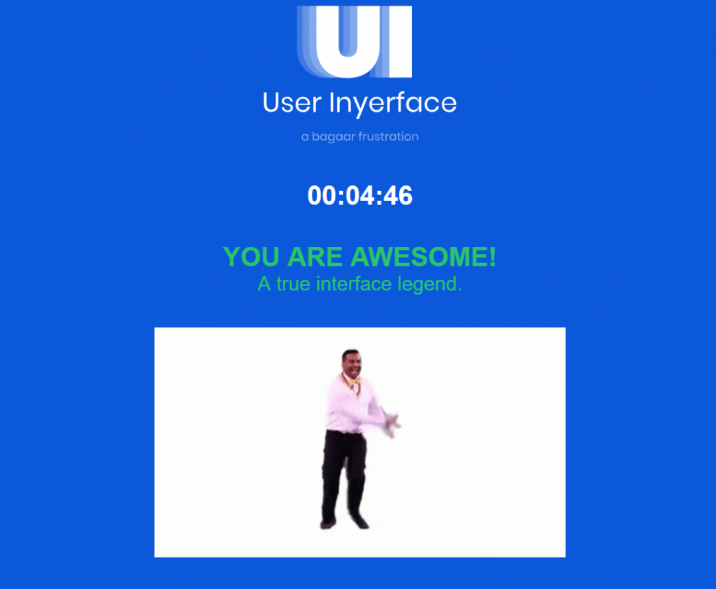
This weeks task was to complete the online “game” User Inyerface by the Belgium interaction design studio Bagaar. Here is a screenshot from after I “won” the game:
The “game” is an intentional exercise in frustration. It demonstrates several interesting things that we take for granted and do not usually notice. The first is that there exists a commonly accepted semiotic framework for user interface design in technology, and when something deviates from this design, frustration and confusion follow. An example of this is that the cancel and proceed buttons in this game often have their colors switched from what one would normally expect – the selected or proceed button would be white instead of highlighted in a different color, and the un-selected or cancel button would be highlighted. This is the opposite of what we usually expect and are accustomed to, and it led to me hitting the wrong button several times. It took a conscious effort to be aware of each way that this game did not follow design conventions to be able to successfully move through it, and each new way the game diverged from my expectations required further attention and slowed my progress.
The second interesting idea that this game gets across is that the common semiotic design language that is used across modern technology is designed specifically to make interaction quick and easy. This may seem obvious, but the reasons behind it may not be. Beyond a simple desire to make the ‘best’ interface possible, it becomes clear playing this game that a good interface is necessary to maintain user attention. When presented with a bad interface, meaning one that does not conform to our expectations, we quickly become frustrated and lose interest. If I had not been required to complete this game for this assignment, I would have quit very quickly. An example of making an interface quick and easy to use is by auto-filling text fields. Modern websites often do this by using cookies, or browsers have your information stored. This way you do not have to type in the fields each time. Companies are motivated to do this, because every little thing that increases frustration or causes us to lose interest is one less potential sale or data input for advertising.
The third interesting principle of the game is how design can persuade users to act in a certain way. By utilizing our common design language, you can both trick people into clicking things they didn’t intend to, and you can convince them that one option is preferable to others by designing it in a way that users associate with the right choice. An example of tricking users into clicking things is on the initial start screen where the big green button that you assume is to start the game actually says “No” and does not proceed. A big green button is usually associated with proceeding or starting something, and users are likely to assume its function without reading the text on it or investigating it more closely. A simple way of persuading users is by highlighting a choice with a positive choice associated color, or by simply making the choice you want them to select bold or in larger font. We are trained through experience and repetition to associate the right choice with the one that appears the most appealing or stands out. Unless someone is paying close attention, you can be easily persuaded to unconsciously choose a specific option.
The fourth interesting thing I noticed was how, through pop-up messages and count-down timers, the game forces you to remain focused and it retains your attention. Websites often take this tactic when the system notices you haven’t interacted with it in a set amount of time, and by giving you a message that states you have x amount of time or you will lose your place, your reserved item, the information you have entered, or you will have to start all over, it convinces you that you need to continue interacting with it and refocus on it. There is usually no good reason why it will reset everything or cause you to lose your place – this is a programmed behavior.
The game was incredibly frustrating, and I will never play it again, but it was useful in illuminating many of the ways we are manipulated and persuaded, often without our noticing, to keep our attention, convince us to make a purchase, or provide additional information.
I am impressed! with you time but surprised that you do not want to attempt it again. Despite the frustration, I thoroughly enjoyed the “game.” My final screen did not let anyone know that it was my 3rd attempt to complete it. I am wondering though did you read the ‘Terms and conditions screen?
Hi Rebecca,
I did not read the terms and conditions, no. I usually never do! I went and read through it now, it is quite funny, but also an equally frustrating experience as the game, although I don’t think it is really much more frustrating than reading normal T&Cs. This is probably the point, of course, as websites and apps don’t really want you to read the entire T&C or think too hard about the contents of them.
Rebecca
I am really impressed. I think I gave up around my fifth attempt!!
Pat McLean
Hi Brian,
Great analysis of this task! I really identified with your last comments about how the game represents the ways design interfaces can be used to manipulate users. Like you, I noticed how the clock feature is something many sites employ to force users to make quick purchasing decisions. Your comments about how common language and symbols (like green for “GO”) impact how we interact with websites definitely highlights the importance of taking a more critical approach to the sites we visit. I know I tend to look for some of these “tricks” more often after the readings and activities this week.
Brian,
What a thoughtful discussion regarding the game. Those substantive comments regarding design resonated with me. I was able to reflect upon your analysis and put in a framework in my mind, how we are used to the traditional semiotic framework.
Your forth point regarding time deadlines and countdown systems really resonated with me. I had not considered that concept when thinking about the game. And I agree, the element of a deadline or countdown does cause a technology user to focus on a digital presentation. It is an interesting tool to try to keep students on tas