
This website was simultaneously a frustrating yet fascinating experience on aspects of user design that I have never really reflected on much before doing this activity.
The opening page was my first area of confusion, and I found it difficult to figure out where to click to advance to the next screen. Due to the timer, I began to click on every image and text on the page blindly until it finally moved on.
On the next screen, I didn’t find it too difficult to fill in the password and email requirements, despite the intentionally confusing instructions at the bottom (luckily I knew what Cyrillic meant, which saved me from wasting time to look it up).
The next page contained checkboxes, instructing you to only select 3. I first began clicking them one by one, but the words “unselect all” caught my eye in the bottom corner, saving me from having to deal with each box separately.
The next screen for me was the most difficult, although not at first. I hastily typed in some random fake personal details, but got tripped up for a couple of minutes on the age confirmation section. I just threw a random age in there at first, but then it took me some time to realize that I had to calculate my age manually. Ultimately, I ended up just using my actual age and real birthday for speed purposes.
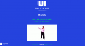
The CAPTCHA-style page at the end was probably the fastest and easiest for me to complete out of all the pages. Since this activity was so clearly designed to be ridiculous and over the top, I decided just to take the instructions absolutely literally, which allowed me to breeze through that section.
I did complete it it in about 7 minutes, which I think is a decent amount of time for a page that is designed to be completely unfriendly to the user. I noticed on a few classmates blogs that some people took a really long time to get it done, and I can see how that could happen based on the intentionally ridiculous interface. However, I think that one of the reasons that I completed it in a relatively short amount of time was because many of the worst design elements are things that I have seen and experienced before. I’m 41, which means I am old enough to have seen the growth and changes of the web over a long period of time. Traversing the web for this long also includes firsthand experience with many dubious interfaces that were similar to frustrating aspects of this activity.