
Classification Methods
There are different classification methods that can be used for displaying data in a map. The following image shows how the choice of this method greatly determines how the data will appear to the viewer. It is important to consider this when creating a map, as it will influence the conclusions that can be drawn from an analysis.
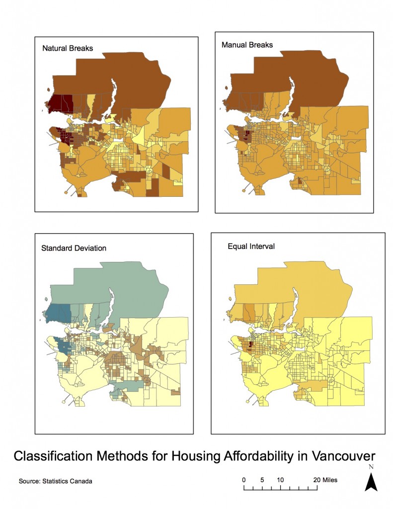
There is no ‘silver bullet’ when it comes to this methods, and both the data that is used and the goal of the map will have to be analyzed in order to decide. In this case, for example, different methods would be chosen by a journalist putting together maps of housing cost in Vancouver and by a real estate agent preparing a presentation for prospective home buyers near UBC.
As a journalist, I would choose either the natural breaks or the manual breaks classification. Looking at the histograms, these are the ones that are more evenly distributed. This is important since the viewers will not be analyzing this breaks in the data, their attention will turn to colors and to the differences between the classification categories. If we were to choose one that was not evenly distributed, such as the equal interval method, then the information might appear misleading (most of the values would fall under the lower category, therefore appearing as though most housing in Vancouver is affordable and only a few are not). The wide set of values found in the first category would be more accurately presented by dividing them up in different classes. This would, of course, be a convenient “mislead” if you are a real estate agent addressing prospective buyers, which is why there are ethical implications in the use of the classification method. A real estate agent could choose this method and mislead their clients, or she could use the natural breaks or manual breaks classification and provide a more accurate view. The method of standard deviation would also be useful for journalistic purposes, since it provides an important point of reference that might be seen as interesting or useful for the readers of the article: which areas have housing below average and which ones have housing above average? This wouldn’t be very useful for the real estate agent, as prospective buyers would be wanting to know approximately how much they would be spending on their housing, rather than how it compares to the rest of Vancouver (given that they have already chosen they want to live near UBC). The classification method has ethical implications since it is a big determinant of how the viewers will perceive the information presented in the graph: it is important to make it the most objective and clear for them to make their own judgements.
Housing Affordability: Comparing Vancouver and Ottawa
- What is affordability measuring, and why is it a better indicator of housing affordability than housing cost alone?
- What are the housing affordability rating categories? Who determined them and are they to be ‘trusted’? (You have seen in the previous map how different classification breaks produce very different visual impressions).
- Is affordability a good indicator of a city’s ‘livability’?
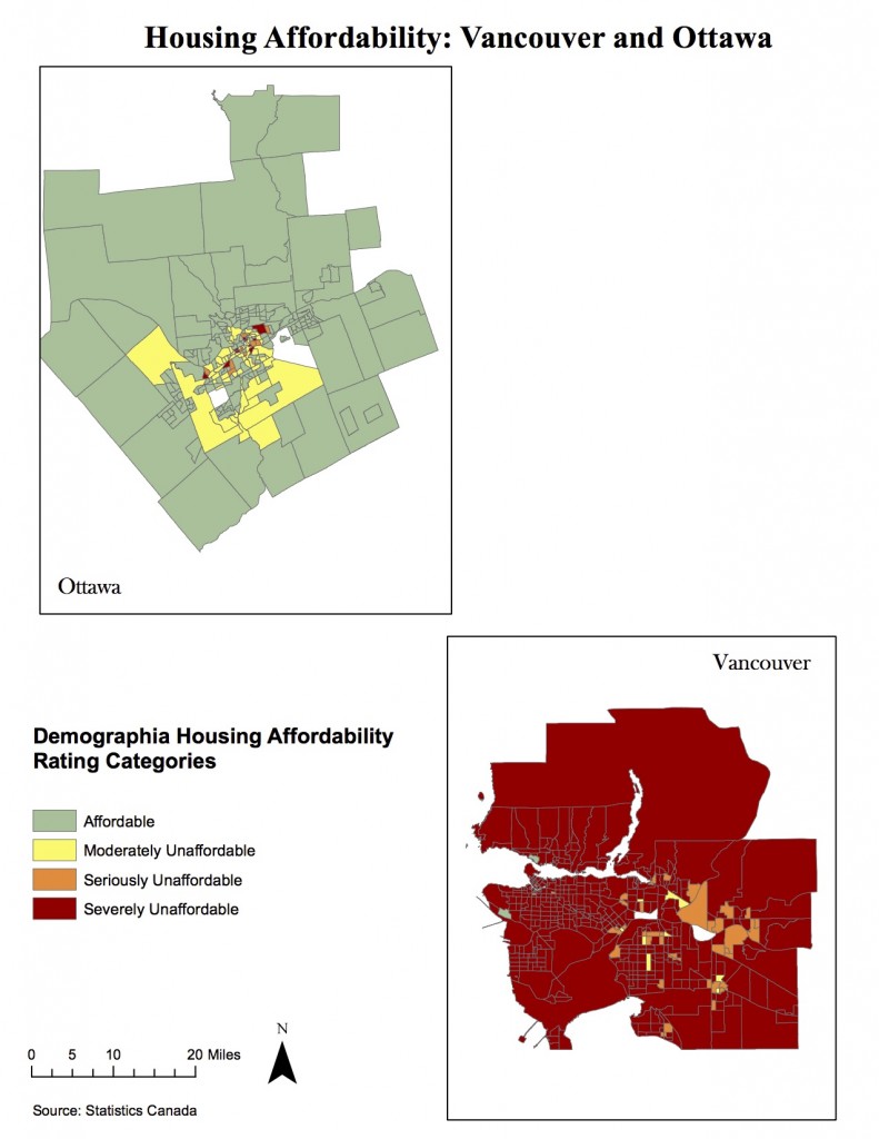
This map has been normalized to show “affordability” as opposed to simply housing costs. This measure is obtained by dividing median cost of dwelling by median household income, therefore providing a more useful measure by taking into account what the cost of housing represents within the citizen’s income. In general, it takes into account the cost of living and the minimum wages/average salaries within the city.
The rating categories for housing affordability were determined by Demographia, a consulting agency performing annual international housing affordability surveys which gather data from around 90 metropolitan centers. This rating system has been recommended by both the World Bank and the United Nations.
While affordability certainly affects “livability” in a city by rendering less income for leisure activities and hampering social mobility, it is only a single factor. For example, Vancouver, despite its ‘severely unaffordable’ ranking in the Demographia index, has been ranked as the third most livable city in the world by ‘The Economist’ and ‘Forbes’ magazines, which take other factors such as safety, healthcare, educational resources, infrastructure and environment.
Accomplishment Statements:
- Using spatial and tabular census data in order to visualize and compare housing and income data of two Canadian cities.
- Varying the choices of quantitative data classification in ArcGIS in to understand the effects of this choices on map display and data interpretation.