04/12/16

Personal Reflection on the Course

This course was part of a set of courses I have decided to take in order to build the technical skills necessary for my development as a professional. It proved extremely successful in doing so, as it integrated a wide range of topics and applications significantly relevant to the areas of food security, resource management and economics. But the course also surpassed my expectations, as I not only learned the steps to get around ArcGIS, but also found how to manage group projects and gather data individually. Upon completion of the course, I feel ready to embark on GIS analysis on my own.

04/12/16

Final Project: Determining Priority Areas for Riparian Restoration in the Okanagan, British Columbia

This project’s aim was to determine which areas in the Okanagan valley should be prioritized for riparian ecosystem restoration and management. This was done by finding the areas which had a higher concentration of endangered species (both aquatic and terrestrial) as well as those which were most vulnerable to degradation (due to proximity to agricultural areas, buildings and roads).

We found the Conservation Priority layer to cover a distance of 1355.7 kilometers (43% of the total river area in the Okanagan) and the degradation vulnerability areas to cover 1704.4km (54%).

The total area in the region that was within the range of all six studied factors (salmon species, fish species at risk, wildlife conservation areas, agricultural land use, buildings, and roads) was equivalent to 468.5km, or 15%, of total river length. This was concentrated in four major aras, two of them in the vicinity of the city of Kelowna, one in the vicinity of the city of Penticton and one just south of Skaha Lake between Penticton and Osoyoos.

The resulting map looked as follows:

13000531_10154051427179933_1821228911_o

The analysis was done through a series of steps, including a wide variety of ‘selection’ and ‘overlay’ tools. The process outlined in the following diagram:

Flowchart-4

The whole report can be found in the following link: gisfinalreport.


Reflection: Teamwork and Data Gathering

This project was achieved with the help of three other group members: Andrea Le, Naomi Schettini and Ruimeng Pang. We all had similar interests in our focus of GIS analysis so teamwork ended up being extremely rewarding. We got together to plan our GIS analysis and then performed some parts individually and then reviewed them and put them together as a group. For writing the report, we all gave ideas through a ‘google document’ and each one of us took charge of writing one part. We all edited the final version through the use of the google document before submission.

The two most interesting aspects of working on this project that differentiated them from all other labs performed in class were: teamwork and the gathering of our own data.

Regarding teamwork, it was different to work in a context where information was being gathered and changed by different people at different times and locations. This was extremely important in building skills and knowledge about data handling. It was also rewarding to work with different viewpoints, as I sometimes found my own ideas challenged in positive ways that led me to a new, improved perspective.

Regarding data gathering, I was surprised by the wide range of sources in databases like DataBC. For any factor that we considered, there was always at least one dataset which included our project area and had the exact information we were looking for. However, it was often the case when the desired data was restricted and we had to look elsewhere for something that, often, was not as ideal as what we had originally found. This was important in making me realize the importance of open-source data, and how, before its big advent, it would have been extremely difficult to perform any independent GIS analysis.

Accomplishment Statement: 

Applied GIS skills acquired in class, worked in a group environment and gathered individual data in order to plan and develop my first individual geographical analysis. 

04/12/16

Lab 5: Environmental Impact Assessment of the ‘Garibaldi at Squamish’ Ski Resort

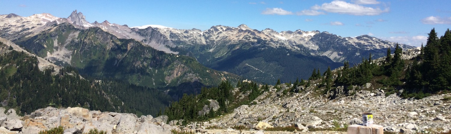
The Garibaldi at Squamish Project, a mountain resort 15 km north of Squamish and 80 km north of Vancouver, has recently been tentatively approved for construction. However, its effects on vegetatioprotected areas
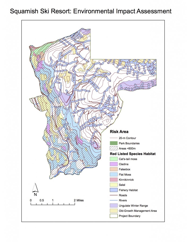
n, fish and wildlife habitat are still controversial and call for further investigation. In this report, prepared for the British Columbia Snowmobile Federation (BCSF), an environmental impact assessment of the project through the use of GIS was performed in order to evaluate whether there was sufficient evidence to oppose the project.

For the analysis, spatial data regarding ungulate winter range and old growth management areas was acquired from DataBC and matched to the project area, showing that 3.17% of the project lies in old growth forest area and that 7.89% lies in ungulate winter range. Terrestrial ecosystem mapping data was used for determining habitats of red-listed species by matching biogeoclimatic units and site series of red-listed species with the mapping data. Through this, it was determined that the project area includes important habitat for falsebox, salal, cladina, kinnikinnick, flat moss and cat’s-tail moss populations, six important red-listed species. This habitat represented 24.8% of the project area.

To determine the effect of the project on fish bearing streams and riparian areas, river data from Terrestrial Resource Information Management was obtained and a buffer zone of 50 meters was established for rivers at higher elevations (above 600m) and of 100 meters for lower elevations (below 600 meters). This distinction was made due to the fact that high- elevation streams have lower probabilities of being fish-bearing. The analysis found that 15.9% of the project area would be of high risk for fish habitat and riparian areas.

By joining all protected/high-risk areas, it was determined that 47.7% of the project area lied within vulnerable territory; a high percentage which certifies that there is, in fact, enough evidence for opposing the project.
Another claim that has been made by opposing agencies is the fact that the project’s location will not allow for enough snow and, therefore, it will not be successful as a ski resort. Digital elevation model data was used to select all the territory that lied below 600 meters and determine that 31.8% of the project area would, in fact, have a low potential for snowfall.
The greatest environmental concerns to the project appear to be the interference with red- listed species habitat and the potentiaHillshade
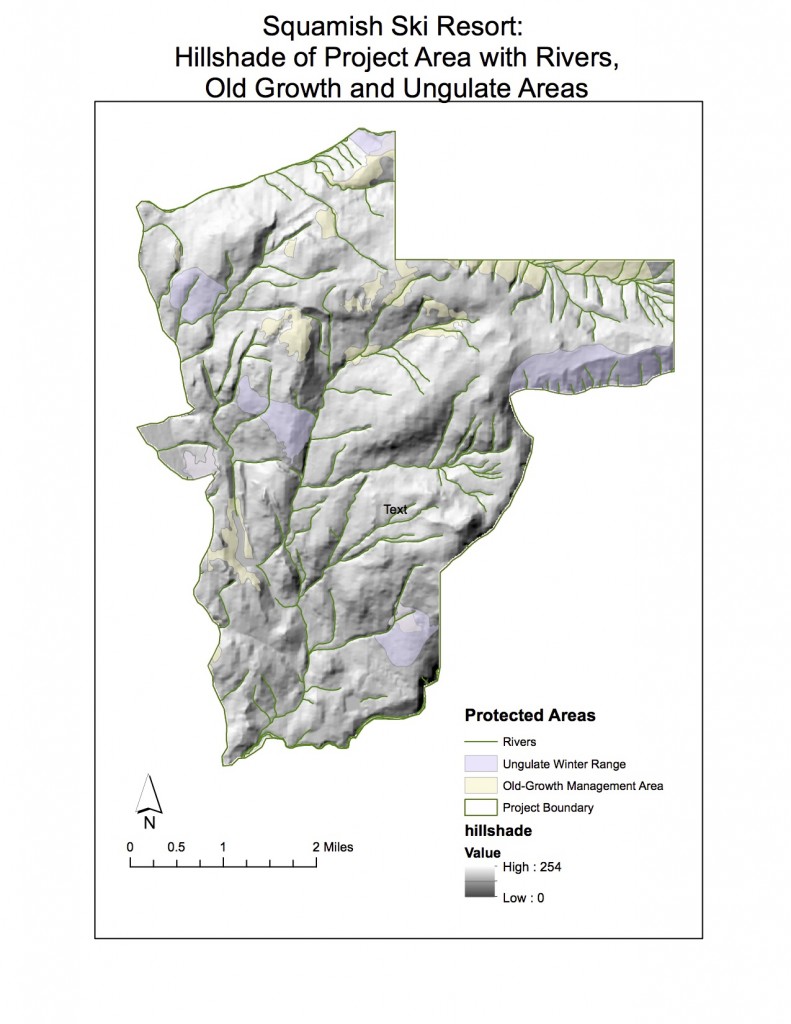
l harm to fish bearing streams and riparian/fish habitat. This area provides an important habitat for species that are scarcely found in other places, and the impact of the project would most likely have a strong effect on displacing them or eradicating them. If the ski is to be, nonetheless, constructed, one way to mitigate it would be to promote projects and initiatives within the resort itself for the protection of these species. For example, hiring biologists to monitor and take care of endangered species, while providing a habitat for them within the resort would be a way of reducing the resort’s effects while at the same time providing an economic benefit to the resort, since these areas could act like a tourist attraction where visitors could get a closer look
at wildlife.

The effect on fish bearing streams and riparian ecosystems is extremely important, as these areas are of great significance to surrounding productivity and biodiversity. Being located in an area of high biodiversity and water habitats, the resort could prove highly detrimental. Ways of mitigating this effect could be to carefully map all river areas and their surrounding areas (as done in this project) and avoid or limit construction of lifts, ski runs or buildings around, or on, these areas. Managing for waste and effluent discharge would be of high importance as well. The report does not recommend the development of the ski resort and proves that there is enough evidence to oppose it. However, if it is to be constructed, it recommends strong and careful management of the potential environmental effects.

Personal Opinion

It is easy to find oneself working on projects that do not coincide with one’s view. In this case, the methodology analysis was planned before hand and the concluding statements within the report are mainly an extension of the results found. It happens to be, however, that I personally don’t think that the project should be allowed to continue. As a hiker and skier who has gotten around to enjoying the natural beauty of the area, I am dismayed by the severity of the potential impact of this project. Even though the idea of an extensive ski resort closer to Vancouver than Whistler does sound appealing, the cost of the effect on surrounding species, forests and riparian areas (whose restoration and management I am especially interested in) would greatly surpass the benefits. In fact, this would especially be so if more than 30% of the area has the potential for a very limited amount of snowfall.

Accomplishment Statement: 

Parsed and filter data and used different spatial analyst tools in order to assess the suitability and environmental impact of a real-life project north of Vancouver. 


04/12/16

Lab 4: Housing Affordability

Classification Methods 

There are different classification methods that can be used for displaying data in a map. The following image shows how the choice of this method greatly determines how the data will appear to the viewer. It is important to consider this when creating a map, as it will influence the conclusions that can be drawn from an analysis.

dataclass

There is no ‘silver bullet’ when it comes to this methods, and both the data that is used and the goal of the map will have to be analyzed in order to decide. In this case, for example, different methods would be chosen by a journalist putting together maps of housing cost in Vancouver and by a real estate agent preparing a presentation for prospective home buyers near UBC.

As a journalist, I would choose either the natural breaks or the manual breaks classification. Looking at the histograms, these are the ones that are more evenly distributed. This is important since the viewers will not be analyzing this breaks in the data, their attention will turn to colors and to the differences between the classification categories. If we were to choose one that was not evenly distributed, such as the equal interval method, then the information might appear misleading (most of the values would fall under the lower category, therefore appearing as though most housing in Vancouver is affordable and only a few are not). The wide set of values found in the first category would be more accurately presented by dividing them up in different classes. This would, of course, be a convenient “mislead” if you are a real estate agent addressing prospective buyers, which is why there are ethical implications in the use of the classification method. A real estate agent could choose this method and mislead their clients, or she could use the natural breaks or manual breaks classification and provide a more accurate view. The method of standard deviation would also be useful for journalistic purposes, since it provides an important point of reference that might be seen as interesting or useful for the readers of the article: which areas have housing below average and which ones have housing above average? This wouldn’t be very useful for the real estate agent, as prospective buyers would be wanting to know approximately how much they would be spending on their housing, rather than how it compares to the rest of Vancouver (given that they have already chosen they want to live near UBC). The classification method has ethical implications since it is a big determinant of how the viewers will perceive the information presented in the graph: it is important to make it the most objective and clear for them to make their own judgements.

Housing Affordability: Comparing Vancouver and Ottawa

  • What is affordability measuring, and why is it a better indicator of housing affordability than housing cost alone?
  • What are the housing affordability rating categories? Who determined them and are they to be ‘trusted’? (You have seen in the previous map how different classification breaks produce very different visual impressions).
  • Is affordability a good indicator of a city’s ‘livability’?

affordabilityVO


This map has been normalized to show “affordability” as opposed to simply housing costs. This measure is obtained by dividing median cost of dwelling by median household income, therefore providing a more useful measure by taking into account what the cost of housing represents within the citizen’s income. In general, it takes into account the cost of living and the minimum wages/average salaries within the city.

The rating categories for housing affordability were determined by Demographia, a consulting agency performing annual international housing affordability surveys which gather data from around 90 metropolitan centers. This rating system has been recommended by both the World Bank and the United Nations.

While affordability certainly affects “livability” in a city by rendering less income for leisure activities and hampering social mobility, it is only a single factor. For example, Vancouver, despite its ‘severely unaffordable’ ranking in the Demographia index, has been ranked as the third most livable city in the world by ‘The Economist’ and ‘Forbes’ magazines, which take other factors such as safety, healthcare, educational resources, infrastructure and environment.

Accomplishment Statements: 

  • Using spatial and tabular census data in order to visualize and compare housing and income data of two Canadian cities. 
  • Varying the choices of quantitative data classification in ArcGIS in to understand the effects of this choices on map display and data interpretation. 


04/12/16

Lab 3: Tsunami Risk Assessment

Lab3 map

This lab found that 14% of the Vancouver area is in danger of tsunamis. This was determined by selecting all areas that were both within 1 kilometer of the shoreline and which had an elevation of 15 meters or below.

‘Buffer proximity analysis’ was used to create a 1 kilometer buffer around the Vancouver shoreline and a ‘selection by attribute’ of a digital elevation model was used to select all areas 15 meters or below. An intersection of these two layers showed the areas vulnerable to a tsunami.

It was found that the following health care and educational facilities were found within a tsunami danger zone:

  • Health Care: 
    • False Creek Residence
    • Villa Cathay Care Home
    • Broadway Pentecostal Lodge
    • Yaletown House Society
  •  Educational: 
    • Emily Carr Institute of Art & Design
    • Institute of Indigenous Government
    • Henry Hudson Elementary
    • False Creek Elementary
    • Vancouver Montessori School
    • Heritage 3R’s school
    • St Anthony of Padua
    • Ecole Rose des Vents

This was done by using the ‘Selection by Location’ tool, and then inputing layers of Vancouver healthcare and Vancouver education, with the ‘danger zone’ layer as the source layer.

Accomplishment Statement: 

Performing buffer proximity analysis, reclassification and conversion of raster layers and a variety of overlay tools in order to calculate statistics describing land and facilities vulnerable to tsunamis within Vancouver. 


04/12/16

Lab 2: Coordinate Systems and Spatial Data Models

Projection Systems and Misaligned Data

When projecting a map onto a coordinate system, aspects such as areas, angles, distance and direction are distorted. Therefore, when mixing two layers with different coordinate systems it is normal for these two to appear misaligned. ArcGIS offers different ways to solve this. Through a command called ‘Projecting-on-the-fly’, the appearances of the two layers are changed so that they appear to look aligned. However, the actual coordinates of the layers remain unchanged. Through a different command called ‘Project/Transformation’, a new layer with a new coordinate system is created, thus eliminating the misalignment problem. Both of these commands can be quite useful under different circumstances. As its name suggests, the ‘Project-on-the-fly’ command is more appropriate when appearance is the main concern and no further geographical analysis will take place. However, if you are planning on modifying the layer or performing deeper analysis, a transformation of coordinate systems would be essential.

Remote Sensing LandSat Data

LandSat is  a remote sensing data that is constantly scanning the Earth by using sunlight as its energy source. It records data by determining different wavelengths, creating an enormous database that can be used in a variety of applications. By constantly (it re-scans a piece of land every 16 days) providing digital data of the earth’s surface, it has proved essential in geographical resource analysis, especially relating to water, vegetation and soil. By automating the data collection process, it has saved professionals huge amounts of time (think about ecologists who spend months estimating vegetative covers of a piece of land!) that can now be spent analyzing and acting upon new discoveries.

Accomplishment Statements: 

  • Used data with different projection systems to learn how to manage and change projections as well as understand their various effects on geometric properties. 
  • Worked with remote sensing imagery in order to understand how it collects data and create a map that compared vegetative cover in the same region at two different points in time.