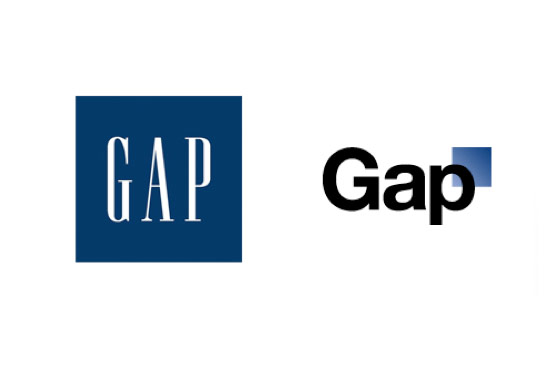
 Gap’s stirred up discontent in social media last year when it premiered it’s newly renovated logo. The new logo was met with no open arms and pretty negative feedback. I am writing this as a response to a marketing blog (probably done last term) by Cindy Cui. She posts
“GAP, an established fashion retail store since 1969, has stealthily changed its iconic blue box to a a smaller blue exo-box to the right as its logo. GAP’s change of logo reveals its new strategy to change its market positioning from a preppy American image to a modern and sleeker look. On the web, consumers negatively criticized GAP’s stupidity to ruin its classic and iconic brand identity that took it twenty years to build.”
I’ll start off with my personal opinion, the new logo looked like a photoshop newbie was handing in a project done very last minute. The reference to the former blue box in the corner is almost insulting, I just didn’t understand the concept at all! The logo didn’t look more modern or sleek, rather it looked cheap and thrown together.
Personal opinions aside, Gap’s strategy of rebranding seemed abrupt and sudden. The Gap logo is something they probably invested alot into, so why make such a big, visual change all of a sudden? From an article I read, Gap’s sales were declining so they wanted to make a new brand that would target a new segment of buyers that frequent shops like Zara and H&M. However, the new brand isolated it’s current consumers and had an adverse effect on attracting a new target market.
Next time, if a brand wants to do this (imagine Apple changing it’s logo to a Pear!) I would suggest 3 things.
- Slowly integrate new rebranding in.
- Ask for opinions from the public.
- Hold a Vote.
With these three steps, it is clear to customers that their opinions matter and those who feel that they have contributed to the growth of Gap will probably become loyaler customers. Gradual integration also gives people more time to digest the new and unfamiliar, giving more time for a company to adapt to any changes, rather than having to be faced with such a catastrophe like Gap did.
Another logo, I just don’t like…

