June 2020

Task 8: Golden Record Curation

“Epic album of all time”?

Honestly, I disliked completing the task this week and wish it was an optional one as opposed to a mandatory one. Initially, I was very excited to learn what songs were included on the record that was sent out into the universe to represent earth and the life it contains. It started pretty well with the first few tracks on the playlist we were given, a wedding song from Peru and Muğam titled as Ugam on the playlist (the Azerbaijan bagpipes song). Then came the composition by Bach (completely okay with this at first although I did wonder why specifically this song was included since I thought there were more well-known classical pieces out there). Upon listening to the podcast episode and reading a little more about the songs that were included on the record, I came to understand that Bach pieces contain a large amount of mathematical operations, which I then rationalized, was the reason for including this particular piece. As I continued with the playlist, I became increasingly dismayed to learn that not just one but THREE Bach pieces were included on the 27 track record. Added to this was a piece by Mozart and also two tracks by Beethoven. There are eight classical pieces then in total if you also include the piece by Stravinsky and the Frairie Round. Add in a further two popular US songs and we now have more than a third of the record representing the Western world alone. Many of the largest nations on earth had but a single song each representing them on the record e.g. India and China.

I guess it being an American project, it would have made sense to include so many western musical artifacts but then the project does not match the criteria set out by Tim Ferris when he stated that they wanted music from all around the world represented, as “music is a good way to memorialize the human species”. The module’s reading this week seems echoed in this task. Just as it’s naive according to Apple (1988) to think of school curricula as neutral knowledge so too is it naive to have thought that this project would equitably represent so many nations and cultures. I would really like to know though what kind of input the various nations across the world were allowed to give in this project or whether they were consulted on any of the songs meant to represent them.

Although I understand that there were physical limits to how many songs and sounds could be included on the record, I feel let down by the choices the committee in charge of this project made. Even some of the 55 languages used for the greetings didn’t make sense to me e.g. Sesotho but not Swahili is on the list even though there are almost three times as many speakers of Swahili than Sesotho on the African continent? Then there is also the small matter of the UN president at the time included in the recordings. Kurt Waldheim (that made the opening address) had hid the extent of his involvement in Nazi war crimes over the years and in general just simply wasn’t a very nice person.

Since I didn’t feel the tracks were truly representative of the world’s nations and cultures, I decided to not try and curate the songs based on that criteria. I simply listened to the tracks and those that evoked some kind of emotion in me were the ones I ended up putting together into a playlist. It was apparently Plato that said “music has a direct effect on the soul” and it was those kinds of songs I sought out from the list given. I arranged them so that the ones I liked the most would appear first in the playlist. Beethoven is ranked highest as listening to the music evoked strong memories from my childhood. On a lighter note- my first exposure to classical music came from watching a kid’s show in the 90’s called the Mozart Band. Having tried to find a video clip of the show I found out it was actually a Spanish cartoon animated by a Taiwanese company that was then dubbed into other languages and distributed. Notably, Bach is absent from this group of young geniuses.

Playlist

(the titles below are as they appear on the NASA site)

1. Beethoven, Fifth Symphony, First Movement, the Philharmonia Orchestra, Otto Klemperer, conductor.

2. Azerbaijan S.S.R., bagpipes, recorded by Radio Moscow.

3. Senegal, percussion, recorded by Charles Duvelle (it was originally thought that this song was recorded in Senegal but it turns out it was actually recorded in Benin).

4. Bulgaria, “Izlel je Delyo Hagdutin,” sung by Valya Balkanska.

5. India, raga, “Jaat Kahan Ho,” sung by Surshri Kesar Bai Kerkar.

6. Peru, wedding song, recorded by John Cohen.

7. Australia, Aborigine songs, “Morning Star” and “Devil Bird,” recorded by Sandra LeBrun Holmes.

8. Mexico, “El Cascabel,” performed by Lorenzo Barcelata and the Mariachi México.

9. Mozart, The Magic Flute, Queen of the Night aria, no. 14. Edda Moser, soprano. Bavarian State Opera, Munich, Wolfgang Sawallisch, conductor.

10. “Johnny B. Goode,” written and performed by Chuck Berry.

Reference

Apple, M. W. (1988). What reform talk does: Creating new inequalities in education. Educational Administration Quarterly, 24(3), 272-281.

McDonald, L. (Host). (2019). Voyager Golden Record. In Twenty Thousand Hertz. Defacto Sound. https://www.20k.org/episodes/voyagergoldenrecord
Task 7: Mode-Bending

This has been by far the most challenging task to complete for me yet. I imagine this is because the two mediums I used for Task 1 (visual and written text) are in my comfort zone when it comes to communication. I had taken a photo of my work bag’s contents and incorporated numbered icons you could click on for more information on the items found in my bag. Below is a reminder of the picture I used.

It was challenging to decide this week how I would redesign the submission and it took me some time to develop an idea of what I wanted to do. One of my initial ideas to transform the task included recording the names of the items in my first language as voice notes and having my classmates assign the words to what they thought each item’s name was. I then reasoned that it wouldn’t be very obvious at all for them to do and so the next idea I explored was to find the internet slang (urban lingo) of the items I had in my bag in some way. Since I didn’t know some of the common slang words used for the items in my bag, I had to turn to the internet to search for them and it was during this process that I concluded that both my ideas thus far weren’t really matching the brief of the task.

The idea I most would have liked to explore would have been to create a mashup song of popular or known songs associated for me with the different items. Mashups (to me) are wonderfully creative pieces of work and I have fond memories of listening to some that combined either the year’s most popular songs or some of my most loved songs. Alas, when I looked into what the process would be like to deliver a mashup I got quite scared. I needed to find acoustic tracks of the songs to overlay with the originals and additionally would have to guess the bpm (beats per minute) of each song. As someone that likes to listen to music but has received no musical training, I just didn’t think I would be able to do this in the few days available this week.

I then started thinking about examples of mainstream media I’ve come across that used alternative ways of communication than what would normally be associated with that particular medium. Examples like Mr. Bean and old-school radio serials came to mind. This gave me the confidence to try my hand at creating my own version of such a media artifact. A small amount of written text is used as an intro in my amateur radio-serial type artifact with the idea being that you as a listener will be able to identify the objects by the sound effects created as the different items in my bag are being used (the aural component). Alternatively, listeners might infer meaning by that what you hear me say given the context that the item is being used in (a verbal component).

Below is the video of my sound project. Don’t worry it isn’t really much of a video as you’ll soon see that the two lines of text included in the clip really don’t give anything away. The story is painted solely through the items and the sounds associated with them along with the context my voice hopefully provides as clues to what they are (the natural habitat that they are used in). I haven’t included all the items from my original bag (I wondered throughout this task why I had picked such a boring bag) but you might want to tick off the items you can identify from the list given below the video. Once you submit your answers, you should be able to see how many you got right (totally optional).

The purpose of Task 1 was for us to get to know each other through the exploration of the items we hold in our bags. What do these items “say” about us? Now that you have identified the items I have in my bag through the radio-serial type artifact above, you should have also formed some opinions on me by now. You should have picked up that I am an educator that spends time balancing written texts (my notebooks and textbooks) with the digital (e.g. emails on a laptop and drawing pad) along with verbal communication either in person (greeting my colleagues) or digitally (my Skype meeting). At least, I hope some of that information could be picked up on as you listened to my artifact. 🙂 The New London Group’s description of how people create through hybridization seems applicable to me too as I constantly blend digital and analogue communications (written and verbal) in my work.

The second video included here are for those that have a burning desire to know exactly which items are responsible for which sounds. To be clear- this isn’t the intended artifact for the task submission and I only included it for those that might really want to link the sounds with the items.

Reference

The New London Group. (1999;1996;). A pedagogy of multiliteracies designing social futures. (pp. 19-46). Cambridge: Routledge. doi:10.4324/9780203979402-6

Link 3: Potato Printing

I picked Tyler’s post for Week 4 (Potato Printing) to contrast my own as the third submission towards my linking assignment. The very first thing I notice when opening Tyler’s blog is the beautiful landscape picture he has chosen as a background on his WordPress space. The words of his posts overlay this picture and there is no clear barrier between the written word and visual per se. As a result, the blended visual and textual elements are part and parcel of his posts. Bolter (2001) offers a wonderful description of this when he refers to words and visuals on the computer screen becoming so entwined that it becomes hard for the reader to know where the pictorial space ends and the verbal space begins. These words mirror exactly my experience on Tyler’s site as I find it can be tricky to read the black text over the background image at times but I also embrace the visual element offered by the background in his posts. The fact that Tyler has chosen to blend the image and his text in such a way makes it clear that he considers the visual elements in his post as very important and it seems re-affirmed by the fact that he also starts every post with an additional photo related to the task at hand.

His blog site is also very sleek without the presence of almost any menus and so to navigate between tasks, I have to return to his home page and scroll through posts that are arranged chronologically. My own blog site of course has far fewer images and a clear barrier exists between my chosen background image and the textual elements on my blog. Text appears on a white canvas overlaying the background image on my site. I also have a clear navigation pane at the top of my blog site, which allows a reader to easily find a subsection of posts that they might want to look at.

In reflecting on our two posts, I wanted to look at Tyler’s post for two specific reasons. We had both chosen words to print that hold special meaning to us. His word, was snowy (originally snow) and Tyler admits to choosing this word because he loves snow. On the other hand, I had picked the word coast based on my love of the coast. What was intriguing to me about this similarity was the perspective it offered me on how others might engage with my own post. I had thought of my word as being special in some way- given its deep meaning to me and so had Tyler. However, in reading his post his word did not evoke nearly as much emotion in me as my own did. I have never known snow, I might have seen it a handful of times in my life and so there is very little real life connection to the word for me. Tyler might even have very special memories connected to the word that I don’t share. Of course, this isn’t unexpected but it made me realize how differently people might react when they read our posts and find no emotional association with the words we picked so carefully. The deep emotional connection I feel when reading over my post might not be the same that others experience when reading it.

The second reason why I picked his post was because Tyler had confessed to having a terrible experience in creating his potato stamps. He reveals that he had hoped that after completing the task that he could use the activity in his own classes but had now changed his mind. If you read between the lines, you might even think he regretted picking this task. However, what resulted from Tyler’s very candid admission of the experience was a wonderful example of exactly what this course aims to achieve- a network of connections and a weaving together of ideas. He received  spectacular comments of how he could adjust the task to make it perhaps easier and more applicable for the grade he teaches (a message of hope and encouragement I believe) and others that commiserated with his struggles. I wonder whether we would have witnessed such a sharing of ideas and contributions to the discussion had Tyler not been as honest as he was about his undertaking of this task. It’s wonderful to see how even a negative experience can unlock a wonderful learning experience for us all.

Reference

Bolter, J. D. (2001). Writing space: Computers, hypertext, and the remediation of print (2nd ed.). Mahwah, N.J: Lawrence Erlbaum Associates. doi:10.4324/9781410600110

Link 2: An Emoji Story

I chose to look at Laura’s post in contrast to my own for the Emoji task of Week 6 as the next contribution to my linking assignment. Her blog space, like mine, is hosted on WordPress although the different themes that we have employed create very different experiences in how we engage with our individual posts. The layout on Laura’s blog space is perhaps less clinical than my own with a colorful background and a logo with her name displayed brightly in this space. This has eloquently infused a sense of her personality into the space where my own can be regarded as more minimalist. I have made less use of the architectural elements available in WordPress to give readers of my blog a sense of my character. This results in the reader having to rely solely on the contents of my posts to infer more of my personality.

There are also two main ways to navigate Laura’s blog with a vertical menu on the left hand side allowing one to navigate to her different weekly tasks. On the right hand side, she again has a vertical menu, which links to her author bio and last activity according to the date posted. In contrast, the menu to be used to access the different subsections of tasks in my space runs horizontally at the top of the blog and the main page has to be used to look at chronologically posted submissions. The layouts of our different blog spaces does affect the readability of posts though as Laura’s text is spaced more compressed between the two menus and mine appears less restricted. I regard it as a bit of a trade-off between more functionally and freedom of movement in the space versus a less constricted reading experience. I like both formats and didn’t have any trouble reading Laura’s post, it was only when returning to my own post that I picked up on this subtle difference in experience.

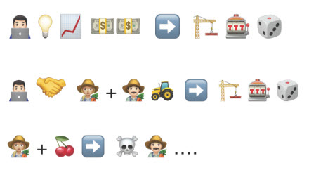
In focusing on the contents of the weekly task, although deciphering the title and plot of the show Laura focused on unraveling using emojis was beyond me, I was very drawn into her description of how she went about completing this task. She went into detail on how she approached conveying the title and plot i.e. her choice to mostly convey ideas rather than individual syllables and like her, I also had to compromise on how I wanted to represent my plot based on the number of emojis available to me. We also both started by illustrating the title of the story which seems a natural inclination given the influence of the written word in our daily lives (a book starts with its title followed by the story).

However, what really piqued my interest in her post was the mention of the other two stories she wanted to explore but was unable to because of the lack of available emojis. No Egyptian related emojis could be found apart from the Egyptian flag nor was there an emoji for the Eiffel tower in the library of emojis out there. I was almost in disbelief that these emojis would be unavailable among the 3 304 Unicode Standard pictographs in existence. This made me pause to reflect and consider how representative emojis truly are and whether this was important.

First created in the 1990’s in Japan, the most recent set of emojis added to the library came after a proposal from Apple to include more options regarding accessibility emojis. Was there a need for more emojis though? Well, simply put- these pictographs (pictorial symbols) have come a long way from their first use in adding tone to text based digital messages. According to the Washington Post, cultural experts have even posited that “representation by emoji validates identity”. Since emojis are thought to be used by 92% of the global population online, representation then becomes a truly important aspect to ensure people can authentically express themselves.

I randomly found a Statue of Liberty emoji and a Moai (Easter Island Head statues) emoji on my keyboard but hardly any other emoji that could be linked to a specific country or cultural group (apart from country flags). As we keep expanding the library of emojis, I think it will be important to bring in representation of these facets associated with human culture if we want to ensure everyone has an equal opportunity to represent themselves using these symbols.

References

Baca, M. C. (2019, July 18). Why emoji are — finally — becoming more diverse. The Washington Post. https://www.washingtonpost.com/technology/2019/07/18/why-emoji-are-finally-becoming-more-diverse/

Task 6: An Emoji Story


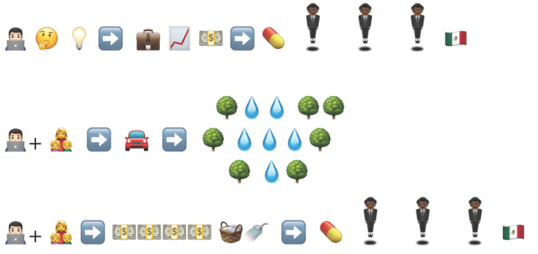
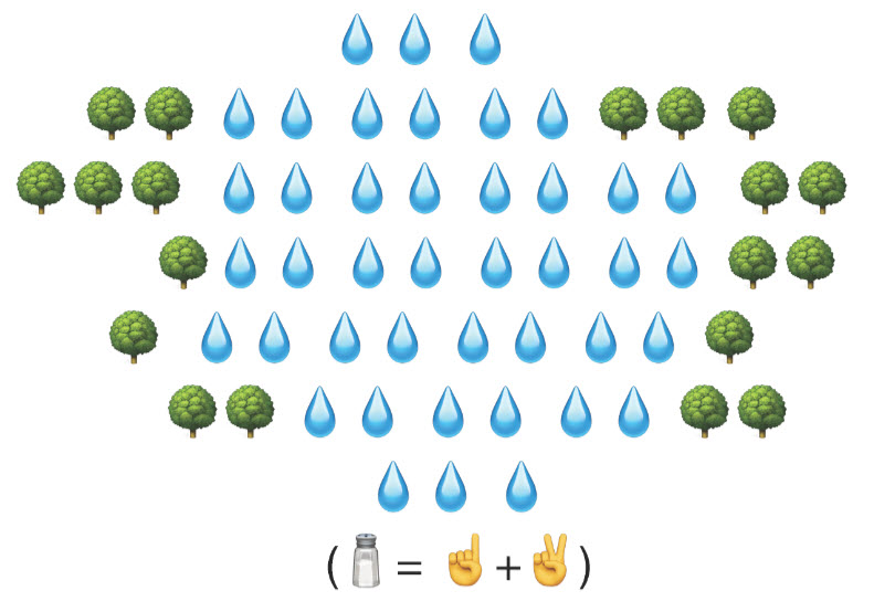
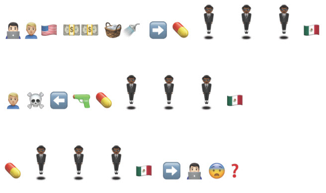
I have to admit that the task this week was pleasantly frustrating! It was challenging but also a lot of fun to come up with a story (plot) that I wanted to share and then creatively pick out all the symbols (emojis) I could use to convey that message. My first challenge was to decide on what kind of emoji keyboard or tool I was going to use to construct the title and plot of for the last TV show I watched. One of the factors I considered to help me make this choice was the ease with which I could find the emojis I wanted to use to construct my story on different platforms.

Google Docs and Apple Pages offered the option of searching for emojis by name or keywords, which made the process of selecting emojis simpler and more efficient than scrolling through available lists. Google Docs also had an additional feature, which I didn’t see on any other platform when it came to filtering through lists of emojis i.e. the option to draw the symbol, or image you are looking for and it returning results based on a visual match to your drawing.

The other factors I considered in my choice of keyboard/ platform were the number of available emojis as well as the aesthetic appeal of their design. A common saying seems applicable here as not all emojis are seemingly “created equal” and below you’ll find four very different looking “tree emojis”. The combination of factors mentioned above eventually led me to choose Apple Pages to complete my task.

I predominantly relied on the emojis to represent certain words or actions to convey the story of the plot but there were cases where there simply weren’t emojis available for a literal representation and I had to rely on a combination of emojis to then try and convey the idea of the word I had in mind e.g. the basket and shower head. I also had to think creatively to how I was going to convey a sense of scale in my story and I decided to incorporate multiple emojis of the same kind in order to accomplish this. Therefore, even though I only used two emojis to represent the title of the show, the sheer number of emojis and their layout conveys a different message than that of a single tree-water droplet-tree combination would have I believe.

Additionally, I made use of a large amount of arrow emojis to help direct the reader in how to read the symbol representation of the story plot. In most cases, the emojis are meant to be read from left to right (the normal convention in Western writing) with the exception of line two. In this case, a symbol (the water pistol) limited my ability to adhere to the normal writing/ reading convention I am used to. Since this emoji only displays from right to left, with no mirror-image available on the platform that I used, I adapted my writing and this in turn also alters the way the viewer of my story will have to attempt to interpret this line.

This task presented a first-hand opportunity to explore the reverse ekphrasis phenomenon of using visuals to explain words (Bolter, 2001). I had to rely on emoji symbols (images) to do what I would normally have done with words (my primary method of communication). Emojis are of course most commonly used to display emotions, gestures, facial expressions or certain objects in digital communication with friends, family and even colleagues in the online or virtual space. They tend to be used to add an extra layer to the conversation by creating a more intimate and personal communication between the parties involved. This is successful because both words and the visual element offered by the emojis can complement one another and offer a complete message to the reader that is rich in context to the parties. This task focused on using only one medium i.e. emojis (symbols) as a primary communication tool or method. It was therefore challenging because I was trying to string emojis together to form a cohesive story and I lacked the words I am so used to using to help fill in the gaps so to say.

Reference:

Bolter, J. D. (2001). Writing space: Computers, hypertext, and the remediation of print (2nd ed.). Mahwah, N.J: Lawrence Erlbaum Associates. doi:10.4324/9781410600110

Link 1: Manual Scripts

I chose to look at Shaun’s post for Task 4 as my first linking assignment submission. The first striking feature of Shaun’s blog space is how his posts have been stylized for every task. A different colored header with a bold font type title can be found at the beginning of every post which, is then followed by detail on the digital tool he used to create his content for that particular post.  In the case of Task 4, Shaun used Adobe Spark to collate and present his contribution to the Manual Scripts task. The final part of the post on the blog site gives instructions on how one could access images of his handwritten manuscript along with his thought analysis.

There were several distinct differences between Shaun’s approach and my own in bringing together our thoughts for this task. By including the Adobe Spark presentation, Shaun requires an action from his fellow “academic lurkers” in order to access his thoughts. You need to click on each separate image in order to enlarge it and read his work. In contrast, my own post starts with the title for the task and includes no information on what tools I used to create my post or content for the task. This is followed by two separate images (taken with my mobile phone and posted unedited onto the blog site) that allows the reader to inspect my written artifact from the start. No action is required by the reader to access my handwritten manuscript or thoughts.

Shaun has deliberately crafted his work into a more edited format for the reader to be engaged with the process of viewing his task. In this approach, he has also broken down the task into sections for reflection by posting first a question and then giving his thoughts on that particular question. My post never directly quotes the guiding questions posed in the assignment instructions and follows a more free-flowing approach in the discussion. Neither approach is wrong and I found it refreshing to look at Shaun’s created Adobe presentation for the task. There were some technical hassles involved in the process e.g. having to use the back button to return to the gallery of the post and the fact that one had to click on the top half of an image to open it but these weren’t really a hindrance to me as I went through his presentation.

An interesting question that Shaun posed in his submission was whether one could really qualify his written document as “writing” given that he didn’t use a cursive style to lay down his thoughts. This is curious to me as I wondered why Shaun would hold the perception that only cursive is a valid form of writing. If that were true, then we must be taking the wrong approach in teaching children to read and write as we definitely don’t start off teaching them cursive. Perhaps there is something more to read into this statement and his mention of becoming extremely reliant on word processors and keyboards for his daily writing. Does he maybe avoid writing by hand because he perceives that there are certain prescribed minimum requirements he finds cumbersome or a hindrance to meet? A word processor on the other hand would take away the effort required to meet “specified requirements” in writing and perhaps this has played a role in his preference for this medium of writing. This is all speculation of course but it was an interesting train of thought to follow as I mulled over his statement. As clearly mentioned in my post, I still prefer writing much of my thoughts and work by hand and to me writing by hand is more freeing than what it is for Shaun.

Task 5: Twine Task

This was a really fun task to do although I have to admit it took me much longer to complete than any of the other tasks up to now. I first had to decide on what the story would be that I wanted to tell throughout my game and it took quite a few hours of brainstorming just to settle on this aspect of the task alone. I finally chose to craft a story that I could share with my younger cousins and I hope that even you (as part of a slightly older audience) will still enjoy it too. It’s meant to amuse and there are multiple endings that can be reached.

Of course, the story was only the peak of the glacier as working in Twine requires understanding how passages are linked, knowing how to edit fonts, add in effects etc. This tweaking is what brings the story to life and adds a personal touch to each Twine created. The passages are of course at the heart of a Twine story or game as they are the links (or hypertexts even) that allow the reader to follow a path of their own choosing. In my story, most generally these links appear as two separate word statements at the bottom of each passage as it’s displayed in the screen and although they appear to be just words, they require an action by the reader to choose how they wish to move to the next part of the story. There are also circular links included in my game at each alternate ending that allows the reader to return to the start of the story and travel along a different path if they so choose. I have also included associative links to other websites hosted outside of Twine for more information on certain topics.

In the end, the hyper-textual links in Twine passages allow the reader to visit and carve out for themselves a rich virtual path in the story (unique in many cases to each reader as there are multiple snippets of information to move and link through, which in essence will make the story and how it’s read unique to each reader). To play the game I designed, download the Career Fair Day folder and open the file. Enjoy!

Reference:

Bolter, J. D. (2001). Writing space: Computers, hypertext, and the remediation of print (2nd ed.). Mahwah, N.J: Lawrence Erlbaum Associates. doi:10.4324/9781410600110

Task 4: Potato Printing (Option 2)

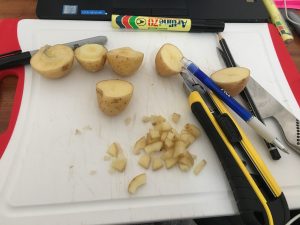
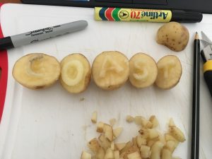
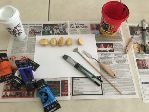
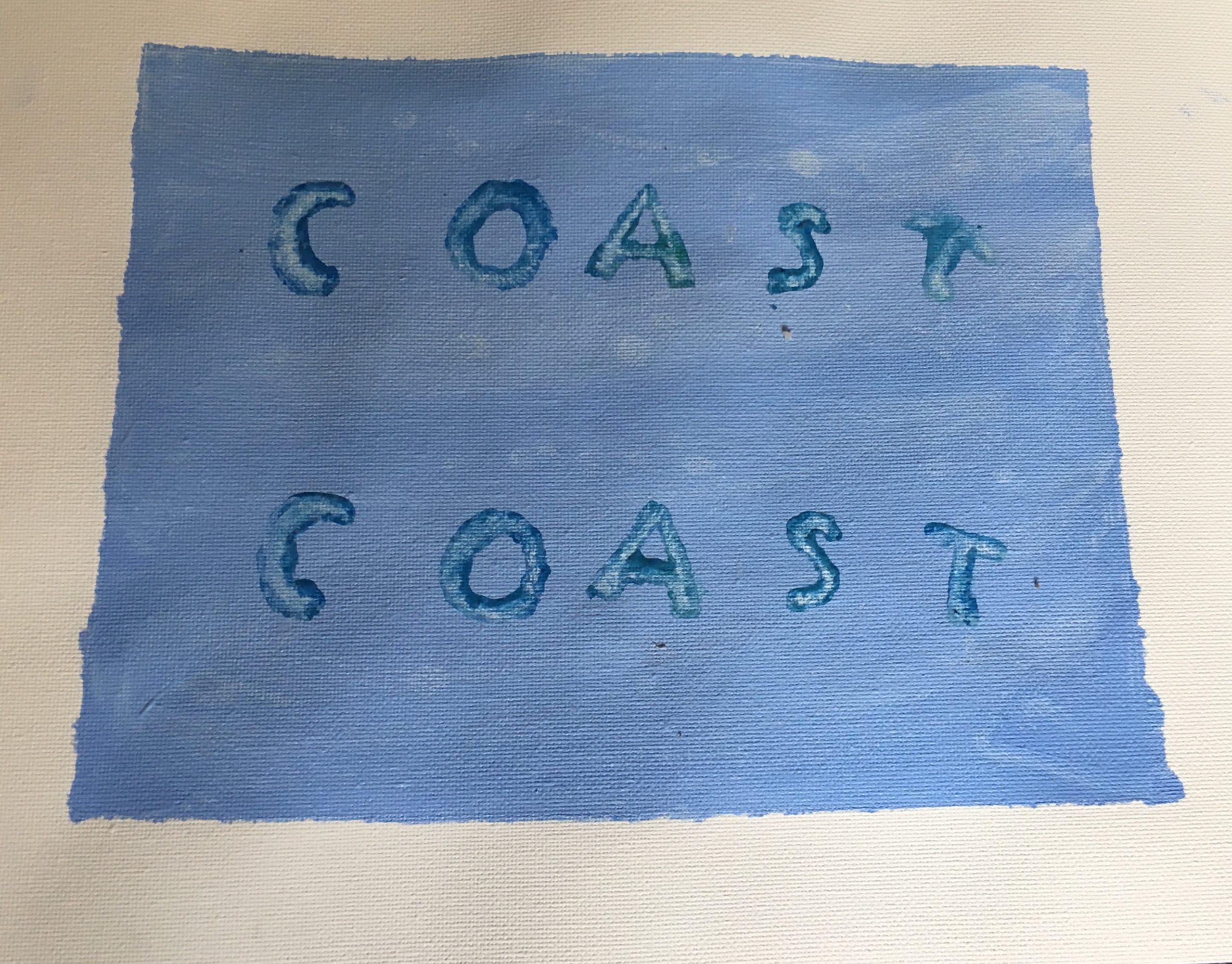
I wanted desperately to do this task because it reminded me of a school activity I did years ago when I was learning about how writing developed in different civilizations and had to do a lino print. From what I can remember, my lino print was far easier to do than this task as it took me about 50 minutes to carve my first set of baby potato stamps. You’ll see from my pictures I made a mistake in my first attempt to create letter stamps for the word “coast*”, which I only caught onto when I started with the actual printing (I didn’t carve out the reverse of the letter “s” so when I stamped my initial version of this stamp, it gave the mirror image of the letter that I wanted). No matter, I got them made but there are some other struggles in the process that should also be highlighted- like the video tutorial I tried to trace my letters with a sharpie to make the cutting easier, which didn’t work at all (re-watching the video I realized I forgot to dry the potato with paper towel before trying this)! I tried a different marker, a pen and finally just used a pencil to carve an outline of each letter before using a carpenter knife to cut out the shape I had traced.

Looking at the two prints, I think they turned out okay. There is a big space between the “c” and “o” letters, which were due to the size of the potatoes that I had aligned with markings next to one another to get my two prints (my own alignment technique). The letter “t” in my first word print smudged a bit but I think it is legible even though there is no doubt that it would have been thrown out by the monks in their scriptoria.

Working on this activity, I found the words spoken by Paul Collier true when he demonstrated the working of the letterpress in the video included in our module this week. Using a letterpress or potato stamps “requires a greater degree of consideration” than had I done the same task using a word processor and printed the document on lets say a laser printer. The mechanization of writing that we utilize today has definitely taken away some of the planning and organization that was needed with this kind of printing. The quote mistakenly attributed to Marshall McLuhan but which rings true to his ideas on communication and technology summarizes this: “we shape our tools, and thereafter our tools shape us” (the words belong to John Culkin, a close friend of McLuhan). We are now at the stage where we shaped our printing methods by developing the computer and printing equipment that can produce documents in a matter of seconds and in the process it has taken over the organization and the “thinking” once associated with printing for us. In that way it has shaped us too as we now only concentrate on the meaning that we want to convey with our words and we leave the printing to the machines.

*The word “coast” has a lot of meaning for me, I picked it for its use as a noun- a place where I feel most at peace and also the verb- to describe how I view my daily movement at the moment, simply coasting forward without much purpose or direction (I wrote more about this word in Option 1 of the task).

Culkin, J. (1967, March 18). A schoolman’s guide to Marshall McLuhan. Saturday Review, 51–53, 70–72.

Task 4: Manual Scripts (Option 1)

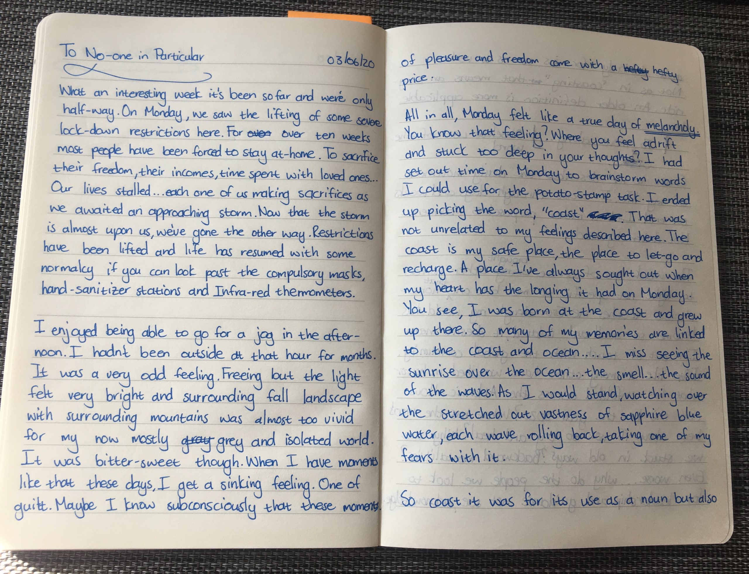
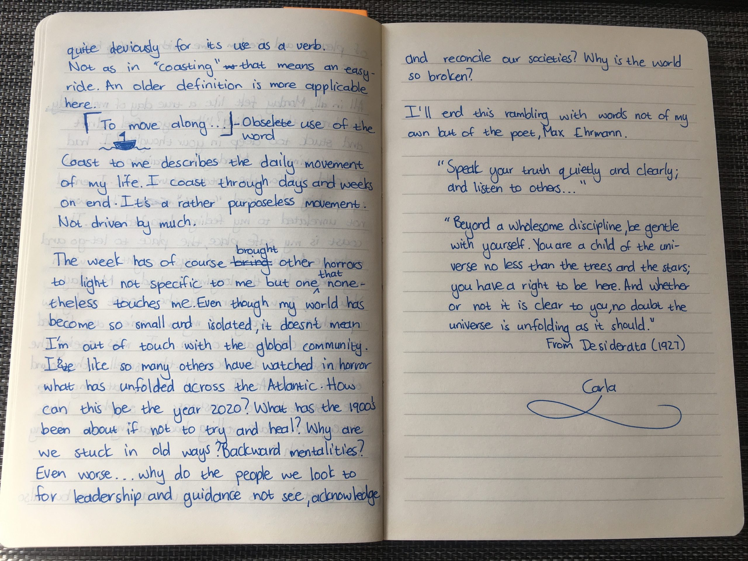
I made the choice to complete both options for Task 4 because I simply could not decide which one I would rather do. I am an old-school lover of written notes and right next to my laptop sits a notepad with a pen ready for any thought that I feel is so important that it requires a permanent commitment to paper. The task was thus not difficult in the sense of the mechanics required to produce the final product, as I am familiar with writing hand-written documents and favor this form of expression over typing on a word processor and printer.

To address some of the questions posed in this task though- when I make a mistake in written documents; I most often scratch it out by using two lines. This is a habit I picked up from my undergraduate years of study where we were prohibited from using correction fluid. I don’t find it bothersome and I now read over these blotches on the paper quite easily- I have no qualms over the resultant look of the document even though some might say it taints the document. I also don’t really care about how neat my hand-writing is. I used to write in cursive but as the need arose to write faster, I adapted to a style that allowed me to record thoughts at a quicker pace. Rather unconventional, at times, I also draw attention to certain parts of the text by underlining it or by including a small diagram. This is a habit I picked up from work where I often rely on diagrams to convey thoughts or ideas (I’m no Picasso but I think my diagrams get the job done).

However, the part of the task that was challenging was to decide on what I wanted to share with a larger audience. Very few of my written documents are shared with others and it felt a little intrusive to have to share my work with people I had barely met. Sharing the document, I felt would expose me and allow others to in effect spy on my inner thoughts and feelings. The podcast we listened to this week confirmed that these feelings were valid when the presenters succinctly summarized that writing lets us “be with each writer through their text”. Reading someone’s writing allows you to see and experience a world through their eyes or representation and thereby gives us an intimate view into their thoughts.

Writing by hand is definitely more personal to me though than using mechanized forms of writing. Apart from obvious cues such as how we write certain letters, underline words of importance or draw diagrams, I believe that even those mistakes documented in writing can give some insight into the thoughts of the person that wrote the text for e.g. I still struggle in deciding whether to write certain words in English as one or two words. My first language has a general tendency to write most words as one and in English, it is the opposite. My cheat (incorrect grammatically I think) is to use a hyphen between words like lock-down (should actually be one word) and hand-sanitizer (should be two words). Writing those words on a word processor would have allowed me to spot the errors and correct them before sharing my thoughts with the world as a printed document (a process that would have de-personalized the text). In conclusion, there is a personal touch to be witnessed in hand-written notes and letters that somehow can get lost when moving to print-based forms of writing.