July 2020

Task 12: Speculative Futures

Here we are- the final task for ETEC540. What an interesting journey it’s been. I’m quite sad that this will be the final weekly task but I hope you will enjoy my final contribution. For my speculative futures narratives, I created a Visual story/ game in Twine called The Interview.

There will be at least one character (maybe two depending on how you look at it) that we are all familiar with and that I don’t think needs much of a bio although we do get glimpses into how their life has changed over time. I don’t want to give too much away! The other characters are purely fictional but represent students like us that participated in this course, we get to catch up with them much later in life. To access the story/ game please click on The Interview.

Task 11: Algorithms of Predictive Text

Hmmm… so a little context for the micro-blog above. I was scheduled to get married at the start of April. Alas, that had to be cancelled or hopefully only postponed as a result of the Covid pandemic. In the last few weeks, my partner and I discussed skipping the actual celebrations and just getting the paper work done. This is thus an imaginary message to my parents telling them that I’m sorry that they will miss the hypothetical day (they are not allowed to travel). I didn’t actually intend for the message to be this one though, I really wanted to start by saying that, “this is not my idea of a holiday” but the word holiday didn’t appear as an option with the predictive text. I then just went with the word “formal” and this is the message that flowed out of that initial choice. Even before beginning the task, I was thinking of how different this task might be to the speech to text and manual script tasks. For some reason, I kept on circling back to the idea of how much writing has changed over the centuries. More about that later though…

The entire micro-blog seems clunky in the way it was put together with words being used rather oddly and sentence construction also seeming strange. That is entirely due to the silly options the predictive text offers at times. Just take a look at the screenshot below… I live in South Africa, why on earth would I want to reference Washington? It doesn’t even make any sense in terms of the sentences already constructed in the message.

The micro-blog reads a bit like as if someone with a rather basic grasp of English wrote this message and as such I can’t say I’ve seen similar statements in any other textual products that would be considered mainstream media or even scholarly. It did remind me of the spam emails I get informing me of the millions I’ve inherited but this is probably not the place to get into that. The text is different in several ways from how I would have normally expressed myself, for one- I wouldn’t have typed this message in English but would have used my first language. On that point, I was super excited to see one or two words from my mother tongue be included in the predictive text options. It’s rather funny to think I would go “weekend” after just saying sorry for something in this text. Again, this was a rather silly option provided by the algorithm given the sentences already constructed. Can the algorithm not recognize the contexts in which certain words might be used?

Enough about the message here though and back to considering the changing landscape of written text through the use of algorithms. Where literacy was once a domain for only a privileged few, this kind of predictive text algorithm almost allows anyone to assemble a semi-coherent message in a language they might not even know. To test this theory, I conducted a little experiment. I removed the English keyboard on my phone, added an Italian keyboard and went back to my messaging app and repeated our micro-blog task. This time without knowing what the words were that I was picking. Here is the translated result. Can I declare myself fluent in Italian now? 😀

Probably not… But I do wonder about what affordances are lost when the user has to input less and less of their own thoughts and creativity in the message they are constructing. Isn’t that something that many of us agreed upon when we reflected on the speech to text task- that there was more thought that went into the story and words we wanted to weave together in our stories if we were given the chance to type it vs. just narrating it? Is this a similar situation for predictive text? Not quite, but there does seem to be a similar feeling attached to making use of predictive text. I did feel as if I lost a little of my own voice in this message, I felt limited by the technology in what I wanted to say and how I wanted to express myself.

I don’t like the idea that an algorithm is deciding for me what the message is I am constructing. It feels controlling and steals from me the opportunity to be an individual. Someone somewhere has decided for me that I should be using the word “Washington” in my messages where I probably have only used it a handful of times in my entire life. Where are the words that I would have liked to use? The ones I love and regularly make use of… Until algorithms can be more ethical and less biased towards further privileging those part of the societies that have constructed them will they be of little use to help contribute towards a more equitable society or education system. Their biases (small and large) robs us of our individuality and tries to conform us to some inputted standard. The algorithms are of course not to blame, it is the designers of those algorithms and the data used to construct their biases that reflect the underlying problems still present in our societies.

Task 10: Attention Economy

It was Nobel Laureate Herbert A. Simon, who first articulated the concept of the Attention Economy when he proclaimed that, “a wealth of information creates a poverty of attention”. This topic reminded me of a poem I came across in another ETEC module that so aptly illustrated the idea of how our attention is being diverted to activities that see a change in the very behavior we use to define human existence.

Our daily lives are now so intertwined with the devices we use that we spend on average a third of our waking hours engaged with mobile technology alone. With the millions of apps out there it is not surprising that so many different techniques have been developed to try and fight to keep our attention. I think what the task this week highlighted so well for me though was exactly how accustomed (or is the correct word really “trained”) I’ve become to these embedded features or design elements. By employing an alternate design, the game we were tasked to play purposefully had me recognize what I am typically used to engaging with on these interfaces. The task also gave rise to a pretty strong emotional response. I became increasingly frustrated and even anxious by not being able to complete the tasks required of me in a timely manner. Everything took a second try or even a third before I got it right and was able to move on to the next screen.

Right on the very first page, I had to remove the filled in text before adding in my details to “register”, I had to Google a Cyrillic letter to add to my password, match letters to my email address, use annoying drop down lists for the domain name and go into the terms and conditions to accept them. The deathly slow scrolling rate to go through the terms and conditions along with the ticking clock and pop up window reminding me that time is a limited resource was the beginning of my anxiety-filled experience. On top of that it took me some time to figure out that to progress I had to click on next which was placed rather oddly on the left hand side of the window (as opposed to a more natural central or right orientated position which would be in-line with the convention I am used to).

Window after window came filled with similar annoyances (why have an age scale that goes to 200? Who lives that long?). I even wanted to ask the chat bot for help- a cheat for the game… I was naive but hopeful (okay, maybe a little desperate). Whatever I typed ended up being complete gibberish. Another time, it told me to wait because there were 430 people in line. I came to accept that I was truly alone.

I made it in the end but ended up feeling a little emotionally drained thereafter. I was overstimulated and felt exhausted by the amount of effort I had to put in to progress between the screens.

What I take from the experience of playing this game was the impact that digital interactions have on me. The very design of a website clearly has the ability to affect me emotionally whether positive or not. I think this disillusioned me from the idea that these spaces are neutral ground in some way. They contain a lot of elements that have been purposefully used to elicit some kind of response in me (whether that is for my benefit or theirs). Is there an alternative though? On the site for the Center for Humane Technology (spearheaded by Tristan Harris), there is a suggested design framework for developers to help them take into account six human sensitivities to counter strong responses elicited through the interaction with technology in order to create more balanced/ neutral spaces. Take a look at the snapshot below of this framework.

To conclude, I watched a talk this week by an expert in XR data privacy and it seems that so many concerns that were highlighted in this week’s module regarding data collected and the design of social media apps/ websites to manipulate our behavior is being transferred into the Virtual and Augmented reality spaces too. Just take a look at this article to gain some insight on this. I’m afraid that these are problems that simply cannot be ignored and will require each of us to educate ourselves on design practices being used to manipulate our attention, demand more transparency from tech. companies on how they operate and to pressure governments to institute and uphold laws that will see more protection of our rights and information.

Task 9: Network Assignment Using Golden Record Curation Quiz Data

The experience of completing the task this week was the polar opposite of Task 8’s for me, which was strange as these two tasks are really inextricably linked. As I worked through the module’s theory component, I suddenly felt at home with words such as “matrices” being used. As a science graduate, mathematics feels very much like a safe space and a tool I can rely on to help reveal the truth about relationships in data. Or can it?

It was with much enthusiasm that I opened the data set sent by Ernesto in Palladio. I was fascinated by all the facets and groupings available to toggle and filter the visualized networks with. Just a few seconds were needed each time to reveal a new and unexpected connected network between the musical tracks, curators and groupings. Each one calling out for careful further inspection to make sense of the interesting visuals taking over my screen. It also meant a lot of crosschecking with fellow curators’ posts on the reasons for their track selection to paint a richer story of the networks panned out in front of me.

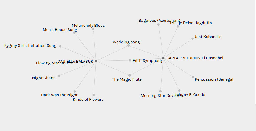
The very first network I’d like to share was one created with just myself and Kristin’s track choices. Even though I had read over her post last weekend describing her curation, I was very surprised to see that we in fact had picked nine identical songs (you might be wondering whether we were comparing notes on the sly during our selection process but I can guarantee you that we weren’t). Judging our song selection solely by the visualization of this network though would tempt one to think that our analysis and curation of the songs must have been based on similar criteria.

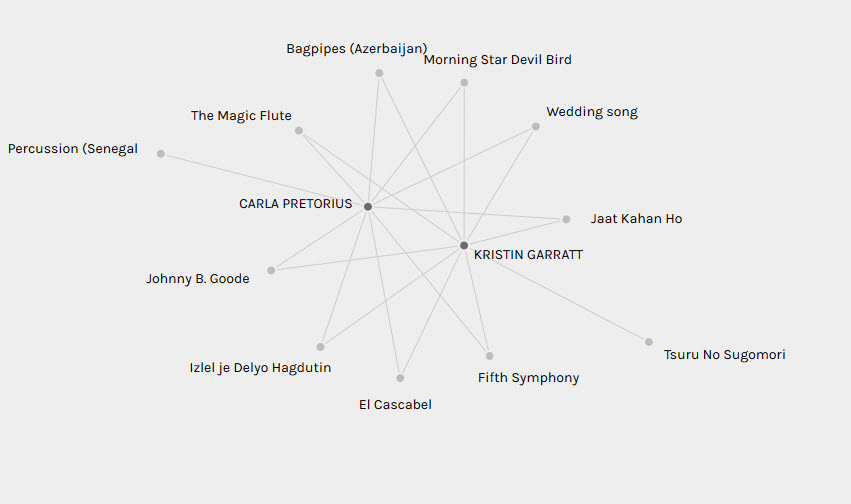
I distinctly remembered though that Kristin had followed a meticulously thought out process in the way that she selected her songs. She eliminated songs that had similar sounds from her list and she tried to represent the different continents in a more equitable way. In contrast, my own criteria for song selection was based solely on a song being able to evoke some kind of emotion in me. Vastly different approaches resulted in almost identical song selections. This was fascinating to me and highlighted the risk associated in interpreting data without considering the context from which that data came. A first glance of the connected network formed between Kristin and my selections would have rightly led one to conclude that we placed emphasis on similar songs but it does not reveal in any way the reasoning behind that selection and emphasis (which could only be gleaned from our blog posts). Fascinatingly, this bias could also be confirmed with the network graph created between Daniella’s track choices and my own. Like me, she also chose tracks solely based on emotional reactions but in this case, we only shared three identical track choices.

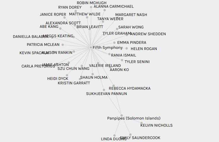
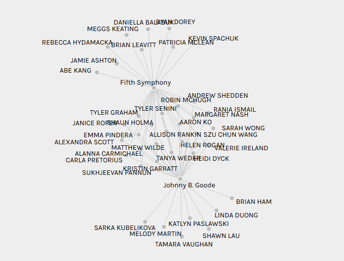
The other graph I wanted to show-case was a multiplex network created between the most popular track curated (Beethoven’s 5th Symphony) and one of the least popular tracks (the panpipes track from the Solomon Islands). Only two curators had selected both of these tracks (Rebecca and Sukhjeevan) thus signifying the critical role they play in connecting these two networks. In contrast, the track I rated as my favorite (5th symphony) and least favorite (Johnny B. Goode) had a multitude of curators that had selected both songs.

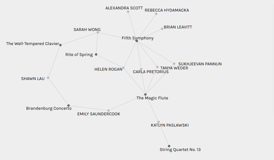
I also wanted to look at the network formed between the eight classical tracks of the Golden Record and the choices in curation within my group since many of us had commented on there being too many such tracks perhaps included on the Golden Record. This revealed that the 5th symphony was the most popular choice of classical song and on average most curators in my group had selected two classical pieces with the most popular combination being this track with the Magic Flute track. Most interestingly though, the three curators to have only selected one classical track (Brian, Rebecca and Alexandra) had all picked the 5th symphony to form part of their curation. I think this says something about how pervasive the 5th symphony in fact is in terms of its reputation as a true piece of musical mastery but again this might just be my interpretation.

I think this exercise was useful in revealing interesting similarities in the choices made among all the curators in their selection of songs. However, it’s also very clear that one has to be careful in reading too much into the choices made as the reasons for selection can clearly be vastly different, which adds a different dimension to how one views these networks.