Categories
Uncategorized

Linking Assignment

Linking Assignment

Joti Singh – Task 12:

In this task, Joti explored the balance between societal order and individual freedom, drawing parallels to “The Giver,” a text that I’ve taught in my 7th Grade class. Joti’s use of narrative and the Canva AI image generator to create, “The Harmonizer,” presents a very insightful perspective on the potential for technological control in society.

This really resonated with me because it mirrors the discussions I have with my students about the underlying dystopian aspects of utopian societies. It also connects to my ongoing interest in how technology impacts freedom, a topic I’ve explored in my own work and that I wrote about in my creative writing for this course. Her narrative not only matches my teaching approach but also challenges me to think more critically about the role of technology in shaping societal norms.

Julia C. – Task 7:

Julia’s redesign of the “What’s in My Bag” task using Genially is an excellent example of how multiliteracies can be used to enhance a learning experience. By incorporating interactive elements like video reviews, social media links and audio recordings Julia created a more multifaceted way for viewers to explore her content. I was particularly interested by how Julia’s use of Genially offered such a rich, more impressive presentation compared to my own approach, where I focused solely on the audio aspect of the task. This comparison made me reconsider the possibilities of using interactive tools to cater to different learning styles, something I hadn’t fully explored in my version of the assignment but have in other courses. Julia’s work inspires me to think more creatively about how to present content in ways that can engage many senses and learning preferences.

Steve Acree – Task 8:

Steve’s thoughtful approach to selecting songs for the Golden Record album showcases a practical yet diverse selection of our world’s music. By including songs from different continents and focusing, at times, on voice-related tracks, he created a collection that not only represents various traditions but also captures the shared human experience. Steve’s focus on diversity and geography in his selection process definitely resonated with me, as it kind of mirrored my own approach. However, his idea of representing a song from every continent was something I hadn’t considered and now see as a missed opportunity in my own list (I actually looked back to see which songs I selected and if I got one from every continent!). The personal touch of including voice-related songs adds a deeper layer of “humanity” to his collection, making it a good choice for a capsule. This task also introduced me to the concept of the Golden Record, which I found to be a beautiful way to extend an invitation to other life in the universe. Steve’s work has inspired me to think more broadly about cultural representation in projects like this.

Abdulehed – Task 7:

Abdulehed’s choice to redesign the “What’s in Your Bag” task by incorporating an audio mode is a solid example of embracing multimodal learning. By converting text into AI-generated speech, he successfully captured the tone and emotion that can often be lost in written text, making the content more engaging and accessible, especially for auditory learners and those who are visually impaired. I found a strong connection between Abdulehed’s approach and my own, as both of us opted to focus on the audio aspect of this task. His work shows the power of audio in conveying emotion and creating a more inclusive learning experience. Reflecting on his redesign has deepened my appreciation for the impact that different modes of communication can have on learning, especially in making content more accessible and engaging for diverse learners.

Steph Takeda – Task 10:

Steph’s response to my Task 10 highlights the comical frustrations and challenges we both encountered during the exercise! Like me, Steph found the inefficiencies and distractions of the task to be particularly eye-opening (and annoying), revealing how easily our attention can be manipulated by design elements that seem minor at first glance. Steph’s reflections resonate with my own experience, particularly in terms of how we often rely on visual cues and click without much thought. This exercise served as a humbling reminder of the vulnerabilities we face in our interactions online, something that’s becoming very important in educational contexts. Her insights into the broader implications of these issues, from hacking to privacy breaches, shows the need for greater awareness and caution in our digital lives. This exchange helped me understand the subtle and important ways that digital environments can influence our behavior and decision making.

Shannon Wong – Task 7:

Shannon’s response to my Task 7: Mode Bending, highlights the similarities in our assignments, as we both focused on using sounds to convey the objects in our bags. We also both mentioned ASMR and noted that preparing the activity in audio form took much longer than expected. Shannon’s insights into the impact of background music that I used for the audio were kind and really solidified my choice of using music in the first place. Her reflection showed the shared understanding we both have about the power of sound in demonstrating meaning. Again, her mention of how background music can alter the feel of an audio clip resonated with me, especially since I intentionally chose an upbeat track to set a certain tone. This exchange also made me think about how soundtracks in movies and TV shows can shape the viewer’s experience, much like how our choice of sounds and music shaped the experience of this task. Shannon’s mention about the time investment required for this task, particularly the need to script the audio, definitely matched my own experience and made me appreciate the careful planning that audio tasks require.

Categories
Uncategorized

Final Project: Describing Communication Technologies


This is my final project, The iPad Revolution, completed as an infographic poster. Below is the Genially graphic embedded into the blog and also a link to see the completed infographic online.

https://view.genially.com/6

6b50730469cdd6d75f4b648/interactive-content-the-ipad-revolution

Categories
Uncategorized

Task 12: Speculative Futures

Prompt: 

Describe or narrate a scenario about a device found a decade into a future in which society as we know it has come apart. Your description should address issues related to communication and elicit feelings of decadence.

Narrative: 

It was too late.

She approached a sign on the side of the grassy, abandoned highway that read, “Vancouver 600m.” It had been lodged into the grass on the shoulder of the road, perhaps by another wanderer, for others to see and recognize.

It’s the year 2052, 14 years since the fall of society. Fourteen years since the great war.

Behind her, cities lay in ruins and the once-bustling streets and highways of her past were now silent and empty. She searched east, to the places of her childhood memories and summer vacations spent. The lakes still sat the same, but nothing else remained except debris and memories of what once was. She thought to herself that if only they had all lived as if they were on summer vacation, none of this would have happened. “I’ll head back to the city,” she thought to herself.

As she returned through the intersection into the core of what once was her home, she felt a sense of belonging even though it was all gone. She combed through the wreckage and navigated her way north towards her old neighbourhood. In the distance, a pair of raccoons rummaged on the patio of a two-story home, a Vancouver special, as they searched for food. She could see pieces of debris fall from the patio and scatter along the yard.

Suddenly, she stopped.

A bright light shining from the newly formed mess bounced off a surface, reflecting the rays of the warm sun. She started for the house in the distance, hoping for an artifact from the past. As she approached the yard, the raccoons scattered from the patio back through the sliding doors of the house. There, she knelt to look closer, and there it was—a cellular device nestled between layers of dust and rubble. It was a sleek, glassy phone, its screen cracked but otherwise in good condition, hopefully still functional.

Without hesitation, she reached for a cube from her backpack, attached it to a cord and plugged it into the phone. With a hesitant yet familiar touch, she powered it on. A faint glow illuminated the dust that surrounded her, revealing a fragmented interface. This phone, once an essential piece of communication, now stood as a relic of an era that once was. It was a symbol of the decadence that had led to society’s downfall.

She immediately swiped, clicked and searched through the device.

The memory was filled with messages, social media posts and news articles from a time when people were more concerned with digital likes and shares than the real-world consequences of their actions. Everyone picked a side and heard no one but themselves. As she opened and scrolled through the messages, she saw the last desperate attempts at communication before the great collapse.

From Sydney to Family Group Chat: Hey everyone, the power just went out here. Is everyone okay?

From Tijana to Best Friends Group: Guys, I can’t reach my parents. Has anyone heard anything about the situation in the city?

From Ashton to Work Colleagues: Hi everyone, I know it’s chaotic, but we need to finalize the report. Can anyone still access the server?

From Laura: I love you. No matter what happens, remember that. Please stay safe.

From Community Alert System: Emergency broadcast: All residents are advised to stay indoors. Do not attempt to travel. Further instructions will follow.

From Johnny: Do you have any extra water? We’re running low and the stores are empty.

From Eliza to Seven Group Chat: Does anyone know what’s going on? The news is saying different things and I’m scared.

From Government Alert: Attention: Martial law is now in effect. All citizens must comply with curfews and directives. Stay safe.

From Luca: It’s been years, but I just wanted to reach out. I hope you’re okay. Take care.

From Sydney: Hey, where are you? I’m heading to the shelter. If you get this, meet me there. Love you.


These messages, filled with fear, confusion and a sense of an  impending end, brought her back to the uncertainty of it all. The phone’s battery was nearly depleted, and with each passing moment, the screen flickered, threatening to go dark forever. Now, she felt a newfound sense of sorrow reading through the messages.

This phone, once a necessity of connectivity, now only served as a haunting reminder of what was lost. The prosperity of the past was evident to her as she thought back to the high-tech designs of the past. The volume of data stored within this tiny device served as a reminder of their spoiled existence. Yet, it also highlighted the fragile connections and the ease with which they were created.

She held onto the side button as the device finally powered down.

Tears trickled down her dirty cheeks as she began to stand with a heavy heart. She packed the cube and the phone into her backpack and turned for the gate. The device, like the society it once served, was now just a ghost of its former self. It was a symbol of the nature of human progress that ultimately also led to its demise. She quietly stepped back out towards the road, to a destination uncertain, a silent witness to the end of an era of what once was.

It was too late.

Categories
Uncategorized

Task 11: Text-to-Image

Reflection

Was the result relatively accurate in your estimation?

Arriving at this task, I have never used Craiyon before. I found the site easy to use but very slow on my computer which rarely ever happens. The generated images, although original. Seemed to lack a lot of detail and the prompting never really seemed to help the quality improve. The AI struggled with the details of the image and wasn’t able to match my instruction, such as accurately creating a dog wearing a red cape or creating a realistic human face. This does seem to be a common limitation of AI image generators that I have used. The AI always seems to produce variations that are close but not exactly what I envisioned.

Were those images what you had in mind when you gave the AI the prompts?

The images definitely did not meet my expectations. The AI’s interpretation of “a dog wearing a red cape” resulted in various red clothing items instead of a consistent cape. Similarly, the human face distortion indicates that the AI might not be adept at generating realistic human features, especially in dynamic poses like jumping when I entered the prompt to “create a man who has just graduated from his masters program at the university of british columbia jumping up in the air on campus, excited to be all done.”

What differed?

The main differences were:

  • Inconsistent Details: The AI generated different red clothing items instead of a specific red cape. I assumed that a cape would be a specific enough type of garment that the AI would be able to produce.
  • Distorted Human Features: The AI struggled with creating a realistic human face, particularly in an action pose. The images were mostly headshots of men smiling or graduation related images that didn’t fit my request.

What can you infer about the model or the training data based on the results?

These inconsistencies may suggest that the AI model might not have been trained on enough diverse and high-quality images of the specific scenarios that I requested. Perhaps this AI tool, Craiyon, relies on patterns and previously requested images to learn and improve. If Craiyon hasn’t seen requests like mine such as dogs in capes or people jumping in specific contexts, perhaps Craiyon struggled to produce original accurate pictures. The article from Vox highlights similar limitations of AI-generated images. It mentions that while AI models like DALL-E can create impressive visuals, they often fall short in generating detailed and accurate representations, especially for complex or specific prompts (Heilweil, 2022). This aligns with my experience, where the AI’s output did not fully match my expectations. While I would conclude that AI image generators have made positive strides, they definitely still have limitations, especially with detailed and specific prompts. While the technology continually improves, it may require multiple banks of information and refinements to get closer to a desired outcome.

References

Heilweil, R. (2022, December 7). AI is finally good at stuff. Now

        what? Vox. https://www.vox.com/recode/2022/12/7/23498694/ai

artificial intelligence-chat-gpt-openaiLinks to an external site.


Categories
Uncategorized

Task 10: Attention Economy

Well then… this made me feel foolish, or perhaps frustrated, or maybe annoyed, or I guess all of the above! Doing the exercise was actually fun as I found a lot of humour in it throughout the quiz. It is actually quite funny because I actually find myself very critical of website design on a regular basis and question the buttons and forms all the time. The design choices in this activity made it incredibly confusing. Reflecting on my own internet usage I can comfortably say that I have learned to click without usually thinking. In a sense, we rarely read the text on buttons and instead look for different things to click to make the process quicker. Clicking a box to say that we have agreed to something is a regular occurrence and looking for red or green click friendly icons is very common indeed. I feel that we have been conditioned to do these things and are now normalized so much so, that we forget that we are doing them. This quiz by User Inyerface does an amazing job of showcasing patterns and our habits of not reading and just clicking (Brignull, 2011). Usually, websites that are scams operate a lot like this and show these dark patterns even more so. I can recall many experiences where clicking on the ‘x’ to close a page sometimes begins a download or opens up an ad, much like this quiz did. Although there was definitely some humour involved in this quiz, the scary realities out there can be quite alarming. I have family members who have put in there email address or password to sites that are fake or that ask for information after announcing that you’ve won a free vacation. It can be quite a mess if you get caught in clicking without paying attention. The assignment did a wonderful job of showing these characteristics and teaching/reminding us a valuable lesson.


Reference

Brignull, H. (2011). Dark Patterns: Deception vs. Honesty in UI Design. Interaction Design, Usability338.

Categories
Uncategorized

Task 9: Networking Assignment

Upon completing the Golden Record assignment, the next step required my peers and I to take a quiz in an effort to gather data based on our song selections. Using the Palladio app, something that I have never done before, we were to interpret the collected data through a visual output, as shown below.

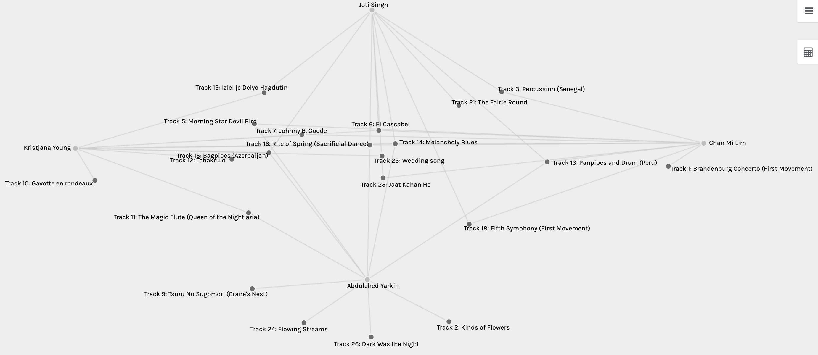
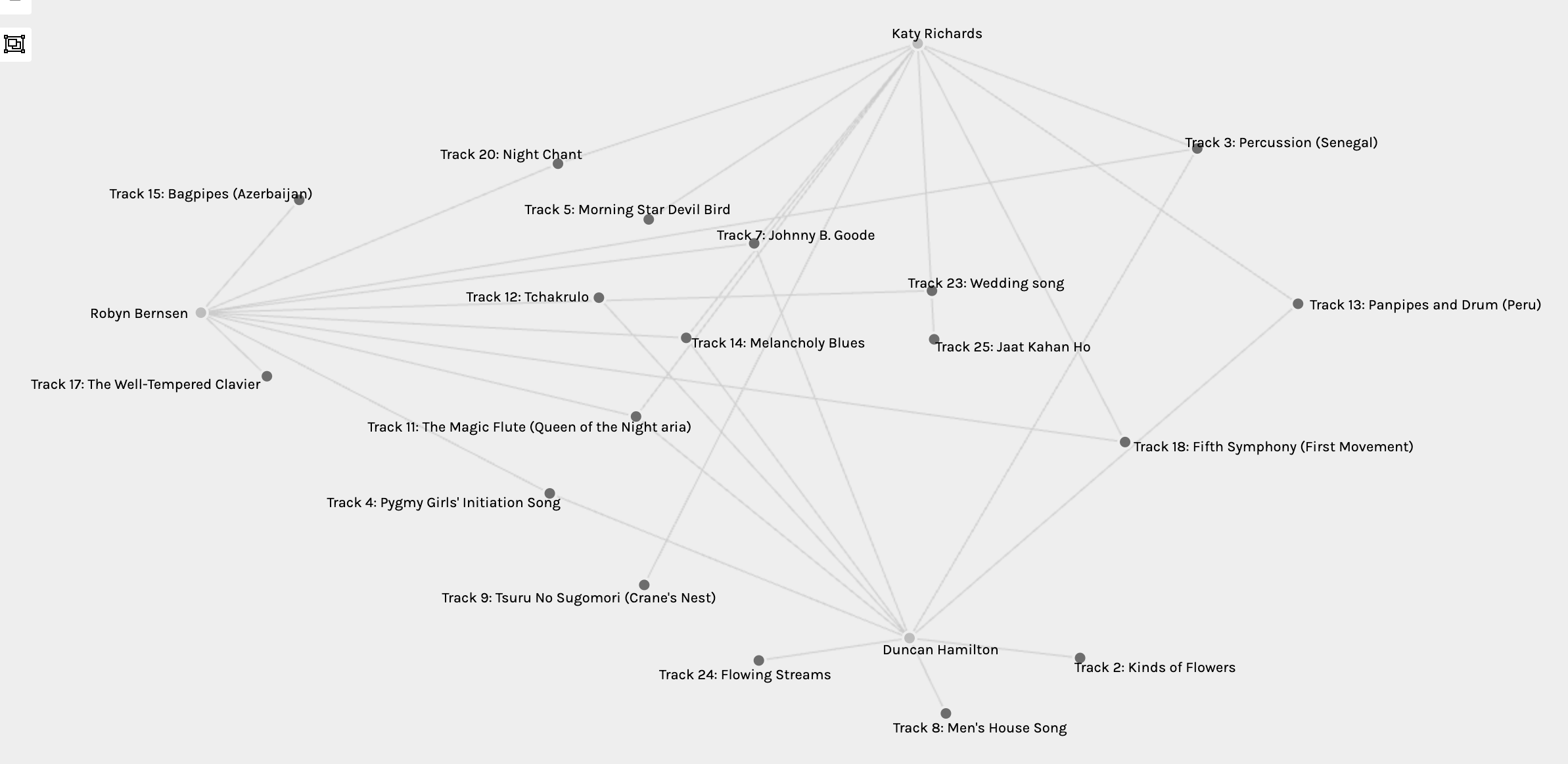
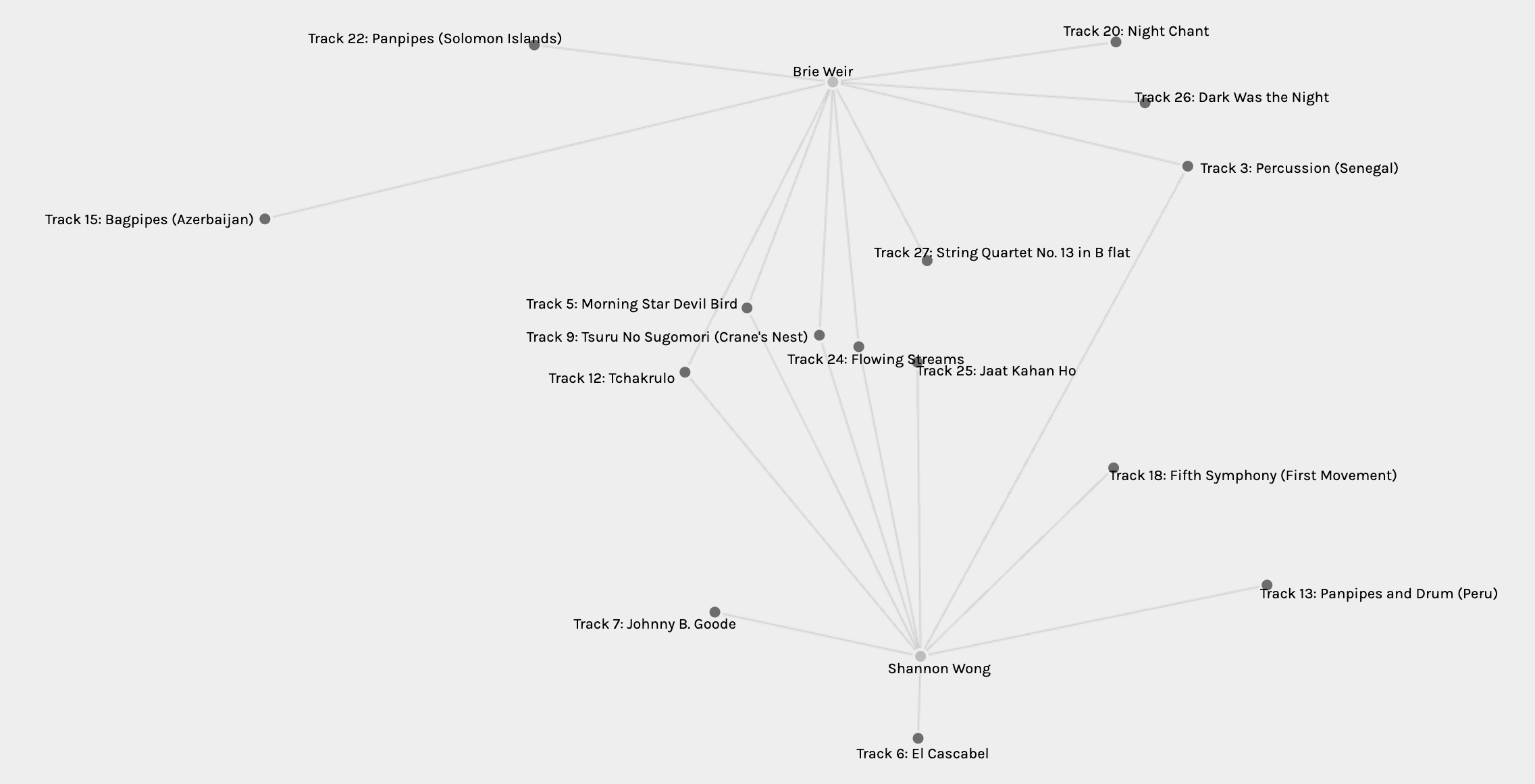
I am not going to lie; the program was instantly intimidating. Loading the file by following the instructions was manageable but the data was immense, just take a look at the above image. However, after discovering more about the program, using Palladio turned out to be very interesting and well worth the learning curve. The app made it fairly easy to somewhat interpret the data and see different connections amongst our group. It really was like reading a new language at times because of the complexity that it came with. I found it a lot easier when clicking the different facet options based on how the program divided the students of the course. Working with the smaller groups, I tried to spread out the MET students on the perimeter of the workplace and then see how the connections happened. Spreading out the lines as much as possible made it easier for me to understand and interpret the data. I untangled every group this way and also if any student was the only person to choose a song that song would be distanced away from the rest of the data.

First, I looked for the tracks that were original to the students. Out of five members of the group, all of them had chosen songs that the other’s had not. Four out of five chose two songs that were original to them. I found this interesting that while they share commonalities, they had different selections than the rest as well. I also noted that only one song was similar between them all which was Track 18: Fifth Sympathy which is a classical number that most likely found its way onto their lists because of how well it’s known to the rest of the world.

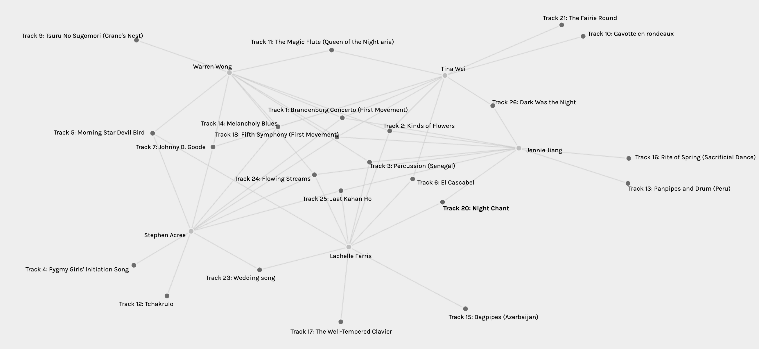
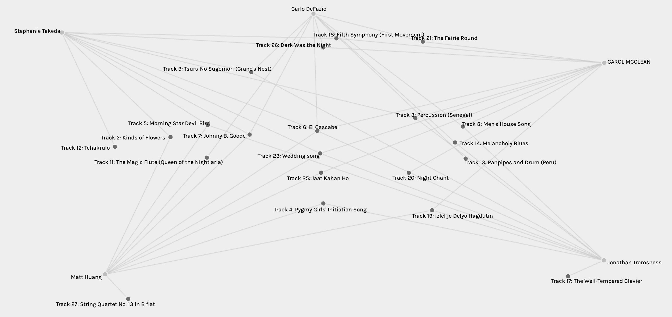
The group that I was part of was Group two, which I was typically most interested in when comparing as making assumptions related to myself is always more intriguing. Group two had one song in common which was Track 6: El Cascabel. It is such a vibrant, Mexican, feel good song that I believe definitely belonged in our playlists based on the way it makes you feel when listening to it. While three students had unique songs chosen only by themselves, I did not have a song that I only chose. Does this make me more predictable and less original? Maybe so, because when I noticed that some students did not select Johnny B Goode to be part of their selection, I was shocked (in a humourous way of course) that they would leave off such a classic. Based on how some of their songs were selected, I would infer that their choices were perhaps influenced by the cultural significance of the tracks, while my predictability perhaps landed more songs such as Johnny B Goode.

Only 4 students were part of the next group, a lot more manageable. The songs in common here were more apparent now but there were not a lot of original selections made. Some of the similar selections included Track 24: Flowering Streams, Track 14: Melancholy Blues, Track 10: Gavotte en rondeaux, Track 21: The Fairie Round and Track 7: Johnny B Goode. I find this group had a very good taste of uplifting and positive music as their commonalities were all solid choices.

Looking at Group four, I instantly noticed that Abdulehed had four tracks that only he selected. I find that the selections that were commonly chosen were all selected because of their great musicality and that Abdulhed had some great taste in cultural music. They did not have much in common at all which showed their unique musical senses.

The next group was very unique in that they each had three of their own choices and four similar selections. These three students chose the same songs that, once again, focused on the feel good musical aspects of the list. Positive and uplifting song choices continued to be selected by most students in the groups and I feel that they best represent our group as a whole as well as the entire human race.

Lastly, two students were very easy to interpret as Palladio makes it easy to see their five similar choices and their other differences as well. This was obviously the easiest to separate and spread apart while the others had some errors in my screenshots as well, noticing some songs in places that I should have moved them from.

Reflection

The assignment was one that I really enjoyed and felt that it provided culture and significance to the course. It also really got me thinking on a deeper level regarding perception and predictability. I really enjoyed trying to distinguish and interpret the data involved but also realizes that it was still hard to determine why songs were ultimately selected. I felt that Palladio did an excellent job of presenting the data in a way which could be manipulated to see more clearly.  The most difficult thing about the interpretation was constantly going back and forth to the song choices and re-listening before inferring why a song was selected, which was a tedious process. It would take a team to try and sort through this the proper way in the end.

I found it difficult to consider so many possibilities of song selection from what’s missing and why or why not songs were chosen. I could make assumptions but I do not feel as though other students may feel that is appropriate to do as personal preference is so unique to every individual. I could look at my own choices and question why others did not select the same songs as I did but the data would not be able to tell me this in the long run. Much like our digital footprint, we may be able to be interpreted and tracked from things in which we do or follow but why we make our choices and how they are grouped with the population is not up to us. It is simply impossible to assume data and we need to remember this always as we could be caught in certain situations grouping individuals based on selections that they make and not searching further.


Categories
Uncategorized

Task 8: Golden Record Curation Assignment

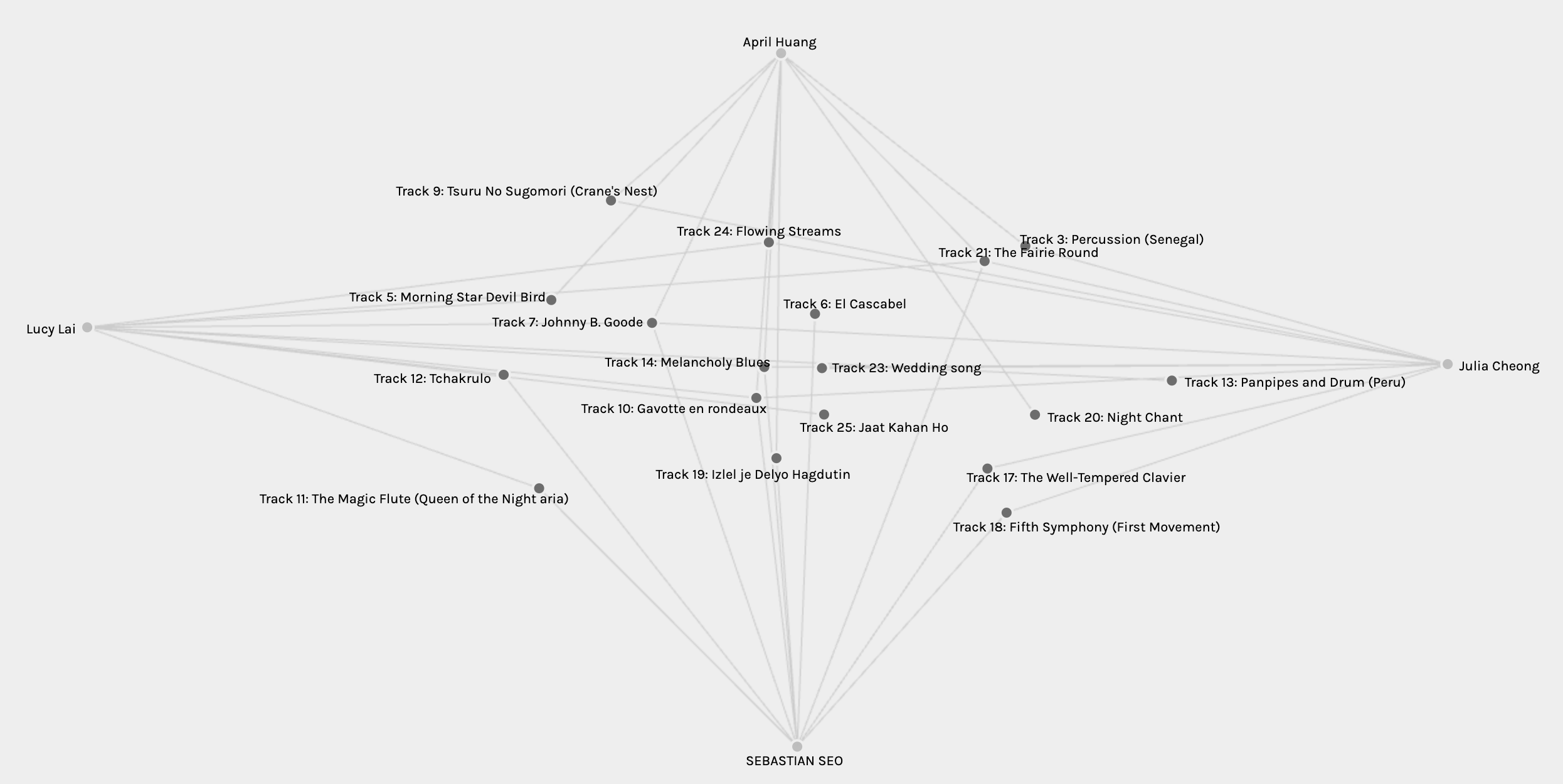
This assignment was incredibly interesting. Discovering the existence of the Voyager Golden Records for me personally, was fascinating. The idea of sending a message from Earth out into the cosmos, intended for any potential extraterrestrial life, is both amazing and inspiring. It must have been a monumental task for Carl Sagan and the team to curate the content, meticulously selecting sounds and images that represent the diversity and essence of our planet. Reflecting on their effort, I can’t help but think about the choices they made and how I might have selected differently. If I were to choose only ten songs for the final draft, I would prioritize a broad spectrum of compositions, ensuring a wide range of representation from various cultures and musicians. This would highlight the rich artistry of human creativity and our peaceful intentions for whoever discovers the capsule. While I wouldn’t want to intimidate any extraterrestrial being, I would also love to demonstrate some of our powerful pieces in which shows our strength and the passion of a human being. The Voyager Golden Records stand as a testament to our desire to connect and share our story with the universe, symbolizing hope and curiosity. Definitely one of the assignments that I won’t forget.

My Top 10:

1. #6: Mexico, “El Cascabel,” performed by Lorenzo Barcelata and the Mariachi México. 3:14
Listening to this track, I feel that this fast-paced melody embodies passion, love, excitement and movement. I want to get up and dance when this sone hits and I feel it is critical to include this one in my top 10.

2. #7: “Johnny B. Goode,” written and performed by Chuck Berry. 2:38
Never mind the Golden Records, this is one of my favourite songs in general. Perfect to tap your foot to and smile while your frequency sparks with this classic number. Besides, anyone who finds these records needs to hear some iconic rock and roll.

3. #8: New Guinea, “Men’s House Song,” recorded by Robert MacLennan. 1:20
This song provides a very valuable perspective on our musical expression highlighting rich culture, different styles and a non-threatening and harmonious quality. I feel it represents a peaceful way about it when listening.

4. #9: Japan, shakuhachi, “Tsuru No Sugomori” (“Crane’s Nest,”) performed by Goro Yamaguchi. 4:51
As this might be the most relaxing number in the entire collection I feel that this track should absolutely be included in the medley. The fact that music like Yamaguchi’s number can evoke that feeling is truly worth it being on the final list.

5. #11: Munich, “The Magic Flute, Queen of the Night aria,” no. 14. Edda Moser, soprano. Composed by Wolfgang Amadeus Mozart. 2:55
I feel that Mozart, merely based on the fact that he is one of the most famous composers in history, should be able to showcase the intensity and storytelling to whoever may find this capsule. It will definitely be able to take someone on a thrilling ride demonstrating the capabilities of human creativity and heart.

6. #13: Peru, “Panpipes and Drum”, collected by Casa de la Cultura, Lima. 0:52
I feel that the panpipes and drum was also a fine piece of cultural representation and a different type of feel of music compared to the rest of the album’s music. It also showcases different types of sounds that can be seen as very uplifting and beautiful.

7. #14: “Melancholy Blues,” performed by Louis Armstrong and his Hot Seven. 3:05
I am a fairly big fan of the blues and feel that, like some other artists on this list, Louis Armstrong is a perfect addition of variety to the tracks. It’s a laid back vibe that showcases the desire for emotion in music from human beings.

8. #18: The Philharmonia Orchestra, “Fifth Symphony, First Movement” composed by Ludwig van Beethoven. 7:20
This sone might be the most iconic pieces on the list. Made by a human being that has created many recognizable compositions, I feel that his contribution to music should most definitely be included in the top 10. It also displays a fierce and intense range of classical music with an opening that is most likely recognized by anyone on earth.

9. #21: Holborne, Paueans, Galliards, Almains and Other Short Aeirs, “The Fairie Round,” performed by David Munrow and the Early Music Consort of London. 1:17
This number is very inspiring and represents the wonderful creativity and talents of children and human beings on this planet. It very much fits so well with the recording by Nick Sagan and I feel that whoever discovers it would be pleasantly surprised.

10. #26: “Dark Was the Night,” written and performed by Blind Willie Johnson. 3:15
I actually had no idea that this number, along with the rest of them actually, was included on this list as it’s one of my dad’s favourite musicians. Even mentioned in the Twenty Thousand Hertz podcast as a favourite, I can remember Johnson’s blues playing through my house in the summer time and it brings great comfort and soul to me when I listen. The guitar technique is unique and classic and has a ton of influence on artists after blind Willie.


Reference

Taylor, D. (Host). (2016-present). Voyager Golden Record [Audio podcast episode]. Twenty Thousand Hertz. https://www.20k.org/episodes/voyagergoldenrecord?rq=golden%20record

Categories
Uncategorized

Task 7: Mode-bending

Categories
Uncategorized

Task 6: An Emoji Story

  1. Relying on Syllables, Words, or Ideas: In my emoji story above, I relied mostly on ideas that were symbolized through emojis rather than syllables or specific words. The emojis that I selected were chosen to symbolize key scenes in the plot, characters and actions from “Batman: The Dark Knight,” focusing on conveying the storyline and emotions of the characters effectively. Emojis represent a new mode of communication, different from traditional written language. They convey this story through visual symbols. Just as Kress (2005) discusses the shift from text to image, using emojis in storytelling demonstrates this transition. Emojis allow for a more concise expression appealing to a visually oriented audience or learner. Actually, my five year old daughter loved it and thought it was a really cool game!
  2. Starting with the Title: To be honest, I don’t have time to watch a lot of television so I tried to think back to a program I’ve seen at all within the last little while. Other than hockey and cartoons, I remembered watching the end of Batman not too long ago. The title definitely came first because it was something simple that I could make out of symbols. It began with emojis representing Bat-man and then came Gotham City, Joker and went rolling from there.
  3. Choosing Based on Visualizability: The choice of  The Dark Knight was definitely influenced by its visual and narrative simplicity, making it easier to visualize and portray through emojis. Like I mentioned above, this paid into the reasoning for my selection but was also sincerely something I recall recently watching. The iconic characters like Batman and the Joker, along with Gotham City and good vs. evil, lend themselves well to emoji representation, making the story engaging and recognizable. Kress (2005) notes that the order of information in multimodal communication is much more open. In the example of my emoji story, a reader may interpret the sequence of these emojis, creating their own kind of narrative.

The first step I took was to give the main characters each their own emoji so that my story would be simple enough to follow. The emoji used for Batman was the easiest to pick out as it seemed to fit him perfectly and I suppose you could say that I blended BAT-MAN per syllable. The Joker was also quite easy to pick as the joker card emoji fit him perfectly but I had to throw in the clown next to it to make it more recognizable. Harvey Dent was easy to select as well since he was the district attorney, therefore the scales of justice emoji symbolized him well. Later in the story, you might see that I changed Harvey Dent into the dramatic masks representing his transformation into Two Face. For Commissioner Gordon, I decided on the police officer emoji to symbolize his role in law enforcement.

The most difficult emoji to decide on was Rachel Dawes since she was a complex character, both a lawyer and Bruce Wayne’s love interest (notice the hearts ????). Since she often guided Bruce/Batman, I considered giving her the woman detective emoji but I stuck to the simple brunette one for simplicity sake.

The criminals in Gotham influenced by the Joker were also fun to express through emojis as I used the purple “evil” face emoji (fits too because Joker’s colour is purple) along with an emoji of a gun. I used an arrow emoji to signify the progression of a scene or idea. I found this very useful for myself.

Overall, I heavily relied on the symbolism/ideas of the emojis to convey my story. There were many emojis that directly linked to the plot of the movie which made it easier to complete. I really enjoyed this assignment as it reflects our evolving ways of expressing ideas, emotions and narratives through images and digital symbols. We simply continue to evolve… I’m curious to see what happens next with our text and symbols in the future. ????


Kress, G. (2005). Gains and losses: New forms of texts, knowledge, and learning. Computers and Composition, 2(1), 5-22.


Categories
Uncategorized

Task 4: Manual Scripts

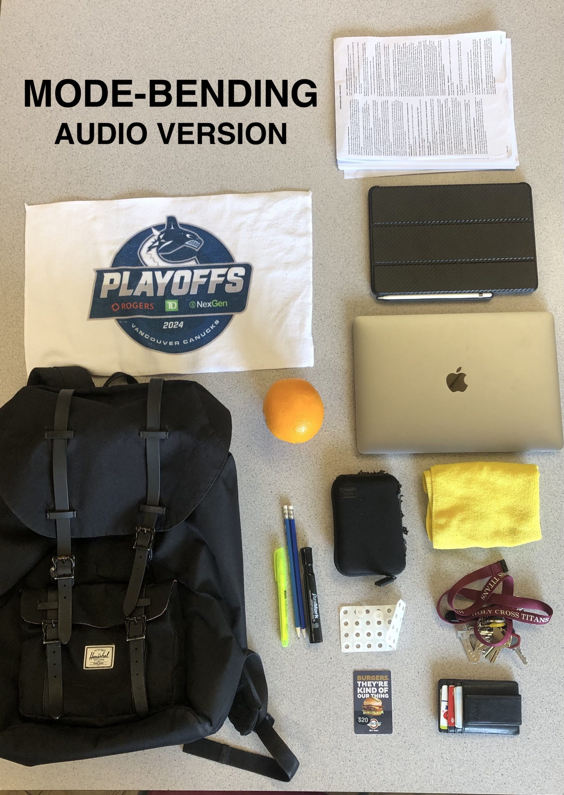
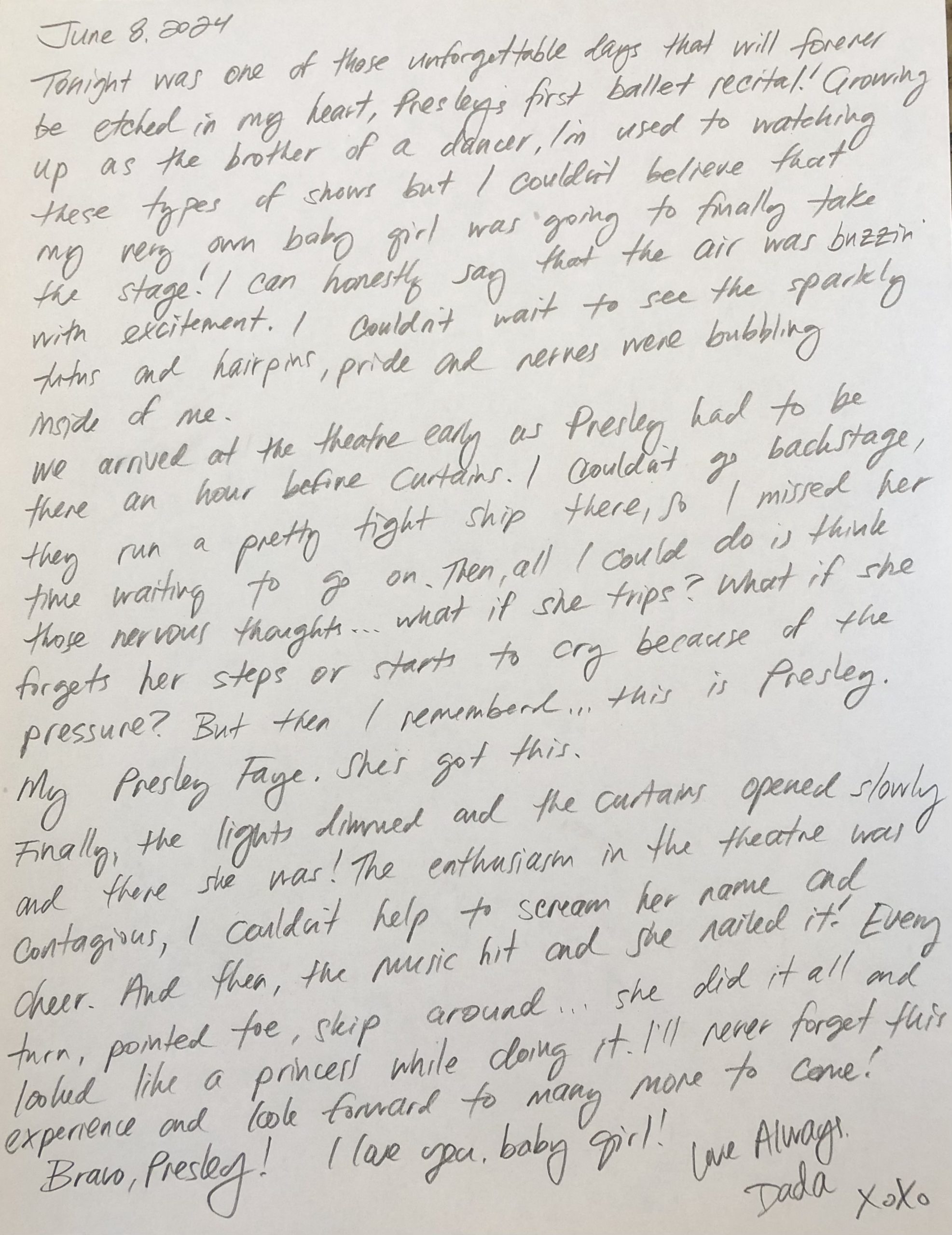
I usually prefer writing by hand over typing. Although typing can lead me to faster writing, easier editing and quick access to digital tools like spell check or a thesaurus, writing by hand can feel more personal and connected, which was especially meaningful for a variety of reasons. Writing out a lesson plan, a birthday card, a letter or an entry in a journal, writing by hand seems much more personal and unique than clicking away at a keyboard. For some reason, I have always enjoyed my printing and I especially enjoy writing with a lead pencil. Something about the lead scraping the grain of the paper really resonates with me and I’ve never thought about it so much until now. While I found the task definitely enjoyable, it was time-consuming and required more focus compared to if I typed this out.

To be honest, I didn’t make many mistakes but when I did have to erase once, I did with the back of my lead pencil. The pencil in the photo has been with me for over 8 years if I recall correctly. Those are the only pencils I like to write with, kind of a snob like that I suppose. But they just have the perfect weight, white eraser and 0.5 lead. When I made that mistake it was a quick fixed, easy erase. If the grain of the paper was ruined or the eraser smudged, I would have considered writing it out again. What does that say about me? I felt that this process made me more deliberate with my word choices and my overall structure, as I wanted to avoid errors. Writing by hand means that editing is more visible, unlike the simple backspace and delete keys available when typing.

The most significant difference between writing by hand and typing has to be the speed and ease of typing. Typing is much faster and allows for quick revisions without leaving a trace of mistakes. Writing for school or typing out things that I don’t feel are as personal doesn’t bother me at all. That’s not to say that school isn’t personal to me but it’s just not practical writing in large quantities but hand. Handwriting feels more permanent, personal and requires more careful consideration of each word. I enjoy this aspect of writing. I truly prefer writing in pencil over typing for most tasks. For personal reflections and diary entries, writing by hand can create a deeper sense of connection and authenticity and I also like that people know my writing when they see it. Take the writing of my daughters name for example. Seeing her name written by me is much more meaningful than seeing it typed. Little things, it’s all about the little things for me.

Spam prevention powered by Akismet