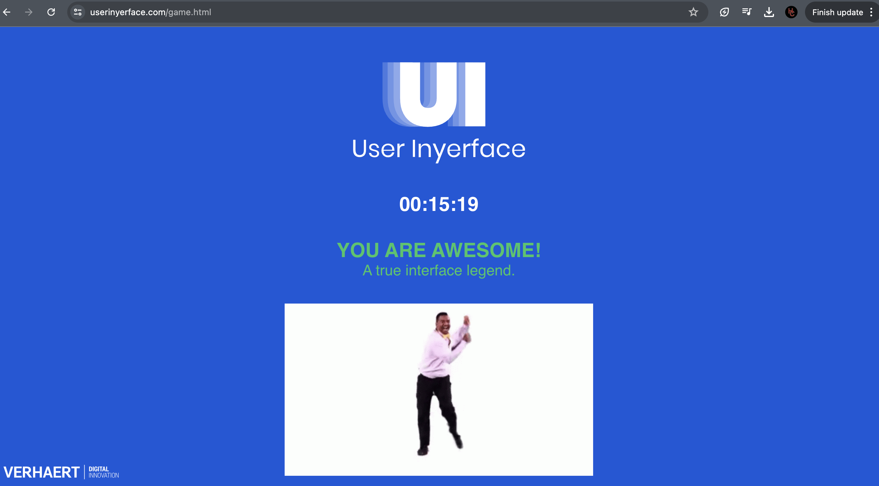
Well then… this made me feel foolish, or perhaps frustrated, or maybe annoyed, or I guess all of the above! Doing the exercise was actually fun as I found a lot of humour in it throughout the quiz. It is actually quite funny because I actually find myself very critical of website design on a regular basis and question the buttons and forms all the time. The design choices in this activity made it incredibly confusing. Reflecting on my own internet usage I can comfortably say that I have learned to click without usually thinking. In a sense, we rarely read the text on buttons and instead look for different things to click to make the process quicker. Clicking a box to say that we have agreed to something is a regular occurrence and looking for red or green click friendly icons is very common indeed. I feel that we have been conditioned to do these things and are now normalized so much so, that we forget that we are doing them. This quiz by User Inyerface does an amazing job of showcasing patterns and our habits of not reading and just clicking (Brignull, 2011). Usually, websites that are scams operate a lot like this and show these dark patterns even more so. I can recall many experiences where clicking on the ‘x’ to close a page sometimes begins a download or opens up an ad, much like this quiz did. Although there was definitely some humour involved in this quiz, the scary realities out there can be quite alarming. I have family members who have put in there email address or password to sites that are fake or that ask for information after announcing that you’ve won a free vacation. It can be quite a mess if you get caught in clicking without paying attention. The assignment did a wonderful job of showing these characteristics and teaching/reminding us a valuable lesson.
Reference
Brignull, H. (2011). Dark Patterns: Deception vs. Honesty in UI Design. Interaction Design, Usability, 338.
2 replies on “Task 10: Attention Economy”
Hey Carlo,
I totally get your mix of feelings—frustration, annoyance, and maybe a bit of fun—after tackling User Inyerface. It’s funny how something so simple can mess with our heads so much!
I felt pretty much the same. The site was confusing on purpose, and while it was kind of amusing at times, it was mostly just plain annoying. It feels like this site took it to a whole new level of crazy.
Your point about us being conditioned to click without thinking is spot on. We’re so used to speeding through everything online, clicking boxes and buttons without reading. It’s almost like second nature. This exercise really highlighted that, making us realize how often we just go with the flow without really paying attention.
Thinking about what Tristan Harris and Zeynep Tufekci talk about, it’s clear how this kind of design can manipulate us. Harris talks about tech companies keeping us hooked by playing on our psychological triggers, and Tufekci warns about the bigger picture of how this can mess with our society. This exercise showed just how easy it is to fall into those traps.
And yeah, while there were some funny moments, the whole thing is a bit scary too. It’s a wake-up call about how careful we need to be online. It’s a reminder to slow down, read the fine print, and be more critical of the designs we interact with.
Overall, this was a pretty eye-opening experience. It highlighted how conditioned we are and reminded us to stay alert and mindful online. Thanks for sharing your thoughts—it’s good to know I wasn’t alone in finding it both frustrating and enlightening.
Hi Carlo,
I enjoyed reading your post. I was on vacation while working on this task and ended up giving up about halfway through. As you pointed out, this exercise was indeed frustrating and humbling. I congratulate you on sticking with it for the full 15 minutes and completing it!
I like to think I’m fairly good at avoiding pitfalls like this, but this exercise showed me otherwise. Like you, I often click without much thought and rely on visual cues like colors to make decisions more efficiently. It was a clever way to demonstrate just how easily our attention can be swayed.
I found the inefficiencies to be the most distracting. Not being able to automatically fill in entries (and having to delete prompts manually), not having a tab function to move between entries, and the slow scrolling were particularly frustrating. On reflection, these issues likely clouded my judgment and thought process during the exercise.
You raise a great point about how easily we can fall into traps with websites that operate this way. Nowadays, it’s no longer an uncommon issue. (I remember my Hotmail account being hacked years ago, with friends from Japan contacting me to see if I really needed money sent for a ransom). This is a serious concern for educational institutions as well, since hacking and privacy breaches could potentially shut a school down. But it’s not just the dark web hackers to worry about. As highlighted in the videos for this module, even “friendly” applications we use regularly often exploit our information in ways we might not realize, which is quite eye-opening. The bigger issue is whether, and how, this problem can be fully addressed and unfortunately, I’m not sure there are answers for that yet.
Thanks.
Steph