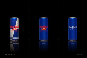
Antrepo, although fictional, has come up with the minimalist effect, which recreates the packaging of international brands, simplifying them to be exact.
Packaging is a marketing technique, but overtime, packaging can become too complex, and some products need some minimal feeling as suggested by Antrepo. On a shelf full of products wrapped in patterned, colorful packaging, won’t the simplest one stand out? And isn’t a brand’s name one of the most important factors of positioning? Perhaps, the minimalist effect could become a new technique of marketing because now the brand’s name pops right off the shelf. In fact, some of the repackaging on Antrepo’s website are more appealing in its simple variation.
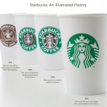
 Some companies have jumped onto the minimalist boat such as Apple, from its original rainbow apple logo to the now white apple. Starbucks’ cups have been evolving over the years as well, with its design becoming simpler. The latest cups don’t even have ‘Starbucks Coffee’ printed on them because their iconic siren is recognized from miles away. However, one of the cons of minimalism is that it could only be effective for well-known brands. That being said, the minimalist effect can test how popular and recognizable a brand is.

