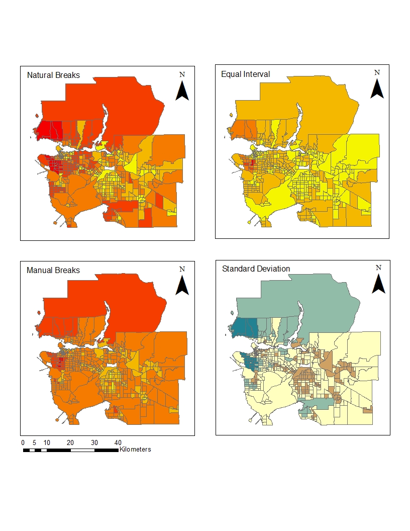
If I were a journalist, I would use the natural breaks method because it shows more contrast between the housing costs more accurately since each colouring depends on a natural grouping of number values. So wherever there is a gap in numbering would be where one category stops and another begins. This would make it easier for the audience to visualize and group housing costs into set numerical categories.
If I were a real estate agent, I would use the equal interval map because it divides the data in a way that shows the area around UBC as an average cost. This would mean that people who were not familiar with the housing prices in the rest of Metro Vancouver would assume that the prices were reasonable and would be more likely to invest in the property. This inaccuracy in mapping makes it unethical because the audience is getting misinterpreted and skewed information.
This data given would not be accurate because it is from 2011 census tract. This tract was made optional by the government meaning that there was a smaller sample size which was also biased because those who answered the National Household survey were in large part middle class Canadians. Furthermore, since the housing market continues to inflate in Vancouver, many of the areas may be more expensive than they were during the 2011 census tract.
Recap of learning: I was able to showcase the differences between various methods of quantitative data classification. This is useful to note in order to produce maps that are ethically sound.