These two maps explore the question of whether absolute or perceptual scaling of symbols is better. Absolute scaling is when the size of the circle is in direct proportion to the value of the data. So, a city with twice the population will be twice the area of a reference city. Perceptual scaling takes into consideration that research has shown that map users tend to underestimate the data values of larger circles. A circle representing a city with twice the population of a reference city will be adjusted to be more than twice the area. It is also called psychological, apparent-magnitude, or Flannery scaling.
Between the two methods of scaling, absolute and perceptual, the main difference that users may notice is the alteration in circle sizes. Psychophysical research has shown that people tend to underestimate areas and volumes which worsens with larger areas1. Due to the change in the exponent in the calculation of circle size, the perceptual map shows points that are smaller whereas the absolute map shows larger points in comparison to the largest point on the map. This change can make the proportional map more user friendly as it offers a clearer contrast between the largest circles and the smaller ones. Thus, map users can quickly and more accurately perceive the difference between cities that have a much larger population compared to cities with a comparatively smaller population. With the absolute scaled map, the circles are scaled accurately in relation to size and population. However, a map user would most likely perceive the areas of the circles incorrectly and thus leading the map to convey inaccurate information. The pros of absolute scaling are that if one would take the time to measure the symbols on the map, they could calculate the exact value that the cartographer used. This is not the case with perceptually designed maps because users would end up with inaccurate values due to the inaccurately sized symbols. The perceptual problem is not as evident on maps with a smaller range of circle sizes. Furthermore, once all the proportionally sized symbols are added onto a map, the problem of illusions needs to be taken into consideration. A circle may come off as looking small when surrounded by larger circles. Conversely, the same circle may appear larger when surrounded by smaller circles. Perceptual scaling is best used for maps that are meant to be scanned over quickly, but absolute scaling is best used for maps in which such accuracy is important (such as in academia).
For maps that are wide spread, it is unknown whether the map users will either glance at the map quickly for interpretation or want the exact numerical value that the symbols represent. Given the above points, one could argue that absolute scaling is better because it will accurately convey the data to the user for whatever they need this information for. However, given the data set that the map is trying to communicate, I would argue that perceptual scaling best depicts the contrast in population of the cities. This is because the contrast of circle sizes makes it is easier for the map user to interpret with the naked eye. It better conveys that Mumbai has a population approximately ten times more than Kannur.
So, which do you prefer?

Map 1 – Absolute Scaling
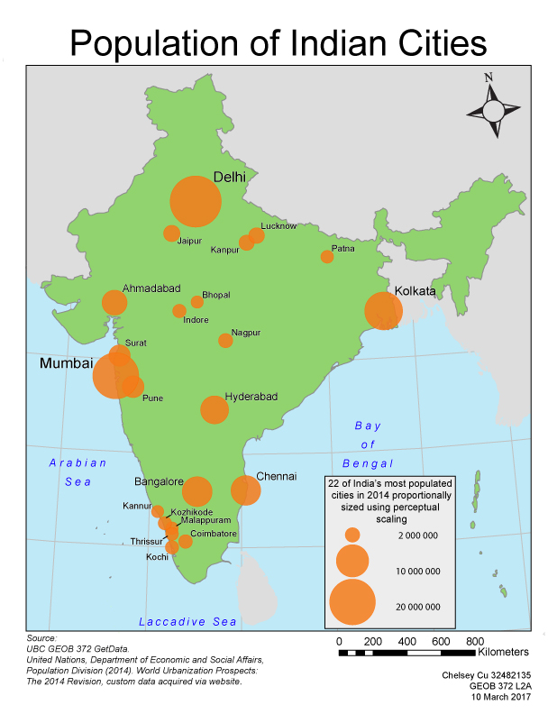
Map 2 – Perceptual Scaling
1Krygier, John. Perceptual Scaling of Map Symbols. 28 August 2007. Web. 10 March 2017.