Author Archives: Chelsey-Ann Cu

Image Classification of Northern Edmonton

Abstract

Remote sensing has been prominent in monitoring the growth of urbanized areas. In the expanding city of Edmonton, Landsat data plays a key role in determining the land cover types that dominate. Through both supervised and unsupervised classifications, as well as accuracy assessments, images can be analyzed by parsing through bands and pixel values. With this information, the region can be classified to aid in future city planning projects. The results in the analysis will emphasize which method of classification is best suited to determine land cover. It is also important to note that while some land cover types are easily identified, others are not, creating a source of error. Nevertheless, this image analysis has successfully determined a general idea of land cover in Edmonton through classification.


I. Introduction

The image acquired was from Landsat 8 Operational Land Imager (OLI). This image was originally taken in 16 bit with 30 meter pixel resolution on 16 August 2016. The sensor captures multispectral images in 11 bands ranging in wavelength from 0.435 to 12.51 micrometers. For the purposes of this study, bands 1 – 7 are used. These include the visible spectrum (bands 2, 3, and 4) near infrared (band 5) and shortwave infrared (bands 6 and 7). The Landsat satellite takes a total of 16 days to circle the globe, meaning that images of one location are taken in 16 day intervals.

The area covered in Figure 1 is the northern half of the city of Edmonton, Alberta. The path number is 42 while the row is 23. The image includes part of the downtown core as well as the more suburban areas. Some of the distinct features of the area is the Canadian Forces Base as well as several golf courses. The area of study also incorporates the agricultural lands that surround the outskirts of the city. Several water features that are incorporated into the area include: the North Saskatchewan River, which slinks along the bottom right corner of the image; and Big Lake, which is located on the mid-left portion of the image.

Figure 1. True colour image of northern Edmonton, Alberta in August, 2016.

For this image, the bands were converted to 8 bit for analysis purposes. Figure 1 was created by using a combination of bands 4, 3, and 2 in order to produce a true colour image. Figure 2 is a false colour image that was created using bands 7, 5, and 3. This particular band combination shows a distinct contrast between urban areas (shown in purple and grey), water bodies (shown as blue-black), and vegetation (appearing as green). In using this, certain key features are easier to identify.

Figure 2. False colour image of northern Edmonton, Alberta in August, 2016.

In comparing the Landsat OLI imagery to the ESRI basemap imagery, one can tell from the colouring of the image, which was taken at an earlier date. The Landsat imagery has more greenery since it was taken in the summer. The basemap appears to have more barren land indicating that it has been taken around late winter to early spring. The image acquired also shows some sites that are different from the basemap. For instance, some areas that are under construction or buildings that were not previously erected appear in the basemap while not in the 2016 image. Since the ESRI basemaps are regularly update, this would mean that the basemap is the most up-to-date version of the study area. And in fact, the basemap image was taken on 14 March 2018, making it more recent than the 2016 image that was obtained for analysis.


II. Analysis

Image classification extracts information from the classes of a multiband raster image. There are two types of classifications: supervised and unsupervised, which vary depending on how the analyst uses the software. In supervised classification, spectral signatures are obtained from training samples that the analyst creates to classify an image. For unsupervised classification, the software finds spectral classes (also known as clusters) in a multiband image without intervention from the analyst.

A. Unsupervised Classification

As part of the analysis, an ISO cluster unsupervised classification was performed using all of the available bands, classifying the image into 50 classes. From there a dendrogram was produced, which grouped together the most similar classes from the results of the ISO classification. This made it easier to identify the best way to further narrow down the classes. Based on the dendrogram, the 50 classes were grouped into 6 different categories: water, commercial/residential, dry grass, trees, agricultural, and industrial. Table 1 shows the number of pixels that are incorporated into each category. Since the pixel size for the image was 30 meters by 30 meters, in order to determine how many hectares that translated to, pixel counts in their respective categories was multiplied by 900 meters squared and then converted into hectares.

Table 1. Values of ISO cluster unsupervised classification of northern Edmonton. Class Pixel

The unsupervised classification procedure was able to produce fairly accurate results. The results are shown below in Figure 3. The most distinct class was water, as the pixel value did not match up with any other class. It was hard to identify tree cover areas because the dendrogram grouped those values together with the rest of the grass fields. This could have left substantial room for error as these pixel values then had to be manually reclassified by the analyst. But after shifting around some of the reclassified values, the grass fields that were classified under agricultural land, become distinct features. Also, it is notable that areas of barren soil or dry grass are easily confused with industrial regions because of the similar pixel values. The program further had difficulties in differentiating between the different land use types in the urban sprawl. This is understandable, since unsupervised classification is best used for land cover identification, not land use.
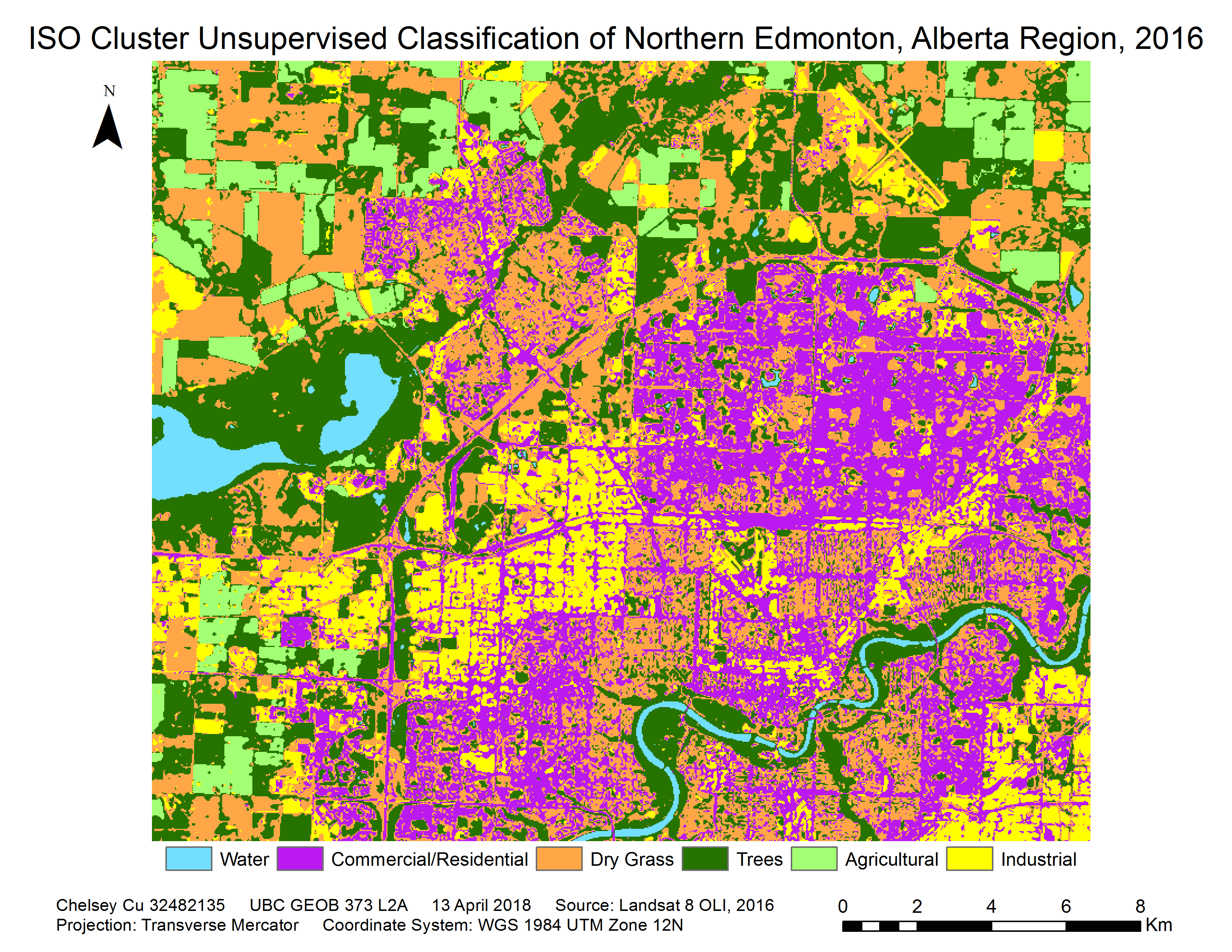
Figure 3. ISO cluster unsupervised classification with a majority 8 filter of northern Edmonton, Alberta in August, 2016.

B. Supervised Classification

Following the unsupervised classification, a supervised classification was performed. Here, training sites were created, using the results from the unsupervised classification as a guideline (see Figure 4). Several training sites were created for each of the previously delineated regions. This increases the accuracy of the analyst-made training sites by pinpointing areas that have previously been grouped together by the software. From these training sites, histograms (see Figure 5), and scatter plots (see Figure 6) can be made from the pixel statistics (see Appendix A). Finally, with the signature files created from the training sites, a Maximum Likelihood classification (MLC) and an accompanying output confidence raster (OCR) was produced.

Figure 4. Training sample sites for supervised classification of Edmonton, Alberta, 2016.

The Maximum Likelihood classification places pixels in a class based on the probability of a pixel belonging to a class. Both the variance and the covariance of the class signatures are considered to determine which cells belong to which classes. The output confidence raster is a means to determine the accuracy of the MLC results. Values are assigned to each pixel based on the software’s certainty that it was classified correctly. A value of 1 to 14 is then assigned each pixel with the lowest values representing the areas with the highest reliability.

Figure 5. Histograms of the analyst-created training sites showing the separability of classes.

Figure 6. Scattergram of the analyst-created training sites showing the separability of classes.

Looking at Figure 5 and 6, the spectral separability of the classes appear to be quite low. Most of the bars as well as the points of different classes seem to overlap in both images. This is problematic because it means that there is a higher chance that objects in the image were misclassified, thus decreasing the accuracy of the results. The best results are if the different classes are in distinct clusters. This helps when the program is classifying pixels that have not been incorporated into training samples. It enables the program to determine exactly what class a random pixel should be placed upon based on its spectral value. However, since the spectral separability in this case is seems to overlap between classes on all 7 planes, the pixel classification could be inaccurate as a pixel that has been classified into one category, could just as easily have been misclassified into another based on its value. For instance, when consulting Appendix A, it can be noted that classes such as agriculture and water are the most accurate, while industrial areas are seen as the least accurate. This could mean that pixel values for industrial areas can be easily misinterpreted and placed into other categories. In fact, this was seen in the unsupervised classification, when multiple dry grass areas were misclassified as industrial.

The results of the supervised and unsupervised classification can initially be compared though looking at Figure 3 and 7. In both cases, a majority 8 filter done on the final image to try to reduce fragmentation. The filter put pixels into the same category as its eight nearest neighbours. In Figure 3, there is a lot more fragmentation between land use classes. Therefore, the image ends up looking patchy, especially in the commercial/residential and industrial areas. While classification may be more accurate, it is also harder to interpret. In Figure 7, one can immediately notice that there is a lot more cohesion in the commercial/residential and industrial areas. Through the training areas that were made (see Figure 4), larger areas that previously had different ISO classes were placed into the same category. In some ways, this classification is less accurate, because large areas are clumped together into one category, meaning smaller scale data might be lost. But it also provides more cohesion between areas allowing the map user to clearly identify areas that each class occupies. Further, since it was a supervised classification, some of the areas that were previously misclassified in Figure 3 was corrected by creating training areas on those locations and manually classifying them into the correct category. In this way, the MLC was able to correct the classification errors produced during the unsupervised classification.

Figure 7. Resulting Maximum Likelihood from a supervised classification with a majority 8 filter of northern Edmonton, Alberta in August, 2016.

Figure 8. Resulting output confidence raster of the Maximum Likelihood from a supervised classification of northern Edmonton, Alberta in August, 2016.

Table 2. Values of Maximum Likelihood supervised classification of northern Edmonton.

Similar to Table 1, Table 2 shows the shows the number of pixels that are incorporated into each category. These have been converted into hectares to identify how much land belongs in each field. In comparing the two tables, the values that fluctuate the most are dry grass. This confirms the earlier speculation that many of the dry grass areas were inaccurately classified as industrial regions. The agricultural areas changed the least, showing that those areas are the most accurately classified in both cases.

Based on the output confidence raster of the MLC does not seem to be very accurate. In Figure 8, there are very few patches of green and quite a large number of pixels that are red, showing that only a small area was reliably classified. The most concerning red region is the North Saskatchewan River. In the unsupervised classification, water was identified as having a dissimilar pixel value to all the others, classification of waterbodies the most accurate. In the supervised classification results, the river is identified as being poorly classified. Moreover, the large amounts of yellow identified in the OCR shows the lack of ability of the supervised classification to accurately identify land cover types.

C. Accuracy Assessment

The pseudo accuracy assessment compares the supervised classified image to the unsupervised classification of the image. In this case, the ISO cluster unsupervised classification results are considered “accurate” or the ground truth data. This is compared to the MLC results to see how accurate the classification was for each of the classes. The row at the top of the chart is the labels from the supervised classification while the left-most columns are show labels from the unsupervised classification. The values that have been bolded in black are the ones that are used to determine accuracy. Based on the assessment, the ISO classes that are the most accurately classified are Trees and Commercial/Residential areas, the one that is the least accurately classified is water. Kappa evaluates how well the classification was performed in comparison to jut randomized values. The value for Kappa is 0.579. This is verified with the percent of the image that is correctly classified at 66.8 percent.

III. Conclusion

Overall, based on the results of the pseudo accuracy assessment, the supervised and unsupervised classification, this seems to be fairly inaccurate. The pseudo accuracy results indicated that with the unsupervised classification, only about 67 percent of the image was correctly classified in comparison to the ground truth data from the unsupervised classification. Looking at the results, classes such as water, which have distinct pixel values, are more accurately classified, while industrial areas have a lower accuracy.

Given the results, the best classification route for identifying land cover would be unsupervised. While land use would be best identified using supervised classification. Land cover can be identified by the pixel values that the sensor records; it consists of only physical characteristics. Land use is more of a social aspect and cannot be as easily identified based on a software and pixel values. For instance, the land cover could be vegetation, but the land use could be agricultural, gold courses or sports fields. Therefore, land use depends more on user classification and cannot be accurately done by the software. Overall, land cover classification can be improved through more information. The spectral separability is key for accuracy, and while there will always be human error created from the analyst, better image quality from improved sensors will help to eliminate this. As spectral separability becomes more accurate, unsupervised classification will as well.

Safest Driving Routes from UBC to Greater Vancouver

Click here for a direct link to the project website.

Abstract

The commute to the University of British Columbia can be thought of as a daily hassle. This project aims to provide insights towards the fastest and safest driving routes to and from UBC during peak traffic hours. In doing so, the map will help to inform the public of any areas to avoid in order to minimize their commute times and avoid accident prone areas.

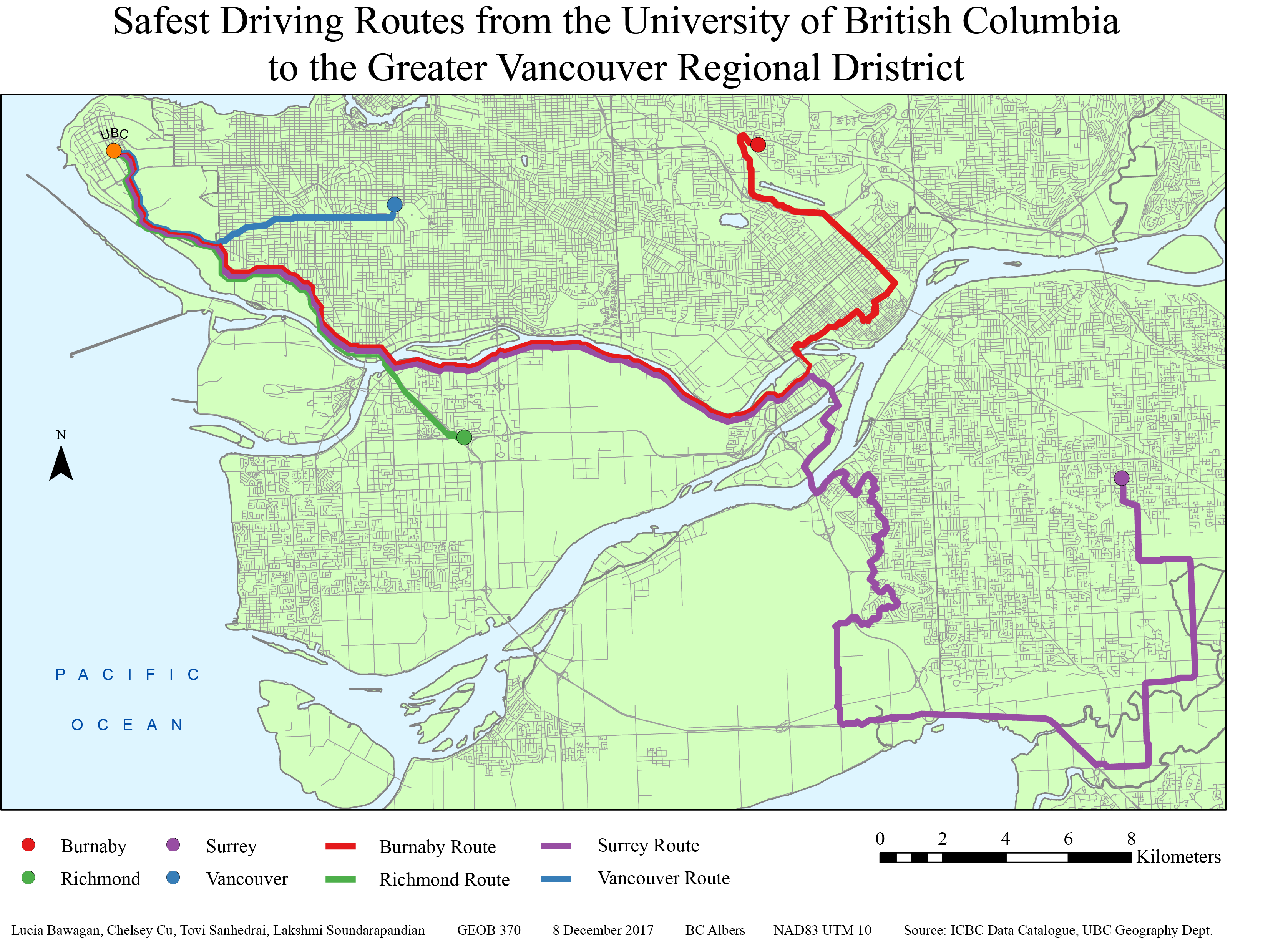
The project used a kernel density analysis approach using ICBC accident data and ESRI’s ArcGIS software. Through analyzing crash severity and frequency, a ‘cost’ surface path was made. This enabled the production four respective paths leading from UBC to arbitrarily chosen points in Burnaby, Richmond, Surrey and Vancouver (which are different municipalities in the GVRD).

The intended audience of these results are faculty, staff and students of UBC. Further collaboration with ICBC,  UBC and the municipalities would increase the accuracy of this project for its users. This project was conducted by Lucia Bawagan, Chelsey Cu, Tovi Sanhedrai and Lakshmi Soundarapandian as the final project of an Advanced GIS course (GEOB370) at UBC.

Introduction

In British Columbia, driving is regulated by the Insurance Corporation of British Columbia (ICBC), which was established in 1973 as a provincial Crown corporation. Since all vehicles are must be registered to legally be parked or driven on public streets in British Columbia, ICBC handles motorist insurance, vehicle licensing and registration, driver licensing, and produces annual traffic reports, statistics and crash maps.

The project, Safest Driving Routes from UBC to Areas Around the Greater Vancouver Regional District, was derived from our interest in finding the safest route from the University of British Columbia (UBC) to residential areas in the Greater Vancouver Regional District (GVRD). As driving is an important skill for most students and faculty members commuting to and from the campus, we take a special interest in road safety. The routes to each residential area are defined as the “least cost” paths that pass through areas classified under varying risk levels within an overall cost surface marked by car accidents that occurred in the previous year. These paths are created using ArcMap, and data from ICBC’s data catalogue.

The residential areas we have chosen are Vancouver, Burnaby, Richmond, and Surrey. These cities were chosen based on their variability in crash types and our assumptions that many people would commute from there to UBC. The least cost paths were created after a kernel density analysis to create a cost surface.

The goal of our project is to create a map of various least cost routes from UBC to residential areas in the GVRD. This map will hopefully bring awareness to young drivers, students and faculty about safe driving practices, frequency of car accidents and areas which have a high frequency of accidents.

Methedology

Initially, the task was to select four different cities within a Euclidean distance of 10 to 20 kilometers from the UBC campus. Settling on Vancouver, Burnaby, Richmond and Surrey, we used car crash data from ICBC along with lower mainland shapefiles, road networks and land use data to showcase the safest driving routes from these cities to UBC and vice versa. The method of analysis involved, first, data clean up prior to creating a cost surface, then selecting points in each city as a destination, before doing a kernel density analysis and creating a cost distance surface which is used to form the shortest, safest path from each city to UBC.

I.  Data Clean Up:

The first step was to ensure that all the layers had the same spatial referencing. So, the projections were all changed to BC Albers and the datum to NAD 1983 UTM Zone 10. The layers were then added to the car crash data shapefiles creating the output layer. This was made into the main geodatabase. Then, the excel car crash data was imported into ArcMap and converted into a points layer in the geodatabase, using the command make xy event layer. Since this spatial referencing did not match, so the projection needed to be defined. We inputted the spatial referencing as WGS 1984 because the longitude and the latitude was measured in decimal degrees and we needed to convert it to meters in ArcMap for the car crash data shapefiles. At this point, other municipalities, that we did not intend to look at, also had data. So, those data points needed to be deleted while in the layer editing mode. The same was done for the roads that were outside of the Lower Mainland area prior to intersecting the layer to the main project layer.

II.  Creating a Cost Surface:

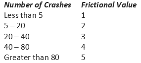
Now, with the data organized, spatial analysis can begin. The cost factors were then defined, by assigning frictional values depending on frequency of car accidents in a location.

Table 1. Frequency of car crashes

Another set of frictional values were also added in for the severity of the car crashes.

Table 2. Type of car crashes

Also, the roads layer was converted into to a raster file and cost values were assigned based on if the pixel was part of a road (value of 1) or not a road (value of 0). During the processing, it was important to ensure that the calculations are restricted to roads (and do not incorporate waterways).

III.  Selecting Source and Destination Features for the Route:

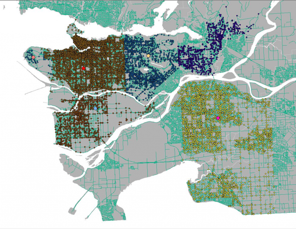
Since we did not have data on which specific neighbourhoods most people commuted from, an arbitrary point in each city was selected as a destination feature to avoid biases. This was done by doing a definition query, choosing points in layer editing mode, and deleting all other points that were not used. Once this was done, all the points in the different municipalities were merged into one layer.

Figure 1. Accident points in municipalities and selected start points for safest routes (larger dots)

IV.  Creating Cost Attribute:

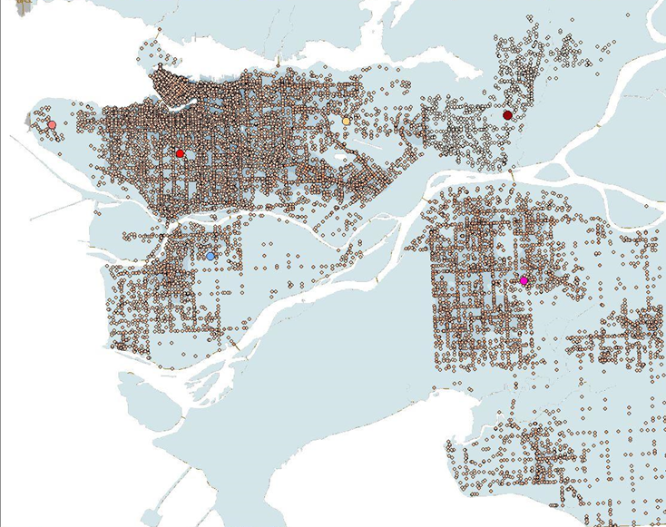
The next step was to create a cost attribute by creating a new column in the attribute table that considers both the weight assigned to the number of crashes and the crash type. This was represented by seven classes in a gradient.

After this, a kernel density analysis was performed.

Figure 2. Combined attributes in preparation for the kernel density analysis

V.  Creating Cost Distance Surface:

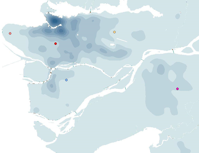
Next, we needed to create a cost distance analysis based on the new combined attribute that was made in the previous step. We created, not only a cost distance raster layer, but also the backlink raster layer as well.

Figure 3. A raster layer of the cost surface

VI.  Creating Shortest/Cost Path:

Finally, with the cost distance surface layer, we were now able to make a path that outlined the shortest distance from our arbitrarily selected point in each of the four cities (Richmond, Vancouver, Surrey and Burnaby) to the UBC campus. Taking into account the ICBC data on car crash severity and frequency around the Lower Mainland, these four paths are the safest driving routes for commuters going to UBC.

Results and Discussion

The results of the project are shown below in figure 4. Or, the map can be downloaded as a pdf by clicking here

Based on the kernel density mapping of the ICBC crash data, all of the routes to the four residential areas head south and then east due to the high density of accidents northward of UBC. From looking at the routes, it can be estimated that there is a correlation between high density traffic areas and accidents. The routes tend to avoid major roadways in the municipalities whenever possible and veer towards less dense networks. Thus, it could be possible that main roads are more prone to accidents because of the higher volume of drivers using them. The routes outlined by the analysis is potentially a longer route from UBC to the destination in either Burnaby, Richmond, Surrey or Vancouver. This is because the analysis uses the ‘least cost’ path (which was designated by the car crash severity and frequency in a specific area) and there is a much higher density of crashes north of campus around Downtown Vancouver/ Kitsilano area.

Figure 4. Final map after analysis with the four routes leading from UBC to Burnaby (red), Richmond (green), Surrey (purple) and Vancouver (blue)

Our analysis can be applied to commuter everyday life in multiple ways. It can increase the awareness of the safest driving routes between the UBC campus and the different cities in the Lower Mainland. For instance, given this information, drivers can be proactively be more alert and cautious when passing by the areas that are prone to accidents. This will encourage overall safer driving practices within the GVRD. Drivers can also avoid these areas whenever possible in order to minimize their commute times.

We would like to acknowledge that there are also points where our analysis falls short. For one, the point destinations were arbitrarily chosen rather than based on statistical analysis of which neighbourhoods most commuters are from. Furthermore, the classification of crash counts and risk levels were also arbitrarily chosen. In addition to this, there are also infinite combinations of cost by type and count when creating the ‘sum of the cost’ attribute. These errors and uncertainties could create uncertainties in our analysis and leave room for future improvements.

Further Studies

This research has been limited in scope due to the constraints in the data that we obtained. For future work, researchers could partner with the University of British Columbia to try and obtain data of where most of the university staff and students live and their mode of transportation. From there, the ones that drive to school can be singled out and an analysis can be performed based on the approximate areas which people commute to campus from. Then the analysis of the least cost path can be improved by using those areas rather areas rather than arbitrarily selecting city points. 

Another step to change our analysis process would have been to normalize the ICBC data that was obtained. In our analysis we only added together the number of car crashes and the type of car crash, but it would be interesting to map out the more serious car crashes in an area over the total car crash number in the area. This would, for instance, show intersections with multiple small crashes being less dangerous than an intersection with less crashes that are more severe, informing users to avoid the latter.

Furthermore, the monitoring of accident-prone areas can help to determine how this will increase and/or shift traffic and accidents to other parts of the Greater Vancouver area. Research can also be done on whether the knowledge of the suggested routes might possibly shift the accident locations from their original locations to along the routes suggested as more and more people use these paths.

The research can also be combined with other fields such as environmental impact assessments. Investigations could occur as to whether  avoiding these routes impact other areas long term. For instance, if taking these routes cause people to be caught more often in stand-still traffic due to car accidents and this, in turn, affects the amount gasoline consumed and the amount of fuel emitted into the atmosphere.

REFERENCES

ICBC Data Catalogue: http://www.icbc.com/about-icbc/newsroom/Documents/quick-statistics.pdf

  • Average annual car crash data published January 2017 for the past year
  • Metadata includes: crash statistics charts and accident reports

UBC Geography Department: G Drive

  • Basemap: Lower Mainland Shapefile
  • Road Networks: Intersection density, All roads in GVRD
  • Vancouver DEM: Differentiate between road features (degree of steepness, shape of the road)

All projected in BC Albers, NAD83 UTM 10

Acknowledgments: Brian Klinkenberg and Alexander Mitchell

Fine Dining and GDP


For those who are wondering, this map is an example of a cartogram which is a thematic map that shows information. In this case, the circles are all proportionately sized by absolute scaling to match each country’s gross domestic product (GDP) per capita. Each of the countries’ are coloured based on their continent to make it easier for the map reader. Do any of the sizes surprise you?

A second variable that I mapped is the number of Michelin Stars that each country has. Michelin Stars is an awarding system for restaurants that was started in Europe in 1900 as a way to get car owners to drive more. Rating restaurants was a way to entice drivers to go to different locations and use their vehicles more. Individual restaurants can obtain up to three stars. On my map, the stars are shown by the different colour intensities. The more opaque the colour, the more stars that country has. On the opposite end of the spectrum, circles that are left hollow are countries with no stars.

Click here for the data of countries’ GDP per capita as provided by the World Bank.

Click here for the Michelin Star rating data.

Absolute Vs. Perceptual

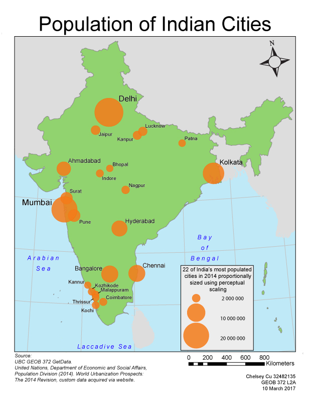
These two maps explore the question of whether absolute or perceptual scaling of symbols is better. Absolute scaling is when the size of the circle is in direct proportion to the value of the data. So, a city with twice the population will be twice the area of a reference city. Perceptual scaling takes into consideration that research has shown that map users tend to underestimate the data values of larger circles. A circle representing a city with twice the population of a reference city will be adjusted to be more than twice the area. It is also called psychological, apparent-magnitude, or Flannery scaling.

Between the two methods of scaling, absolute and perceptual, the main difference that users may notice is the alteration in circle sizes. Psychophysical research has shown that people tend to underestimate areas and volumes which worsens with larger areas1. Due to the change in the exponent in the calculation of circle size, the perceptual map shows points that are smaller whereas the absolute map shows larger points in comparison to the largest point on the map. This change can make the proportional map more user friendly as it offers a clearer contrast between the largest circles and the smaller ones. Thus, map users can quickly and more accurately perceive the difference between cities that have a much larger population compared to cities with a comparatively smaller population. With the absolute scaled map, the circles are scaled accurately in relation to size and population. However, a map user would most likely perceive the areas of the circles incorrectly and thus leading the map to convey inaccurate information. The pros of absolute scaling are that if one would take the time to measure the symbols on the map, they could calculate the exact value that the cartographer used. This is not the case with perceptually designed maps because users would end up with inaccurate values due to the inaccurately sized symbols. The perceptual problem is not as evident on maps with a smaller range of circle sizes. Furthermore, once all the proportionally sized symbols are added onto a map, the problem of illusions needs to be taken into consideration. A circle may come off as looking small when surrounded by larger circles. Conversely, the same circle may appear larger when surrounded by smaller circles. Perceptual scaling is best used for maps that are meant to be scanned over quickly, but absolute scaling is best used for maps in which such accuracy is important (such as in academia).

For maps that are wide spread, it is unknown whether the map users will either glance at the map quickly for interpretation or want the exact numerical value that the symbols represent. Given the above points, one could argue that absolute scaling is better because it will accurately convey the data to the user for whatever they need this information for. However, given the data set that the map is trying to communicate, I would argue that perceptual scaling best depicts the contrast in population of the cities. This is because the contrast of circle sizes makes it is easier for the map user to interpret with the naked eye. It better conveys that Mumbai has a population approximately ten times more than Kannur.

So, which do you prefer?

Map 1 – Absolute Scaling


Map 2 – Perceptual Scaling


1Krygier, John. Perceptual Scaling of Map Symbols. 28 August 2007. Web. 10 March 2017.

GEOB 270: Introduction to GIS

Over the course of this term taking introductory geographic information science (GIS), I have learned that I learn best when I am doing things hands on. I like, not only understanding how things work, and trying to see if I can yield the same results, but also taking the time to figure things out on my own through trial and error. I am proud to have been able to slowly improve on my maps as I built up my repertoire of understanding the software. I learned about the vast array of open source data that is available for analysis, but also the danger of feeding junk data into the analysis and the poor results it may produce. I hope that I will continue to improve and be able to compare my future work with my current ones and see the progress.

Potential Orienteering Map Sites in Greater Vancouver

Orienteering is a sport in which participants are required to navigate from check point to check point in diverse terrain using a map and a compass. There are a number of requirements (such as the size of the plot of land, the percent of elevation of the terrain, easy access for commuters, and so forth) that must be met before an area can be deemed fit for the sport. From there, a cartographer is brought in to map the selected location. The goal of this project was to find locations that are suitable for a cartographer to map.

Our team worked together on the mapping portion of the project then divvied up the accompanying discussion sections. This worked best for us because it ensured that everyone knew what was happening in terms of mapping and had a say in the results. This also eliminated the issue of analysis steps being done twice or missed if each of us had worked on the map separately.

Some issues that we faced when acquiring data was that a lot of material we found was older. For example, the shapefile of Greater Vancouver was from 1999. Other data that we were looking for, such as tree density, was proprietary. This hindered our analysis and left room for error in our final product. I found that while open source data is convenient, it may not always be the most reliable. On the other hand, proprietary data may be more accurate, but, like in our case, may go unused because it is harder to access.

Below are the different components of this analysis.

  1. The flowchart of analysis done.
  2. The map that resulted from this analysis.
  3. The discussion of analysis and results.

As a result of this project, I discovered a sport that I would have otherwise never known about. I think that it is interesting that the specifications for mapping set forth by this sport requires not only maps to be made of the terrain but also maps that pinpoint where maps should be made.

In working on this project, I learned how use new tools that I had previously not been familiar with such as adding X,Y data to excel spreadsheets in order to use that information in ArcMap. For the most part, there was a lot of trial and error when using tools that were unfamiliar. This made the end result more satisfying because it was something that we had spent a lot of time and effort in figuring out. The map aesthetics was something that I spent a lot of time on. Trying to get the halo effect on the words and drawing in the leader lines to try to make the map clearer and more user friendly.

Environmental Assessment of Garibaldi Ski Resort

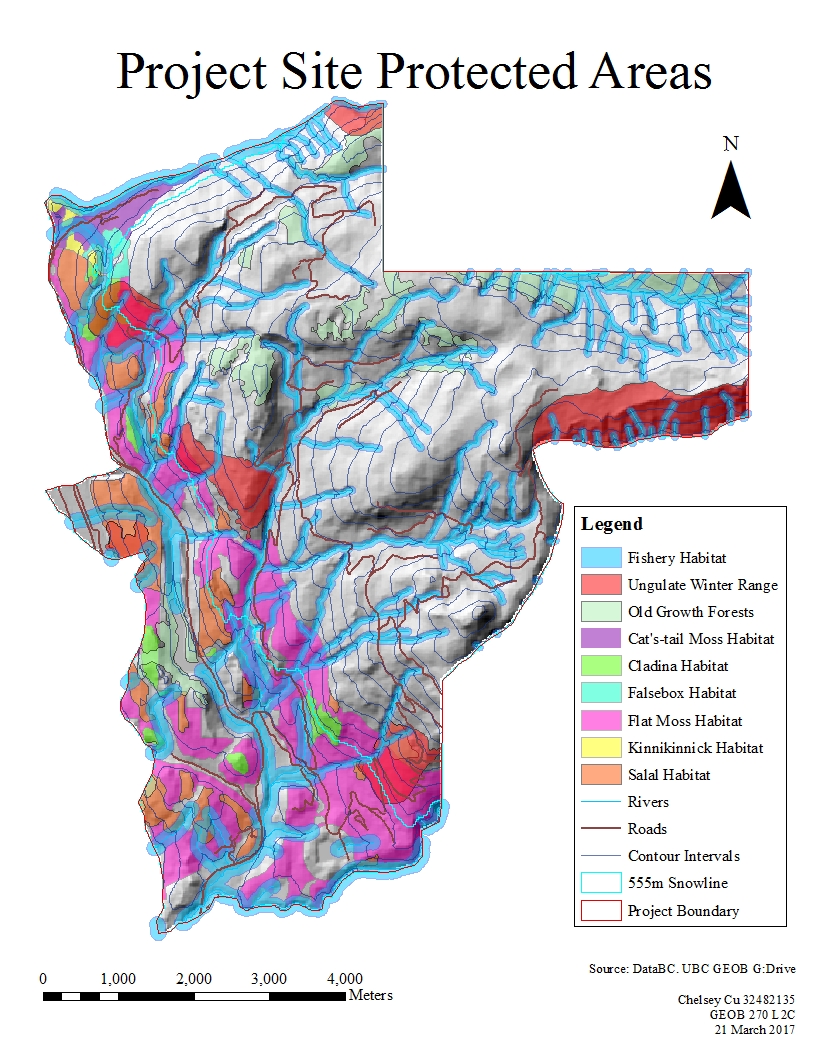
The purpose of this analysis was to look at the proposed project area for the Garibaldi at Squamish ski resort a year-round destination on Brohm Ridge, and determine whether it was a good fit based on the impact that this project will have on the environment. In this analysis, I looked at the habitats of ungulate, fish and endangered species as well as the parks and protected areas already in place and the old growth forests. These areas should be preserved to allow the respective species to continue thriving in their environment. Furthermore, I looked at the road networks already in place which would help to reduce the time and cost of future construction.

The following steps were taken in the assessment:

  1. Gather data from various sources (such as DataBC).
  2. Organize the gathered data.
  3. Focused into looking at solely the proposed project area and removed all the data that was associated with other areas. This lessened the amount of data that I had to deal with and reduced the clutter of information.
  4. Created a 555m snowline, and separated the areas that are potentially above or below this with a line. Those areas below this line potentially do not have enough snow for ski runs.
  5. Separated areas that are potentially old growth forests. These protected areas are not allowed to be cut down during construction.
  6. Separated the ungulate winter habitat. This shows the range of Mule Deer and Mountain Goats in the winter. If a resort were to be built, these animals’ natural habitats would be disturbed since the ski resort would most likely be busiest at the same time.
  7. Separated the red-listed ecosystems. These areas house endangered species and should remain undisturbed to allow the species time to repopulate. It was discovered that six species are endangered in the proposed project area: Falsebox, Salal, Cladina, Kinnikinnick, Flat Moss and Cat’s-tail Moss.
  8. Looked at the waterways in the proposed areas and created a buffer zone around them. Buffering an area creates a border of a certain distance in all directions around a specific area. Some of the streams may be fish-bearing and to preserve this natural habitat, the streams and the area around the streams should remain untouched. Streams that are above 555 meters in elevation are less likely to bear fish, so they only require 50 meters of buffer around the waterway. Streams that are below 555 meters may house more fish and are given a buffer of 100 meters to preserve their habitat.
  9. Combining all the areas that should be protected (old growth forests, fish habitat riparian management zones, ungulate habitats, and red-listed species areas). This helps in calculating areas that should be protected. It also prevents overlaps such as calculating an area twice.
  10. Creating a map using a 3D elevation model as the base then highlighting the previously gathered protected areas. Included are roadways, elevation contour lines and the 555 meter snowline.
  11. Add a legend, scale and compass to help user interpretation.

In the results, I discovered that 29.93% of the proposed project area is below 555 meters. Meaning that, these areas will most likely not have enough snow for the ski runs. 6.78% of the proposed area is old growth forests, 7.89% is ungulate habitat, 24.84% are habitats to endangered species, and 28.07% will fall on fish bearing streams. This equates to 54.68% of the project disrupting protected areas. It is important to note, however, that further research is needed to look at the impact in regards to social, economic, heritage, and health effects.

The two greatest environmental concerns to project development would have to be red-listed species and fish bearing streams as those take up the most of the project area. Seeing as most of these red-listed areas and fish bearing streams fall below the 555 meter line, impacts to these areas can be minimized by restricting construction to higher elevations. This would also be beneficial for the resort owners since there is a chance of insufficient snow below the 555 meter line. In this way, impact to these protected areas can remain minimal, while profit for the resort can be maximized.

Personally, I do not think that this project should be allowed to continue. While the memo notes that limits to construction below the 555 meter snowline can minimize impacts to red listed species and fish bearing streams, these areas will be disturbed regardless. The increased human traffic in these areas will significantly impact and alter the original ecological balance of these areas. Species that are endangered, if unable to adapt to these conditions will become extinct and loss of species in an ecosystem leads to wider scale impacts to the ecological balance in the long run.

Recap of learning: I gained skills in acquiring and parsing data to filter out the information that I needed based on my analytical objectives.  I was able to clip, buffer, and layer different sets of data together to determine whether or not the location for the ski resort has major environmental impacts.

Housing Affordability

Affordability measures the cost of housing compared the annual income that inhabitants earn. This is a better indication of whether or not housing is affordable as opposed to solely looking at housing cost because it looks at how accessible housing is given that people are making a certain amount of income. If one were to look at housing costs alone, they would be neglecting the other factors that affect people’s purchasing power. For example, if housing were on average $2 million in Vancouver but $5 million in London. Taking into account only the housing cost would mean that Vancouver is far more affordable than London. But if one were to look at the additional factor of income, London might have a median income of $150,000 per year while Vancouver inhabitants only have a median income of $50,000 per year. This would mean that with the income that the population is getting, it would be more affordable to live in London than Vancouver. (Please note that all these numbers are inaccurate)

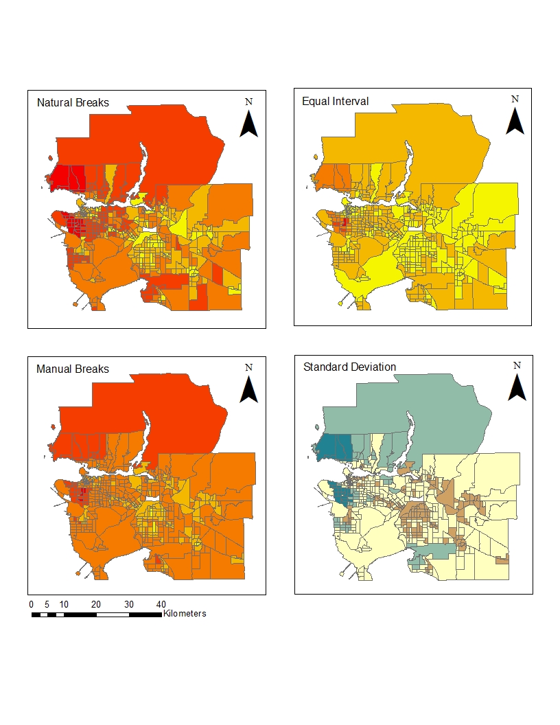
The housing affordability rating categories are: Affordable, Moderately Unaffordable, Seriously Unaffordable, and Severely Unaffordable. They were created by the Demographia International Housing Affordability Survey. They take census data and use the Median Multiple (median house price divided by gross annual median household income) to determine housing affordability.  I think the point of this is to show that housing is no longer affordable for middle income, working class people. As such, this data may be skewed to prove a point. When using manual breaks, one can determine the amount of housing that falls in each category because they are arbitrarily set breaks that suit the purpose of the cartographer.

Housing affordability might not be a good indicator of a cities livability because there are many other factors that could come to play. For instance, food costs might also come into play. Some areas that might have low housing costs and high incomes, such as mining towns in northern BC, have high wages and low housing because there are a surplus of available housing. But the cost of importing food there means that the population of those areas pay a lot more for their food than the population of Metro Vancouver.

Recap of learning: From open source census data, I was able to normalize the data and create a map showing the inequities of housing affordability in two cities.

A Different Point of View

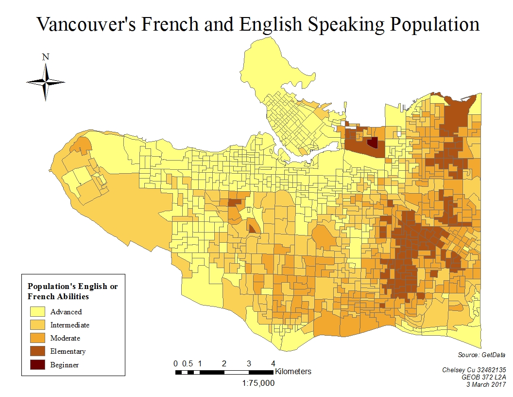
If I were a journalist, I would use the natural breaks method because it shows more contrast between the housing costs more accurately since each colouring depends on a natural grouping of number values. So wherever there is a gap in numbering would be where one category stops and another begins. This would make it easier for the audience to visualize and group housing costs into set numerical categories.

If I were a real estate agent, I would use the equal interval map because it divides the data in a way that shows the area around UBC as an average cost. This would mean that people who were not familiar with the housing prices in the rest of Metro Vancouver would assume that the prices were reasonable and would be more likely to invest in the property. This inaccuracy in mapping makes it unethical because the audience is getting misinterpreted and skewed information.

This data given would not be accurate because it is from 2011 census tract. This tract was made optional by the government meaning that there was a smaller sample size which was also biased because those who answered the National Household survey were in large part middle class Canadians. Furthermore, since the housing market continues to inflate in Vancouver, many of the areas may be more expensive than they were during the 2011 census tract.

Recap of learning: I was able to showcase the differences between various methods of quantitative data classification. This is useful to note in order to produce maps that are ethically sound.